PROJECT: Smart Destinations / GoCity's Responsive Website Redesign and
Marketing Promo Designs
Marketing Promo Designs
ROLE:
Principal Sr. UX and Visual Designer on responsive website and lead gen strategy
KEY SKILLS / DELIVERABLES:
• Competitive Analysis
• Brand Positioning
• eCommerce + Marketing Strategy
• Content Strategy + Copywriting
• Product Cards Comparison
• Product Bundling, Cross-Sells, Up-Sells,
Single-Ticket Purchase Designs
Single-Ticket Purchase Designs
• UX / UI Visual Design
• Marketing Promo Graphic Designs
DESIGN APPS USED:
• Omnigraffle (wireframing)
• Adobe Photoshop (detailed UI designs)
• Adobe Illustrator
PROJECT OVERVIEW / CONTEXT:
Provided UX and product positioning strategies designed to boost e-commerce sales of their multi-attractions admissions pass product lines. These passes enable consumers to receive steep savings up to 55% off gate prices. Collaborated closely with Chief Marketing Officer and Director of e-Commerce to define and differentiate product lines during major rebranding overhaul. Proposed content strategy, IA and UX in wireframe concepts for new potential functionality for three product lines shared by several destinations.
PROCESS:
Analyzed sites' current UX flow and marketing and brand positioning. Defined the various proto-personas most likely to prefer the three primary product lines and the breakpoints in a decision tree. Created wireframes illustrating proposed new concepts for enabling users to be able to better identify which of our three product lines were best suited to their preferred way to travel in a given destination.
SOLUTION:
Represented here are the proposed screen designs for their homepage. When users tap on one of their top travel destinations, users see popular attractions included with their popular GoCard products. Mobile screens feature the header and side panel navigation from their hamburger menu.
I chose photo-rich and immersive imagery designed to invite users to imagine themselves on their trips and appeal to different travel style preferences.
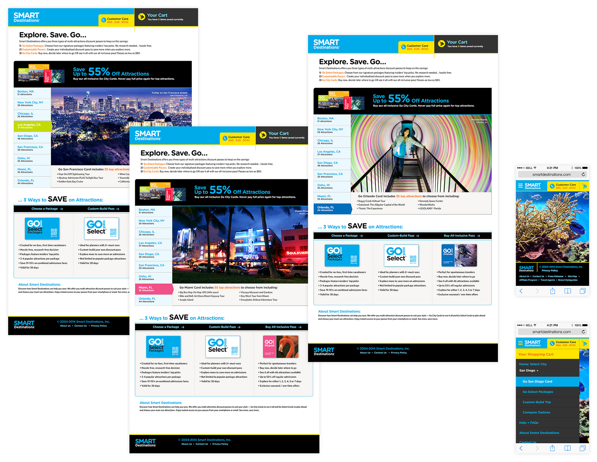
My proposed screen designs for their homepage. When users tap on one of their top travel destinations, users see popular attractions included with their popular GoCard products. Mobile screens feature the header and side panel navigation from their hamburger menu.
Represented below here are three pages in a UX flow from the left that begins with the homepage where users can quickly determine which top attractions are included in a GoCard city destinations. The second screen here features a respective GoCard product detail page. The last screen features a comparison chart page detailing the differences between each product line’s terms and conditions. My solution focused on standardizing the presentation of key facts with bulleted points for quick content skimming for each product type. Comparison chart enables easy assessment of the deltas between each product type.
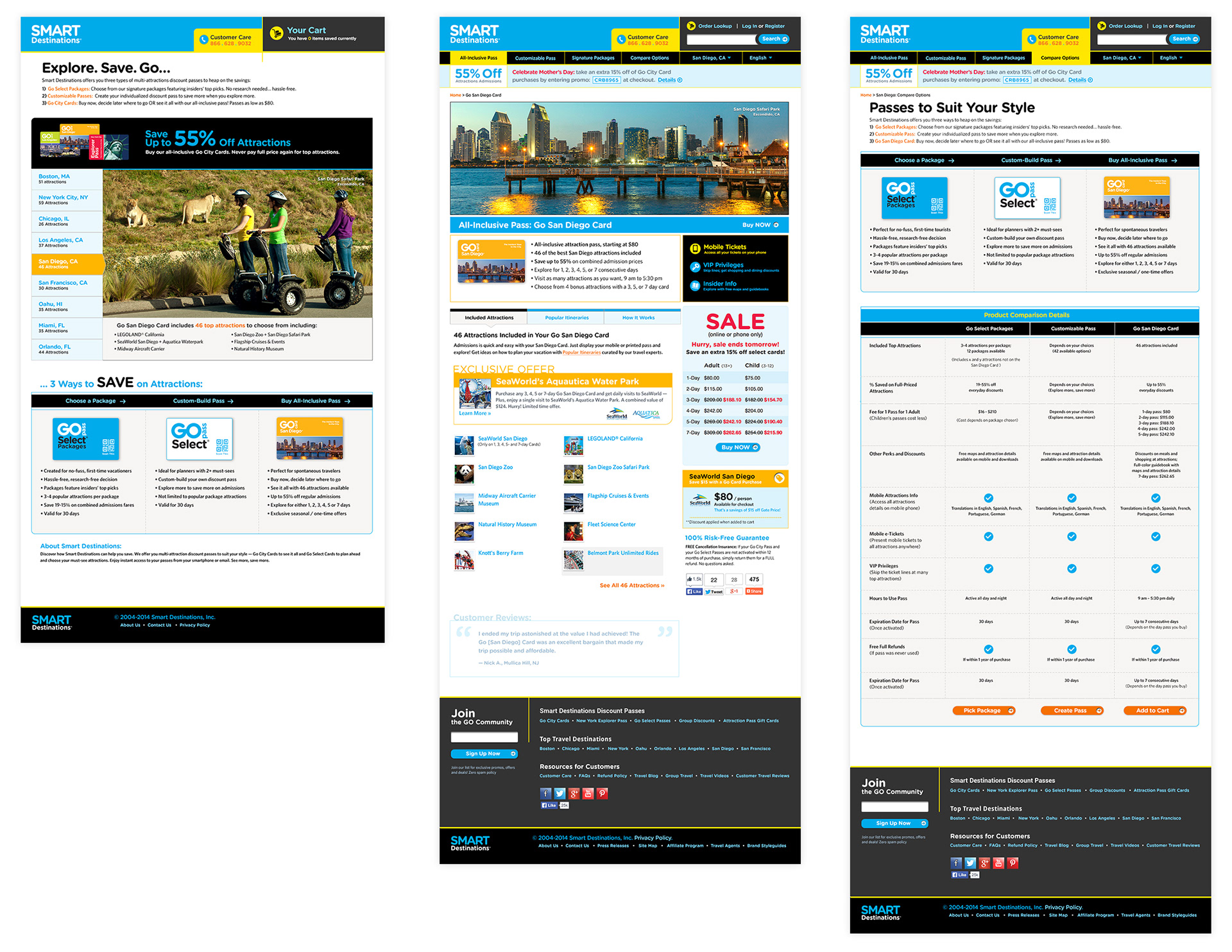
My proposed three pages in a UX flow from the left that begins with the homepage where users can quickly determine which top attractions are included in a GoCard city destinations. The second screen here features a respective GoCard product detail page. The last screen features a comparison chart page detailing the differences between each product line’s terms and conditions.
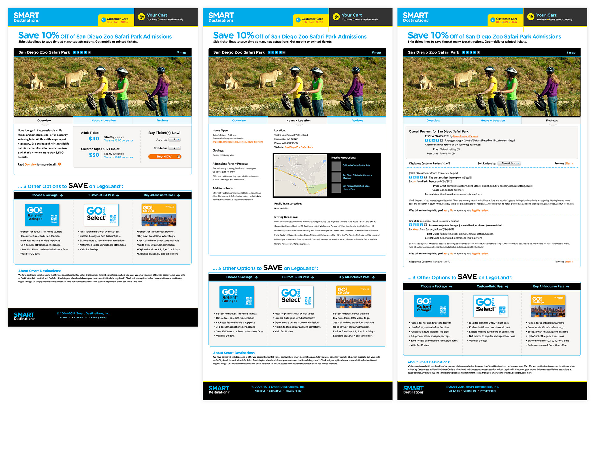
Represented here are three different tabbed views of landing pages designed to invite tourists or locals to buy a Smart Destinations discounted ticket to visit a popular attraction or to save more with our GoSelect Packages, custom GoSelect Pass, and the all-inclusive GoCard City passes.
My solution focused on standardizing the presentation of key facts with bulleted points for quick content skimming. Proposed a comparison chart for easy assessment of the deltas between each product type