PROJECT: MHE — International Division
( International eCommerce Sites Standardizaton )
( International eCommerce Sites Standardizaton )
ROLE:
Principal UX / UI Designer for responsive mobile eCommerce redesign targeting global markets across PreK-12, Higher Ed, and Professional Divisions.
KEY SKILLS / DELIVERABLES:
• Brand Positioning
• Bluesky Product Ideation
• Global eCommerce Strategy
• Wireframing + High-Fidelity UI Design
• Persona-Segmentation Strategy
• Content Hierarchy + Personalization
DESIGN TOOLS:
• Omnigraffle
• Sketch
• Photoshop
• Invision
PROJECT OVERVIEW / CONTEXT:
McGraw-Hill Education (MHE) is one of the top three giants in the PreK-12 edTech and textbooks publishing sector that includes Savvas (Formerly Pearson PreK-12) and Houghton Mifflin Harcourt. MHE's International Division operated multiple disparate eCommerce sites across global markets, creating a fragmented and inconsistent brand positioning and presentation of product offerings. While U.S. divisions worked on integrating their domestic PreK-12 and Higher Ed platforms, the international team needed a flexible, responsive-mobile design system to support multiple countries’ content, pricing models, and product lines. I was the principal UX / UI designer tasked with create a global eCommerce site template—one that balanced consistent branding with local customization for rollout across regions. I collaborated directly with the technical lead in Canada and eCommerce directors in Boston and UK headquarters who were leading the global implementation.
NOTABLE STRATEGIC ACCOMPLISHMENTS:
Delivered wireframes and high-fidelity visuals for the MVP eCommerce site within 2-month deadline for back-to-school launch to establish a unified, scalable design system for international rollout. The new international template would accommodate localization, but within a standardized b2c experience. In addition, I introduced a blueprint for future-state innovations including enhanced personalization and targeted professional development focus within the brand positioning of "Lifetime Learner" and "Theory-to-Practice":
"Lifetime Learner" Brand Positioning:
I positioned MHE as a long-term educational partner that would prepare PreK-12 students with the foundational knowledge from their textbooks and adaptive learning products. Yet, also serve as a lifetime resource for continuing education for professionals and educators
I positioned MHE as a long-term educational partner that would prepare PreK-12 students with the foundational knowledge from their textbooks and adaptive learning products. Yet, also serve as a lifetime resource for continuing education for professionals and educators
"Theory-to-Practice" Professional Development Focus:
I recommended pairing MHE product recommendations with industry applications and career tracks aimed to help students bridge their academic studies with targeted, real-world professional development.
(e.g. medical simulations products for pre-med students)
I recommended pairing MHE product recommendations with industry applications and career tracks aimed to help students bridge their academic studies with targeted, real-world professional development.
(e.g. medical simulations products for pre-med students)
Community Platform Vision:
I proposed community dashboards and personas-driven services connecting faculty, alumni, and students in novel ways for professional development and networking.
I proposed community dashboards and personas-driven services connecting faculty, alumni, and students in novel ways for professional development and networking.
UX / UI High-Fidelity Design Solutions:
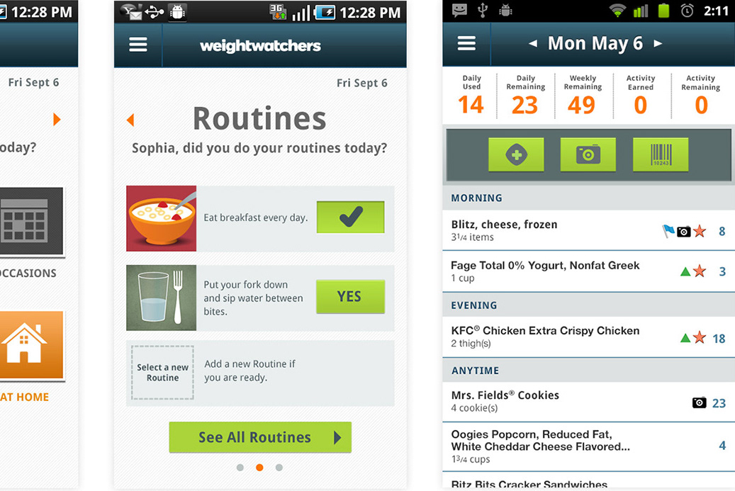
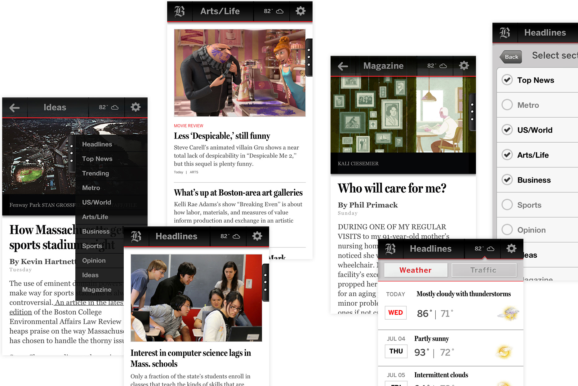
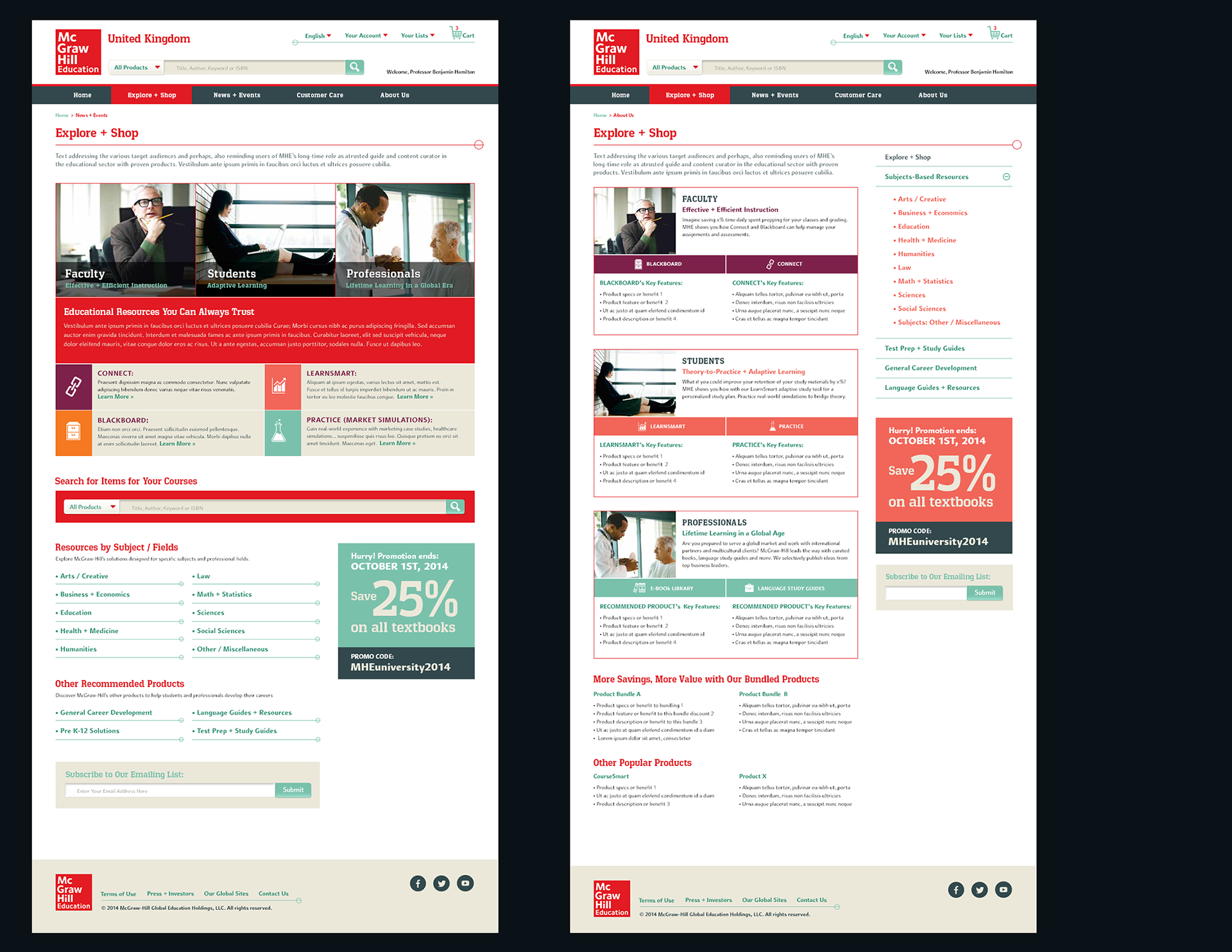
MHE International eCommerce Site Template Designs
(Responsive Mobile Web — Desktop Display for MVP eCommerce Site)
MHE International eCommerce Site Template Designs
(Responsive Mobile Web — Desktop Display for MVP eCommerce Site)
I created wireframes and high-fidelity visuals for the responsive mobile eCommerce website inspired by MHE’s new brand guidelines featuring MHE's brand red paired with warm, earthy colors — mint, hunter green, coral, beige, eggplant, sangria. Sample key pages I proposed for our 2-month MVP soft launch for Back-to-School included:
• Homepage: Showcases bestsellers and new publications
• Explore & Shop: Features bestsellers for MHE's PreK-12, Higher Ed, and Professional markets
• Personas-Relevant Solutions Overview: Recommends products for students, faculty, professionals based on their major or profession
• Explore & Shop: Features bestsellers for MHE's PreK-12, Higher Ed, and Professional markets
• Personas-Relevant Solutions Overview: Recommends products for students, faculty, professionals based on their major or profession
MHE International Division
(Corresponding Mobile Web Display)
(Corresponding Mobile Web Display)
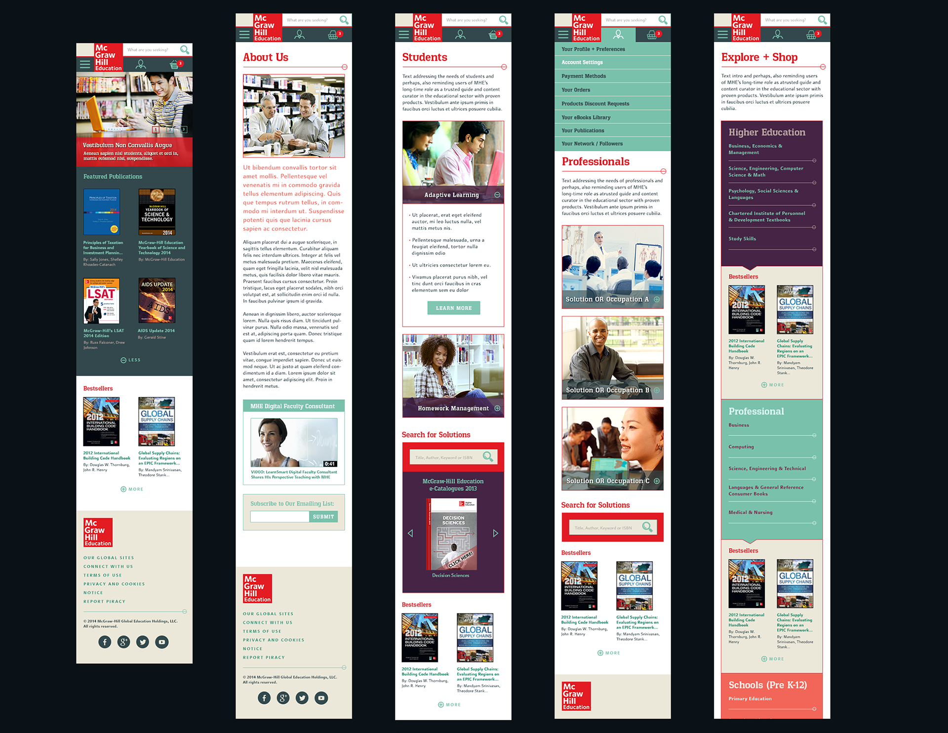
MHE International — eCommerce Shop Page
(My Initial UX / UI design concepts — for desktop display)
(My Initial UX / UI design concepts — for desktop display)
PROCESS DETAILS FOR INTERNATIONAL DIVISION:
IDEATE + PROTOTYPE PHASE
Annotated Wireframes Proposals
Annotated Wireframes Proposals
During the ideation phase, I created annotated wireframes and introduced brand positioning of "Lifetime Learner" and "Theory-to-Practice". I recommended that we position the company's brand as a lifetime learning partner that would connect academic theories to practical real-world applications via our adaptive learning and product simulation apps. I proposed these product features and innovation opportunities:
• Product recommendations based on persona-segmentation, occupations, and personalization
• Dashboards for course management and student progress tracking
• MHE products mapped to industry-specific, practical job training
• E-community for professional development and networking for alumni, faculty, and higher ed students
• Dashboards for course management and student progress tracking
• MHE products mapped to industry-specific, practical job training
• E-community for professional development and networking for alumni, faculty, and higher ed students
These wireframes were presented to the international stakeholders to inspire a North Star vision for product strategy, while a pared-down MVP was launched for the back-to-school season.
DELIVERABLE: MHE International eCommerce Website — Blue Ocean Ideation (pdf)
☆゚・*:.。.☆゚・*:.。.☆☆.。.:*・゚☆.。.:*・゚☆☆.。.:*・゚☆
PROJECT: MHE — PreK12 & Higher Ed Divisions
( eCommerce Sites Integration )
( eCommerce Sites Integration )
ROLE:
Sr. UX / UI Designer for MHE’s responsive eCommerce redesign. Led personas-driven, content strategy for end-to-end b2c experience across business units.
KEY SKILLS / DELIVERABLES:
• Discovery Research
• Big-Picture Product Ideation
• eCommerce Strategy Across Divisions
• Extensive IA + Content Strategy
• Persona Segmentation + Personalization
• Browse + Search Complex Catalogs
• Product Bundling, Discounts, Up-Sells, Cross-Sells
• Wireframes + High Fidelity Designs
• Design System Creation
• Accessibility (WCAG 2.0) Design
• User Testing Prep
DESIGN TOOLS:
• Omnigraffle
• Sketch
• Photoshop
• Invision
PROJECT OVERVIEW / CONTEXT:
Following multiple edTech acquisitions, McGraw-Hill Education (MHE) aimed to streamline its product lines and inform its users about its new adaptive learning products. In addition, MHE sought to build a single, responsive eCommerce platform capable of supporting users with overlapping roles and diverse needs—such as a PreK–12 teacher who is also a parent of high school and college-bound students, or a school board member who purchases on behalf of a district.
As part of this initiative, we focused on designing a seamless, persona-driven eCommerce experience that empowered users to easily discover, compare, and purchase adaptive learning products across divisions.
NOTABLE ACCOMPLISHMENTS:
As the principal UX / UI Designer on MHE’s eCommerce content strategy team, I collaborated closely with MHE's product managers, business analysts, and development teams on the eCommerce and content strategy.
Recognized by the Digital Platform Group (DPG) eCommerce product leadership for these strategic UX contributions:
Led the content strategy to templatize key content pages including PreK12 and higher ed segment product recommendations, higher ed discipline hubs, news article pages, and more.
Streamlined and templatized over 300+ microsites including STEM and literacy PreK-12 program microsites and MHE's edTech product marketing sites into the new integrated b2c eCommerce platform for PreK-12 and higher ed markets.
Introduced content templates with modular AEM (Adobe Experience Manager) components to standardize content presentation and shopping experience across divisions and reduce development time for new features roll-outs.
Designed persona-driven global navigation, product bundles, cross-sells, and adaptive search and filtering frameworks.
Created Visual UI system integrating brand refresh colors—mint green, hunter grey, coral, eggplant purple, and sangria mauve—into an accessible design palette.
BUSINESS IMPACT:
• 60% revenue increase within first year of integrated platform launch
• 15% increase in Higher Ed eCommerce earnings (2017), surpassing MHE’s top three distribution partners combined (Amazon, Barnes & Noble, Follett)
• 12% year-over-year web traffic growth since 2014
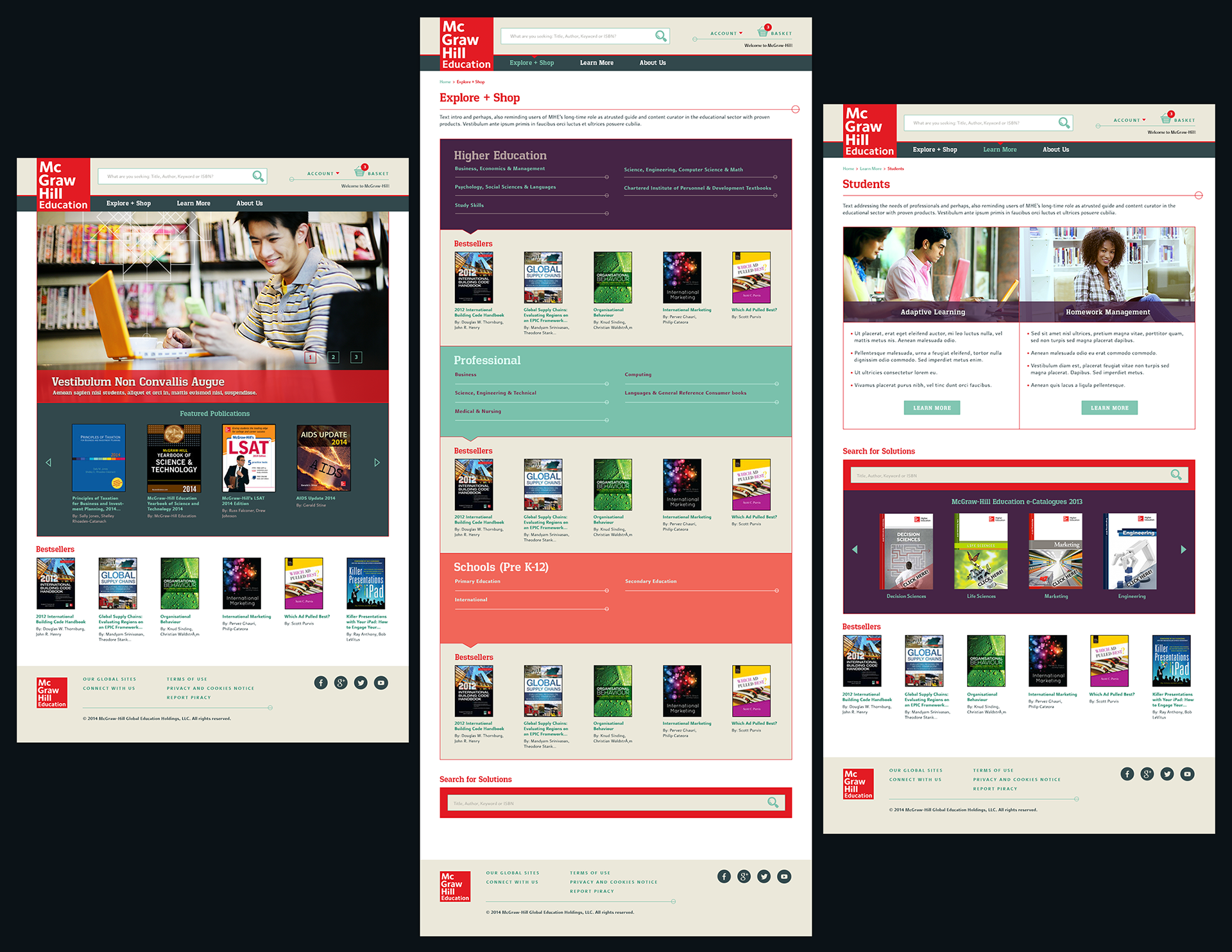
UX / UI High-Fidelity Design Solutions:
MHE Higher Ed eCommerce Site Template Designs
(Responsive Mobile Web — Desktop Display)
MHE Higher Ed eCommerce Site Template Designs
(Responsive Mobile Web — Desktop Display)
Detailed below are sample UX concepts and high fidelity visual designs featuring new components that I introduced including search typeahead, news articles, accordion tab product snapshots. Visual designs were created in Photoshop and later in Sketch. I also built Interactive prototypes in InVision for user-testing and usability validation.
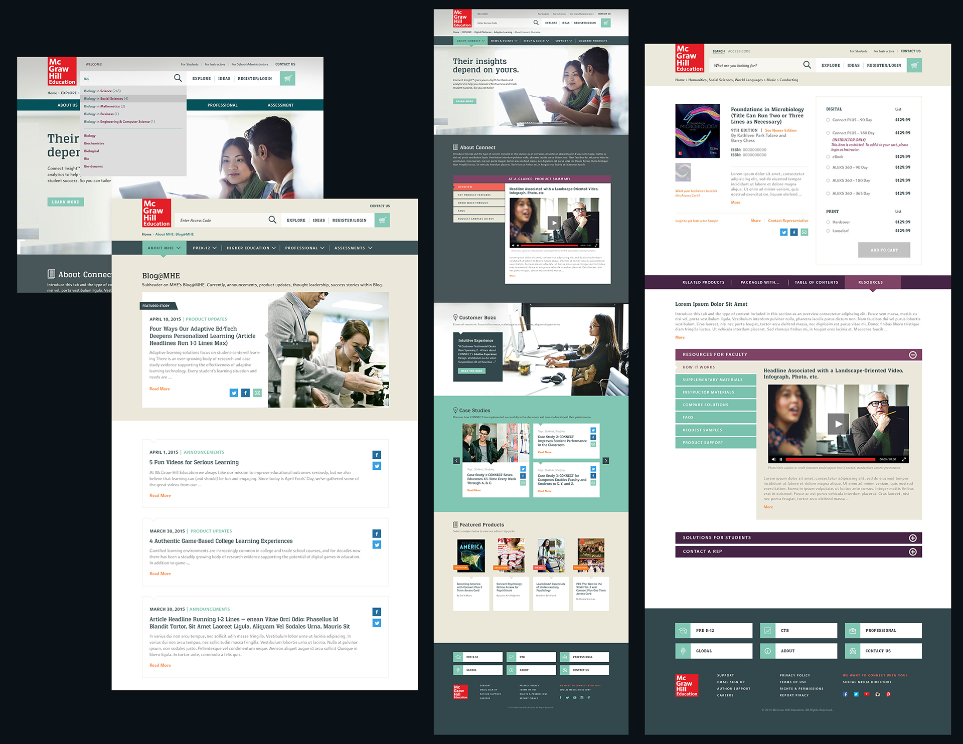
UX / UI High-Fidelity Design Solutions:
Search & Browse Experience
Search & Browse Experience
Detailed below are sample screens following a business segments- and personas-driven global navigation redesign that I led. Included here are several examples of search and browse pages where I defined and standardized the presentation of product details from copyrights, editions, and product overview to enable efficient content tagging. I created new features including search typeaheads, megamenus, search filtering with multi-selection criteria including detailed topics drill-down for interdisciplinary product searches.
EMPATHIZE / DISCOVERY PHASE
Researching the Edtech and Publishing Landscape
Researching the Edtech and Publishing Landscape
As the lead UX/UI Designer on MHE’s content strategy and search-browse teams, I began with a comprehensive discovery phase focused on aligning business goals with user needs:
⒈ Comprehensive Documentation Audit — Reviewed internal documentation, stakeholder interviews, user personas, roadmaps, and an inventory of 300+ MHE microsites to synthesize initial requirements.
⒉ Secondary Research – Read news articles and industry studies on edtech and publishing trends impacting my target audiences. Studied resources such as Scott Thurman's award-winning documentary "The Revisionaries" (2012) to learn more about the politics of content inclusion in textbooks between state boards and school districts such as on the topics of evolution, climate change, historical perspectives.
⒊ Competitive Benchmarking — Evaluated peer platforms to assess how others in the industry handled information architecture, product discovery, and UX patterns.
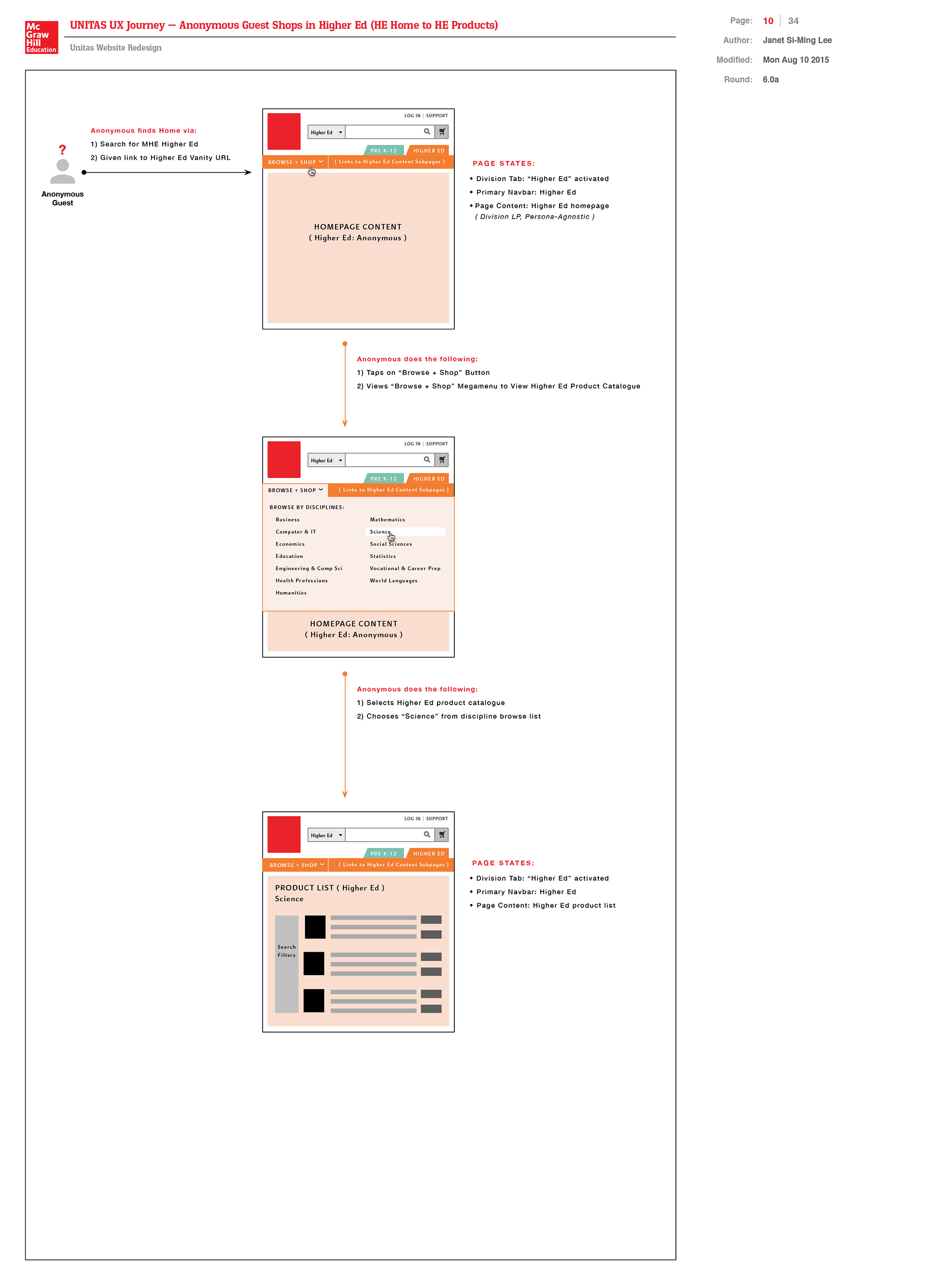
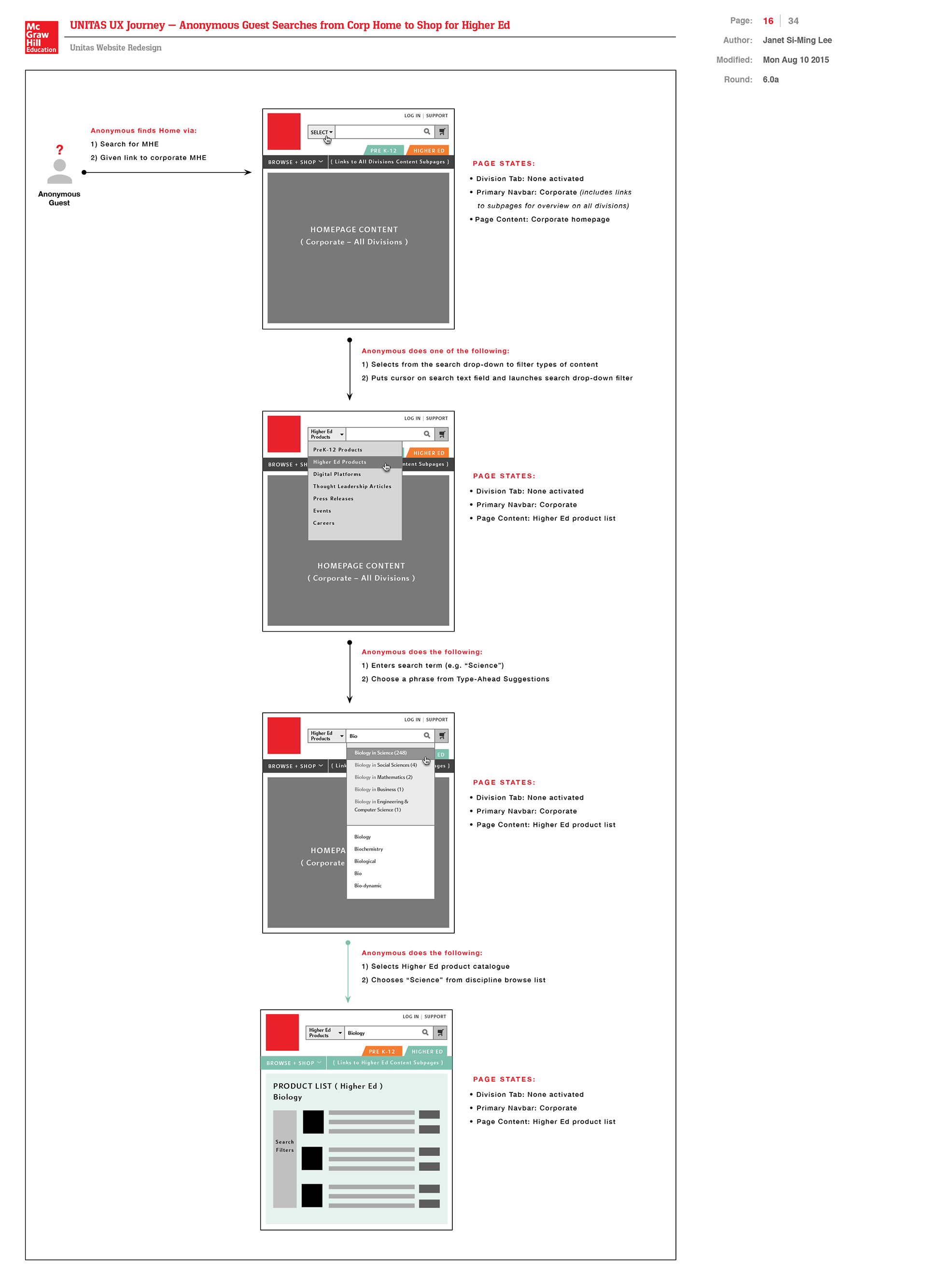
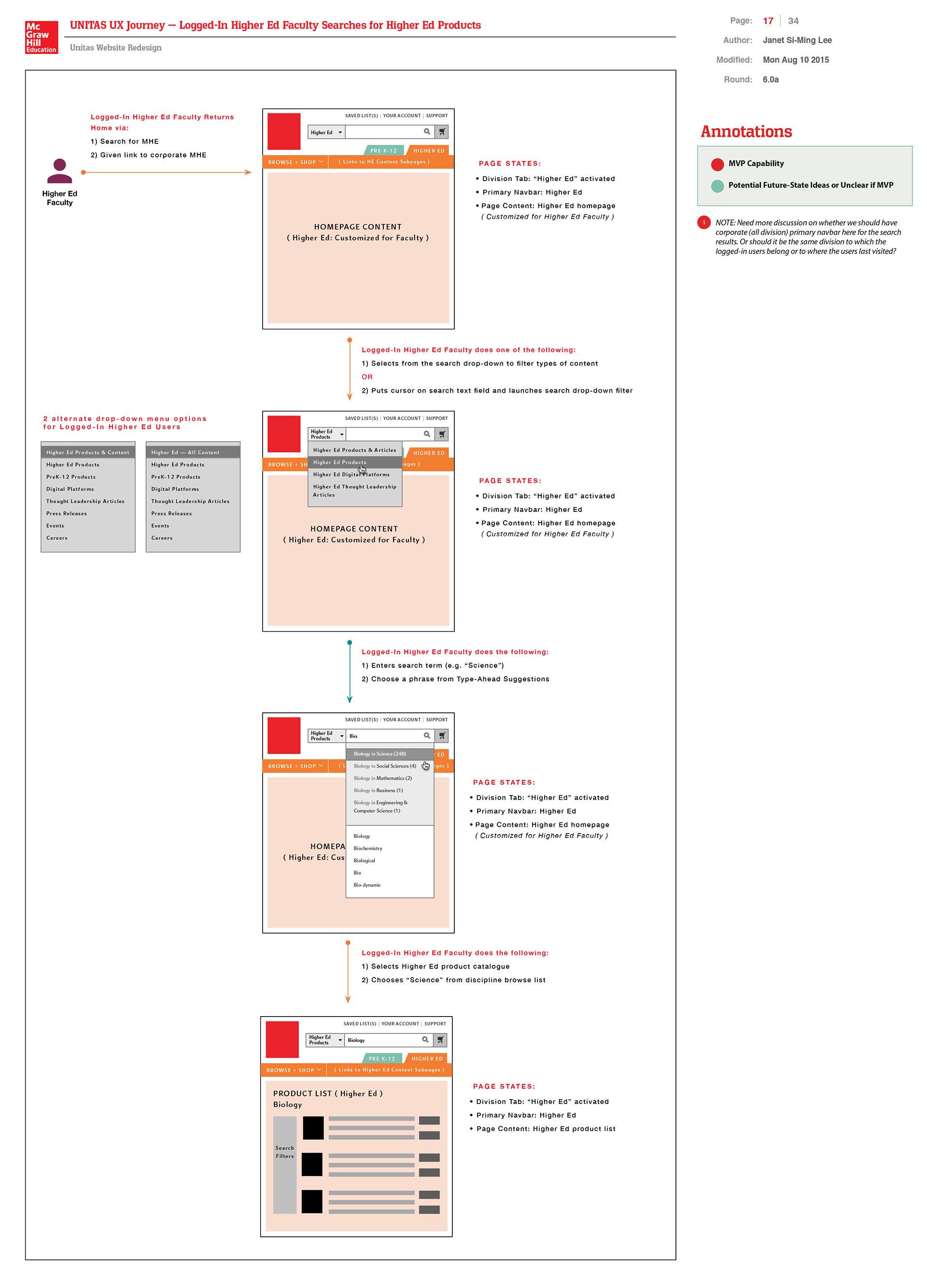
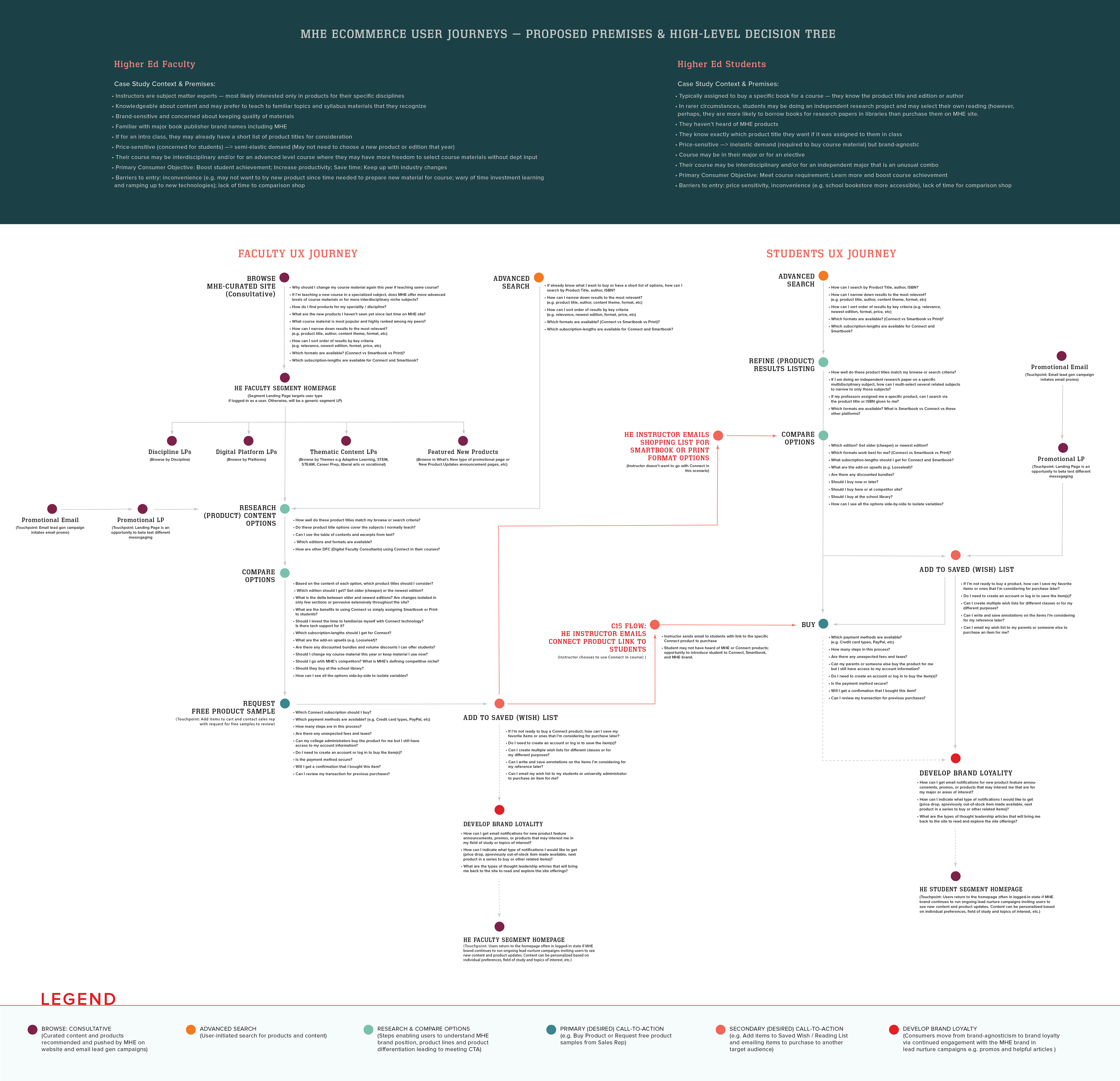
⒋ Persona-Based Sitemapping – Mapped user journeys across existing and proposed new site flows across division product lines. Organized findings into annotated wireflows to reflect multi-role user behaviors.
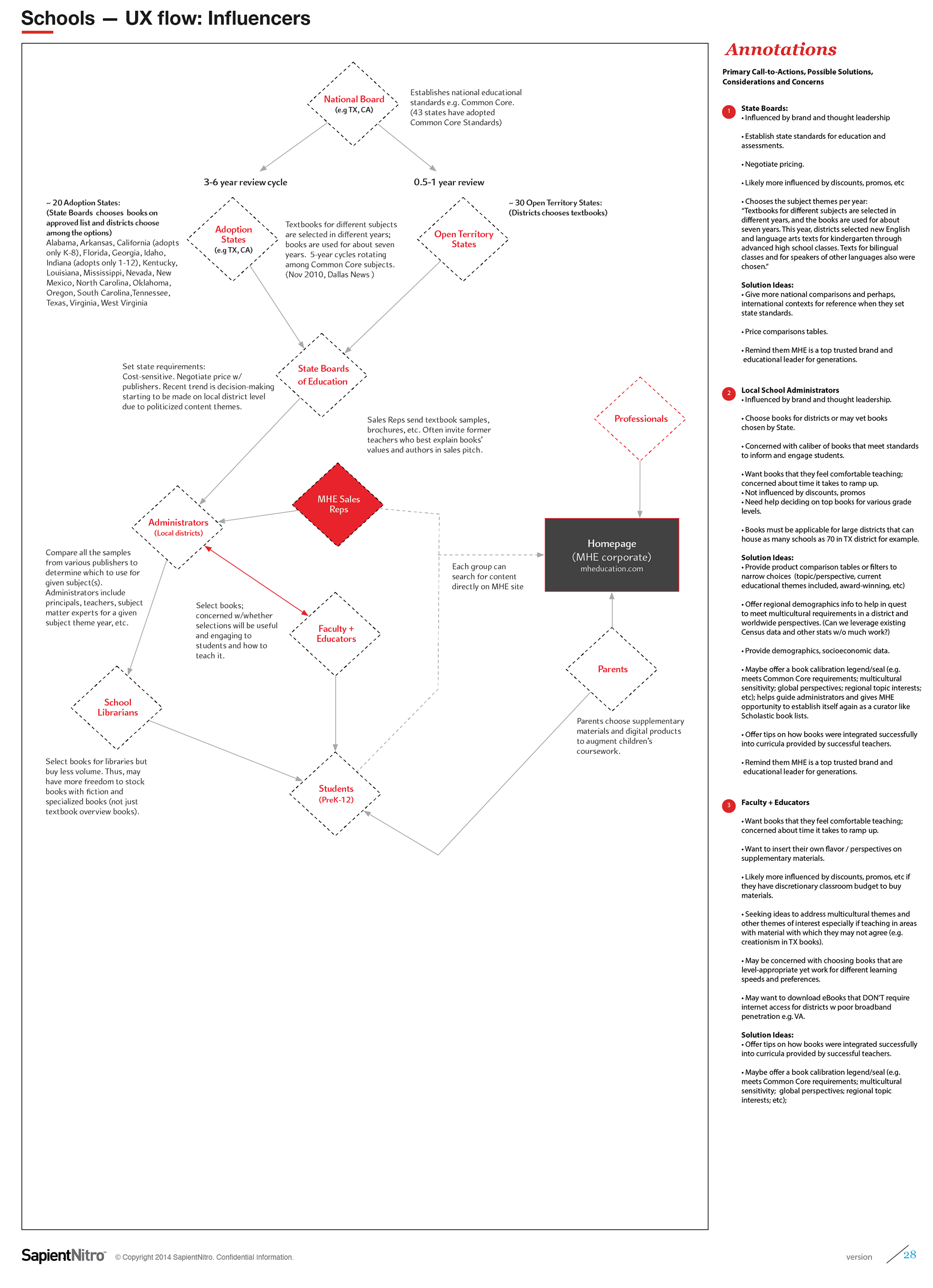
This wireflow above maps the journey of multi-role users—PreK–12 educators, parents, higher ed students, and institutional admins — connecting persona-specific actions with the broader educational purchasing context. I've also included my initial persona profiling notes that shaped how we approached segmentation and role-based personalization.
EMPATHIZE / DISCOVERY PHASE (continued) ...
Defining Target Audiences and Persona Privileges and Customer Journeys via Wireflows, Personas-Segmented Navigation
Defining Target Audiences and Persona Privileges and Customer Journeys via Wireflows, Personas-Segmented Navigation
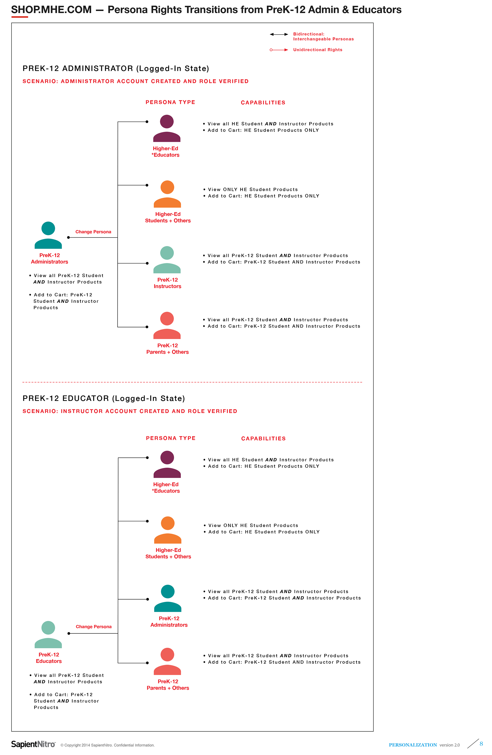
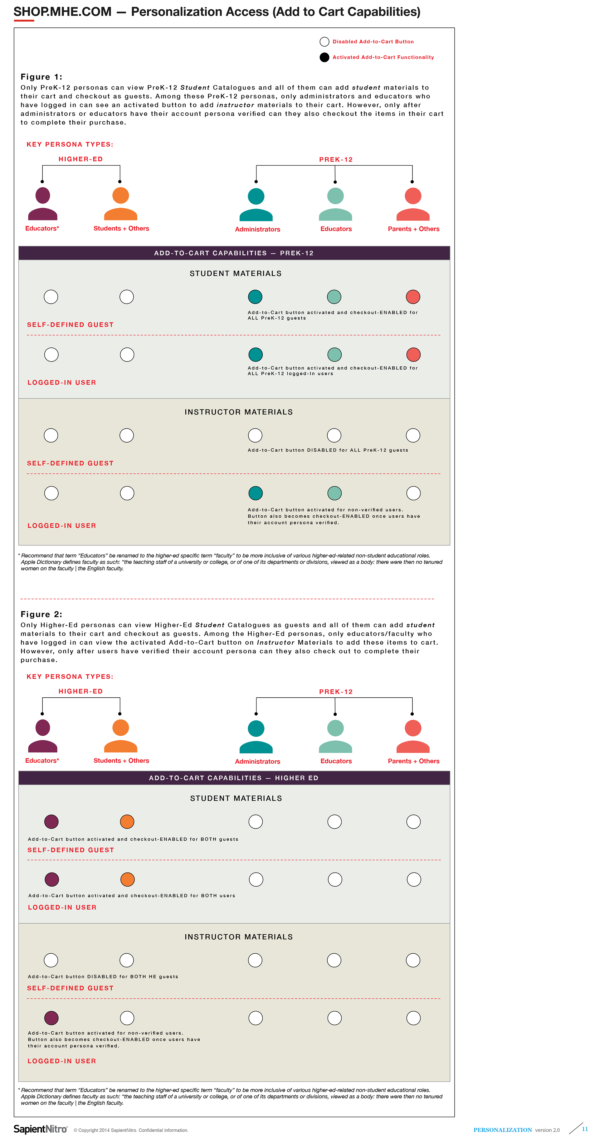
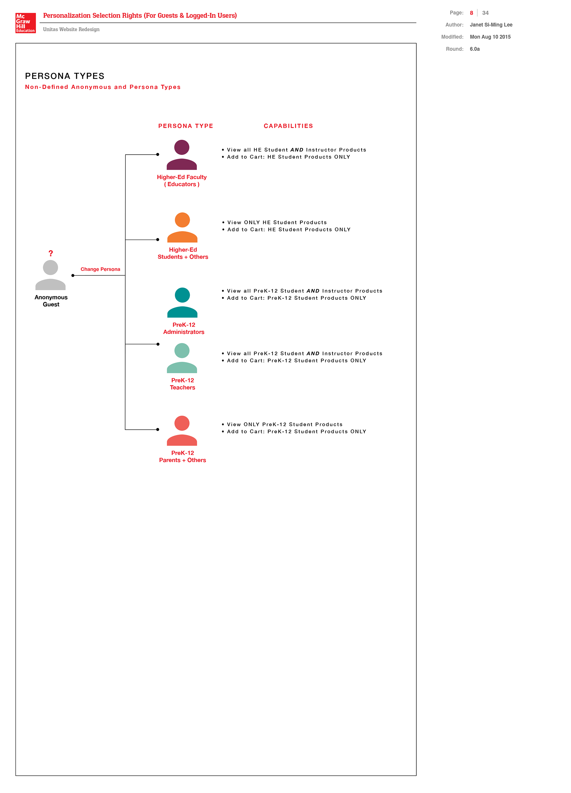
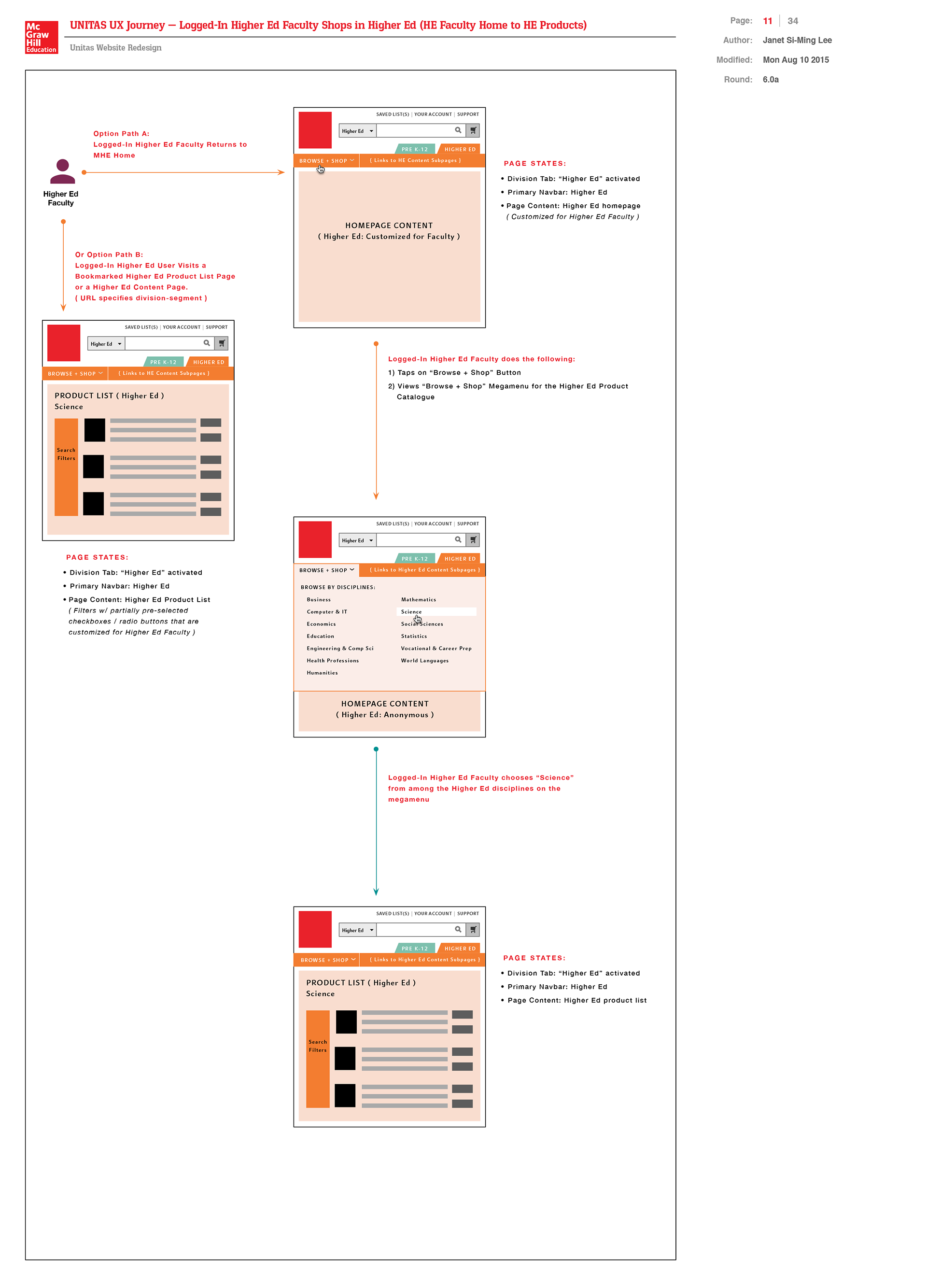
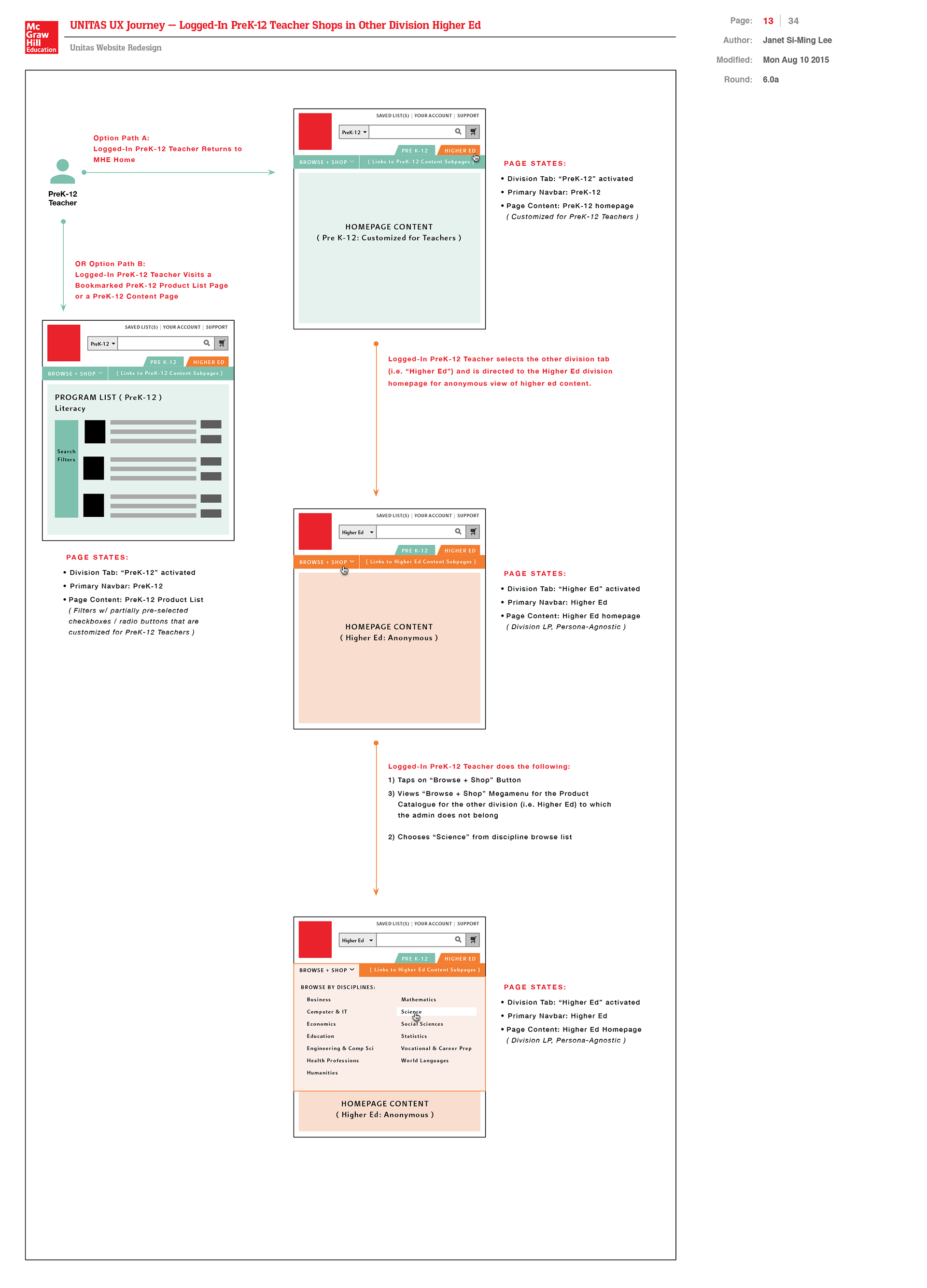
To align the integrated eCommerce platform with user needs, I developed detailed discovery artifacts capturing the unique behaviors, content privileges, and navigation flows for five core personas across PreK–12 and Higher Ed markets—including anonymous (not logged-in) users.
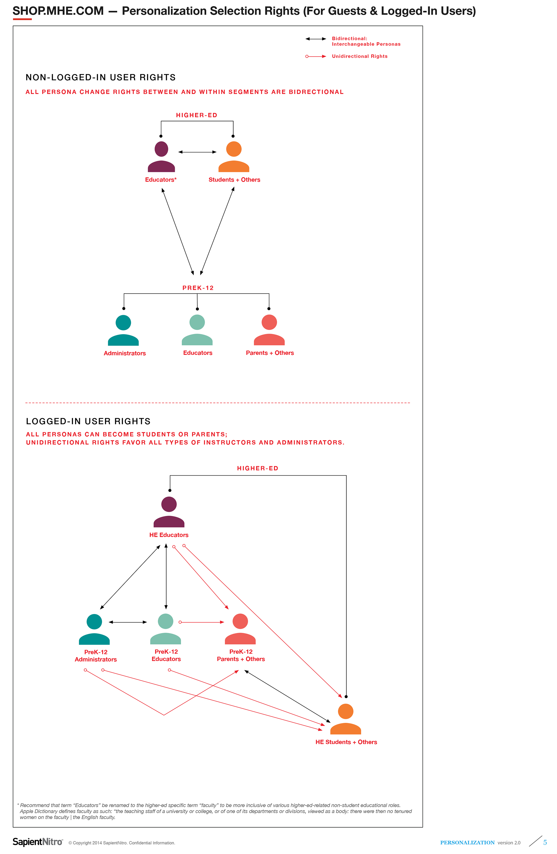
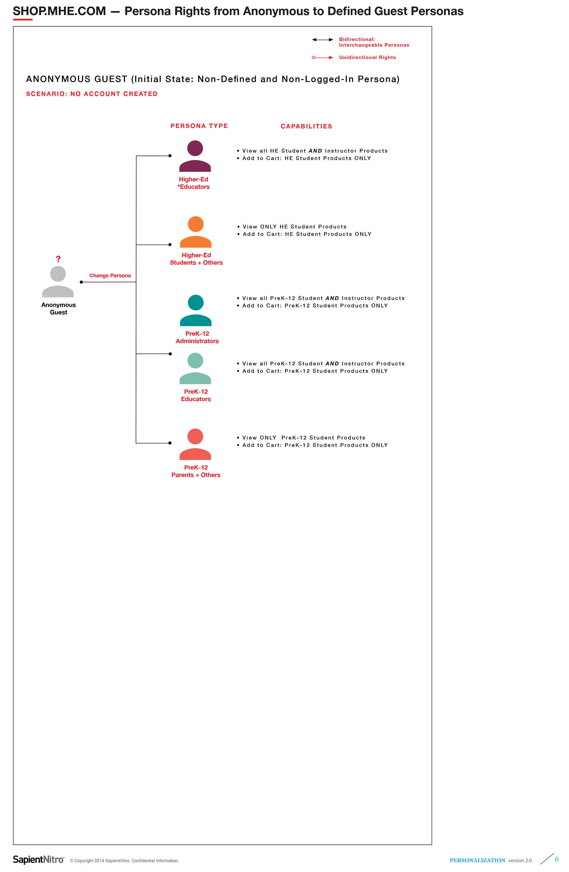
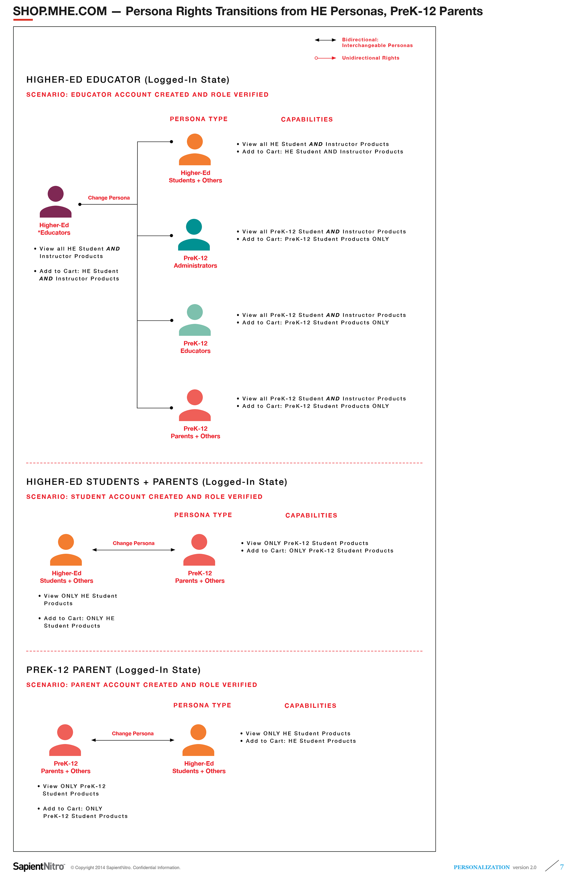
Persona-Segmentation & User Rights
I mapped out differentiated content access, call-to-actions, and transactional capabilities for each persona—such as students, parents, teachers, administrators, and faculty. These diagrams below visually distinguished proto-personas and business divisions through color-coded screens, illustrating rules for persona interchangeability and catalog access (e.g., bidirectional or unidirectional access between PreK–12 and Higher Ed product lines).
Personas-Based Navigation and Wireflows
The wireflows below demonstrate how each key persona navigates critical pages within the unified platform. Color-coded to match persona segments, they highlight tailored primary call-to-actions and content pathways designed to deliver relevant product discovery and purchasing experiences for diverse user needs.
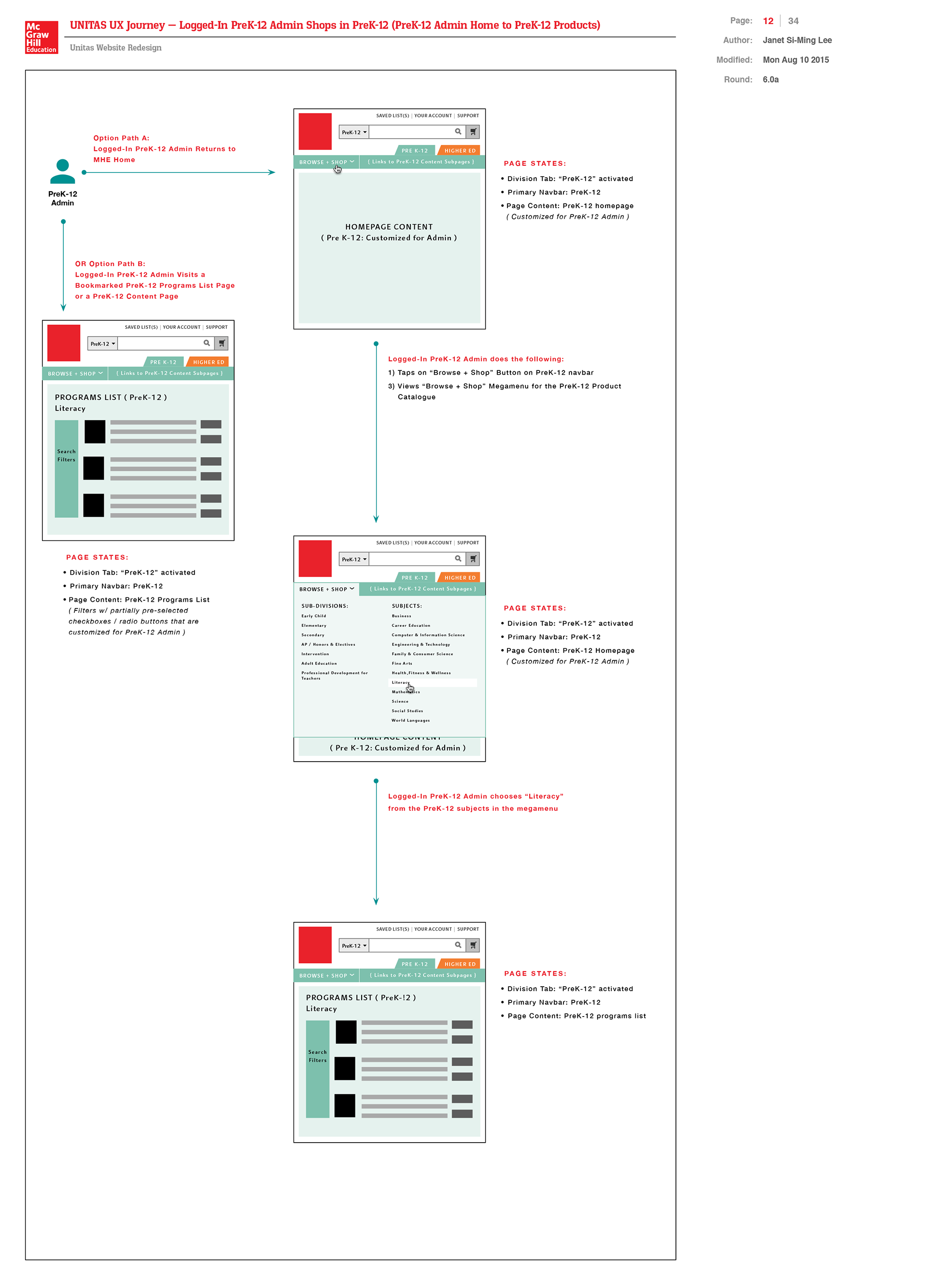
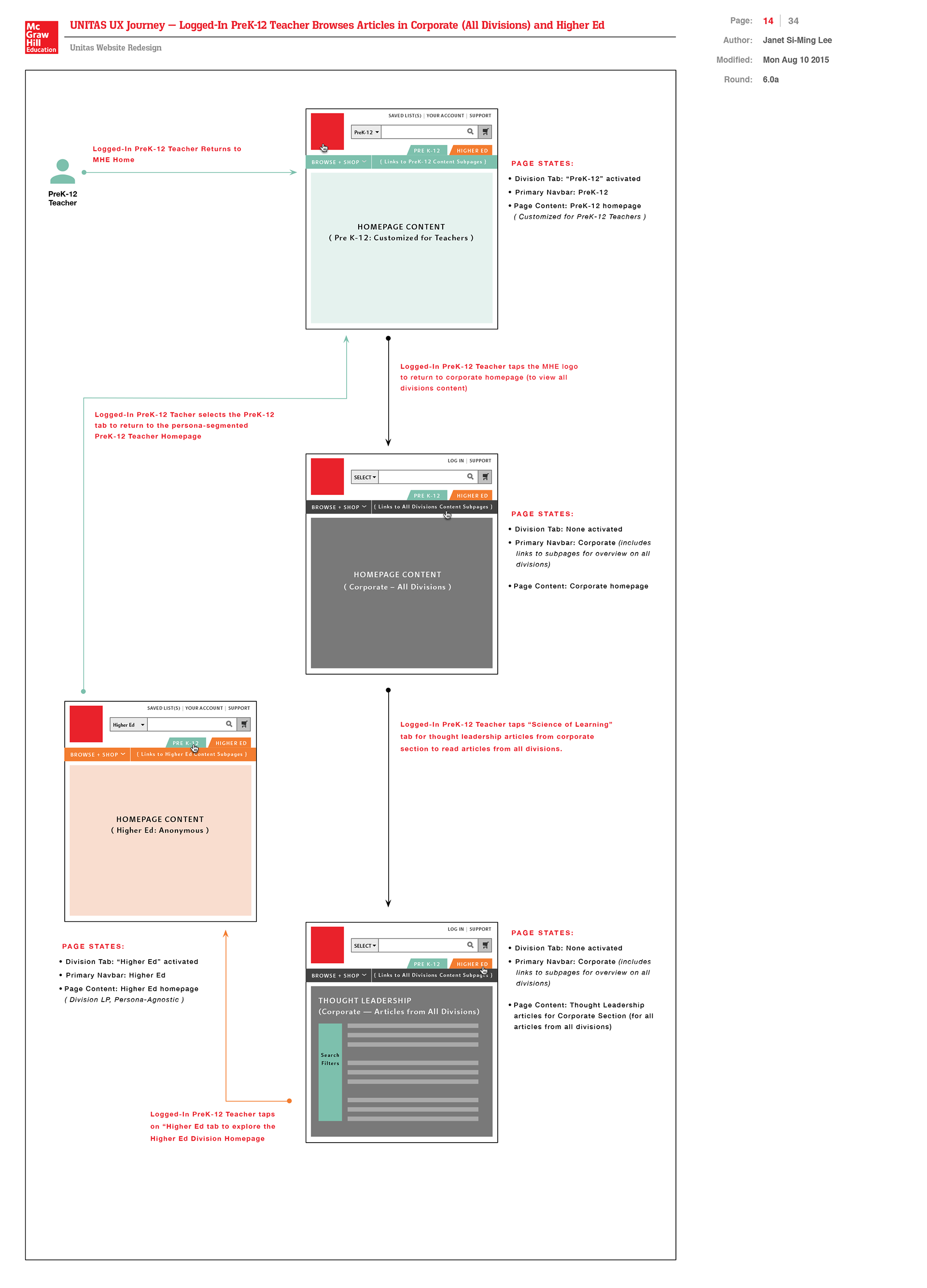
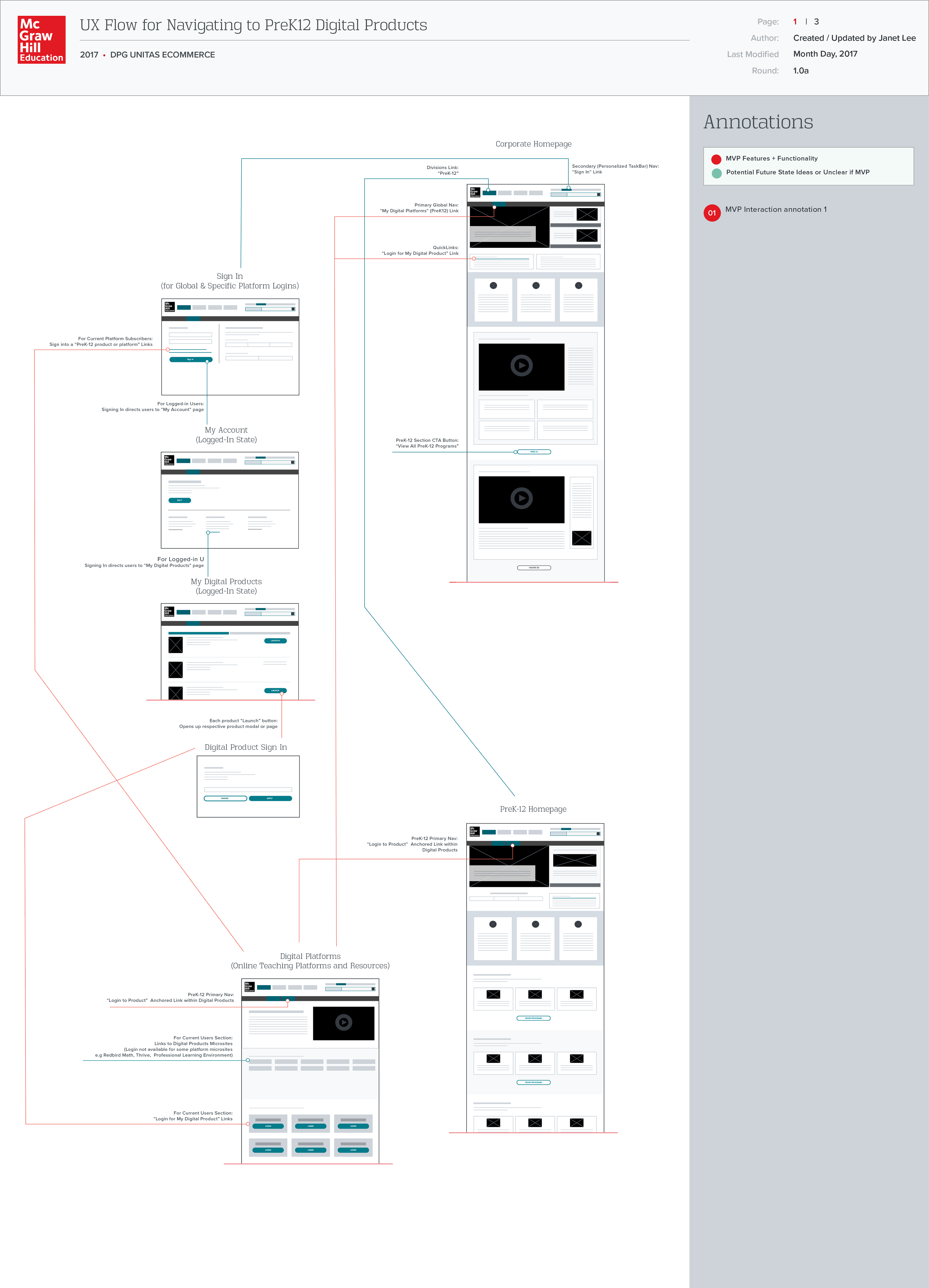
PreK–12 Wireflow
This wireflow visualizes the journey of PreK–12 users — from homepage entry to discovery of featured digital products — abstracted into wireframe blocks representing core site sections and CTAs.
Higher Ed Faculty and Student Journey Map
My unconventional journey map below details Higher Ed faculty and students’ navigation paths. This includes my premises about persona-specific needs and questions, illustrating how the integrated eCommerce platform would address these through targeted content and workflows.
DEFINE PHASE
Content Strategy to Define Templates and Prioritize Key Pages
Content Strategy to Define Templates and Prioritize Key Pages
As the lead UX strategist on McGraw-Hill Education’s eCommerce content strategy team, I introduced a new information architecture and lead generation content approach to templatize product marketing microsites, discipline-focused portals, news articles, and redesigned the global navigation with persona segmentation in mind. I also proposed new search filtering and browse experiences aligned with diverse user needs.
Here are links to content strategy documents (pdfs) that I authored:
⒈ MHE Unitas High-Level UX Objectives and Content Strategy
(Browse & Search Conceptual Framework in UX Flow Proposal)
(Browse & Search Conceptual Framework in UX Flow Proposal)
My Content Templatization Strategy Steps:
⒈ Reviewed all existing vendor documentation cataloging 300+ PreK–12 microsites to understand existing content structure and taxonomy.
⒉ Devised my own categorization schemes for key types of programs and microsites, integrating relevant vendor insights, focused on streamlining content yet retaining intuitive content categorization.
⒊ Prioritized which content pages and microsites to templatize and scale quickly to offer the most MLP / MVP (Minimum Loveable / Valuable Product) to prospective customers.
⒋ Focused initial efforts on discipline / subjects-based landing pages — particularly STEM—where adaptive learning products were most in demand. In addition, other key templates to build included digital platform product marketing microsite to standardize our navigation and content structure for how we would market and provide continued customer support for these products.
⒌ Assessed available Adobe Exchange Manager (AEM) content modules built by Sapient’s backend team to leverage reusable components to compose a new content template. This would enable development team to save on time and resources.
⒍ Created black-and-white wireframes proposing new page layouts combining existing modules with fresh, compelling content narratives tailored to each grade and discipline.
⒎ Identified gaps where new modules needed to be developed for proposed layouts.
IDEATE PHASE
Annotated Wireframes Proposing New Content Template Designs and Persona-Specific CTAs
Annotated Wireframes Proposing New Content Template Designs and Persona-Specific CTAs
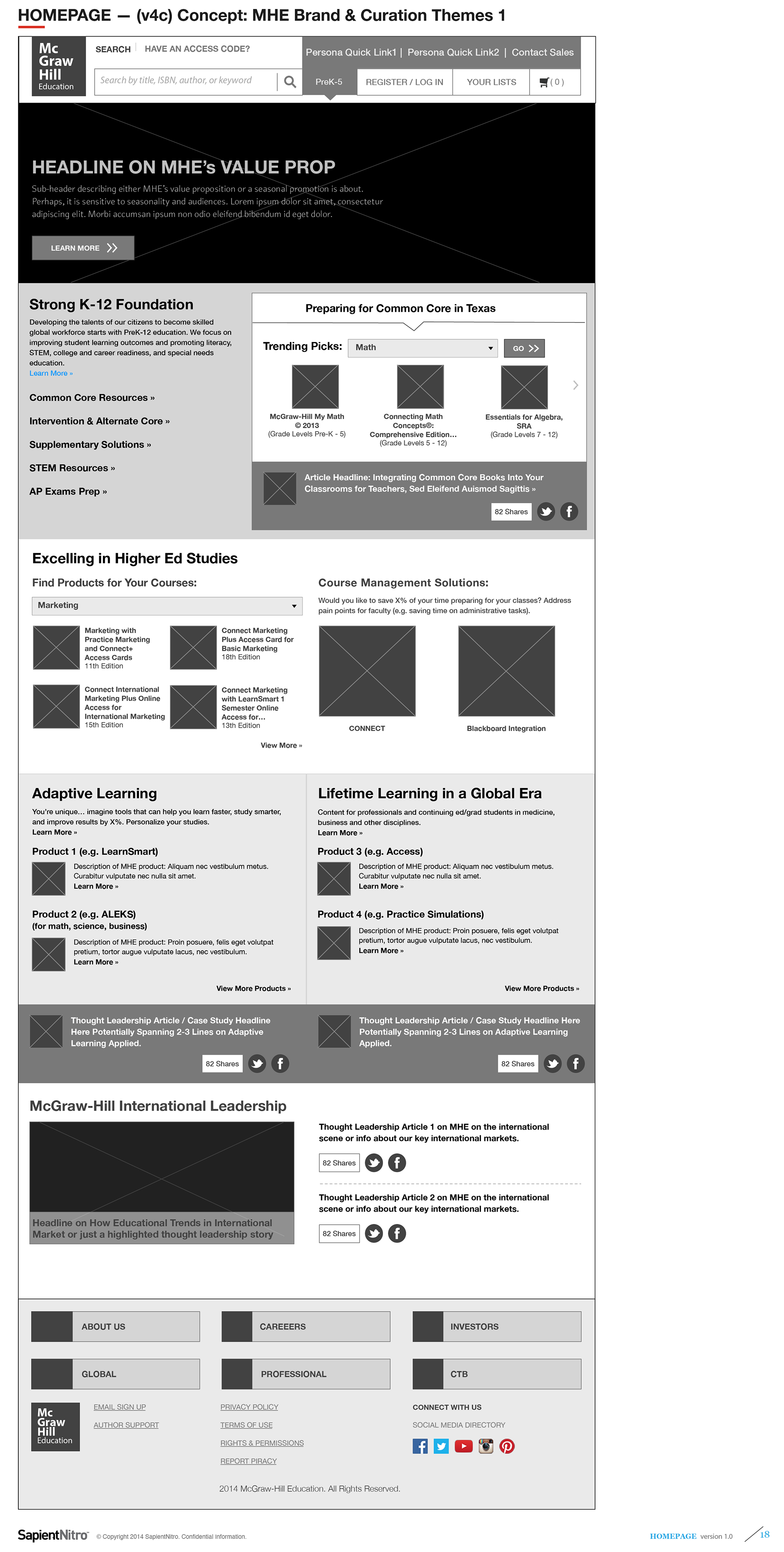
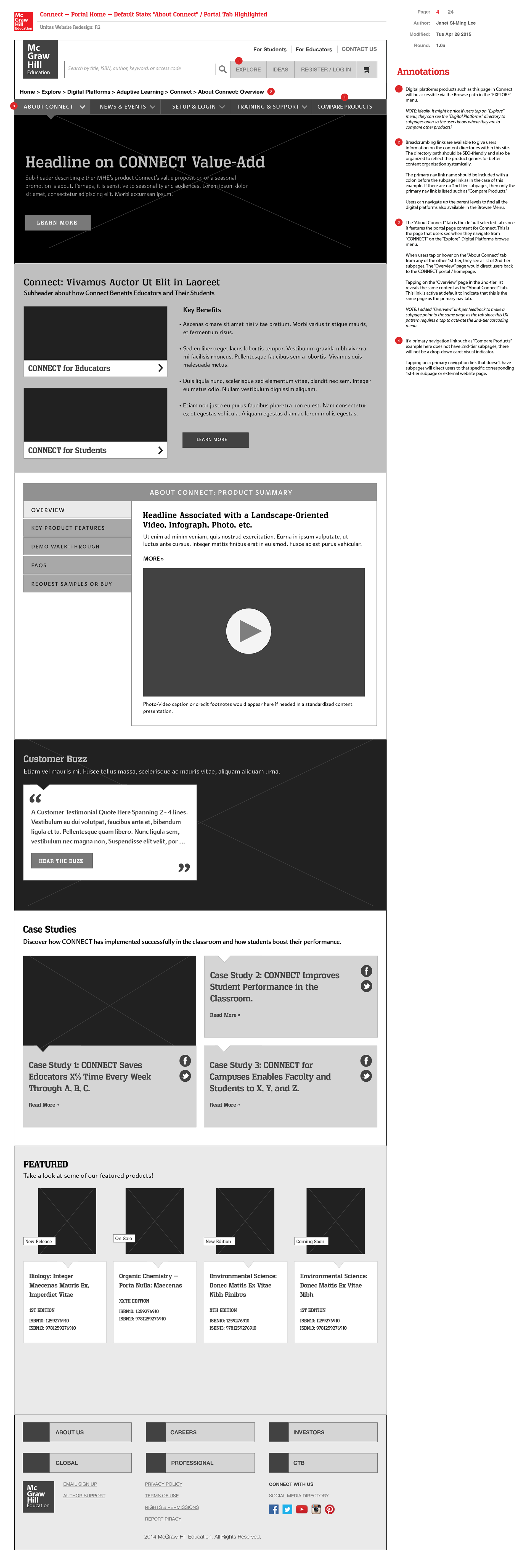
Following MHE’s product team’s alignment on my proposed content strategy, I created wireframes and user flows for the key content templates that we defined as our top priority. Below are sample wireframes from the MHE Unitas initiative—aimed at integrating PreK–12 and Higher Ed eCommerce experiences. As with any standard web design experience, we began with the homepage design as an entry point for all our target audiences and to reintroduce MHE as a global thought leader in next-gen edTech and partner to schools and universities in providing the textbooks and adaptive learning products that provide the educational foundation needed for preparing students for professional development.
Content Page Type 1:
MHE Homepage
(Initial Wireframe Ideations)
MHE Homepage
(Initial Wireframe Ideations)
During MHE’s early higher ed site rollout with their digital agency Sapient, I was concurrently advancing the international eCommerce platform as lead designer. After completing that phase, I was pulled into MHE’s multi-division site integration effort.
These wireframes below illustrate my homepage content concepts during ideation, featuring annotations explaining integration of PreK–12 and Higher Ed persona-driven experiences. These designs emphasized:
• Sector segmentation to address distinct audience needs.
• Persona-targeted content establishing MHE as a lifelong learning partner and global thought leader.
• Sticky, fresh content such as educational articles and tips to engage users.
My objective was to guide target audiences toward relevant site sections and to deepen MHE’s expertise positioning in edTech publishing.
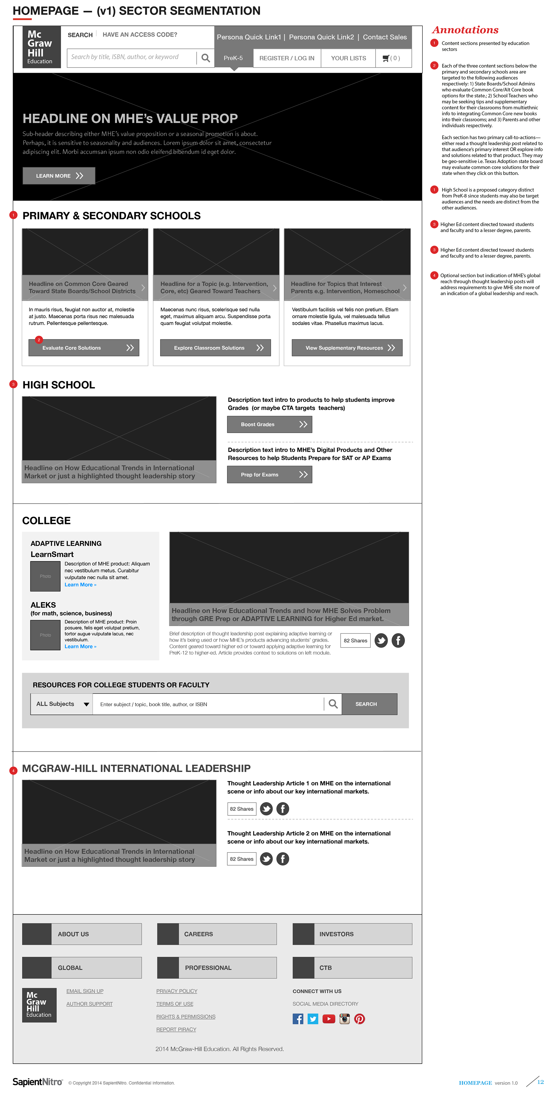
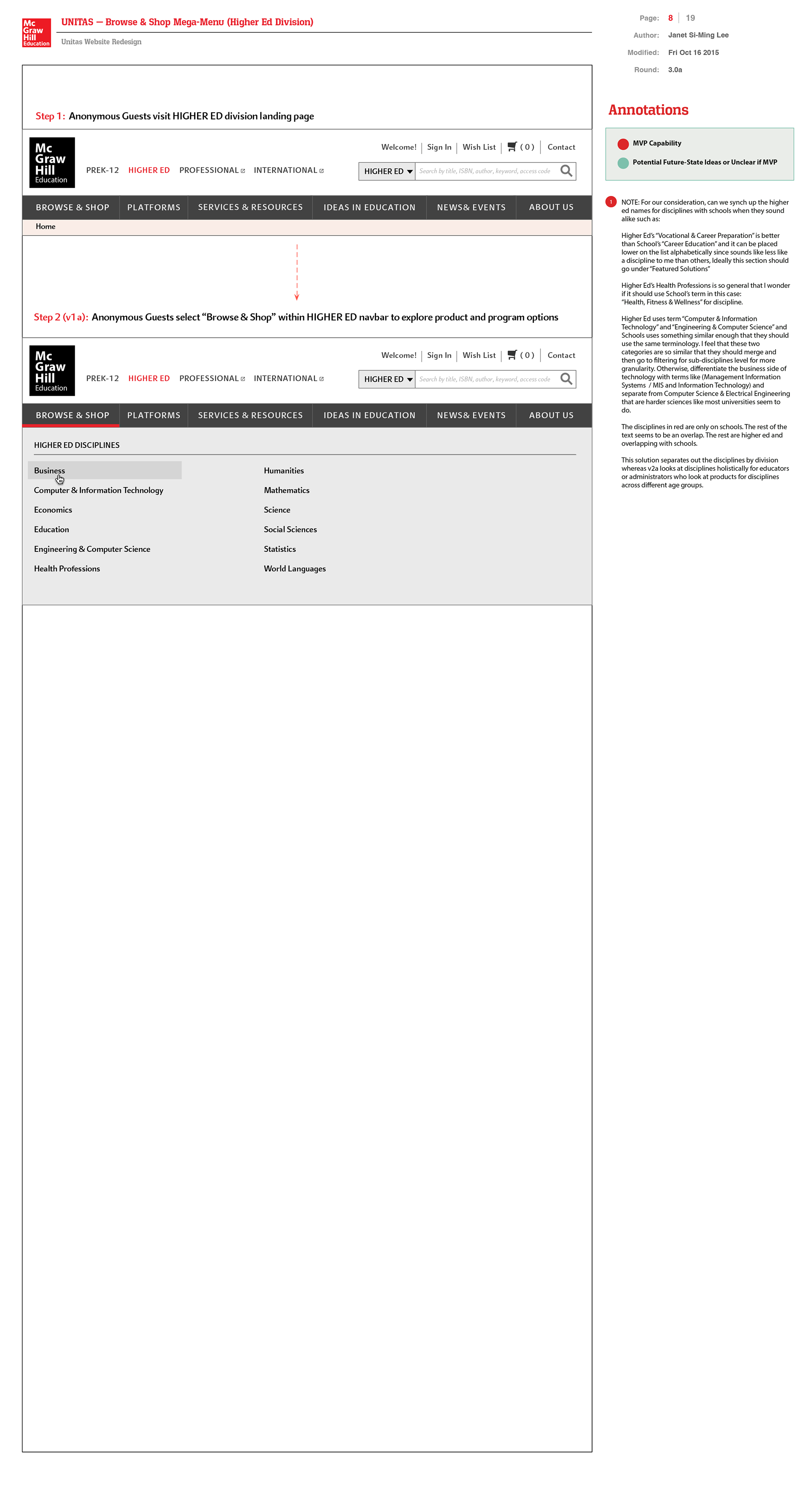
PreK12, Higher Ed, and International Sectors segmentation (v1)
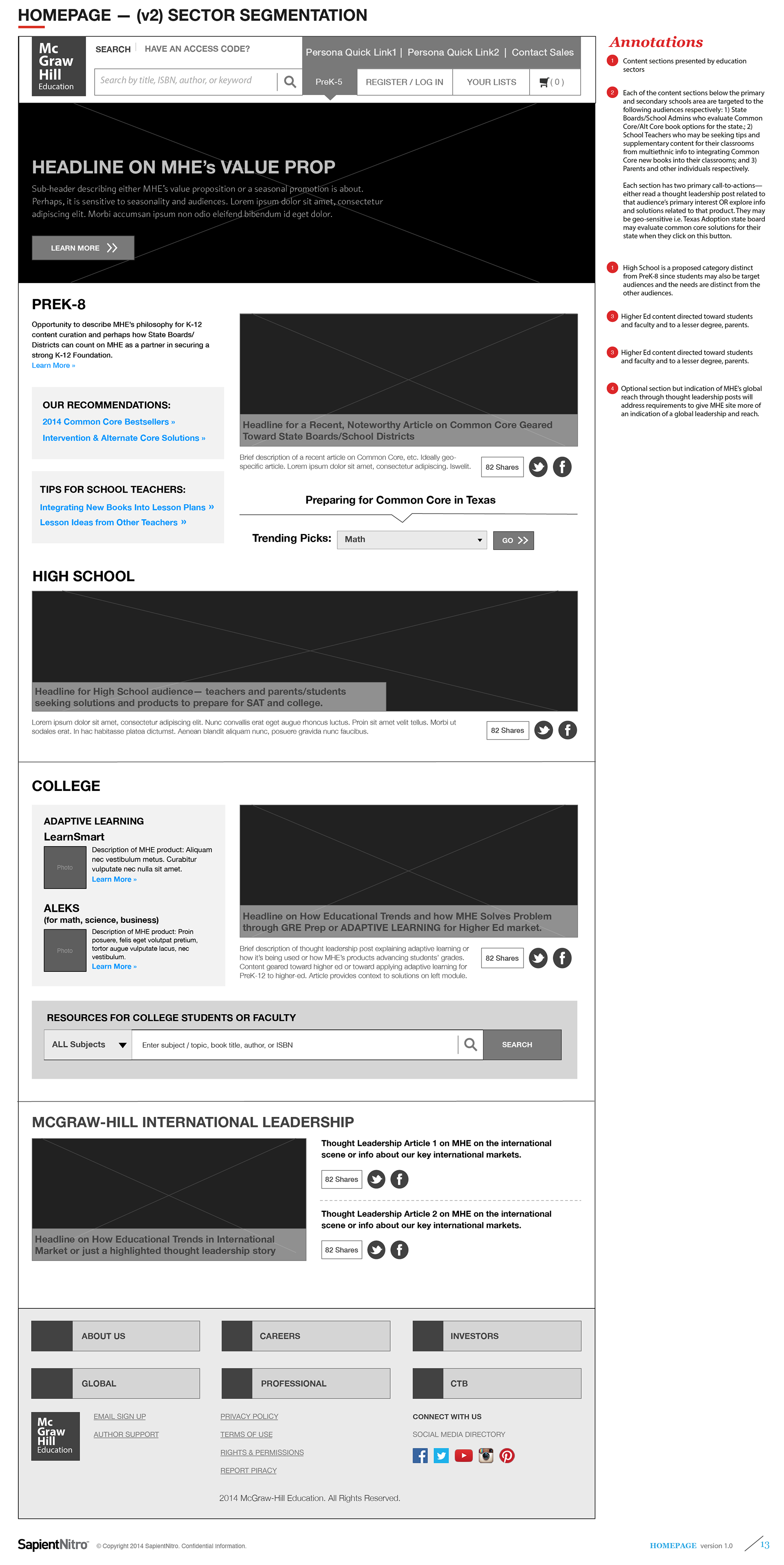
PreK12, Higher Ed, and International Sectors segmentation (v2)
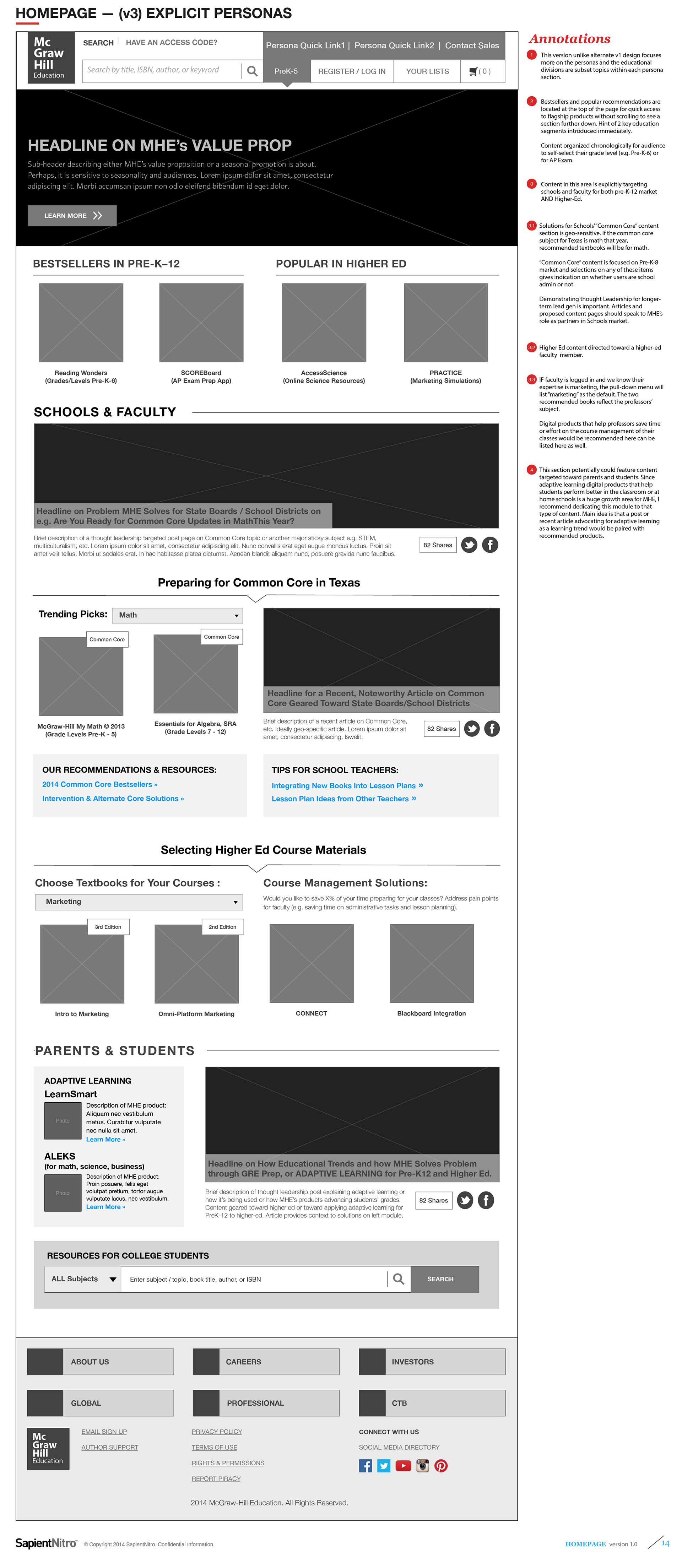
Explicit Personas-Based Content Strategy (v3)
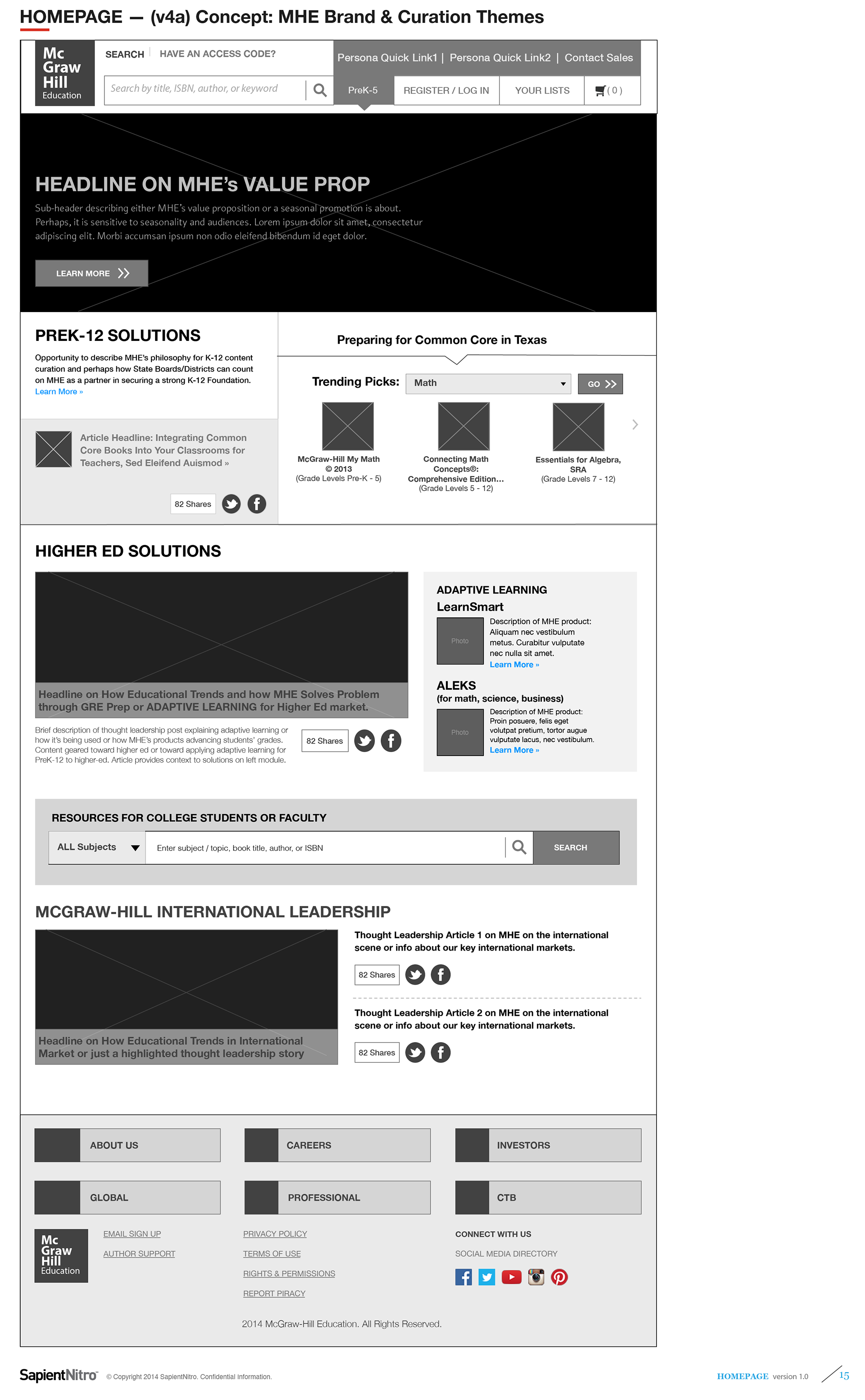
MHE Brand + Curation Themes (v4)
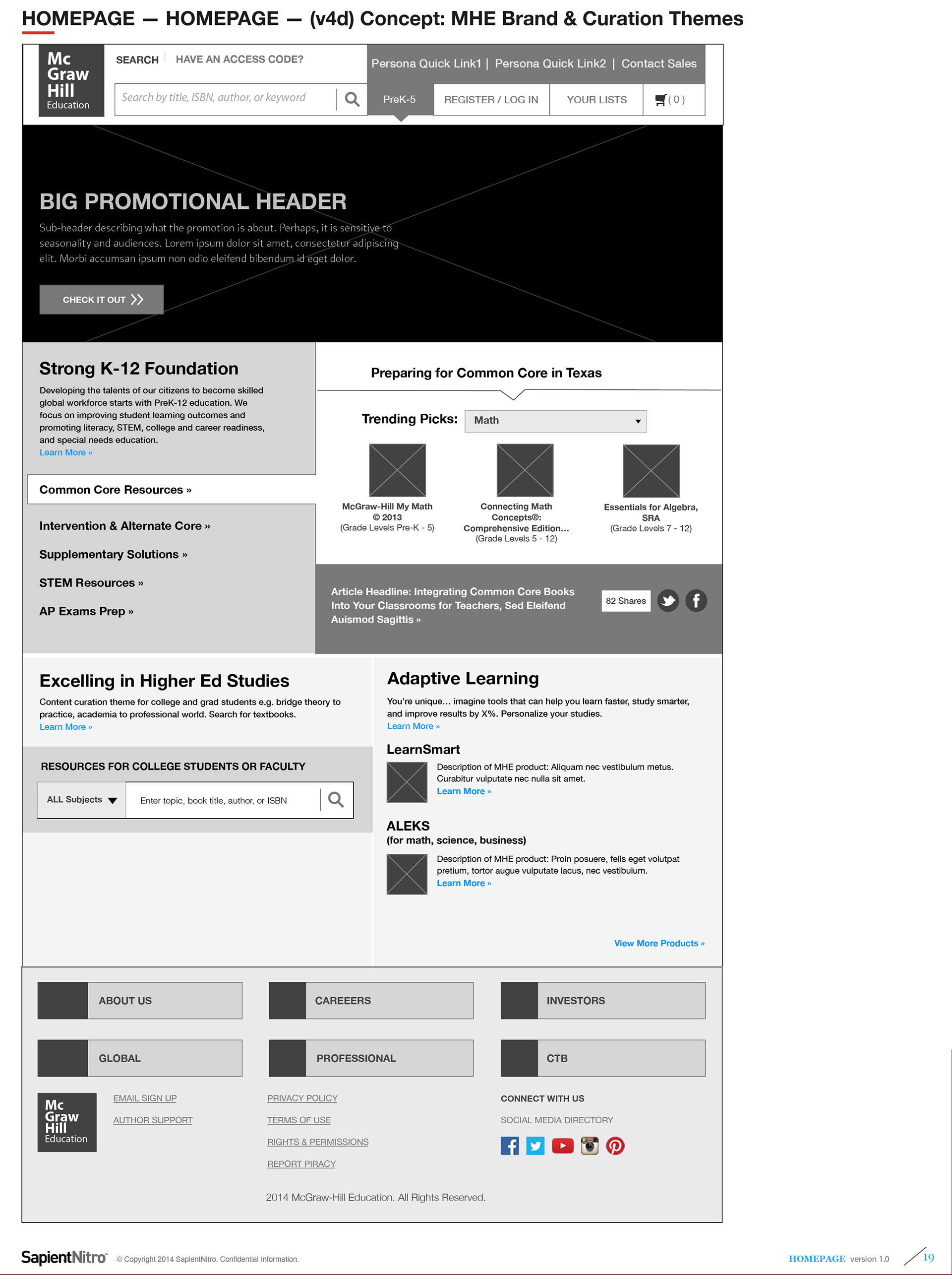
My New Streamlined Homepage Wireframe Proposal
(Based on Atomic Modular Components):McGraw-Hill Multi-Divisions eCommerce Homepage Concepts
(Based on Atomic Modular Components):McGraw-Hill Multi-Divisions eCommerce Homepage Concepts
This proposal refines homepage functionality, removing my initial personalization concepts based on geo-specific personalization due to technical constraints. Instead, my updated eCommerce proposal introduced:
• Customer testimonials-based marketing of our products to build brand trust
• Persona-driven product recommendations tailored to different customer needs
• Designs built on modular, reusable components to reduce development cost and facilitate ongoing, cohesive content management
Content Template Type 2:
Disciplines Hubs Templates
(Scope 1 — Initial Wireframe Ideations)
Disciplines Hubs Templates
(Scope 1 — Initial Wireframe Ideations)
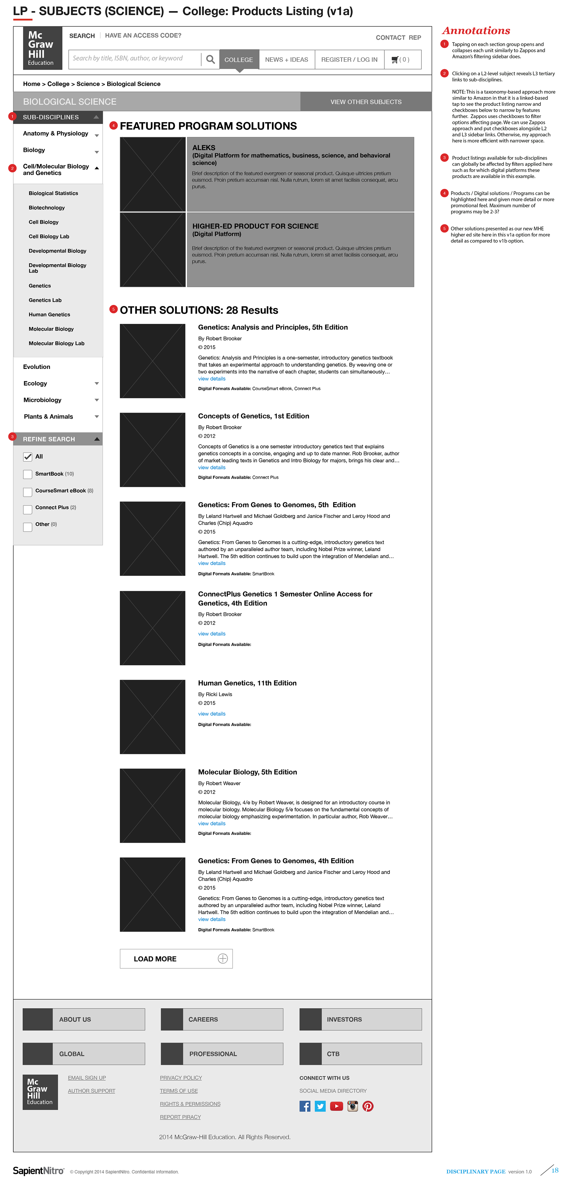
As part of my content strategy recommendations, a core template focus was discipline-based hub pages. At the elementary level, students study foundational subjects such as math, science, English / literacy, and social studies. However, at the high school and college levels, specialization expands into sub-disciplines such as algebra, geometry, biology, chemistry, physics, English grammar and literature, world history, and more.
For this case study, I developed initial discipline hub concepts focused on Science — a subject with deep granularity across secondary and higher education. These initial wireframes emphasized thought leadership by featuring curated articles and content that reinforce McGraw-Hill Education’s position as a sector expert.
Following the navigation pattern Sapient had introduced (horizontal drill-down menus), I maintained their interaction model for accessing sub-disciplines while improving content presentation and storytelling.
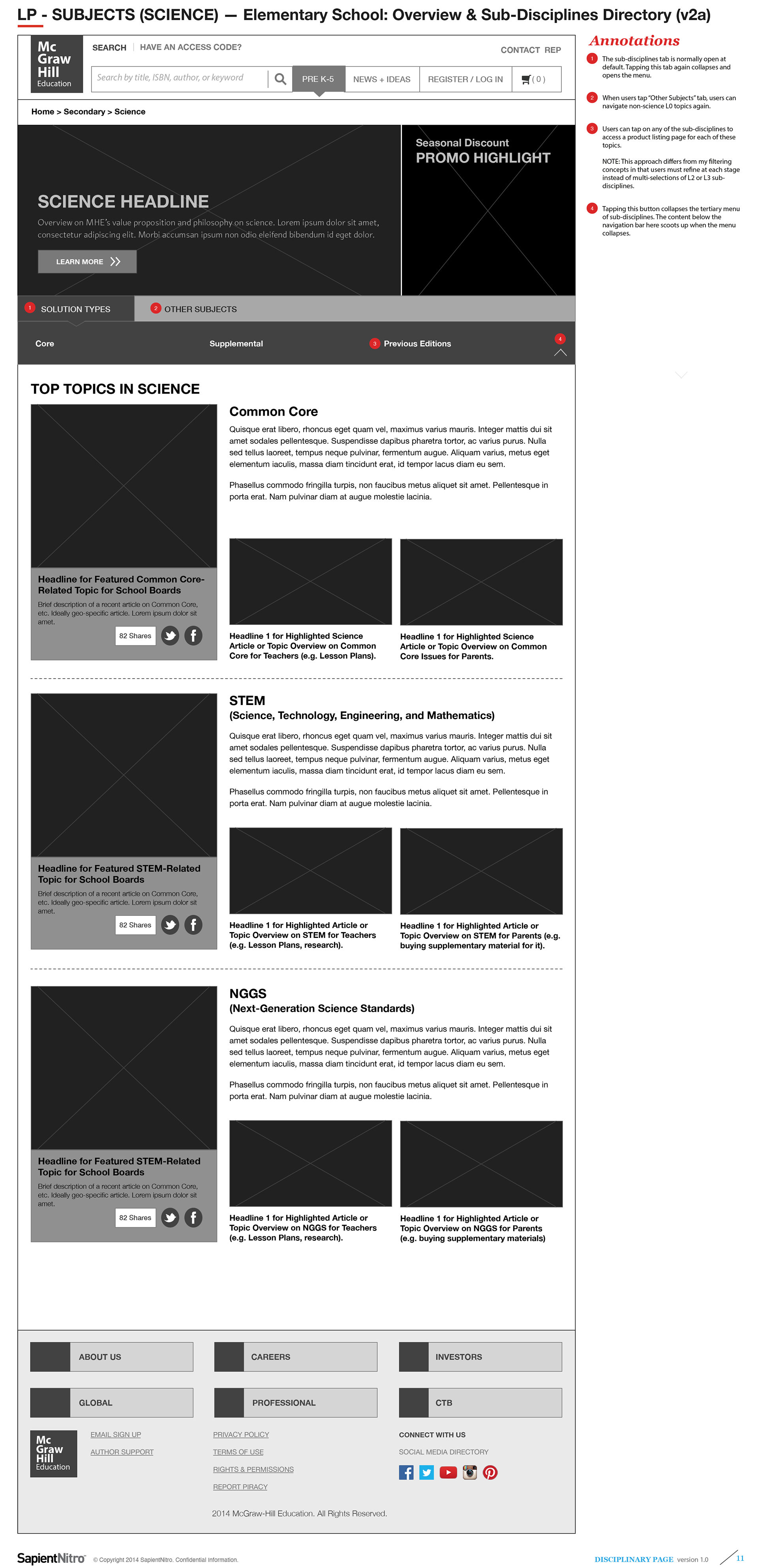
PreK5 Science Topic with Sub-Disciplines drill-down and Articles (v2)
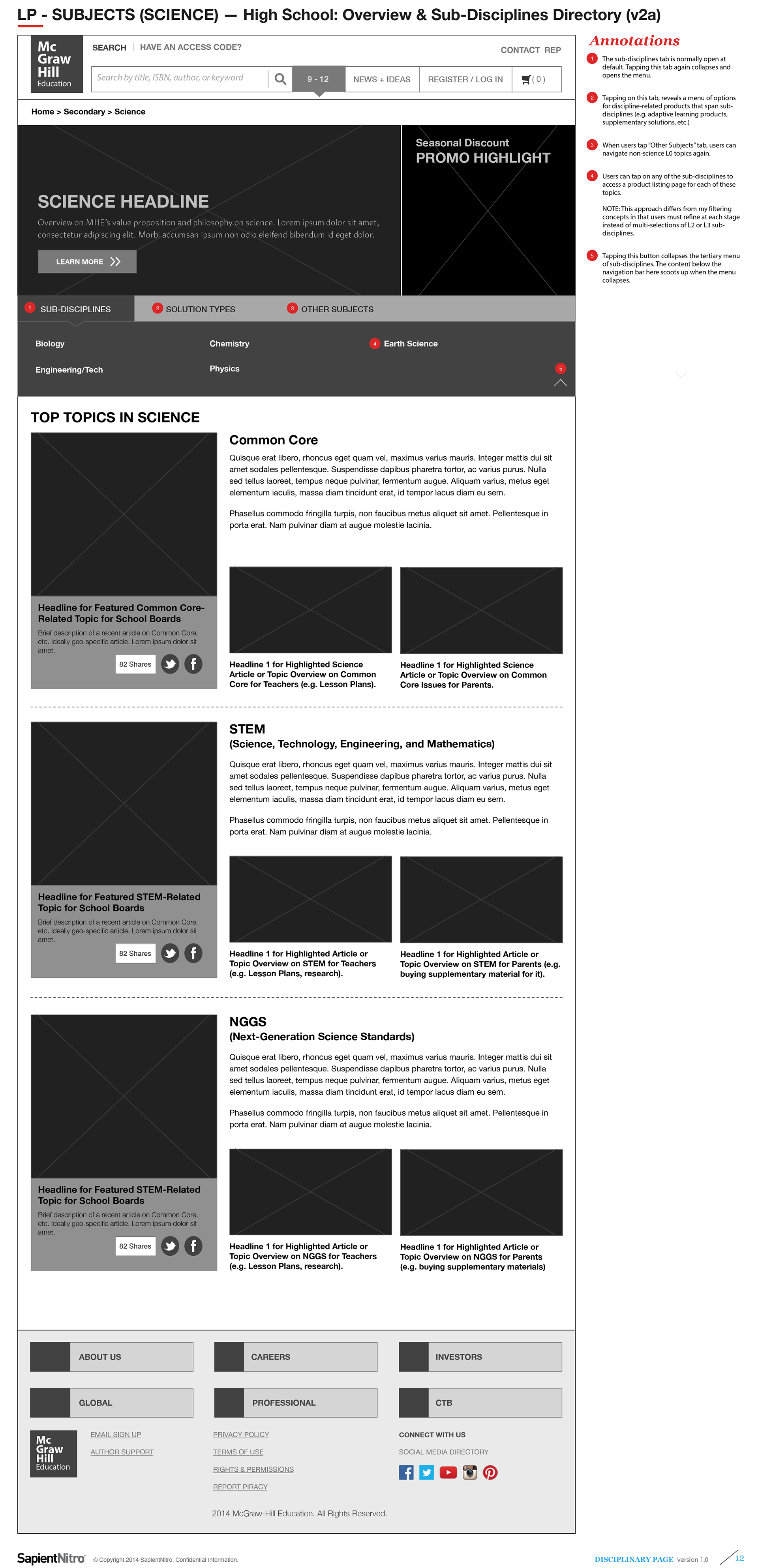
High School Science Topic with Sub-Disciplines drill-down and Articles (v2)
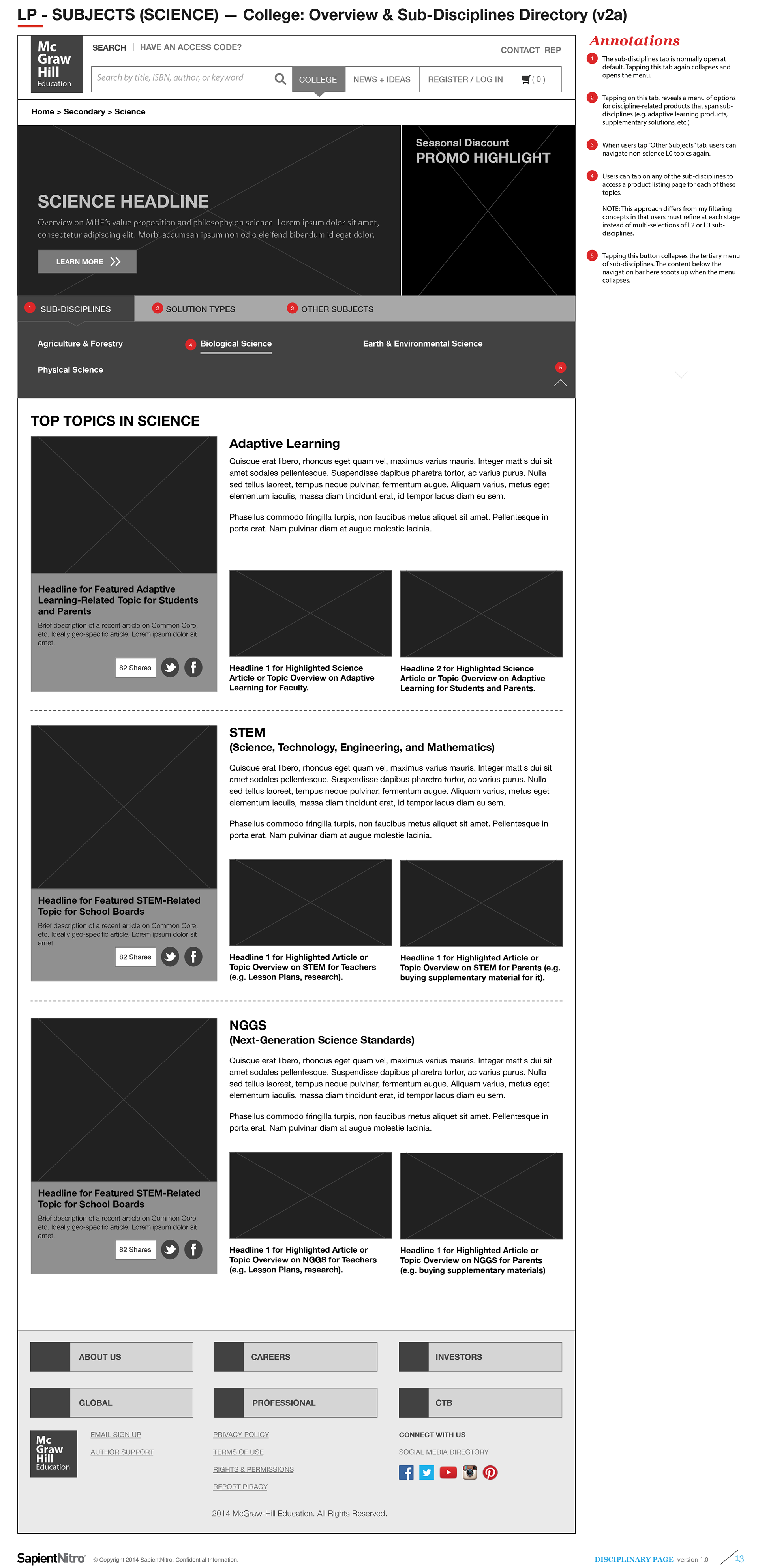
College Science Topic with Sub-Disciplines drill-down and Articles (v2)
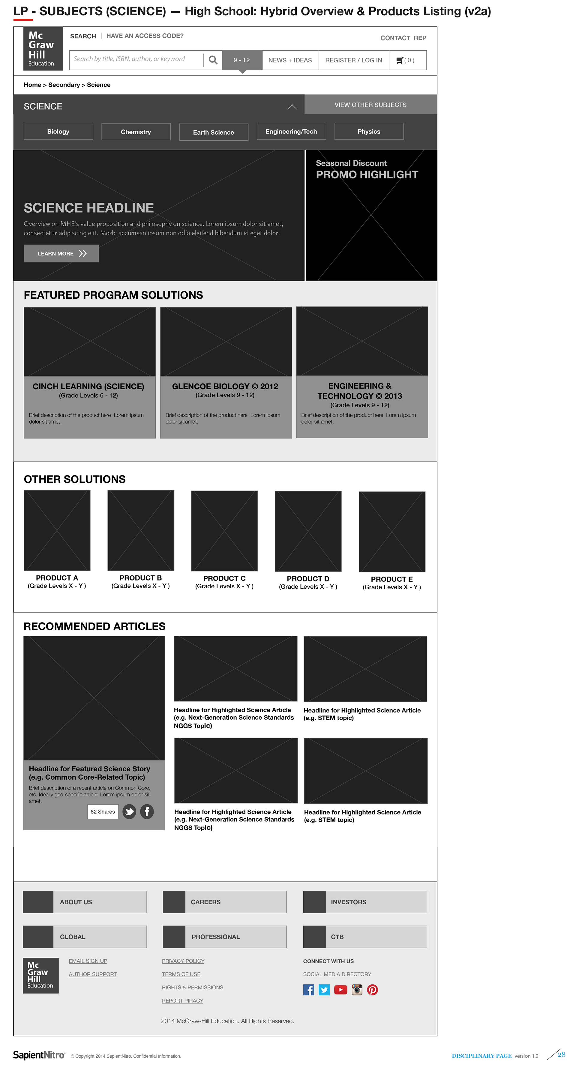
High School Science — Hybrid Products + Articles (v1)
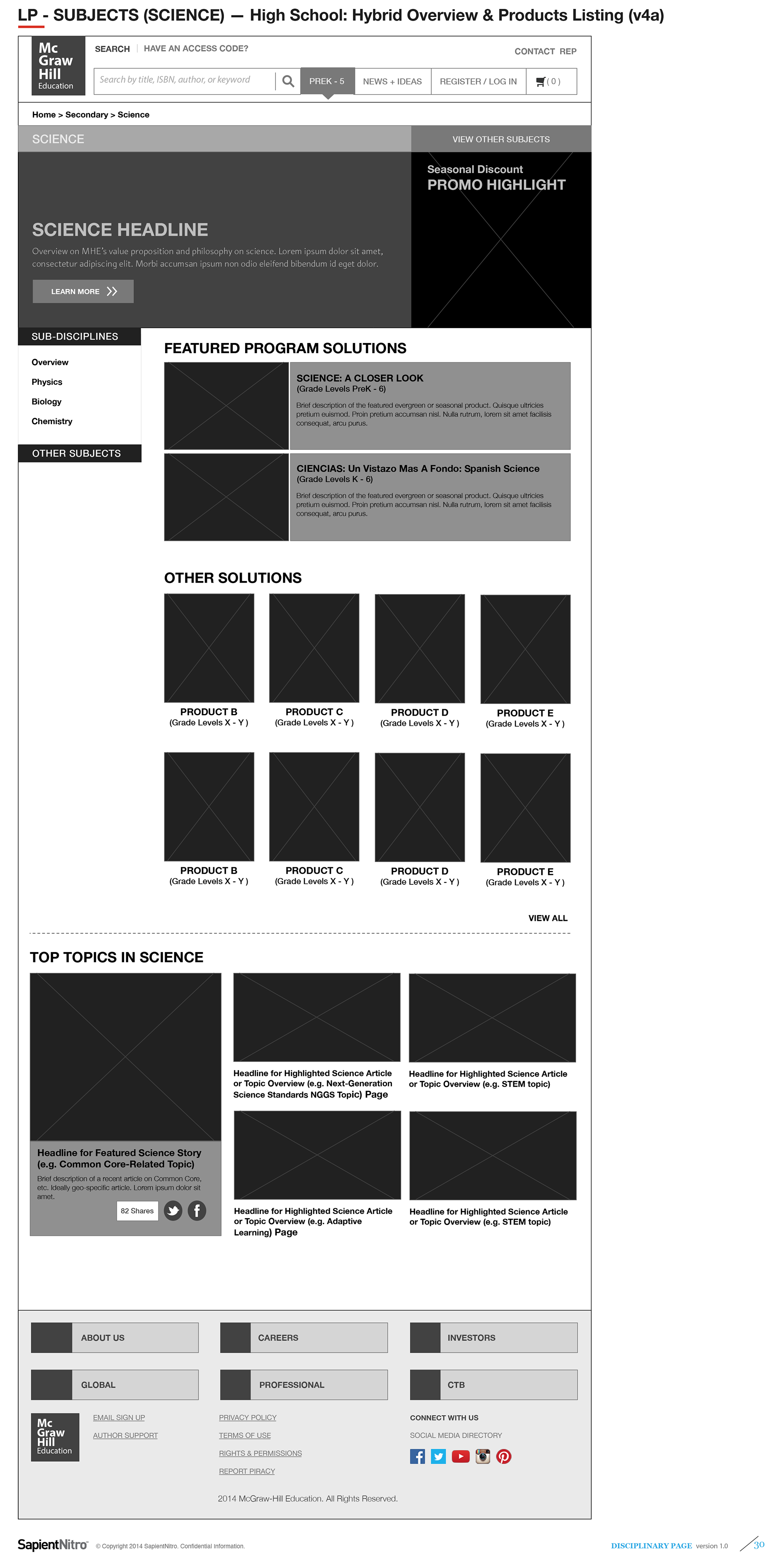
High School Science — Hybrid Products + Filters + Articles (v2)
High School Science — Hybrid Products + Filters (v1)
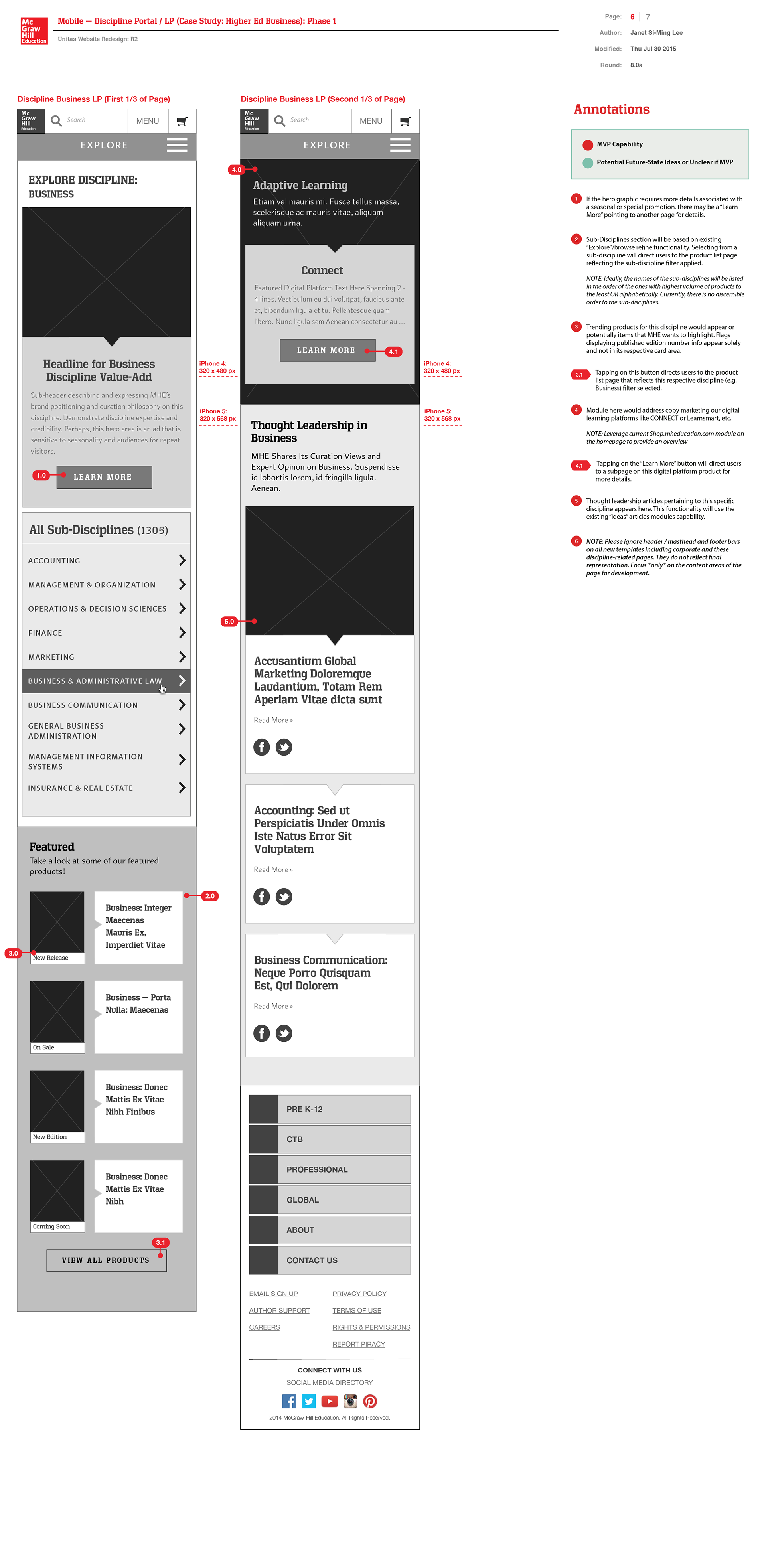
Content Template Types 2 + 3:
Disciplines Hub and Sub-Divisions Landing Pages
(Scope 2 — Wireframes Featuring Modular Components)
Disciplines Hub and Sub-Divisions Landing Pages
(Scope 2 — Wireframes Featuring Modular Components)
To save on development time and cost, I explored wireframes using modular components already developed by the Sapient–MHE fusion development team. These components would be populated by content authors serving PreK-12 and Higher Ed markets.
My layouts aimed to craft a compelling narrative around MHE’s educational services and products. Where necessary, I proposed new modular ui components for development that could be versatile enough to serve both PreK-12 and Higher Ed segments efficiently in new template layouts.
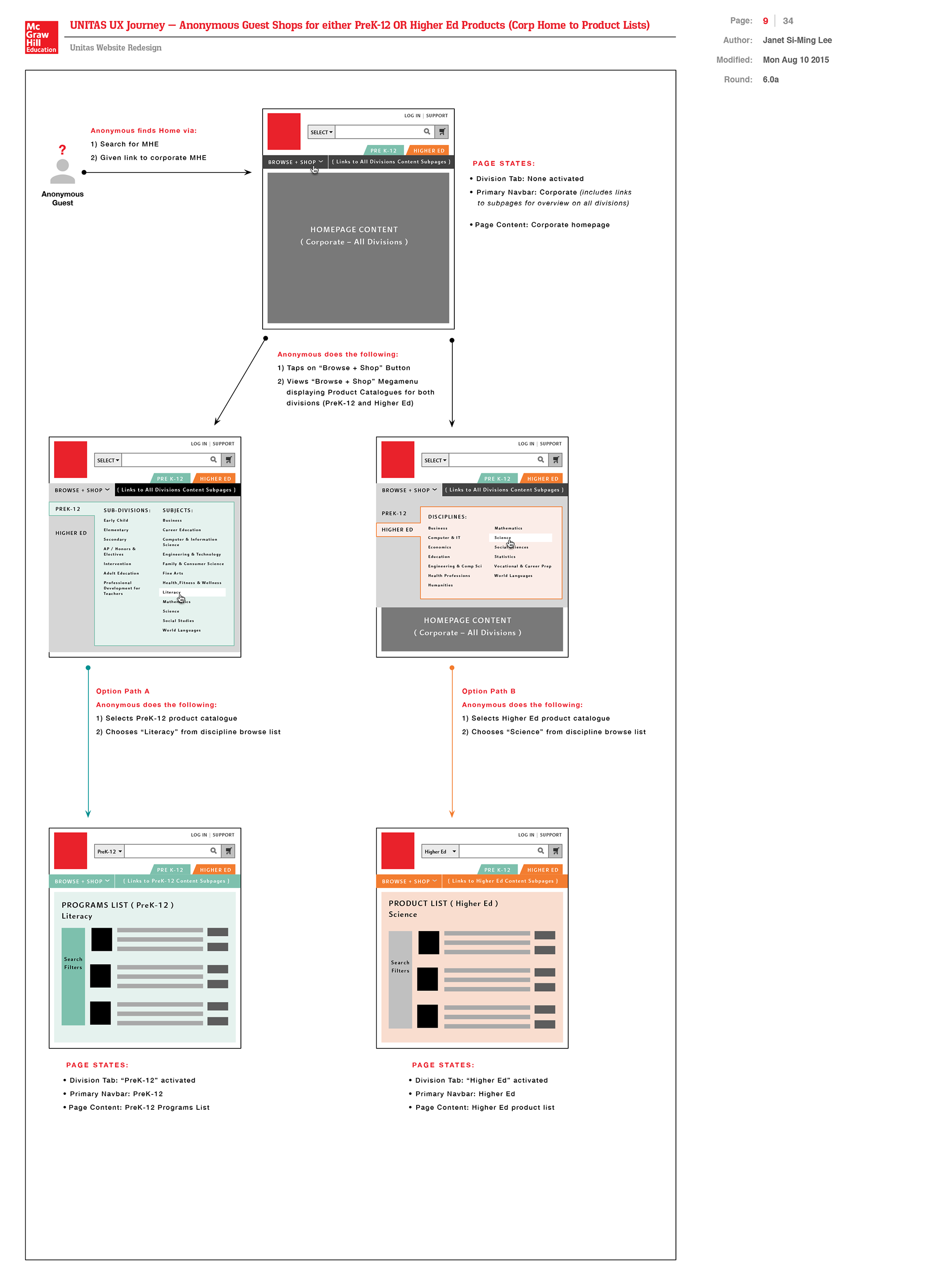
PreK-12 — Elementary School Segment Landing Page (Case Study: Anonymous Guests Browsing for Products)

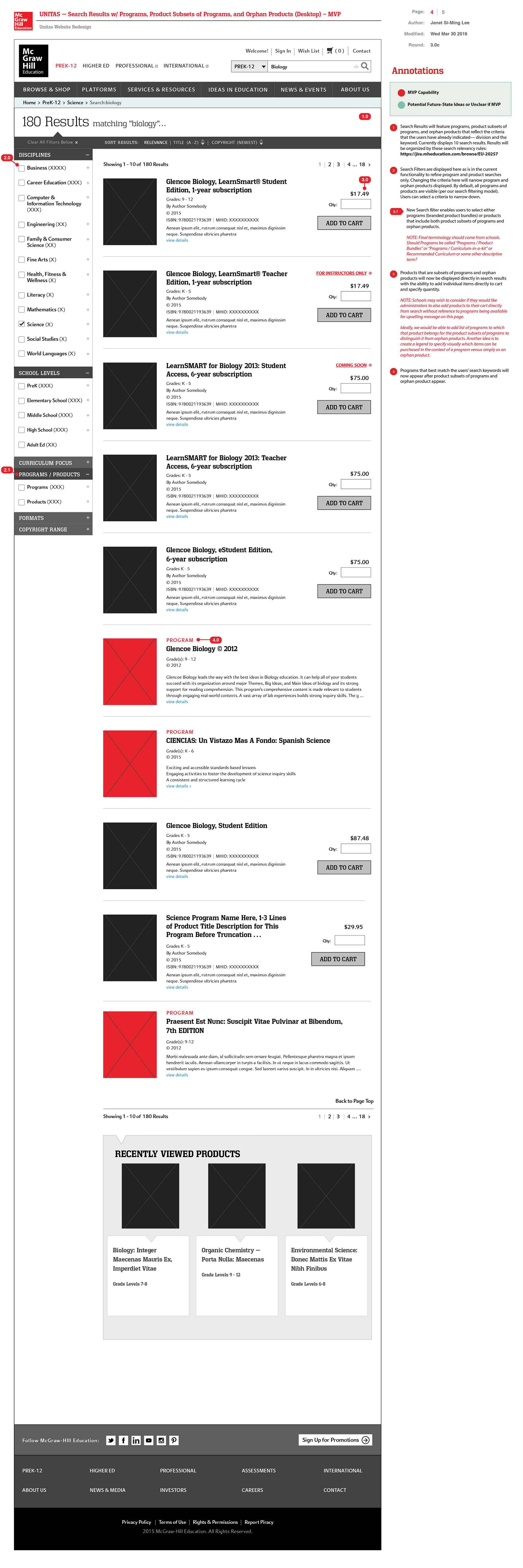
PreK-12 segment search results for Programs and Orphan Products

Filter by School Grade Level
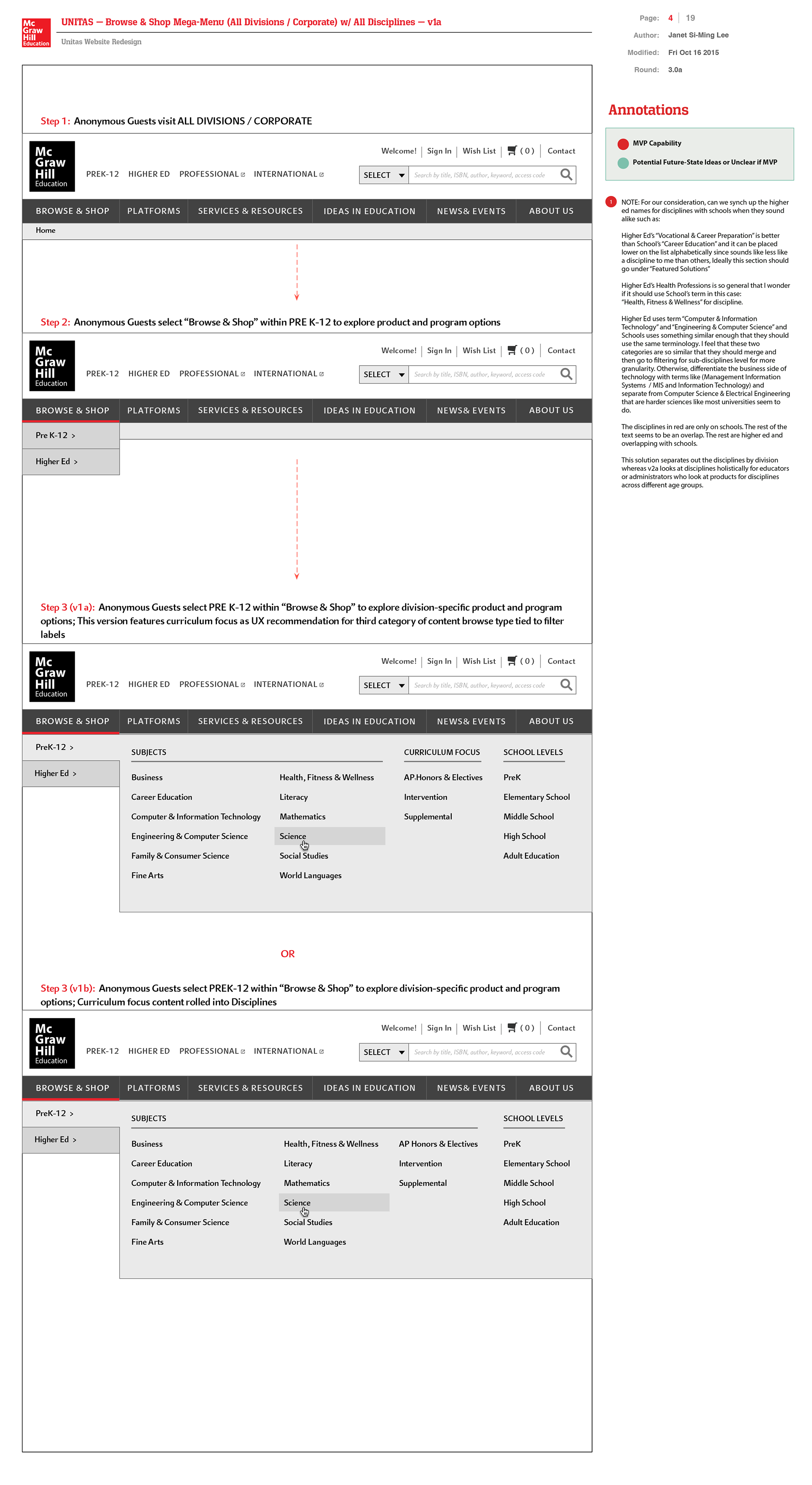
Product Catalogue Mega Menu for PreK-12 ( Case Study: Anonymous Guests Browsing for Products in PreK-12 )
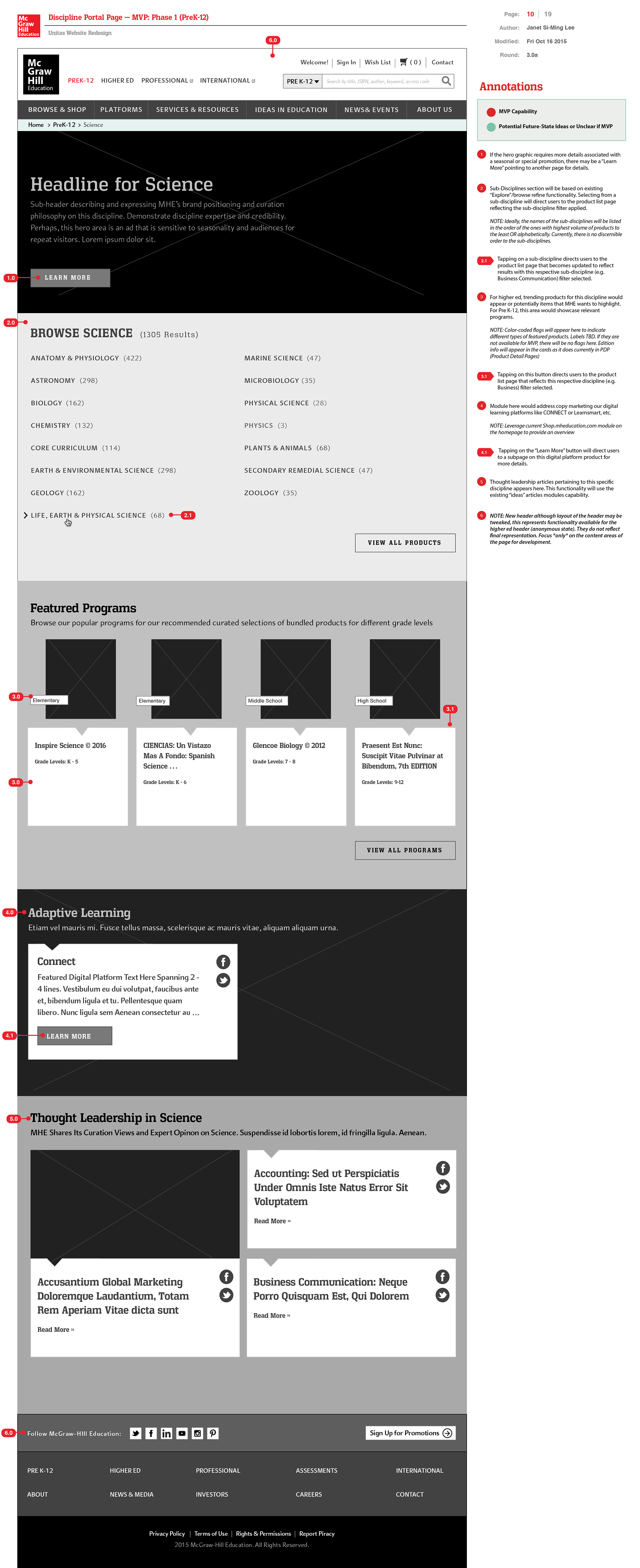
Discipline Landing Page — PreK-12 ( Case Study: Pre K-12 Science )
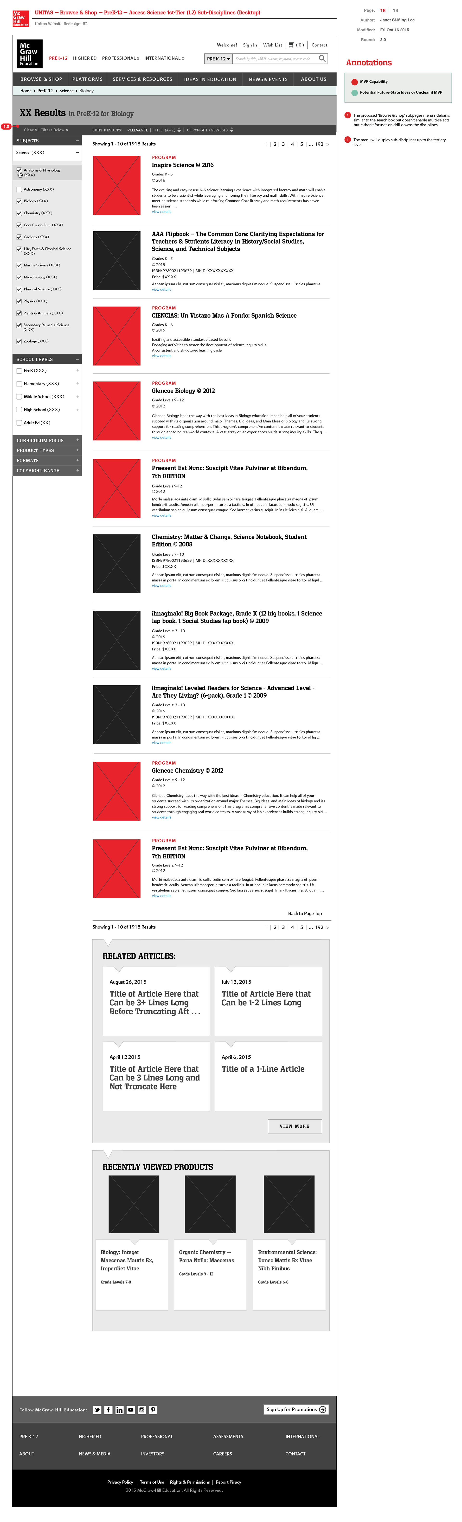
PreK-12 Sub-Discipline Drill-Down to Products & Programs w/ Micro-Filtering ( Case Study: Anonymous Guests Browsing for Products in PreK-12 for Tier 1 and Tier-2 Sub-Disciplines )
Higher Ed Products Catalogue ( Case Study: Anonymous Guests Browsing for Products )
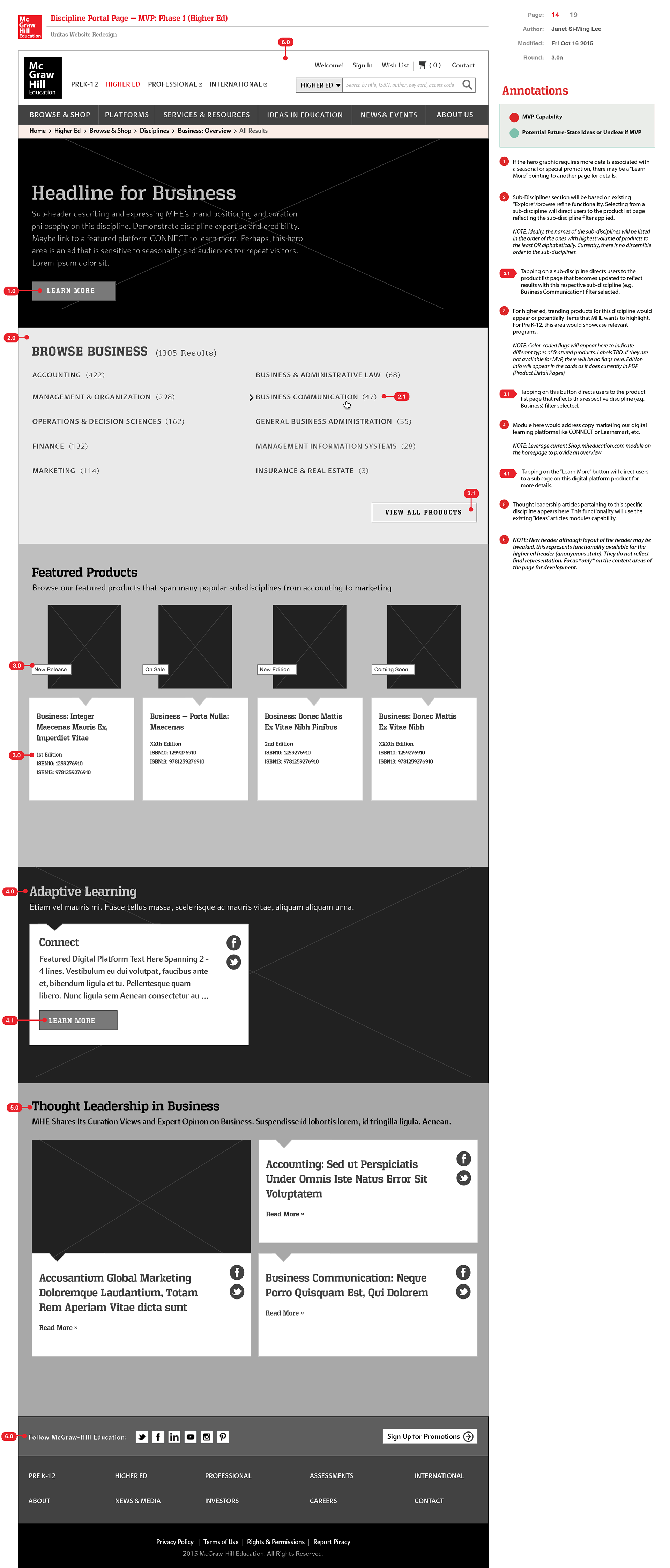
Discipline Landing Page — Higher Ed (Case Study: Higher Ed Business)
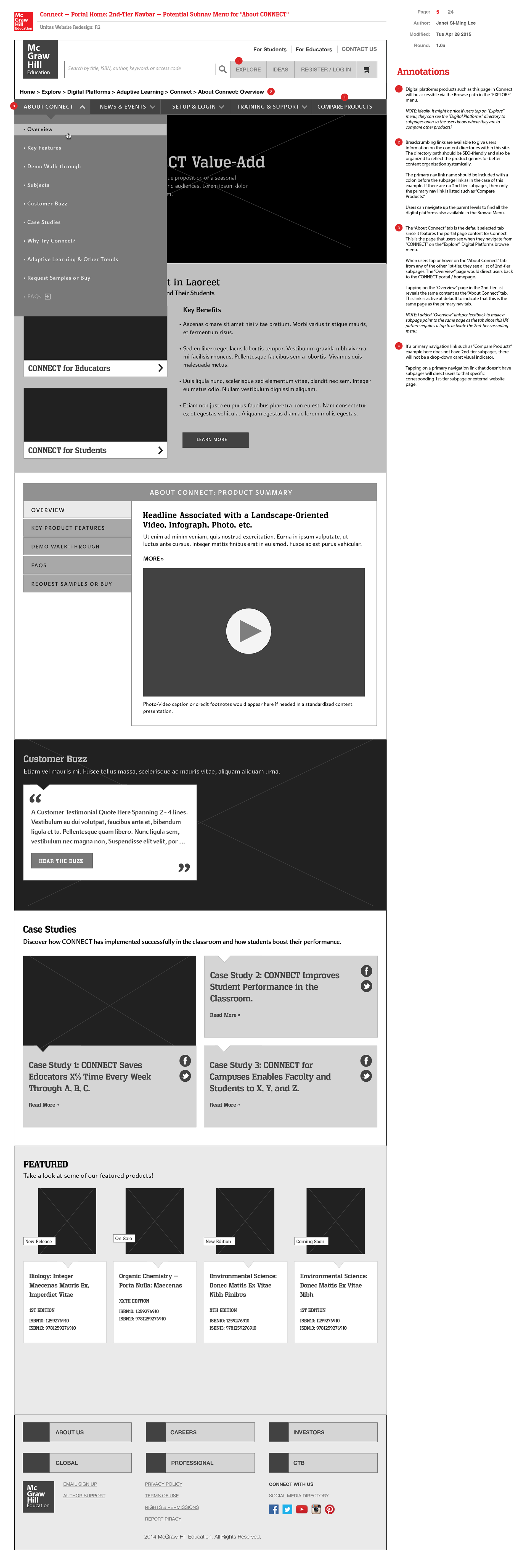
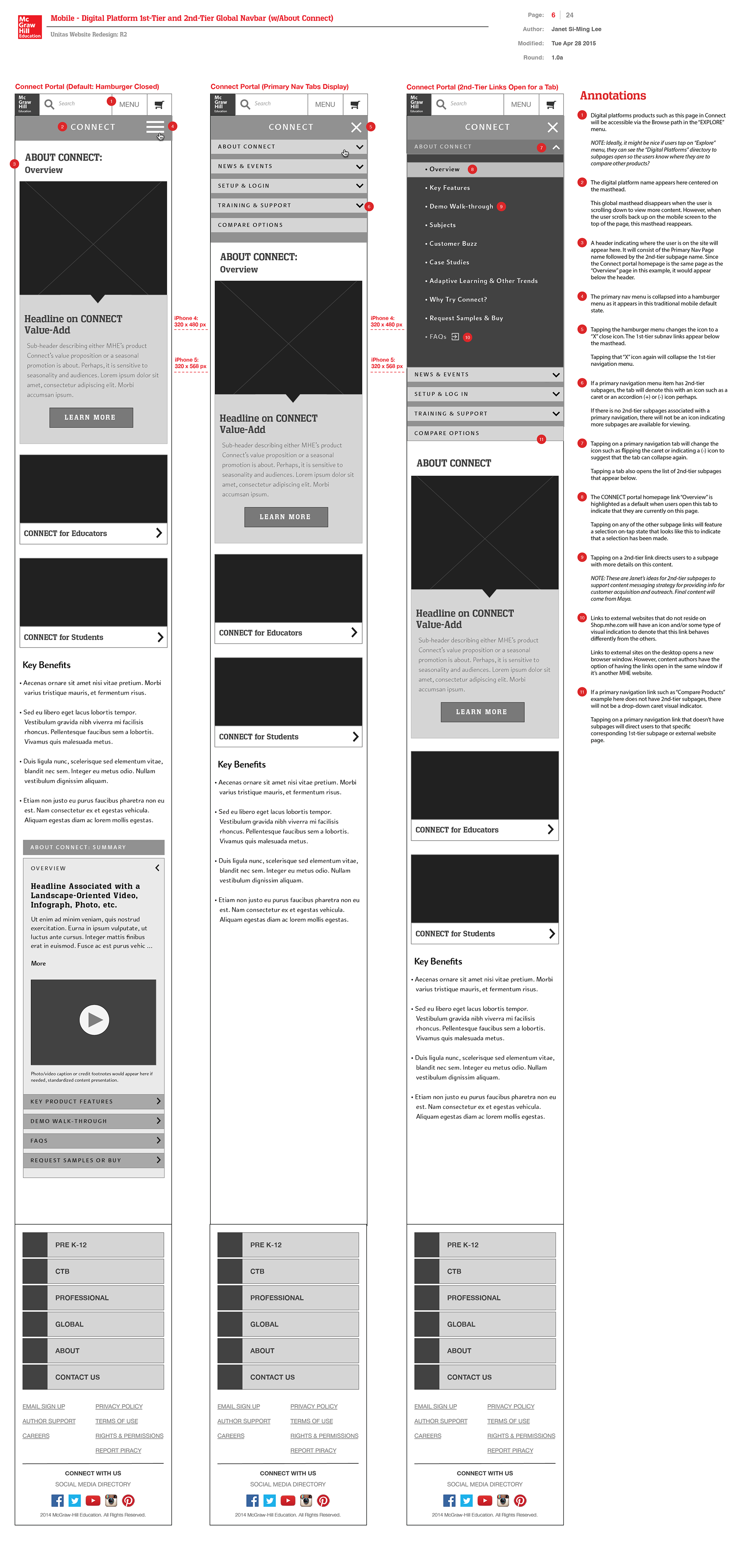
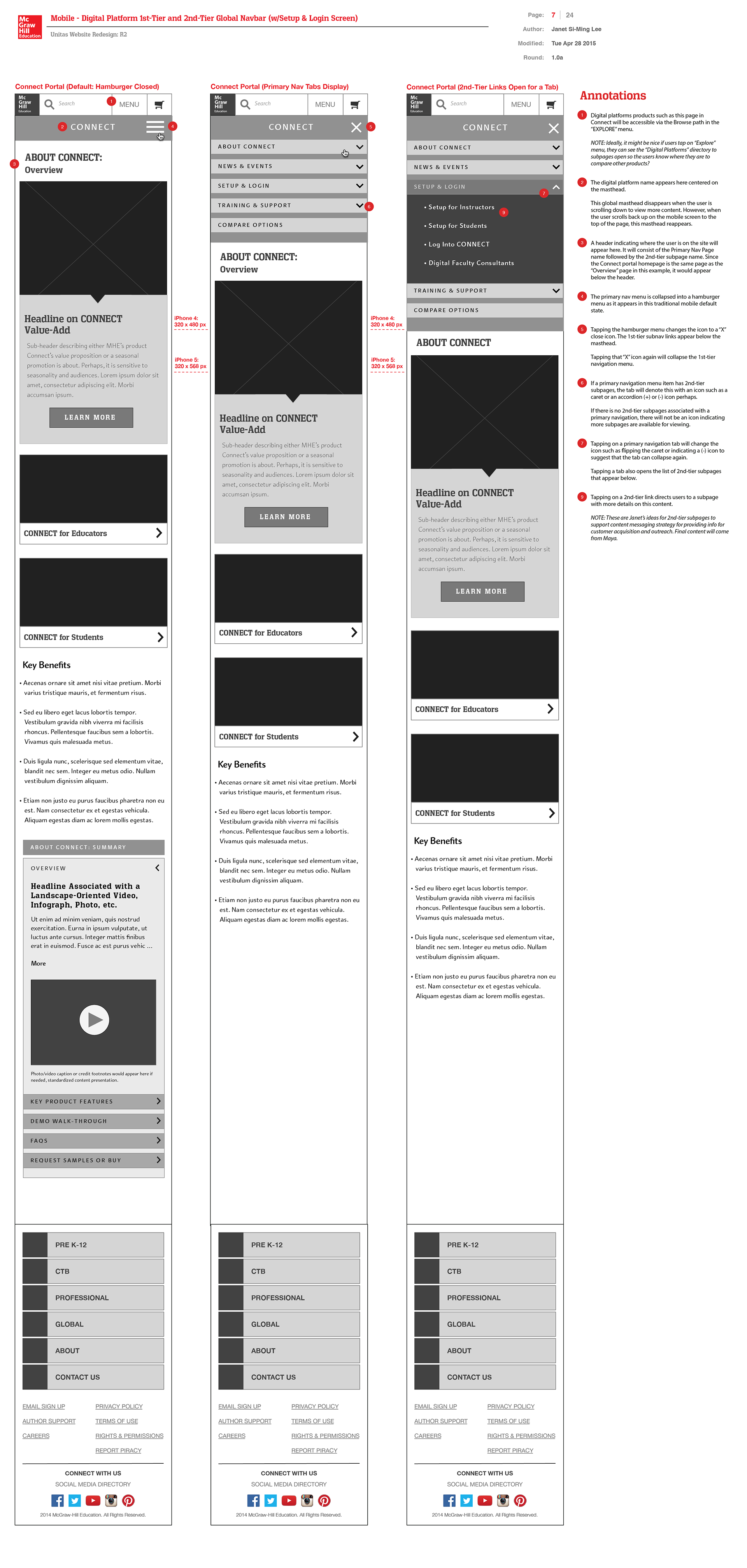
Content Template Type 4:
Product-Related Marketing
(Scope 2 — Wireframes with Modular Components)
Product-Related Marketing
(Scope 2 — Wireframes with Modular Components)
After auditing over 300 microsites, I identified product marketing microsites as a critical next step in the new integrated eCommerce platform. Using McGraw-Hill Education’s flagship digital platform Connect as a case study, I designed wireframes to market this higher ed courseware product to faculty and students.
Connect integrates Smartbook (digital textbooks), coursework administration, and data analytics for faculty to assess student performance. My wireframe proposals leveraged existing content modules to minimize engineering time and cost, while focusing on faculty- and student-facing content that highlights Connect’s features and benefits.
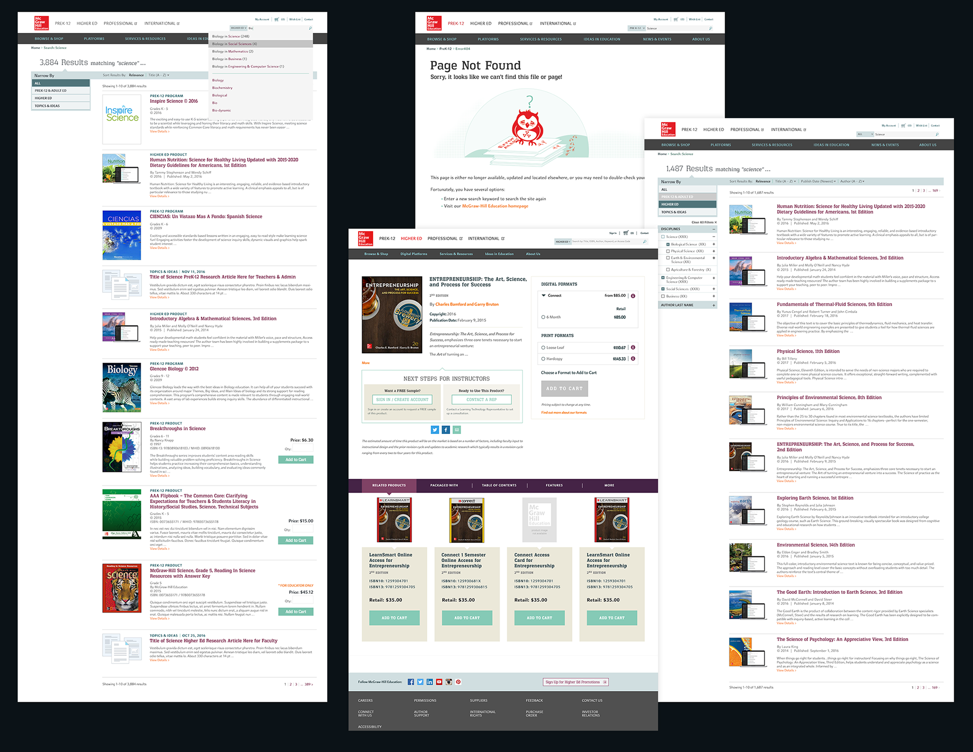
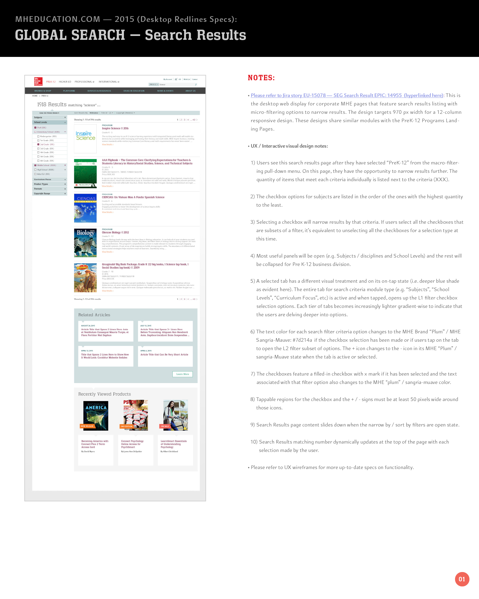
Search Results Pages
In determining the search filtering strategy, my hypothesis was that more students were entering interdisciplinary majors as a reflection of the rising interdisciplinary nature of fields. In fact, my college major was an interdisciplinary major in media arts / design that included web communications, eCommerce and marketing courses at MIT as well as digital fine arts. In addition, my secondary minor was in psychobiology including courses in psychology and biology. Indeed, my secondary research and analysis of interdisciplinary courses available at universities confirmed my observation as well. Thus, I proposed changes to Sapient's drill-down navigation approach toward browsing for products for certain disciplines in the first project scope. My new UX design solutions would enable users to multi-select checkboxes for various disciplines for more targeted search results instead of the navigation drill-down that would force students to narrow search only within a discipline branch. My solution instead would enable more flexibility in variations in how different colleges described their disciplines. Our books and other adaptive learning products were tagged with multiple disciplines for that discovery flexibility.
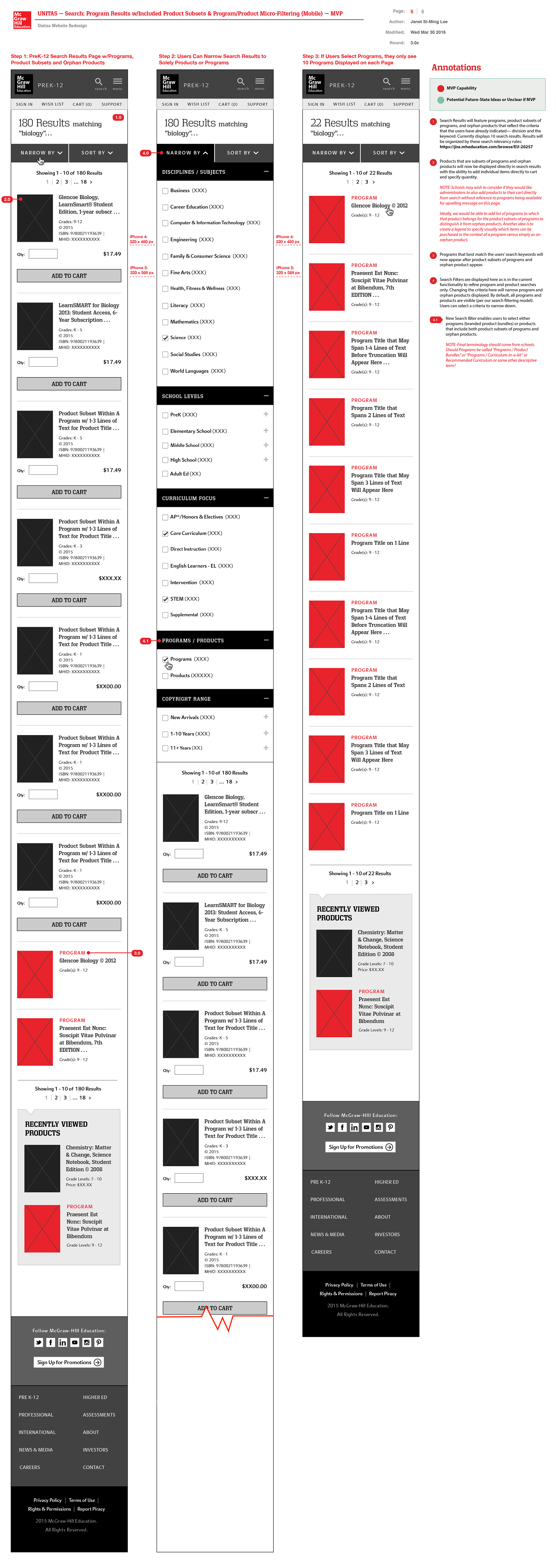
In my wireframe proposal below, I feature a search results page featuring programs (bundled products) and individual product subsets of programs and orphan products (PreK-12) that can be purchased as standalones. In this case study and project sprint below, anonymous guests searching for products will now see product subsets of programs in addition to orphan products and programs surfaced in search results. For my wireframe proposals, I design for desktop and a corresponding mobile displays. I color-coded programs in red and individual products in black boxes.
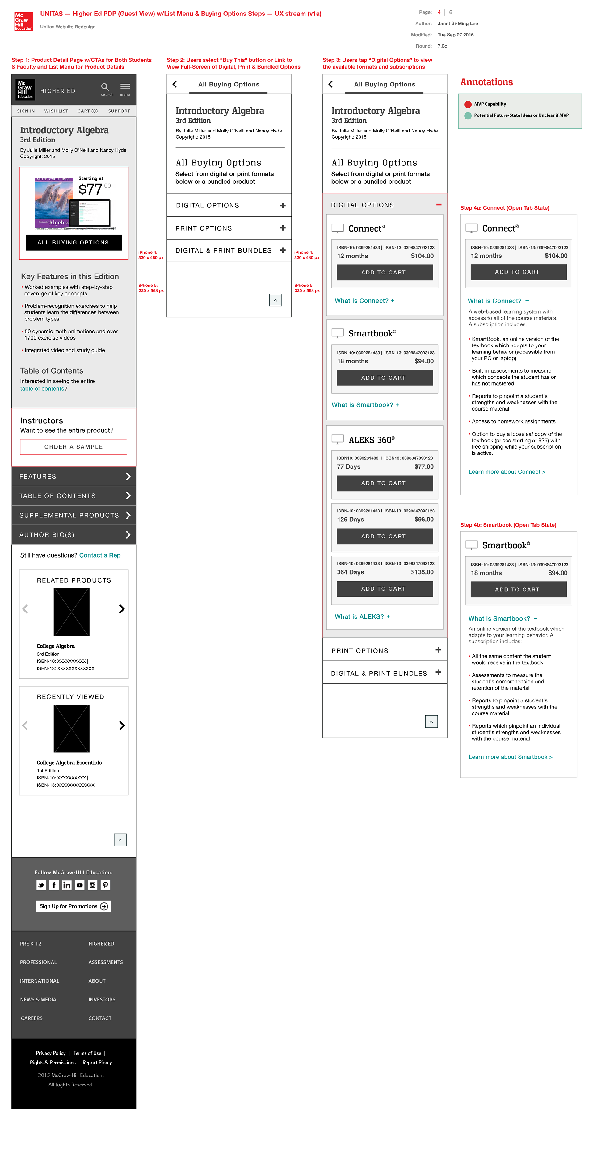
Product Detail Pages
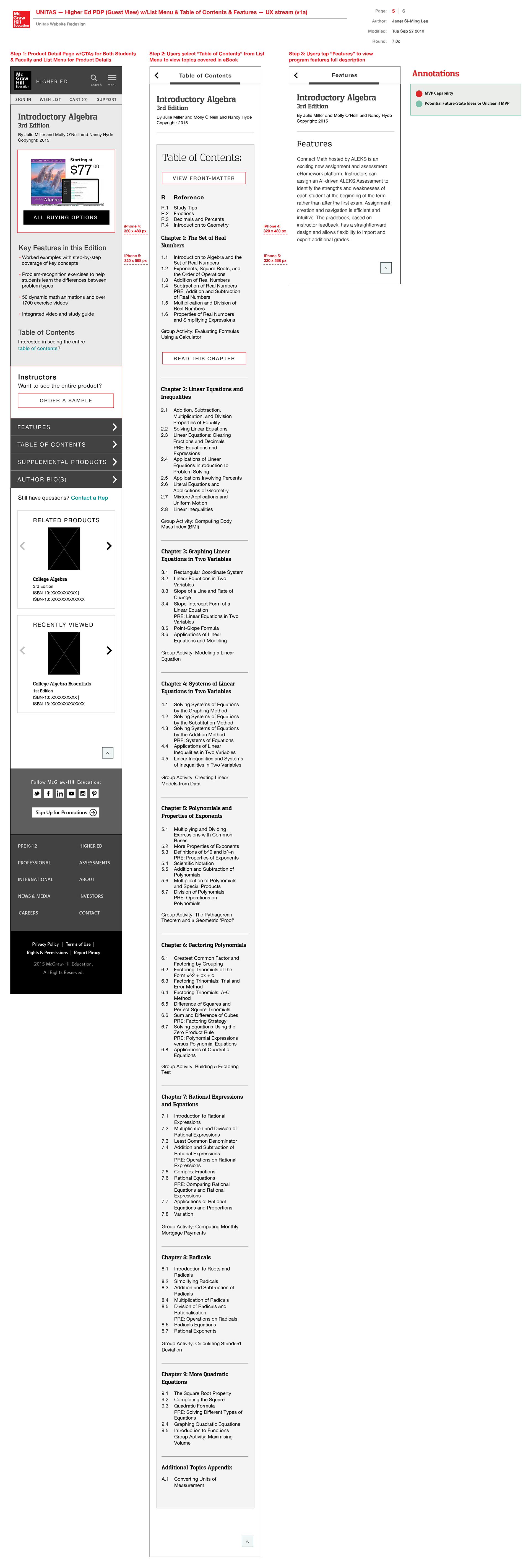
Detailed below are my proposed wireframes illustrating the mobile experience for the product detail pages. Higher ed students are presented with the ability to buy a subscription to MHE's adaptive learning product Connect if their professors use it to teach their courses. If their professors are not using Connect for their course instruction and administration, students can subscribe to Smartbook, a subset of Connect's services. ALEKS is another adaptive learning product that MHE offers for math-specific content. Key information sections I proposed: table of contents, supplemental products, author bios, product features. I also recommended presenting edition comparison info to inform users on whether to pay more for a newer edition if there is a substantial difference in editions. I created accordion tabs for compact content display.
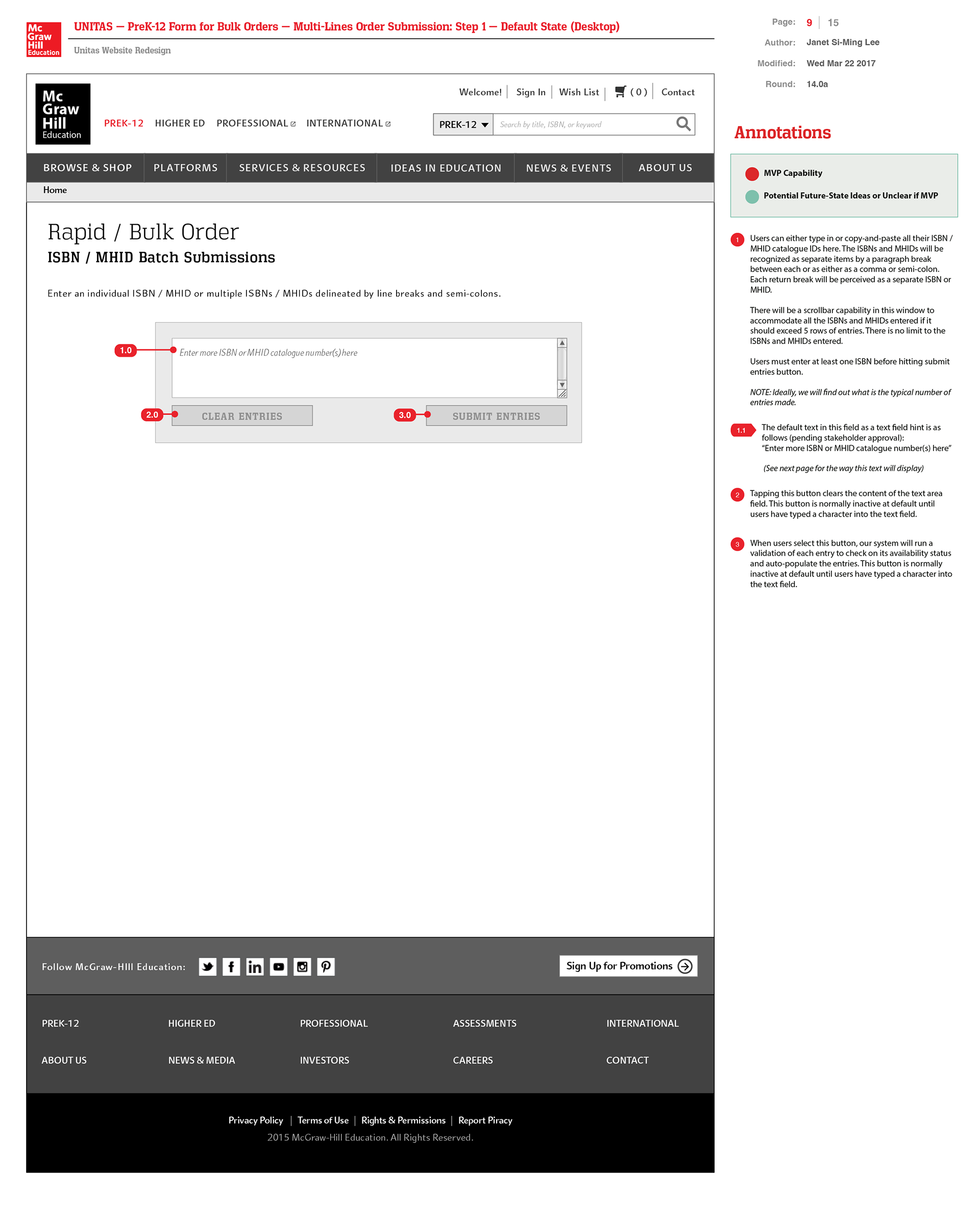
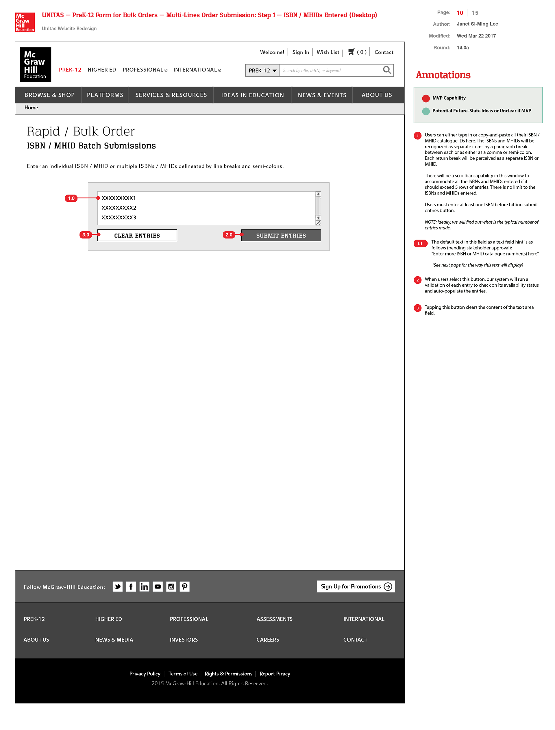
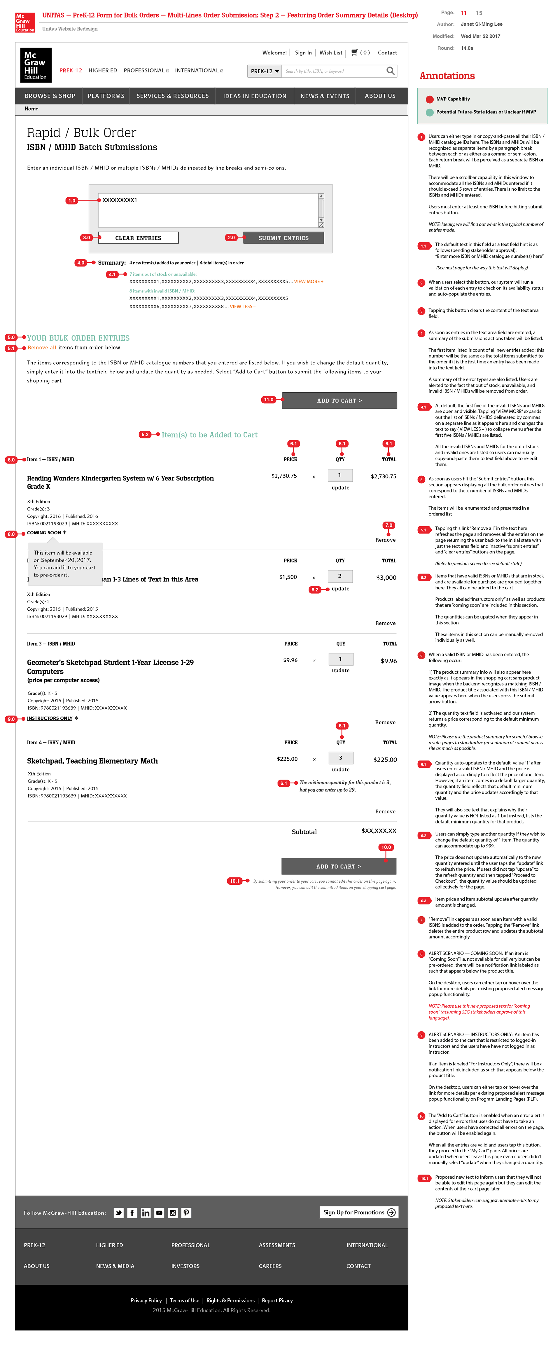
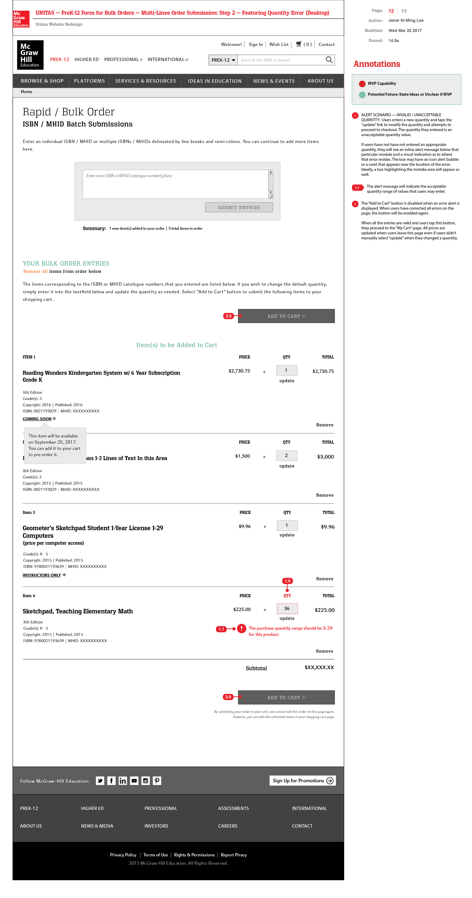
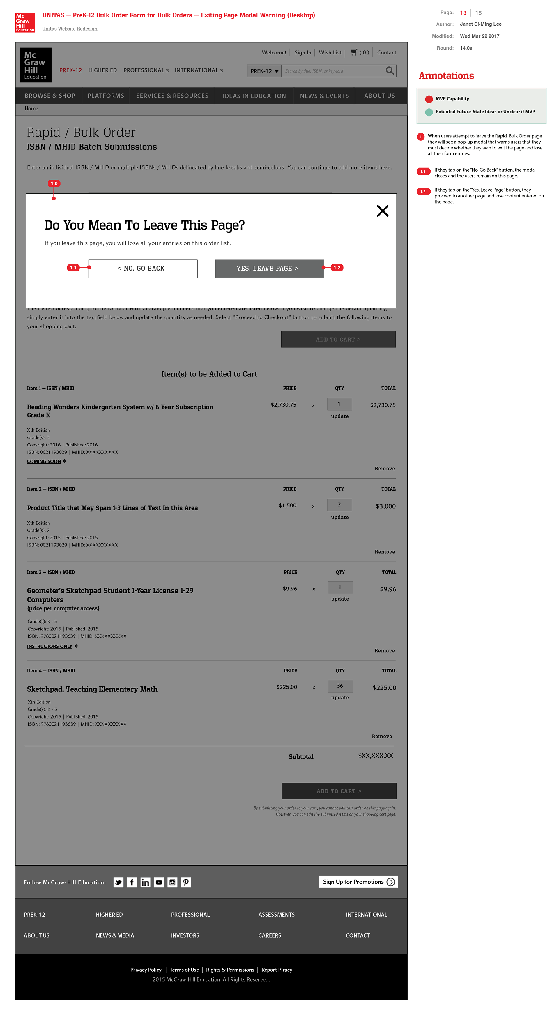
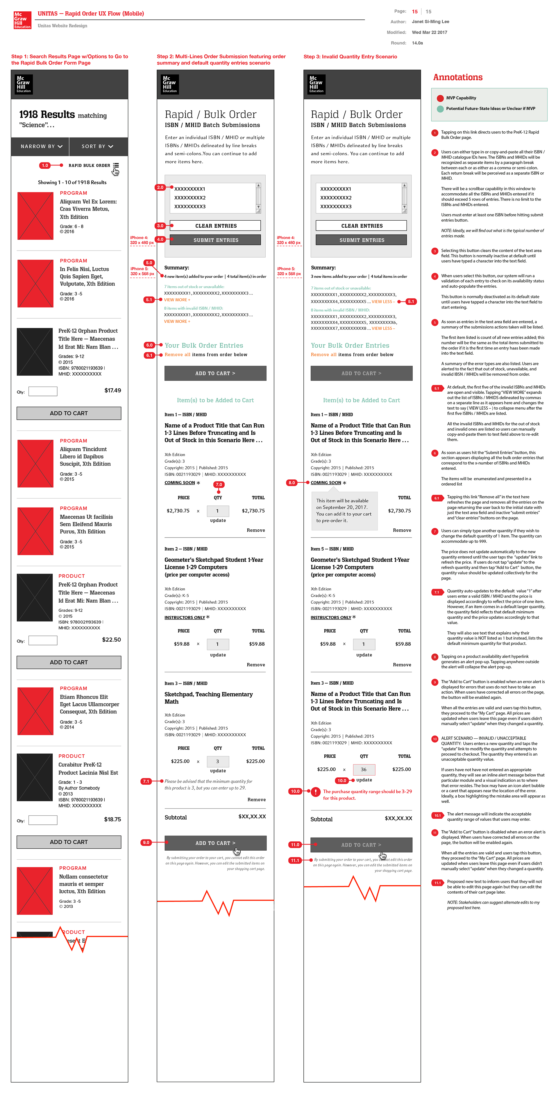
Rapid Bulk Orders UX Sequence
To streamline large-quantity purchases, I designed an annotated wireframe flow for rapid bulk ordering by ISBN and MHID entries. Other enhancements included:
• “Rapid Order” shortcut buttons added to Search Results and Browse & Shop megamenus for quick access.
• Auto-population of bulk order entries details for shopping cart
• Standardized product summaries with essential content overview and copyright info.
• Quantity update controls (+/- buttons) per product.
• Updated shopping cart UX with consistent quantity controls.
• Error alert states
PROTOTYPE / DESIGN PHASE
High-fidelity UI Visual Designs + WCAG Accessibility Design Styleguide
High-fidelity UI Visual Designs + WCAG Accessibility Design Styleguide
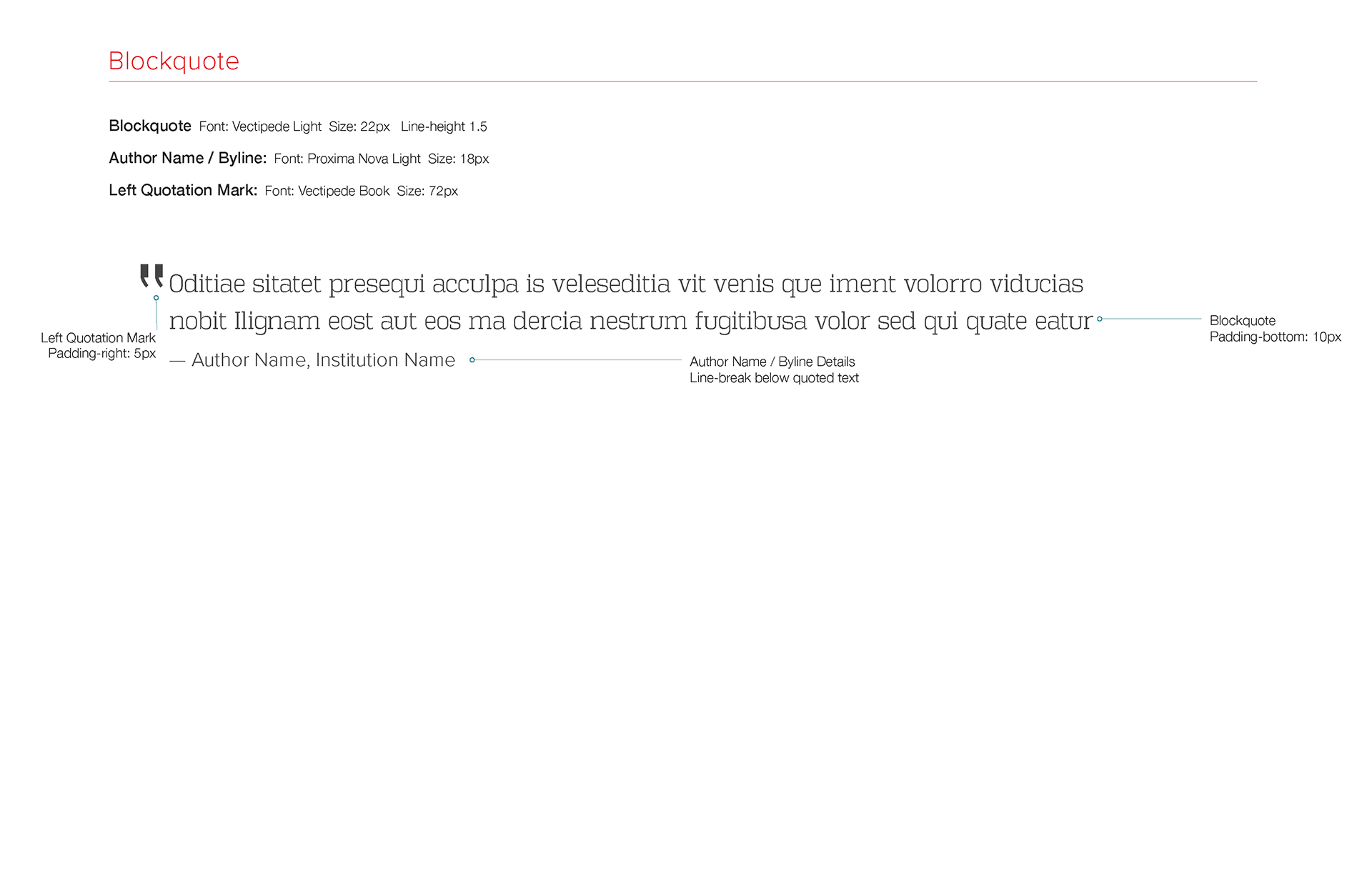
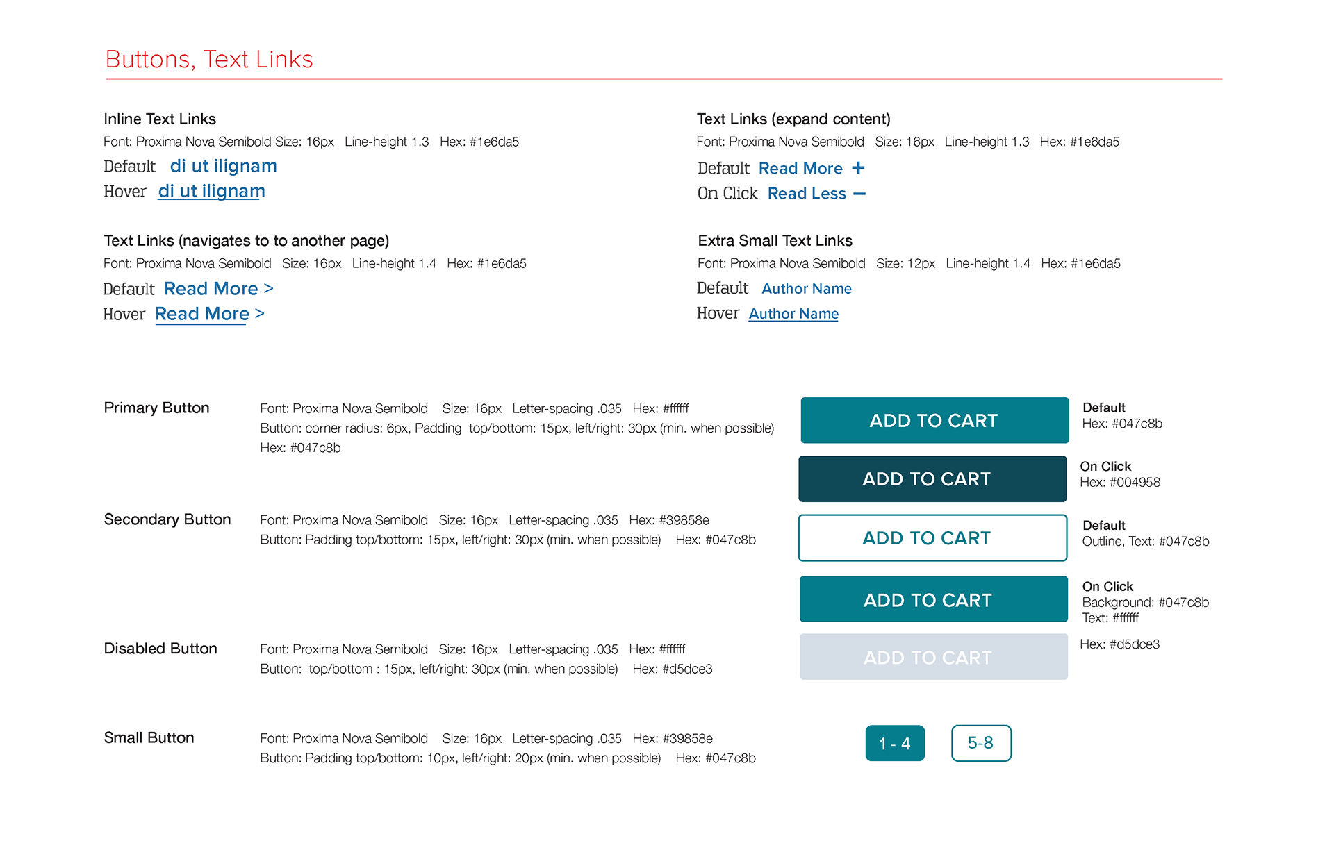
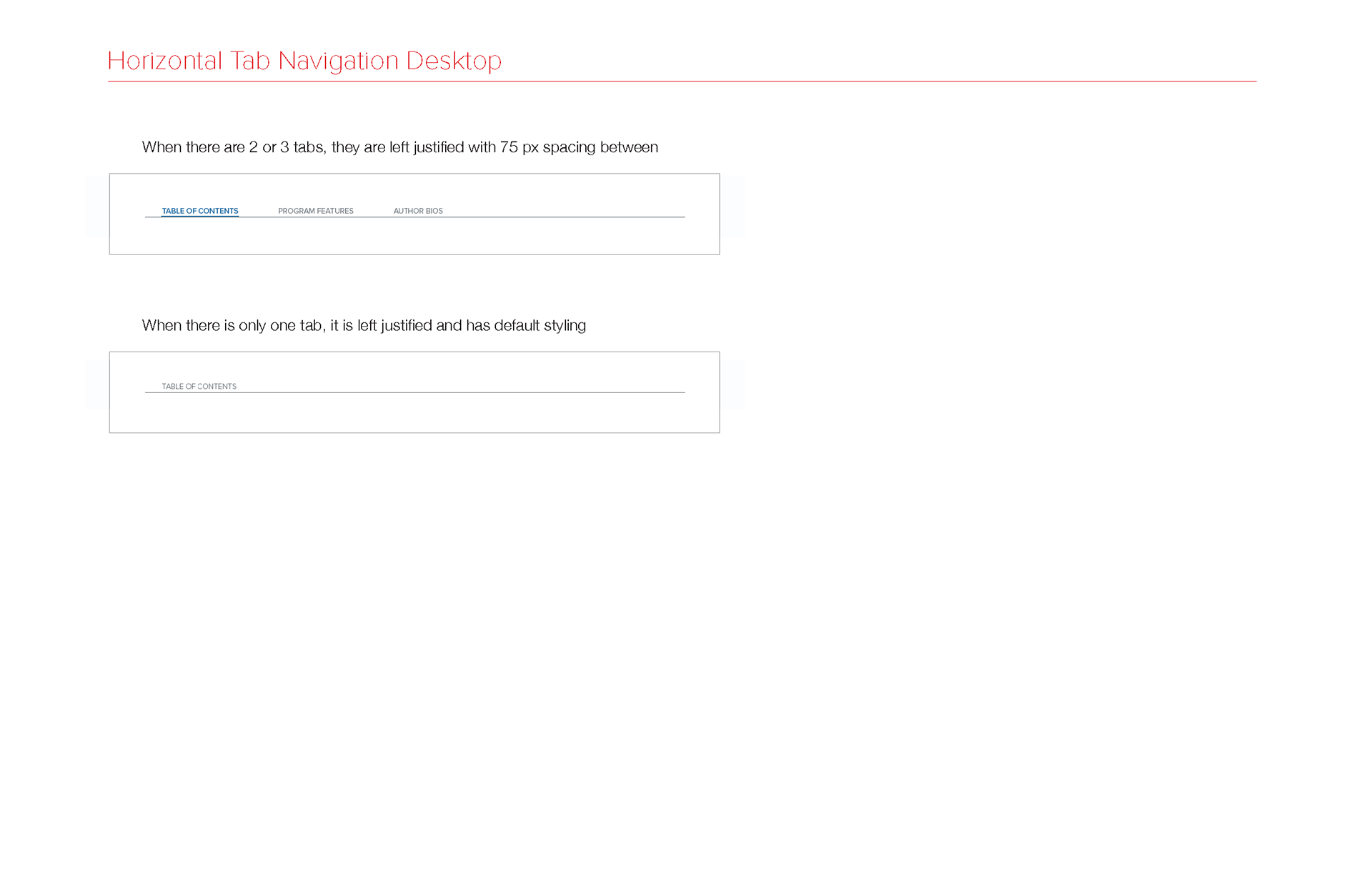
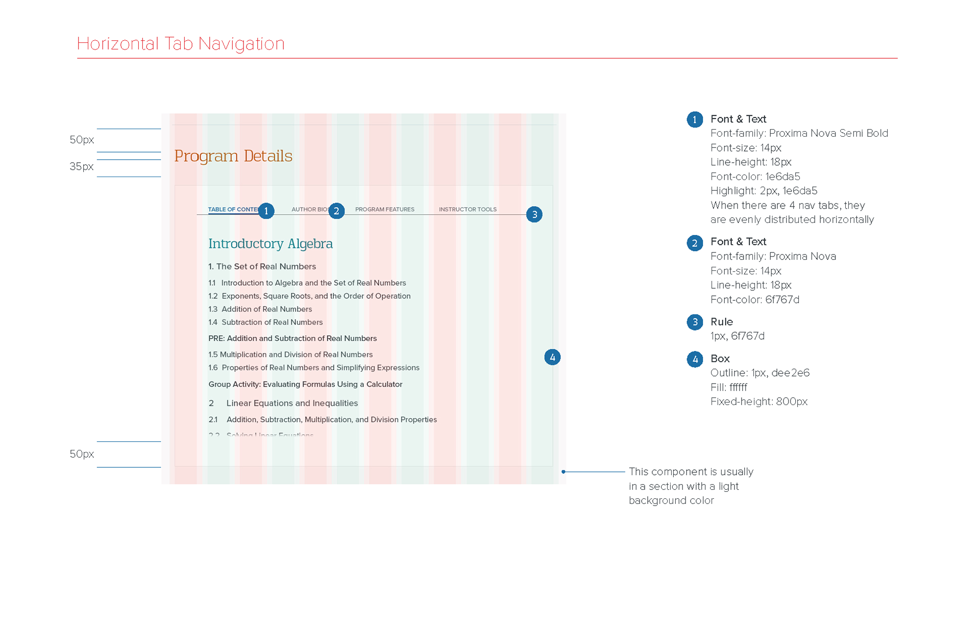
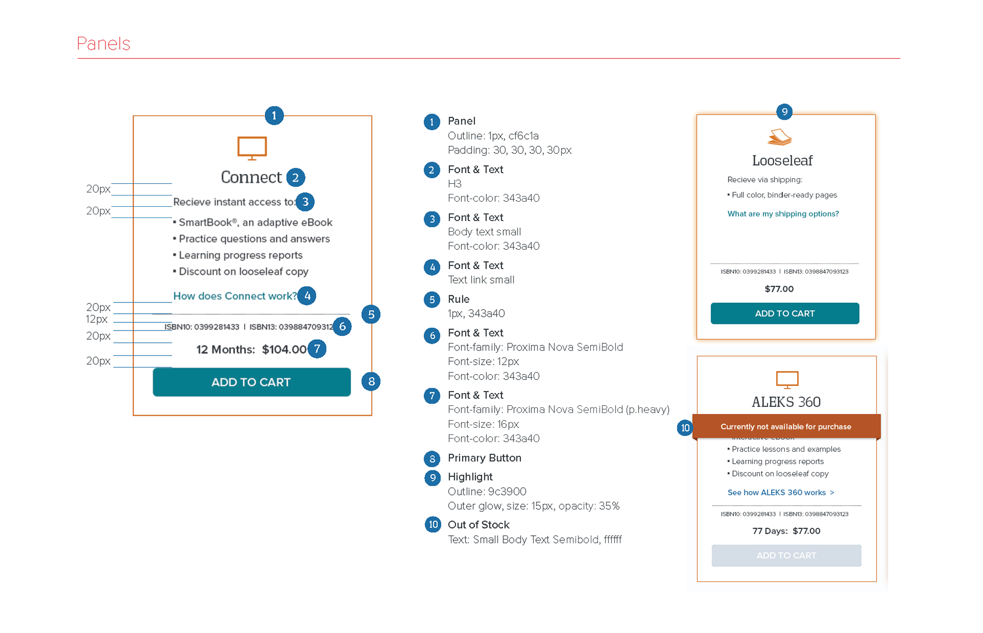
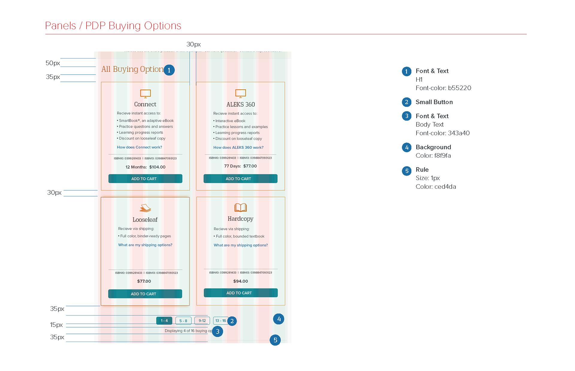
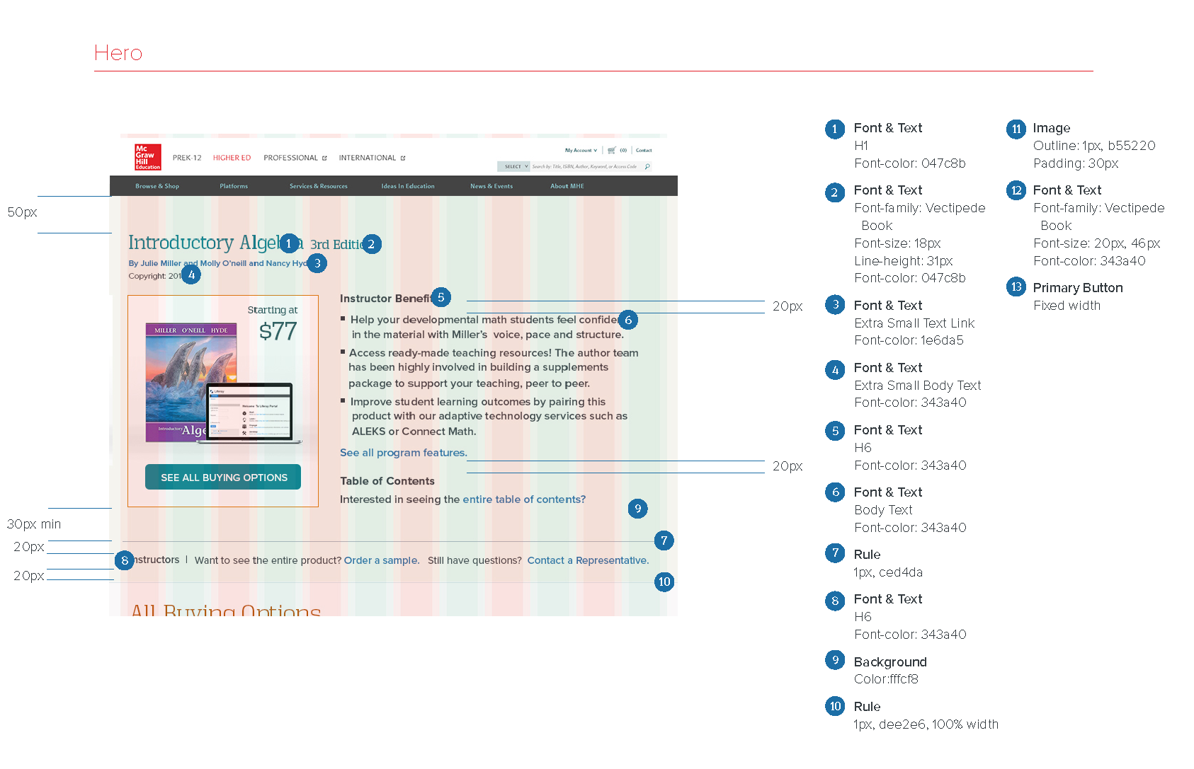
Here is an example of a styleguide I created detailing colors, typography, margins and paddings, and interaction states for desktop and mobile layouts. Initially, our team designed in Photoshop, then transitioned to Sketch. Since developers couldn’t directly inspect design files (no Figma access), I documented detailed redlines and interaction notes in Adobe InDesign files to ensure precise implementation.
Desktop Search ResultInteraction design notes (p1)
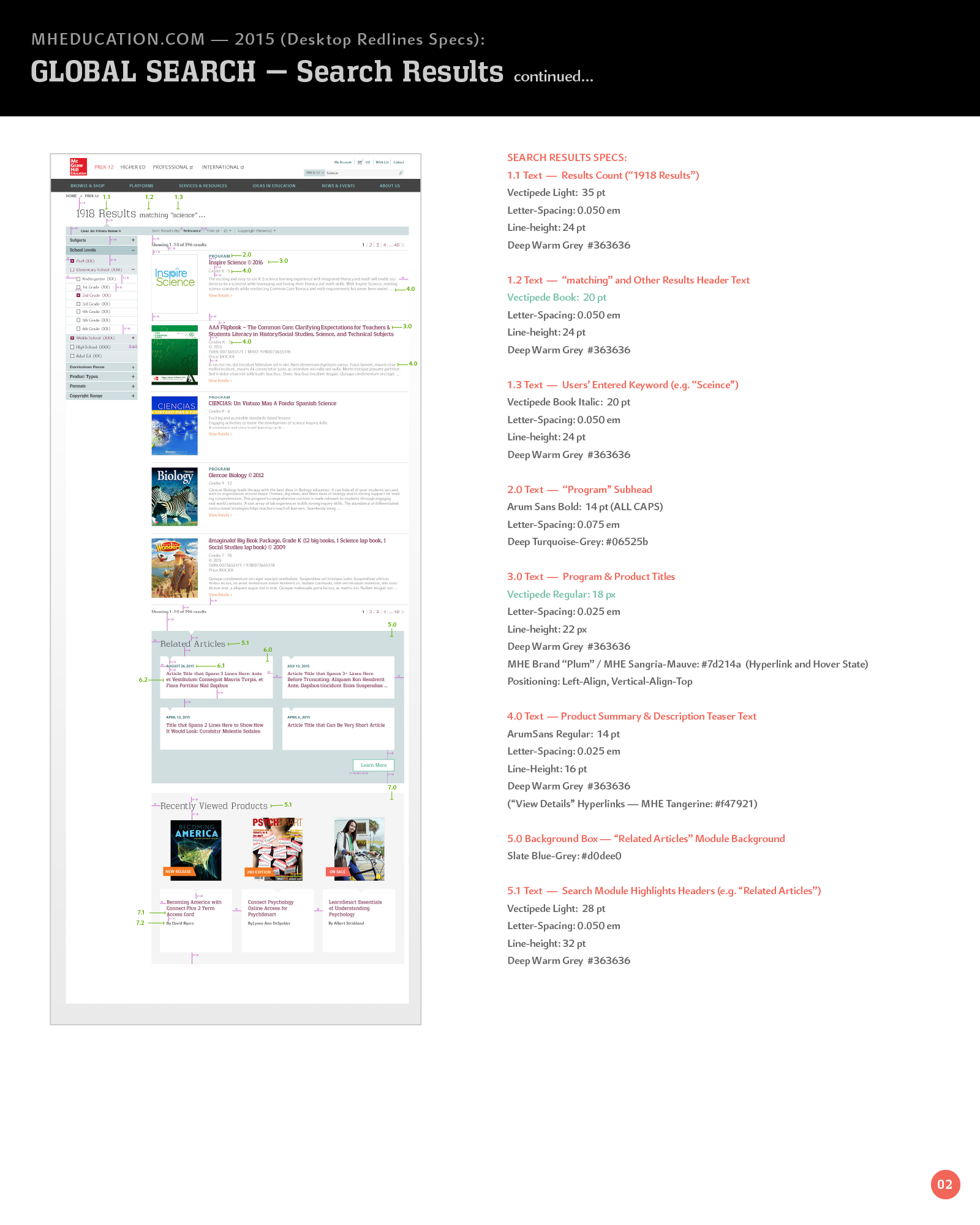
Desktop Search Results Visual design redline specs (p1)
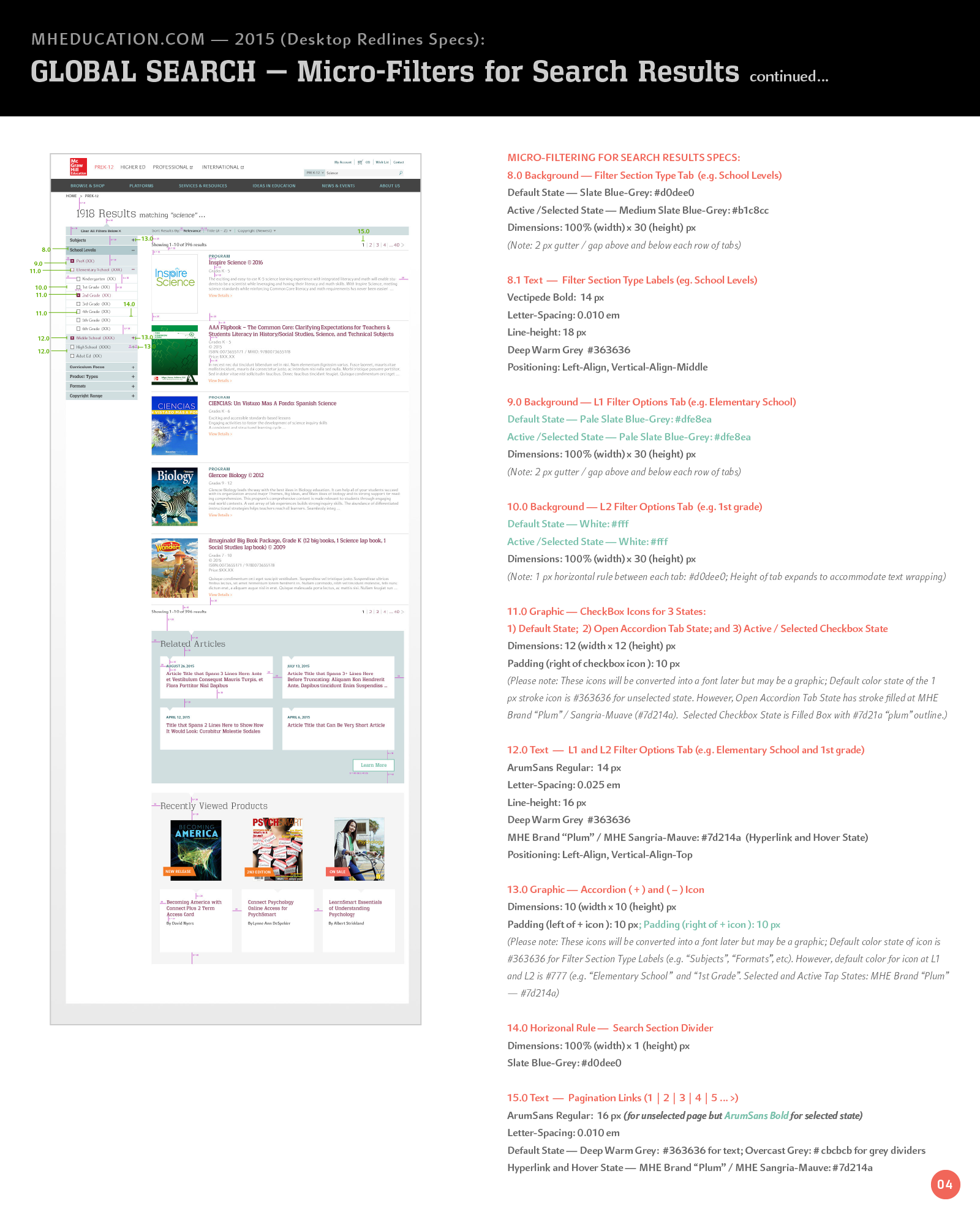
Desktop Search Results Visual design redline specs (p2)
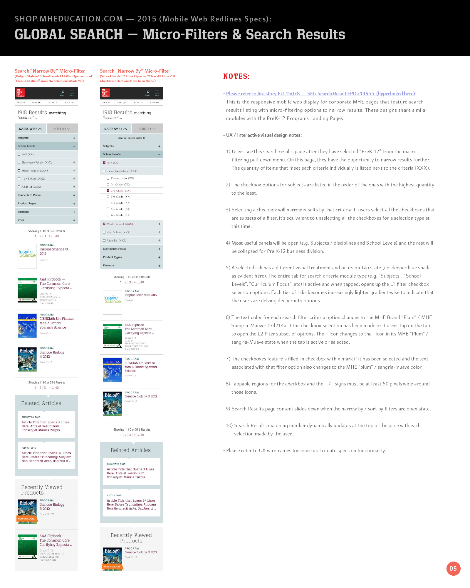
Mobile Interaction notes for Search Results Page
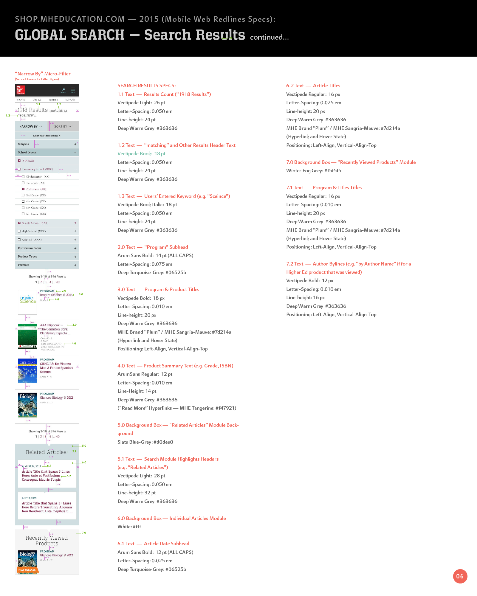
Mobile Visual design redline specs (p1)
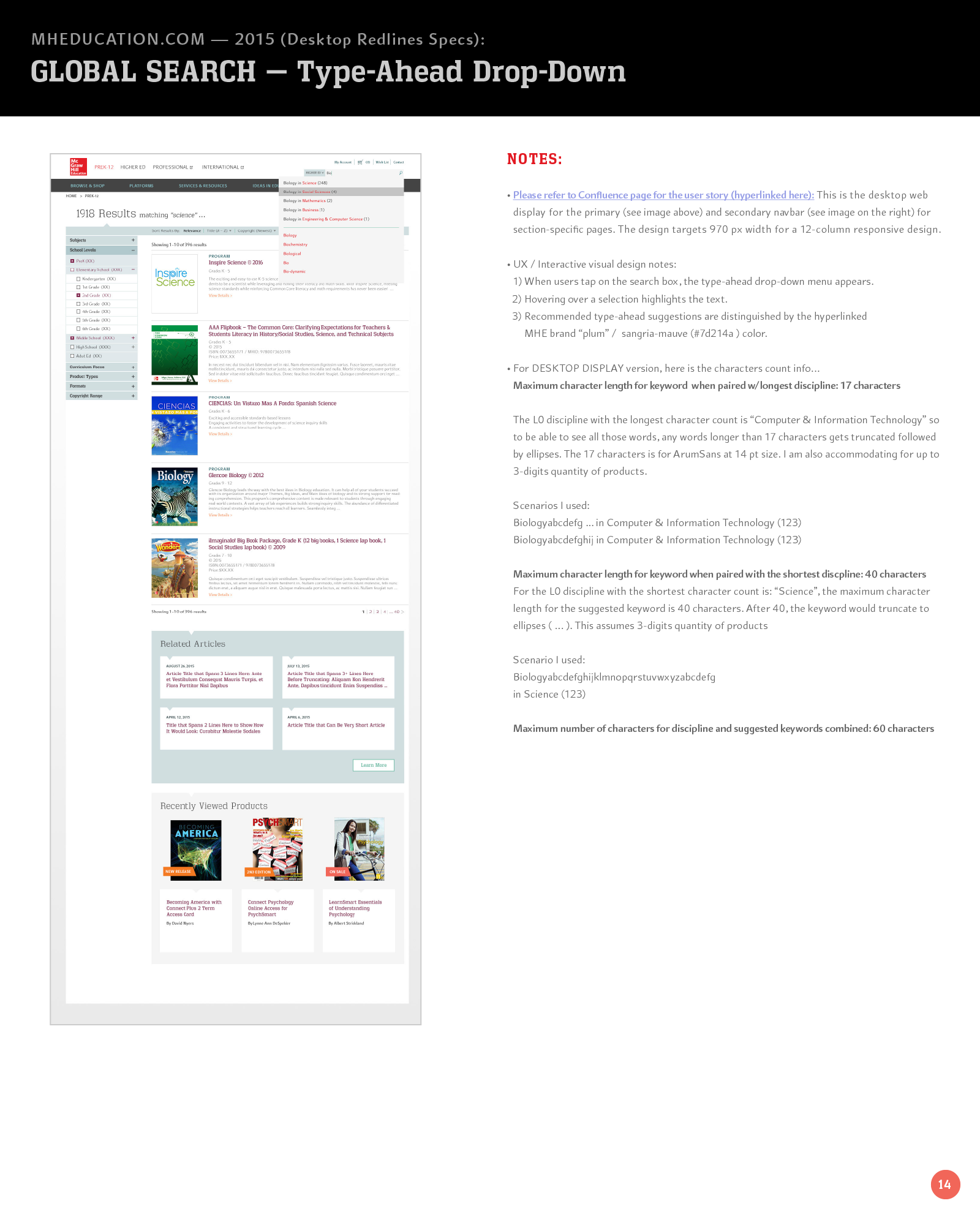
Desktop Interaction notes for Typeahead menu design
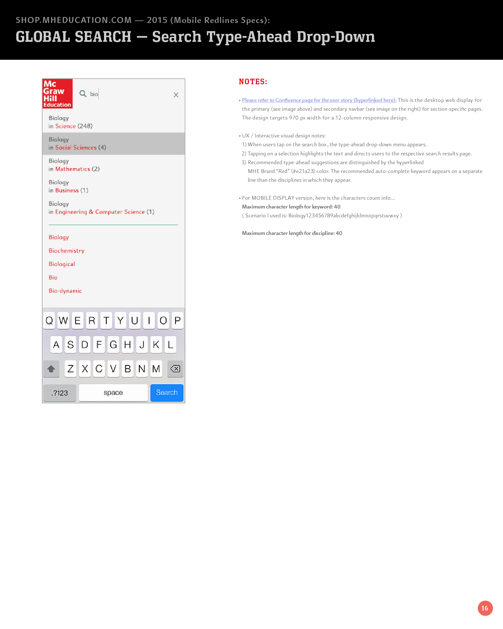
Mobile Typeahead Interaction Notes
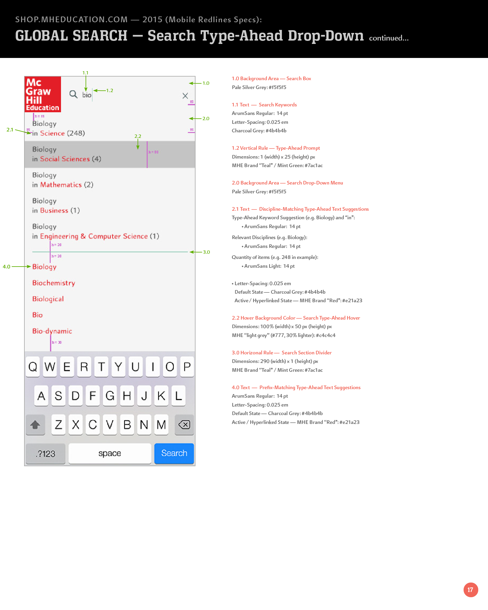
Mobile Typeahead Visual design redline specs (p1)
WCAG Accessibility Design Styleguide
I authored accessibility guidelines adhering to ADA standards, defining color palette combinations for optimal contrast and usability. This followed a redesign moving away from Sapient’s original fuchsia and mint-green palette to a new site aesthetic.
MHE's developers later rewrote the code for the interim coded pages that MHE's vendor Sapient had originally developed for MHE's initial first 90-days MVP launch in order to standardize our codebase for each page template cross divisions. After MHE's developers centralized the codebase across divisions, MHE adopted a centralized CSS styleguide to support an atomic design system for consistent modular component styling.
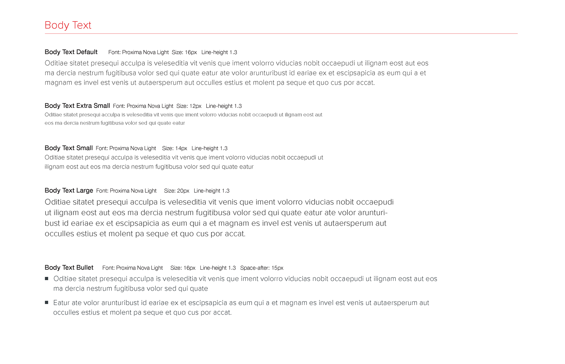
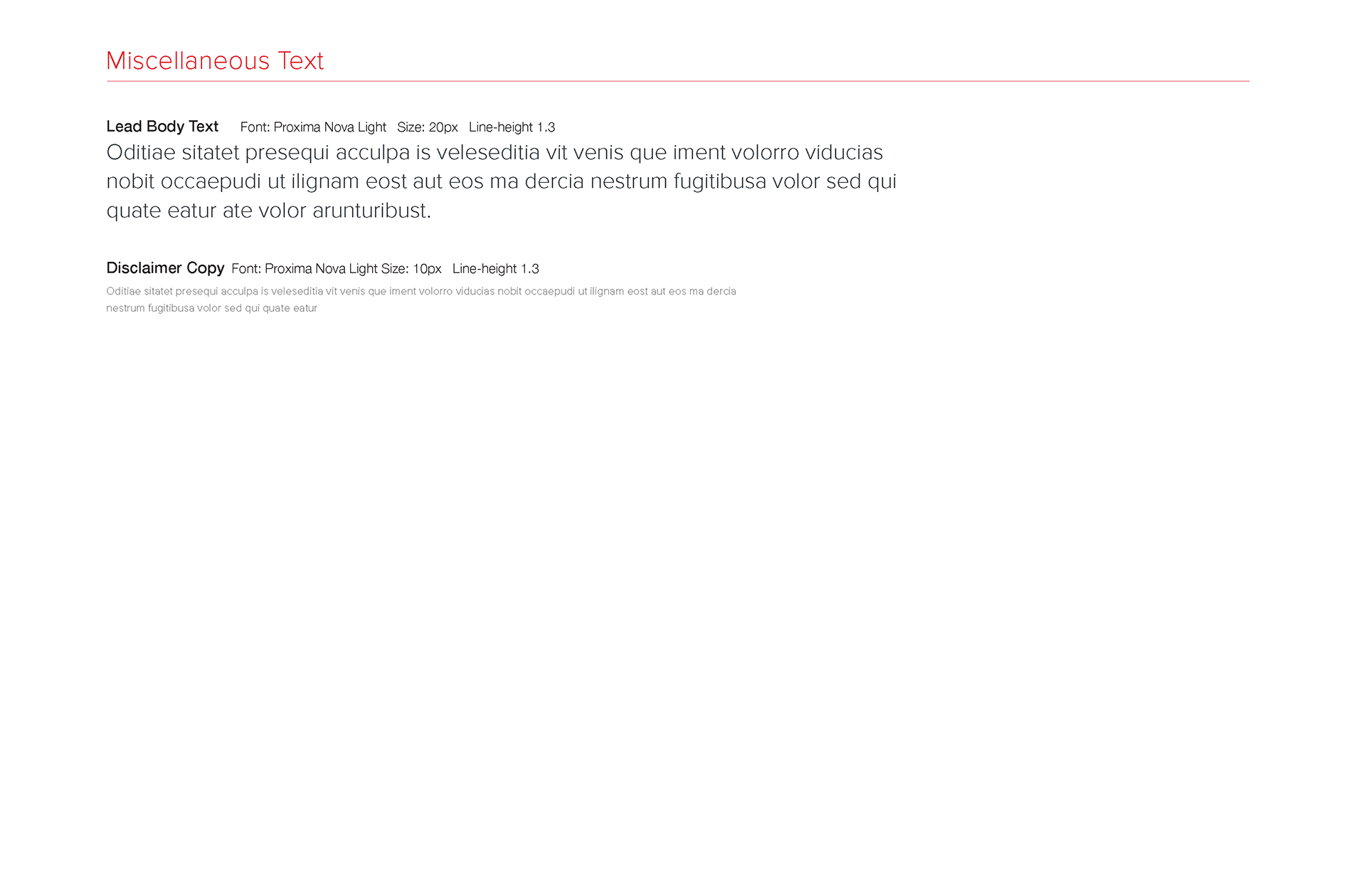
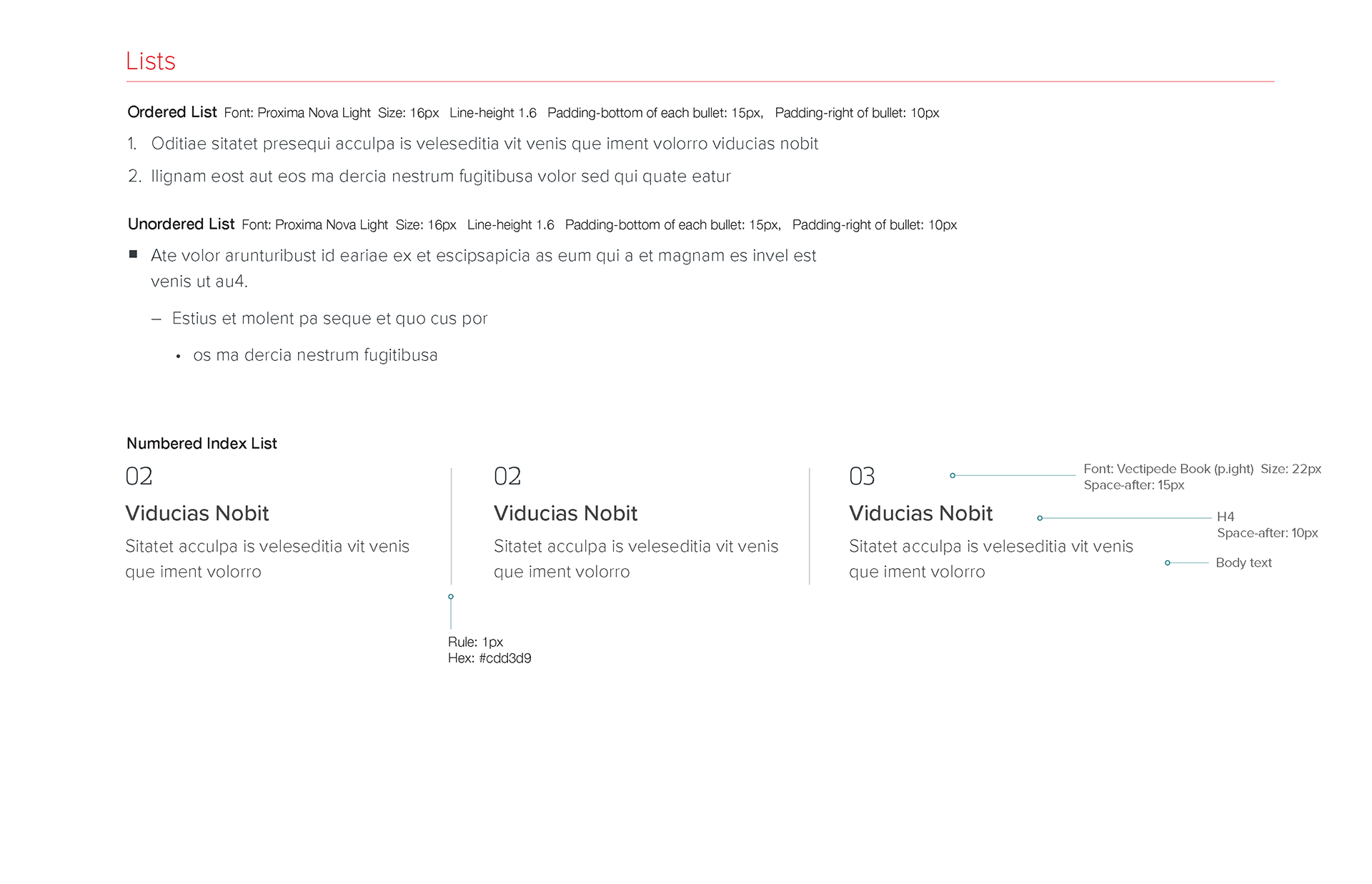
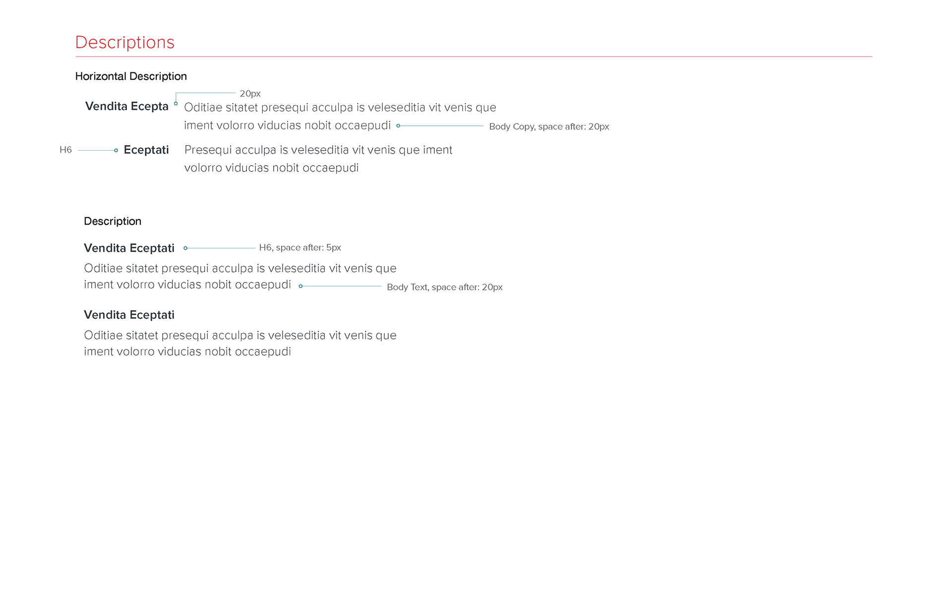
Here's an example of our new styleguide specs based on the third redesign of MHE's website.
TEST PHASE
User-Experience Customer Interviews + Usability Testing
User-Experience Customer Interviews + Usability Testing
To validate our eCommerce designs, we partnered with dedicated UX research teams from MHE’s higher ed and PreK-12 divisions. I authored customer interview questions, usability test scenarios, and interactive prototype scripts used in online sessions. I would prepare the visual designs for the interactive prototypes for each step of the usability test.
I frequently participated in these interviews to gain direct insight into users’ thought processes and site experience. After testing, I collaborated with UX researchers, product managers, and marketing stakeholders to analyze results and define actionable design improvements.
Here's the link to a usability testing (pdf) that I authored: