PROJECT: Weight Watchers Omni-platform Mobile Redesign Integrating Barcode Scanner and Points Plus Tracker Apps
ROLE:
Sr. Interactive Visual Designer at Mobiquity.
Visual design lead on Weight Watchers app (2.3 version). Provided UX consultations as well.
KEY SKILLS:
• Omni-platform UI Interactive Visual Design
• Native mobile app design (iPhone, iPad, Droid)
• Brand positioning strategy
• UI visual design system proposals
• American Disabilities Act (ADA) design compliance
DESIGN APPS USED:
• Photoshop (detailed UI designs)
• Indesign (Redline documentation)
PROJECT OVERVIEW / CONTEXT:
I redesigned iPhone, Android, and iPad apps to reflect new UX updates and to meet American Disabilities Act’s visual design requirements. Integrated functionality from Weight Watchers' two apps— Barcode Scanner and Points Tracker— and unified look and feel for cohesive brand experience.
Weight Watchers (WW) — a weight loss, health, and wellness company — contracted mobile consulting agency Mobiquity to redesign their native mobile apps. Weight Watchers' various digital channels and consumer products were all operated by different divisions which led to their platforms featuring a different look and feel from their websites to their mobile apps across various devices and their packaging for their product food lines over time. They also had two different apps — the Barcode Scanner and a Points Plus Tracker that they sought to integrate into one unified UX experience. The Barcode Scanner enabled users to scan barcodes on the food and beverage packages for quick calories and nutritional info inputs. The Points Plus Tracker enabled users to keep track of their daily calories, activities, and receive helpful tips on recipes, etc. One of the challenges was that Mobiquity had just completed one round of app redesign which was markedly different looking from their legacy designs for from their Barcode Scanner design and Weight Watchers' website and consumer product lines. Thus, my challenge in this one scope was to merge the visual design experience between the Barcode Scanner and Points Plus Tracker into one unified look and feel but work within the limitations of the last round of visual designs as inspiration for their Points Plus Tracker. I also was tasked with the objective of defining a color palette that would meet American Disabilities Act's visual design requirements for 4.0 color contrast ratio which the previous designs did not meet and that the droid and apple product lines didn't always synch up on exact color and typographic options. Furthermore, I had to propose as minimal changes as I can for maximum impact for cohesive user-experience and visual brand to keep to project scope.
I collaborated with the lead UX designer who defined the key functionality needed for each wireframe. I analyzed the look and feel of all the legacy mobile apps (iphone, Android, iPad), the website, and the product packages to propose a few color palette options to the Weight Watchers VP on the Mobile Design division and a team of other WW executives. I adjusted colors as needed to meet American Disabilities Act’s visual design requirements for higher contrast. I applied common elements to use such as the bright green button as the primary call-to-action across all the apps. I provided some UX direction to developers as needed to offer more specificity to decisions that the lead UX designer on this project provided.
When designs I created in Photoshop were approved, I provided visual styleguides and design guidance to developers to implement the designs. I created graphic assets for various resolutions for higher @1x and @2x retina displays.
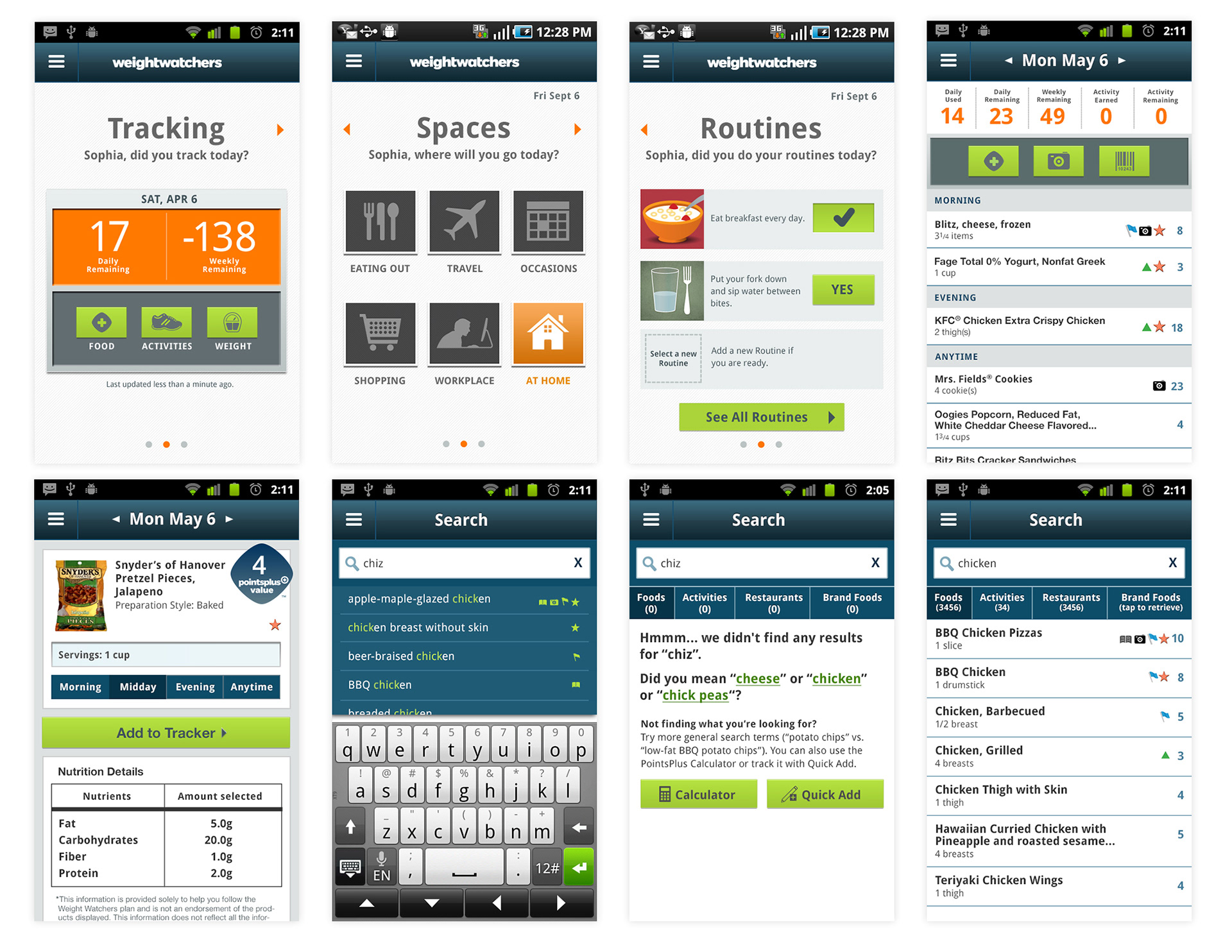
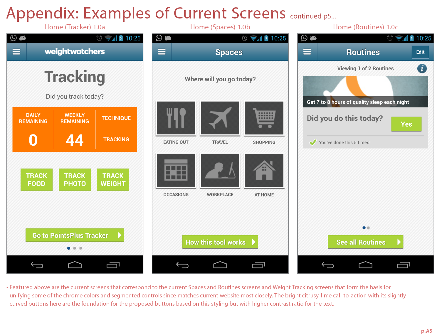
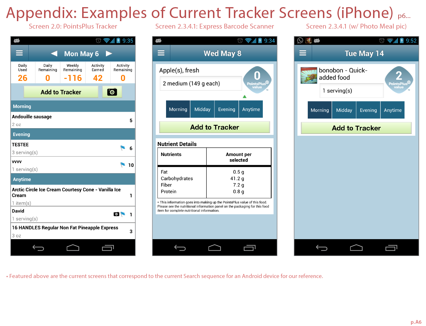
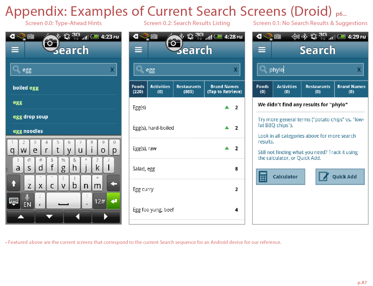
Featured directly below are several screens from the Droid version of the WW app I designed.
The top row features three dashboard screens indicating remaining weekly and daily caloric points, and tips to track their routines and activities. The fourth screen in the top row and the first screen in the bottom right are Points Tracker related screens. They enable users to enter their food, view nutritional info, scan a product, or snap a photo of their meals. The last three screens on the bottom row are several screens in the new search capabilities.
The top row features three dashboard screens indicating remaining weekly and daily caloric points, and tips to track their routines and activities. The fourth screen in the top row and the first screen in the bottom right are Points Tracker related screens. They enable users to enter their food, view nutritional info, scan a product, or snap a photo of their meals. The last three screens on the bottom row are several screens in the new search capabilities.
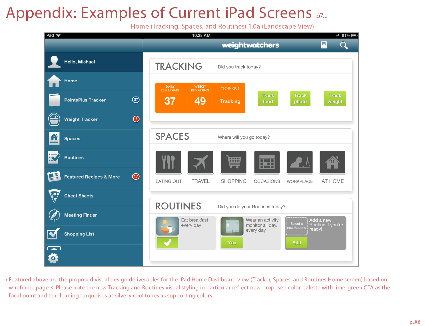
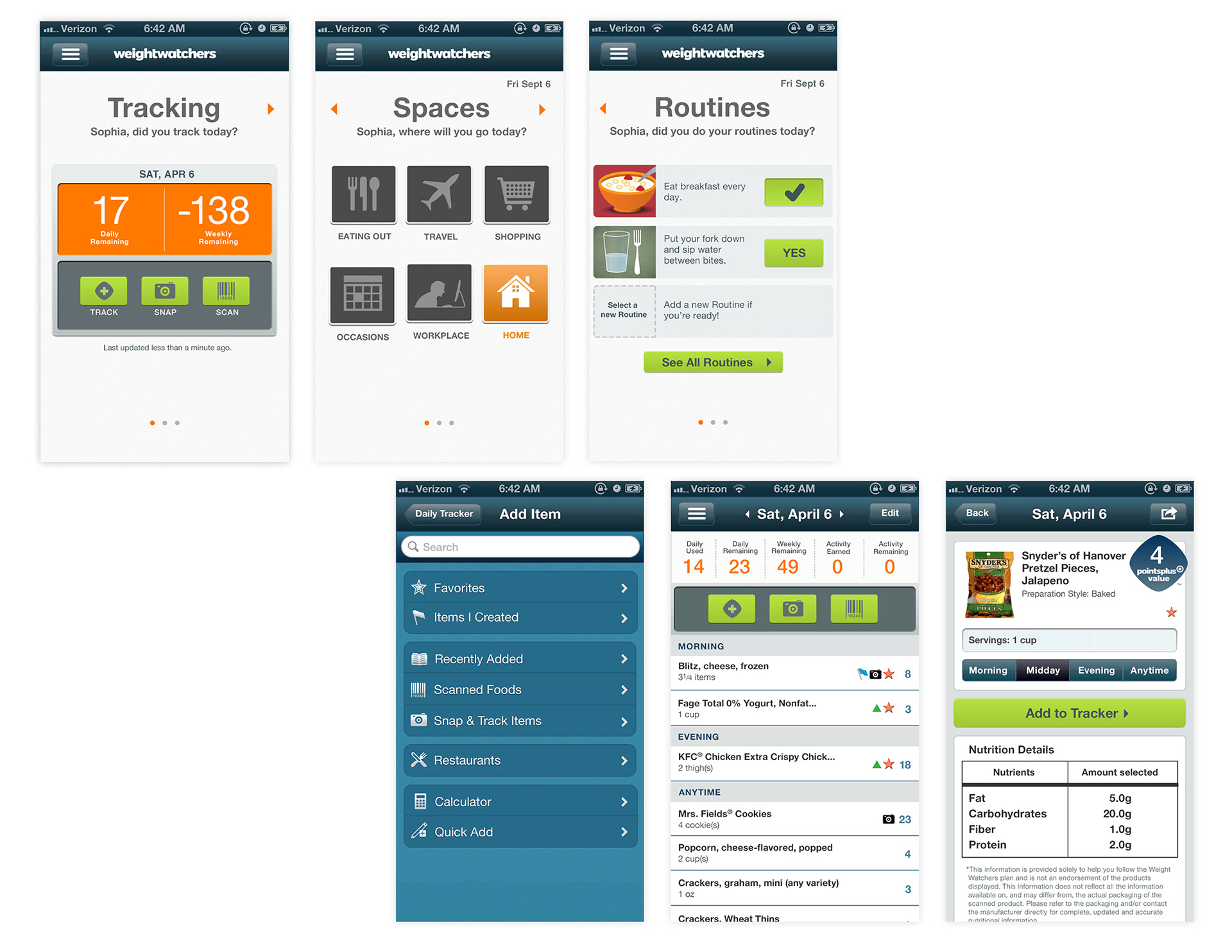
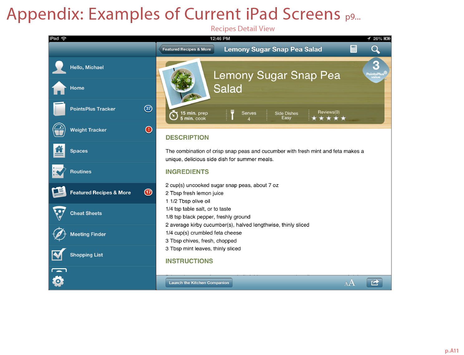
Sample additional screens I designed for iPhone and iPad mobile apps featured directly below.
Unlike earlier legacy WW design palette, this palette leans more silvery and cool-toned than the warmer wasabi green gradient palette per WW client request. The citrusy-warm lime green used in the buttons pop in this more silvery palette. Edges of the cards are now less rounded and more similar to the new lime buttons reduced curvatures. The background behind the slightly-rounded cards are now silvery grey instead of blue as it appears now. The US version of the Points Tracker features three buttons, but international version only has one. To be more device-specific, the typeface Futura was replaced with the default smartphone-specific typeface— Helvetica Neue and for the Droid phones, I chose Droid Sans. Cooler color palette reflected in the design with lime-green buttons still primary focus across all devices. I strove to streamline the color palette by making the back and menu button backgrounds the same color as the chrome and adjusted spacing between objects to be a bit tighter when they belong in the same functional grouping to reduce visual clutter. Unfortunately, due to developers' time constraints, I didn't get the toolbar navbar buttons in the iPhone versions to match their background chrome colors. See previous designs for the Before and After takes on these designs.
Unlike earlier legacy WW design palette, this palette leans more silvery and cool-toned than the warmer wasabi green gradient palette per WW client request. The citrusy-warm lime green used in the buttons pop in this more silvery palette. Edges of the cards are now less rounded and more similar to the new lime buttons reduced curvatures. The background behind the slightly-rounded cards are now silvery grey instead of blue as it appears now. The US version of the Points Tracker features three buttons, but international version only has one. To be more device-specific, the typeface Futura was replaced with the default smartphone-specific typeface— Helvetica Neue and for the Droid phones, I chose Droid Sans. Cooler color palette reflected in the design with lime-green buttons still primary focus across all devices. I strove to streamline the color palette by making the back and menu button backgrounds the same color as the chrome and adjusted spacing between objects to be a bit tighter when they belong in the same functional grouping to reduce visual clutter. Unfortunately, due to developers' time constraints, I didn't get the toolbar navbar buttons in the iPhone versions to match their background chrome colors. See previous designs for the Before and After takes on these designs.
iPhone designs
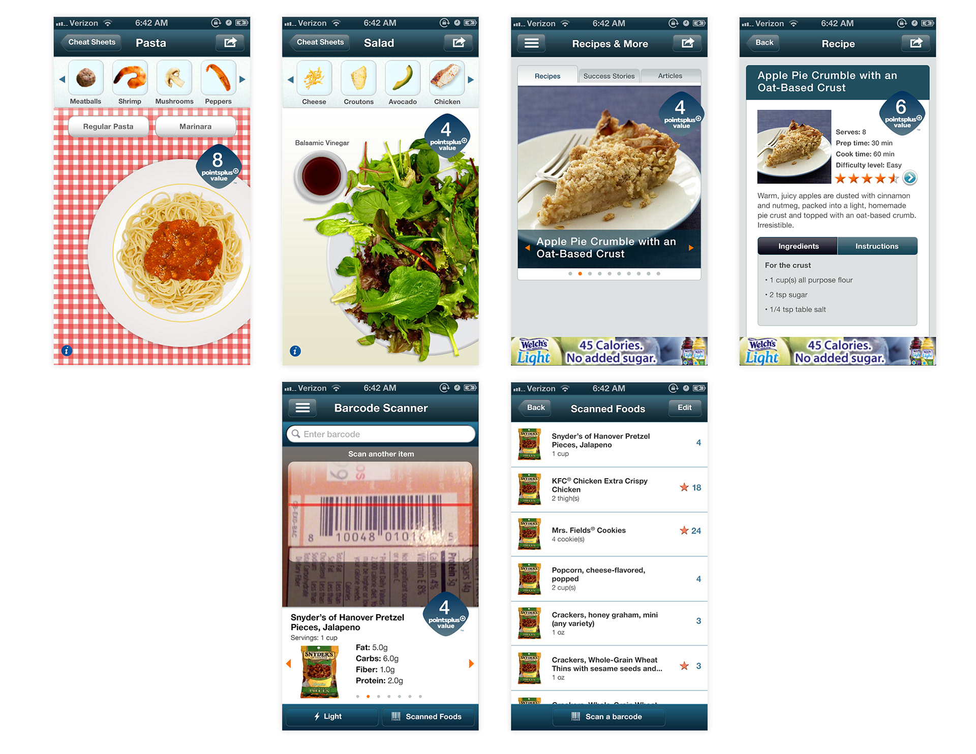
iPhone designs of additional screens
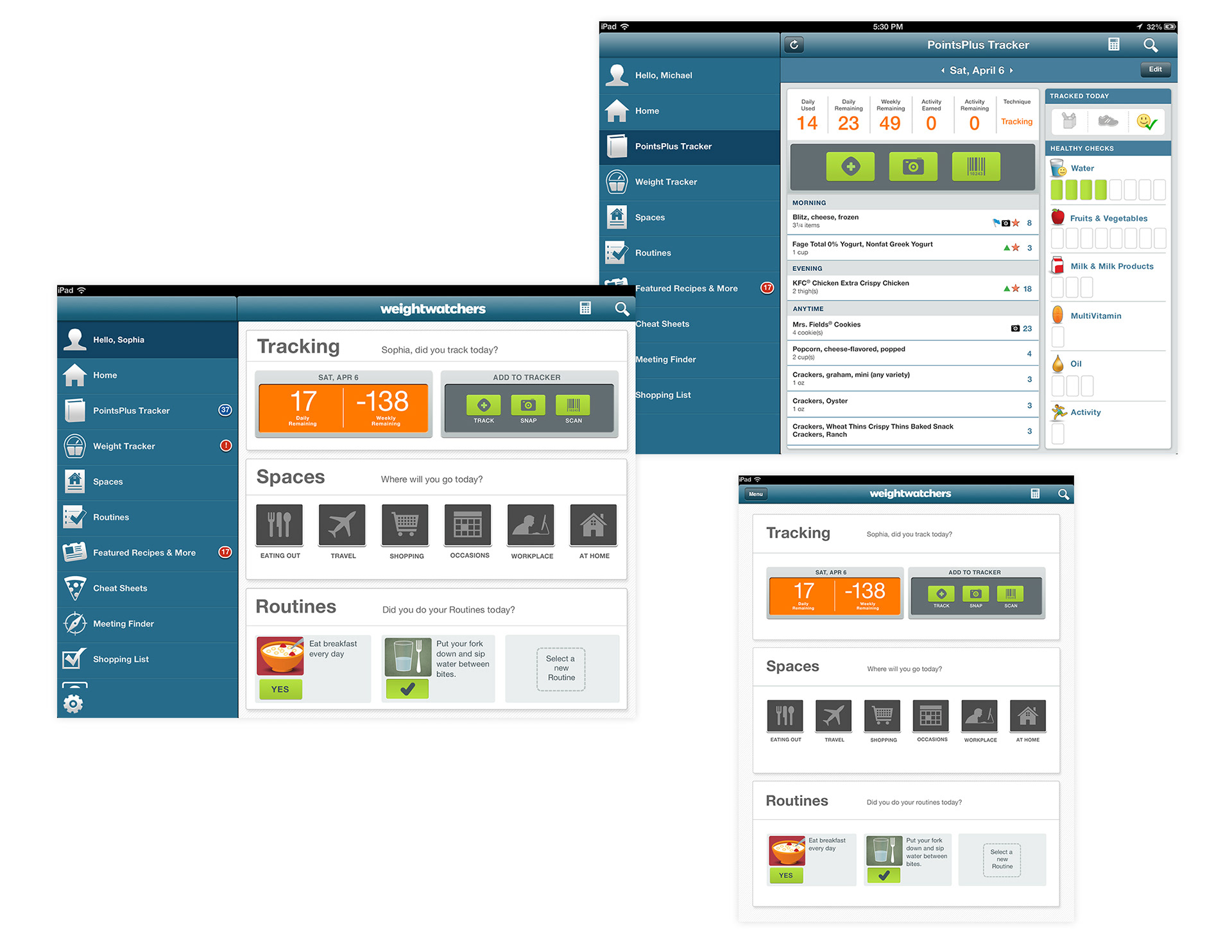
iPad designs
To get a sense of how much I improved the designs in one scope from the previous designs, view these screens below.
Weight Watchers consumer product food package design logos which had a warmer citrusy color palette
Original dashboard (Droid) screens that a previous Mobiquity designer created in the last round as a baseline to leverage and refine for Points Plus Tracker design
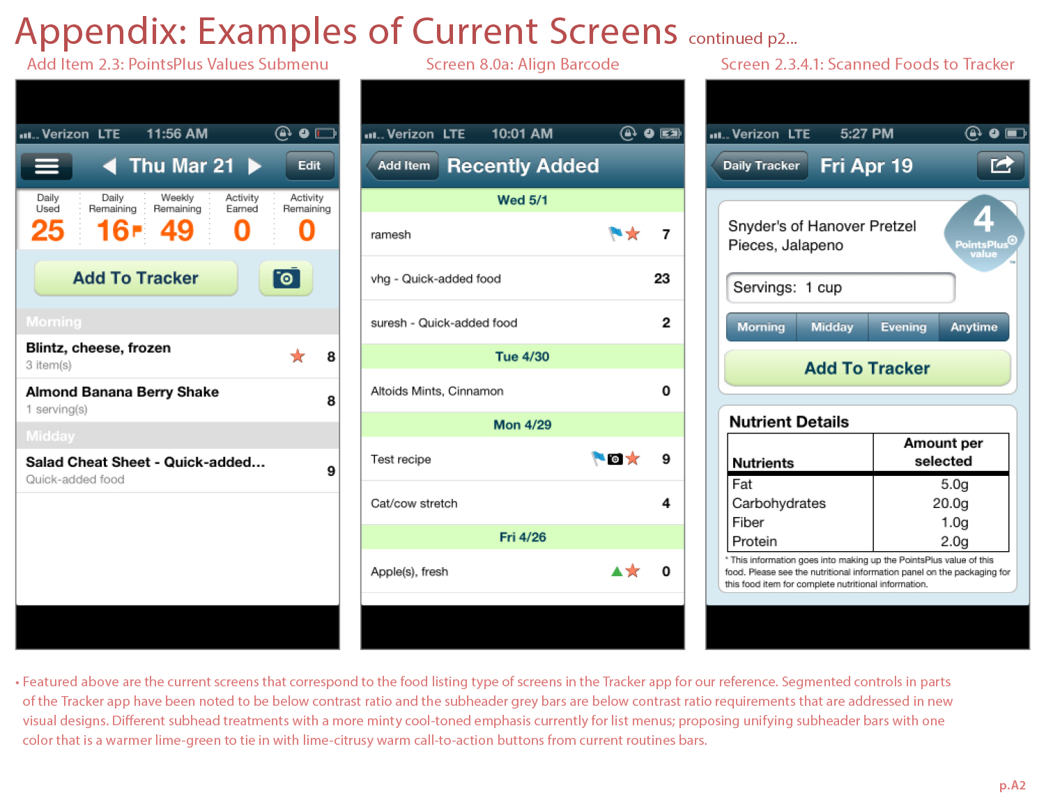
Original Points Tracker (iPhone) screens that a previous Mobiquity designer created in the last scope as a baseline to leverage and refine.
Original Points Tracker (Droid) screens that a previous Mobiquity designer created in the last scope as a baseline to leverage and refine.
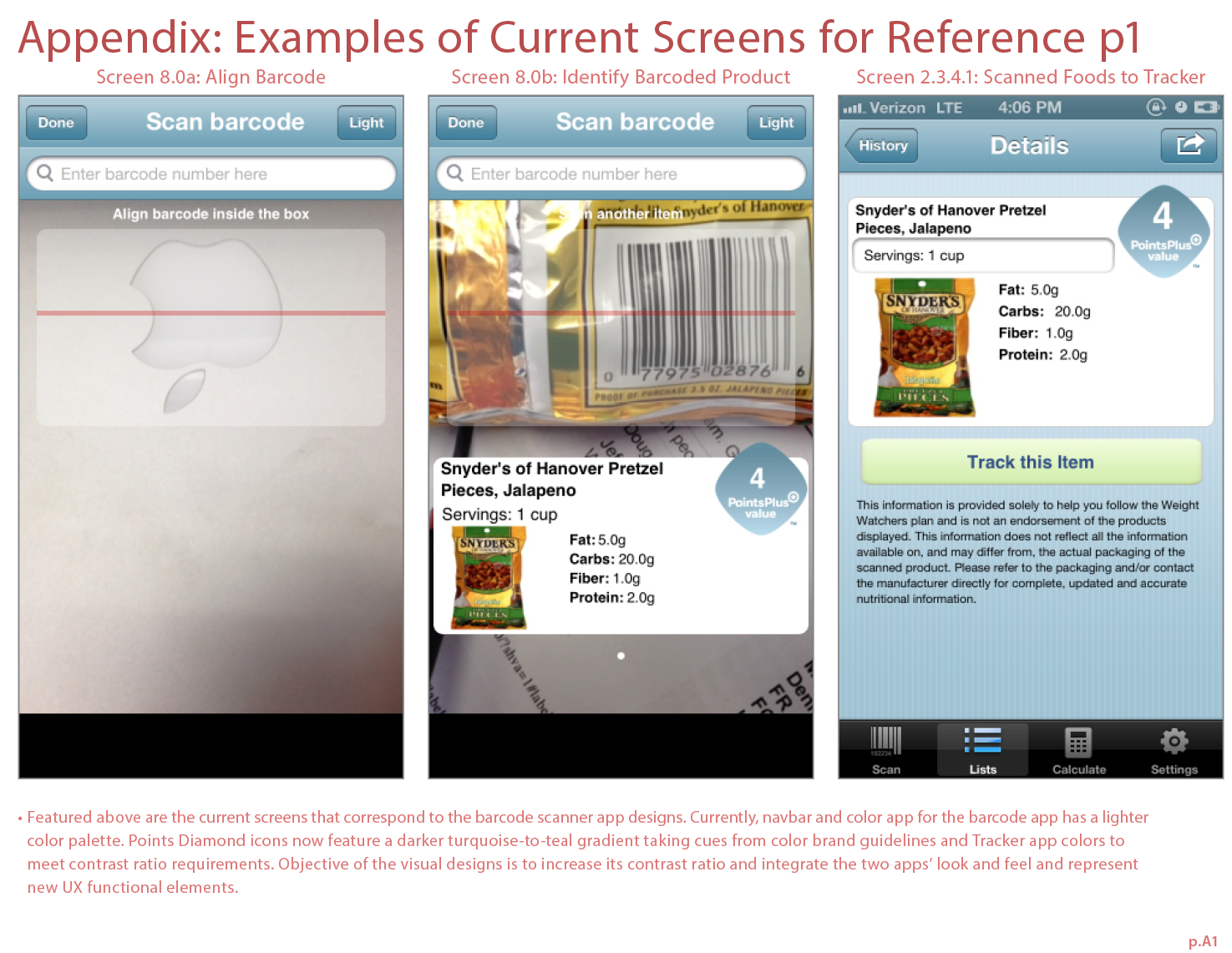
Original barcode scanner legacy app (iPhone) that a previous designer created
Original search-related screens (droid) that a previous designer created
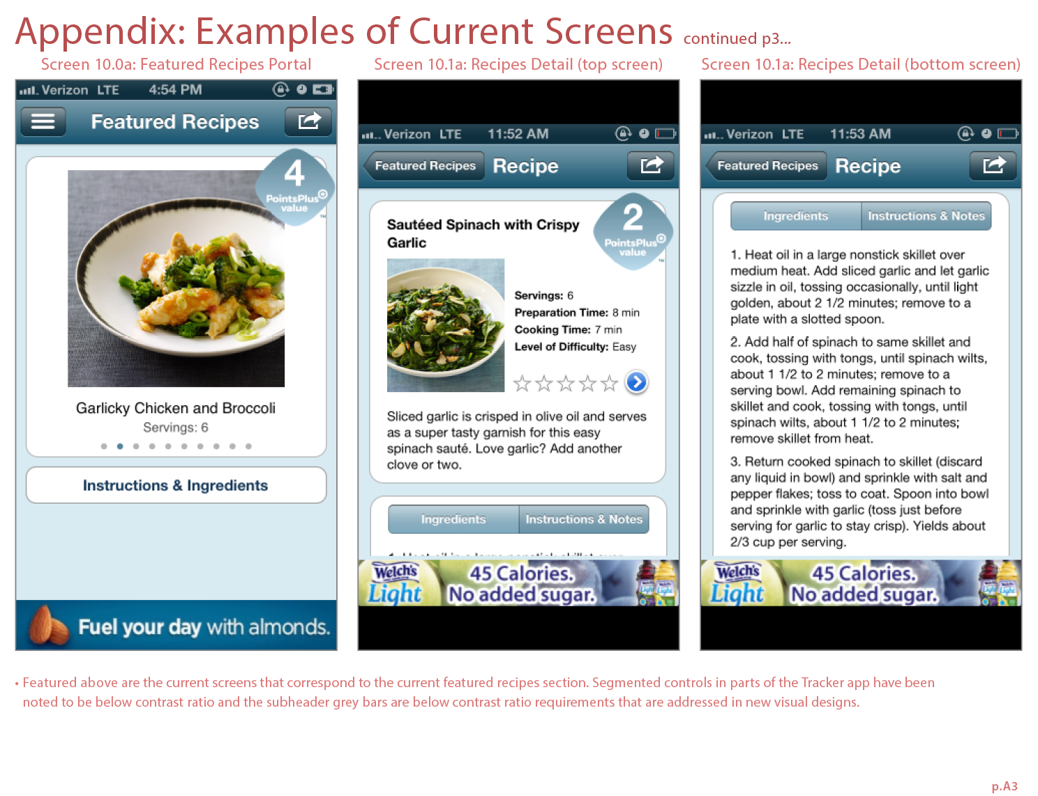
Original recipes-related screens in legacy app (iPhone) that a previous designer created
Original recipes-related screens in legacy app (iPad) that a previous designer created