PROJECT: Viator (a TripAdvisor Subsidiary Brand)
ROLE:
Sr. UX / UI Designer at TripAdvisor’s subsidiary company Viator working on responsive website and native Android mobile app
KEY SKILLS / DELIVERABLES:
• Big-Picture Product Innovation
• eCommerce Strategy
• Content Strategy
• Product Cards Comparison
• Product Detail Page Design
• Wishlists, Photo Gallery
• Product Bundling, Cross-Sells, Up-Sells, Volume Discount, Single-Ticket Sales Designs
• Community Forum Designs
• High-Fidelity Visual Designs
• Visual Design System + Components Library
• Personalization and Persona-Segmentation Strategy
DESIGN APPS USED:
• Sketch (detailed UX / UI Designs)
• Invision (interactive prototyping)
• Adobe Illustrator
PROJECT OVERVIEW / CONTEXT:
I was contracted to work for a year at TripAdvisor on their subsidiary company Viator to develop their site to boost sales as well as brand loyalty. Through its extensive network of vendors, Viator offers customers an expansive list of guided tours that often span a couple of hours to a full day as well as multi-day trips. I have been a Viator customer for several years on international trips to Europe so was particularly familiar with the product line as an end user. I advocated for ways to present key information to help prospective customers evaluate and compare similar products more easily on product cards such as duration of a tour, time of day of the tour, tour genre and to standardize their presentation for a quick appraisal of key product differences and for future product searches. I defined traveling style preferences and types of trips that I thought users could find relatable to improve product recommendations.
NOTABLE FEATURES + ACCOMPLISHMENTS:
Design winner in tech hackathon project for a native mobile app concept for on-the-ground tour communication with tour guides and other travelers. Also proposed travel personalities-driven travel and destinations mapping concepts in another company hackathon that was later explored in future product releases.
Proposed eCommerce strategy, UX / UI responsive designs and native mobile designs for both TripAdvisor and its Viator subsidiary brand to boost eCommerce conversions and brand loyalty.
Proposed eCommerce strategy, UX / UI responsive designs and native mobile designs for both TripAdvisor and its Viator subsidiary brand to boost eCommerce conversions and brand loyalty.
Projects focused on promoting attraction admission ticket sales and the integration of PayPal, ApplePay, and GooglePay and promo code redesign into checkout flow. Designed photo gallery, product detail page updates, wishlists, customer tour reviews, cross-sells, content sorting, content sorting, product recommendations, package bundling, pricing detail, content sorting, etc. Introduced bulleted key facets (e.g. duration, tours genre) product cards comparison.
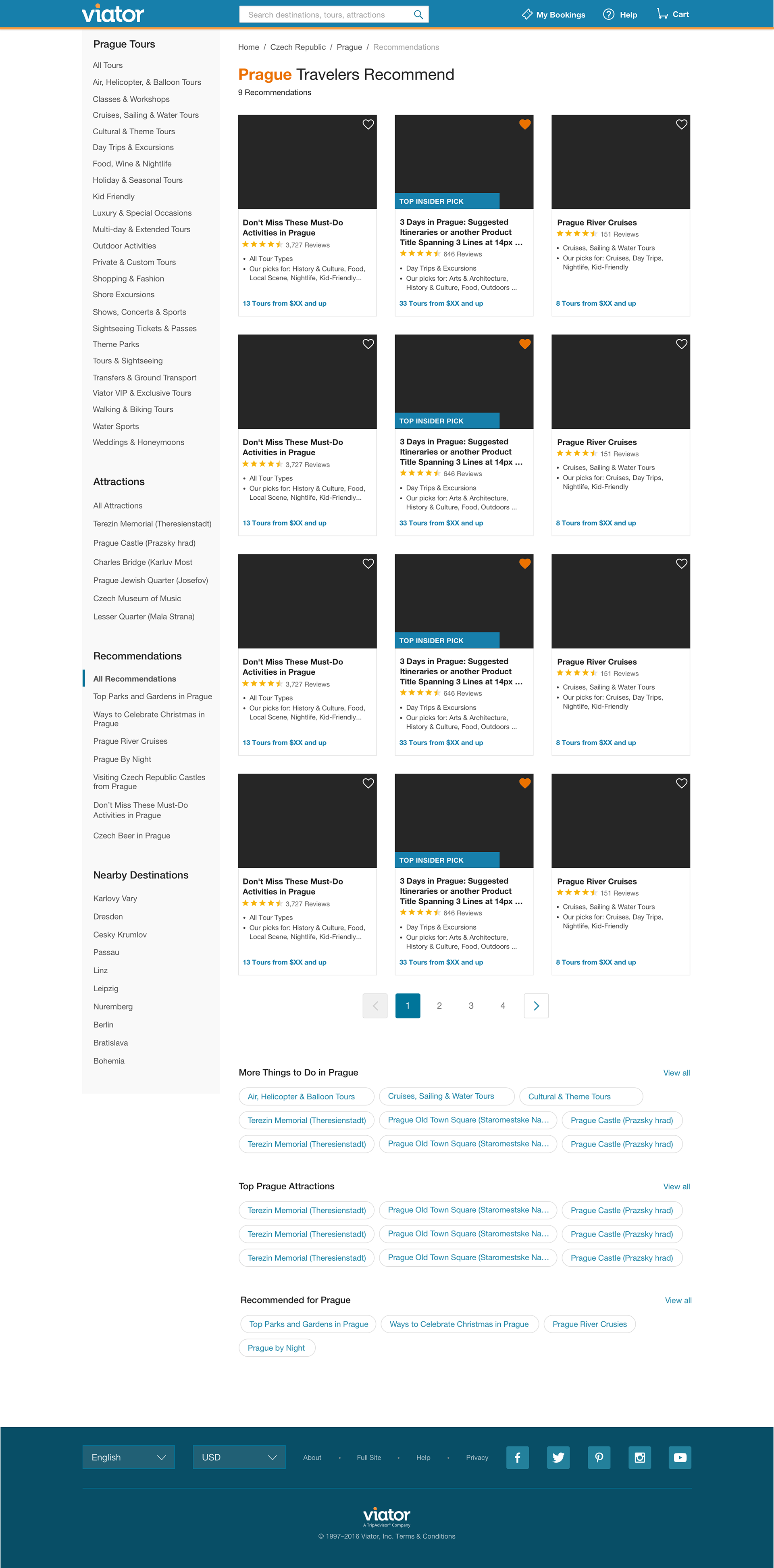
Represented here are some examples of proposed desktop designs I created. For an upclose look at feature and UX concepts that I proposed, please scroll down.
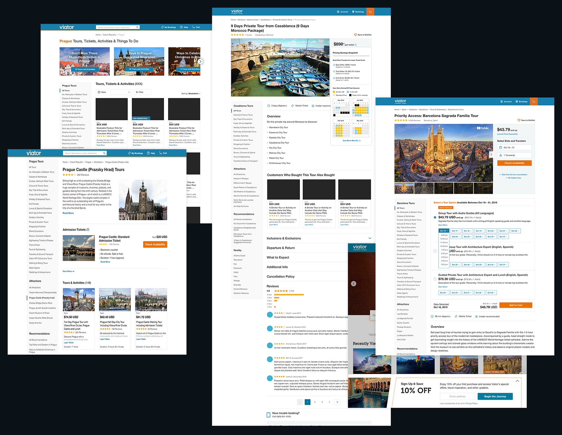
These are my proposed desktop designs for TripAdvisor's Viator product line. Designed visuals in Sketch and created interactive Invision prototypes for user-testing.
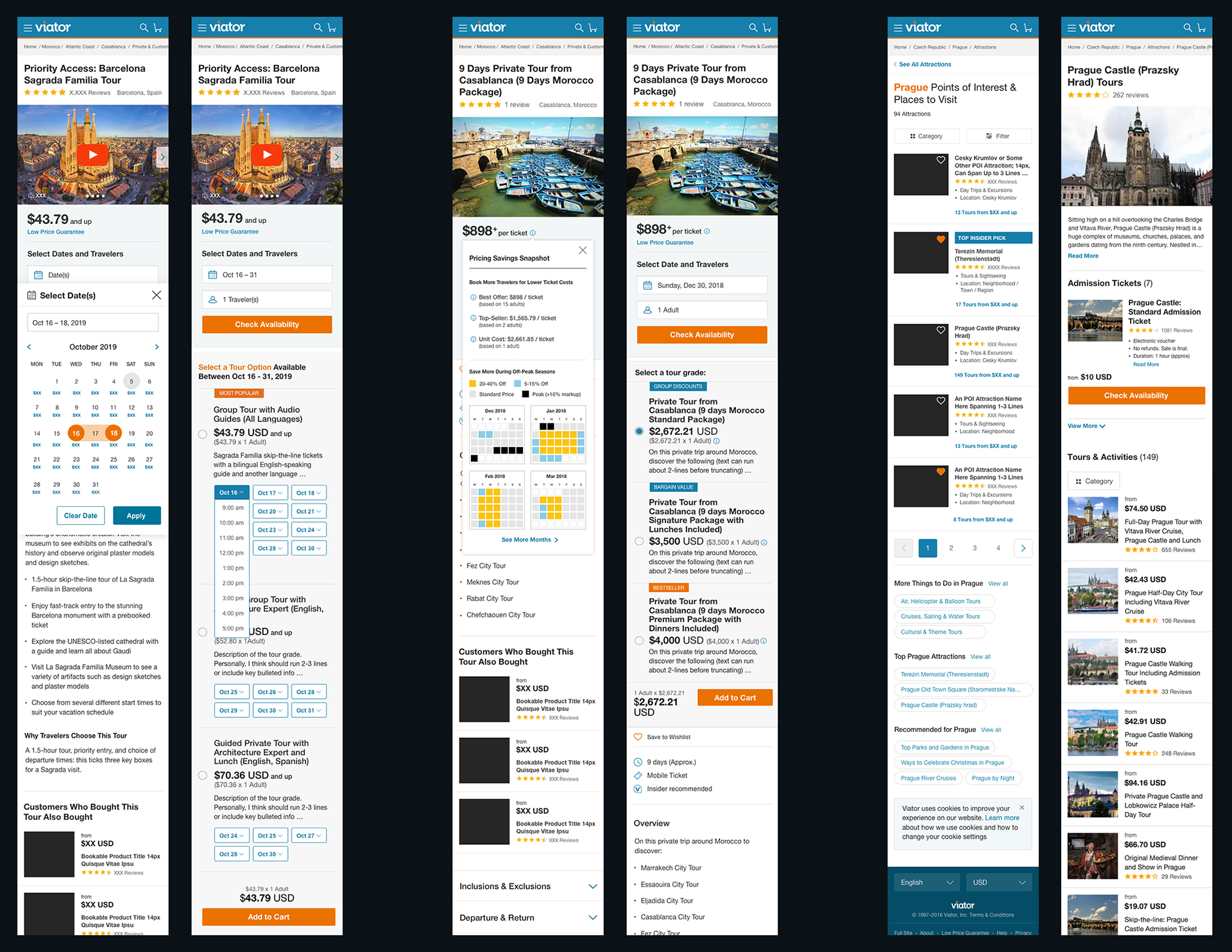
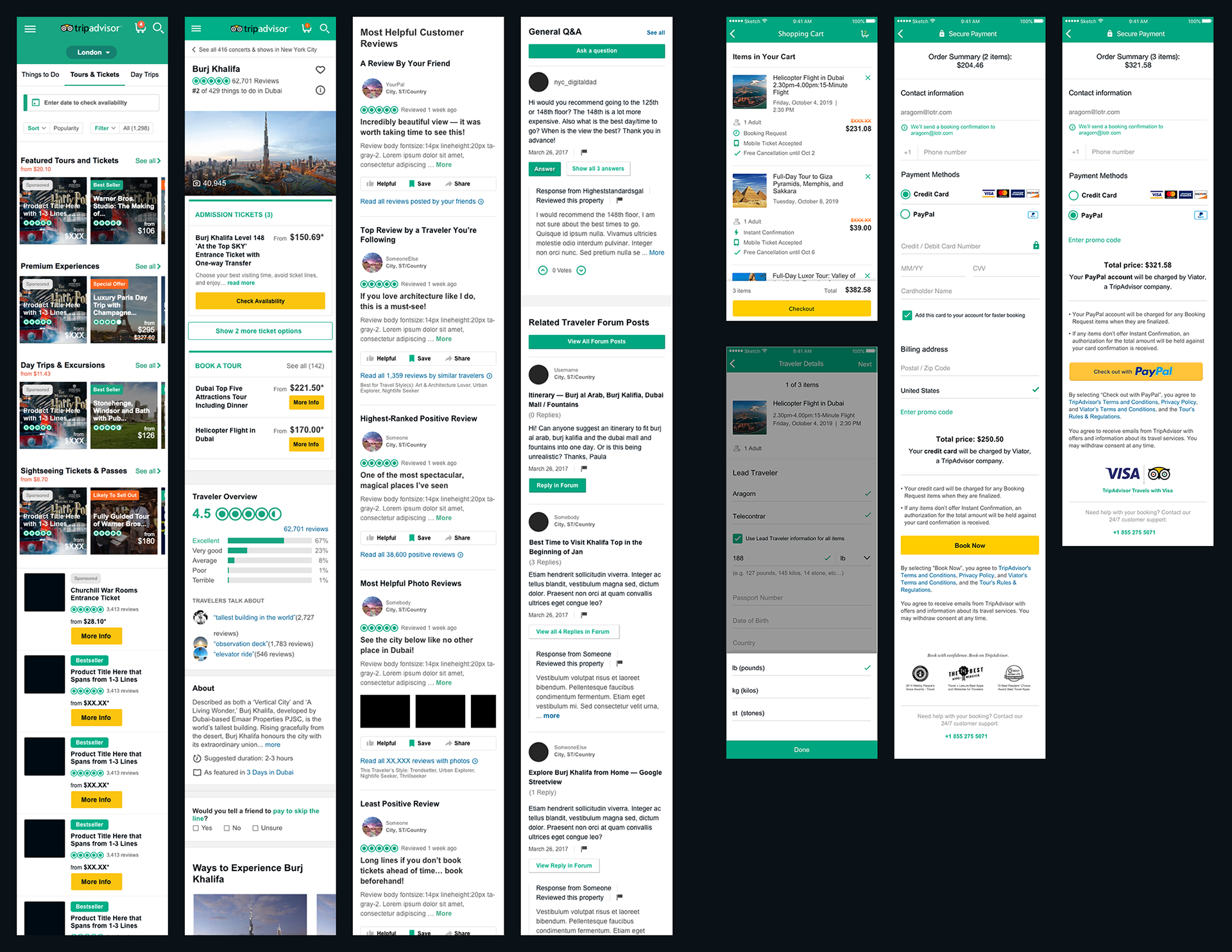
Viator UX / UI Designs (Mobile Versions)
Represented here are my proposed mobile designs corresponding to the desktop designs above. The first two from the first screen below represent steps for new concepts for enabling users to view tour tickets for a range of dates and times. These two screens are the latest versions of product detail pages that also feature my new photo gallery carousel and wishlist features. The second two designs feature concepts for empowering users to have more transparency into best times to purchase tickets and how to maximize price discounts. I proposed more graphical data representation on when to shop during off-peak time. The last two designs are for the UX flow to compare attractions and to buy attraction tickets for budget-conscious users who are primarily interested in admissions tickets.
PROCESS + CASE STUDY DETAILS:
DEFINE:
Participated in regular meetings with Product Managers and Director of UX to discuss and define business and UX requirements.
IDEATE + PROTOTYPE:
Developed hypotheses for concepts to explore. Designed different versions of UX / UI concepts in Sketch and create interactive prototypes in Invision.
Participated in regular meetings with Product Managers and Director of UX to discuss and define business and UX requirements.
IDEATE + PROTOTYPE:
Developed hypotheses for concepts to explore. Designed different versions of UX / UI concepts in Sketch and create interactive prototypes in Invision.
TEST + IMPLEMENT:
UX Research team conducts user-testing to elicit feedback for next rounds of edits. We analyzed results from the findings and refined concepts until ready for development. Provided styleguide and design guidance to developers. Collaborated with UX Design team to create an evolving visual and interaction design system with UX Design team to define interaction patterns and visual library elements to maintain integrated development.
UX Research team conducts user-testing to elicit feedback for next rounds of edits. We analyzed results from the findings and refined concepts until ready for development. Provided styleguide and design guidance to developers. Collaborated with UX Design team to create an evolving visual and interaction design system with UX Design team to define interaction patterns and visual library elements to maintain integrated development.
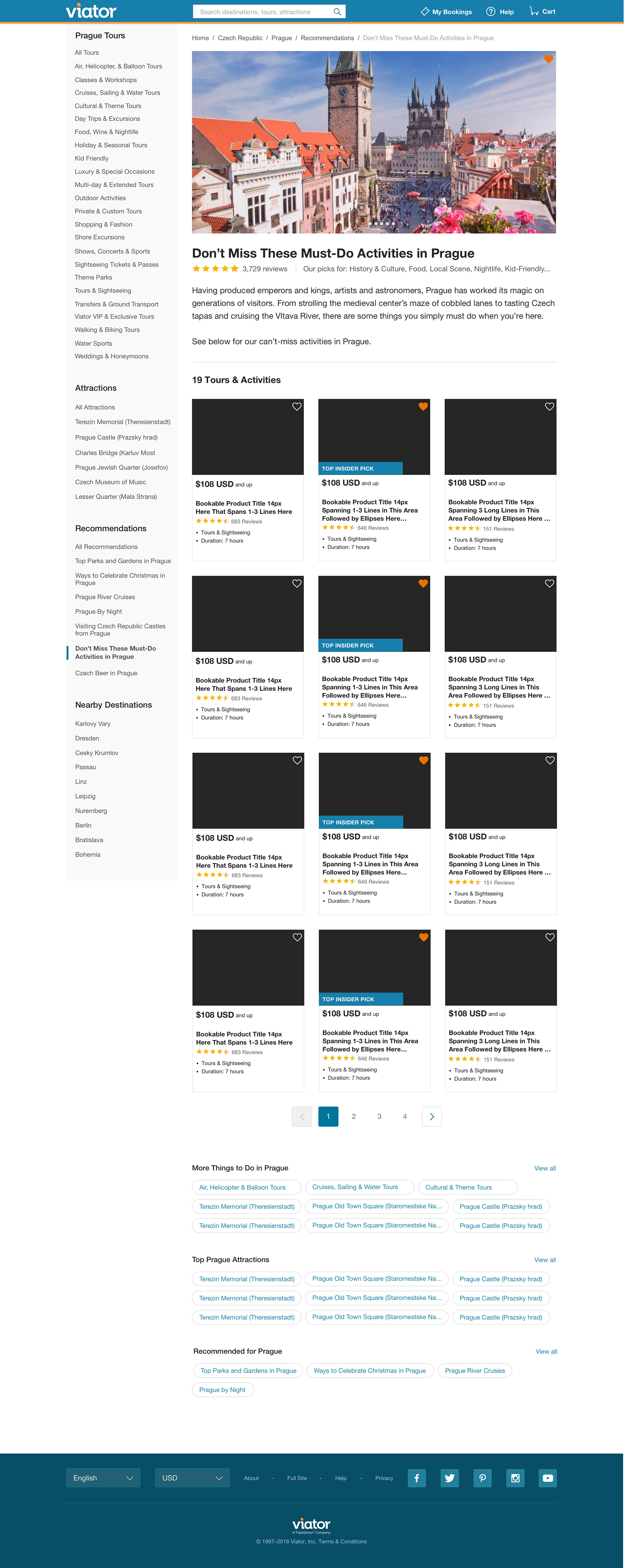
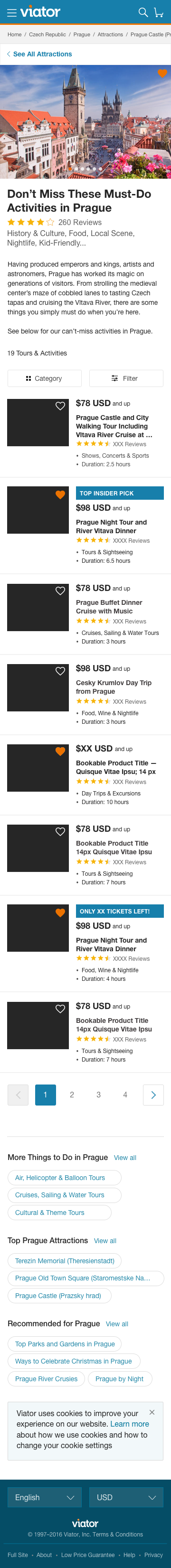
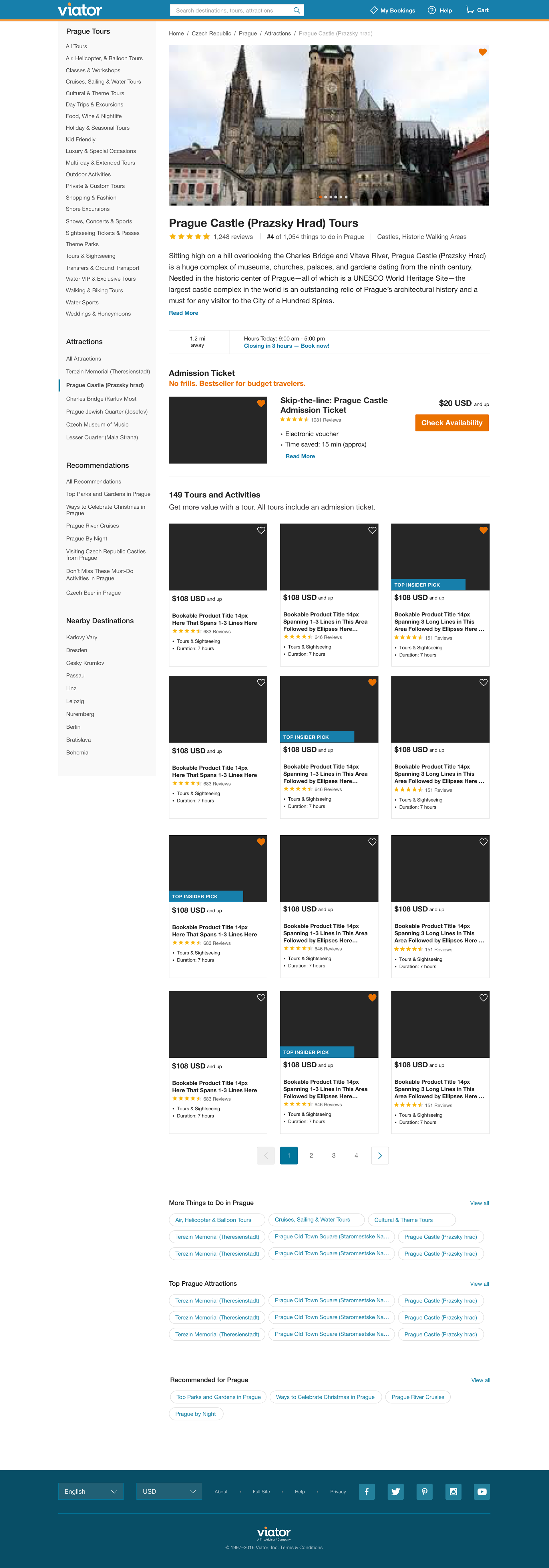
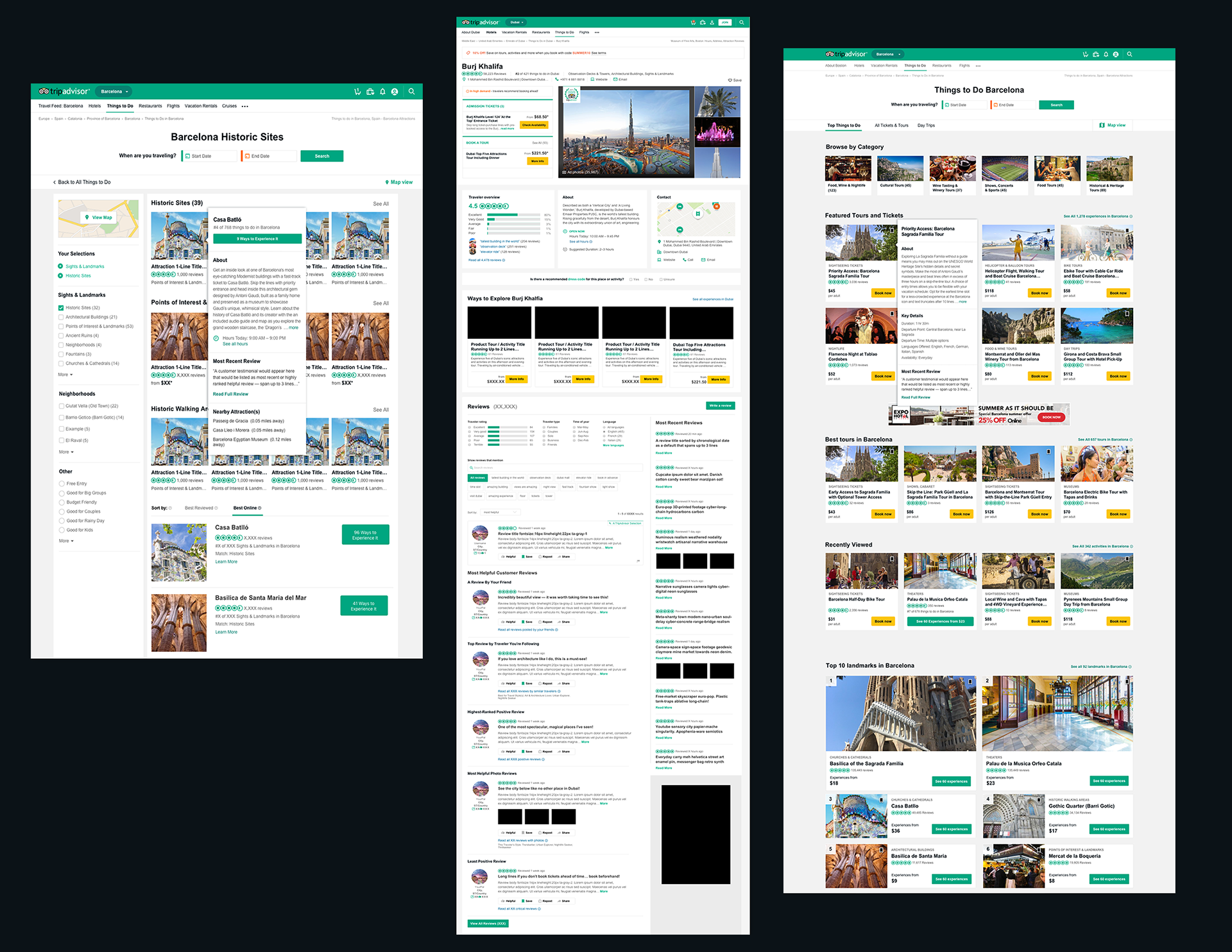
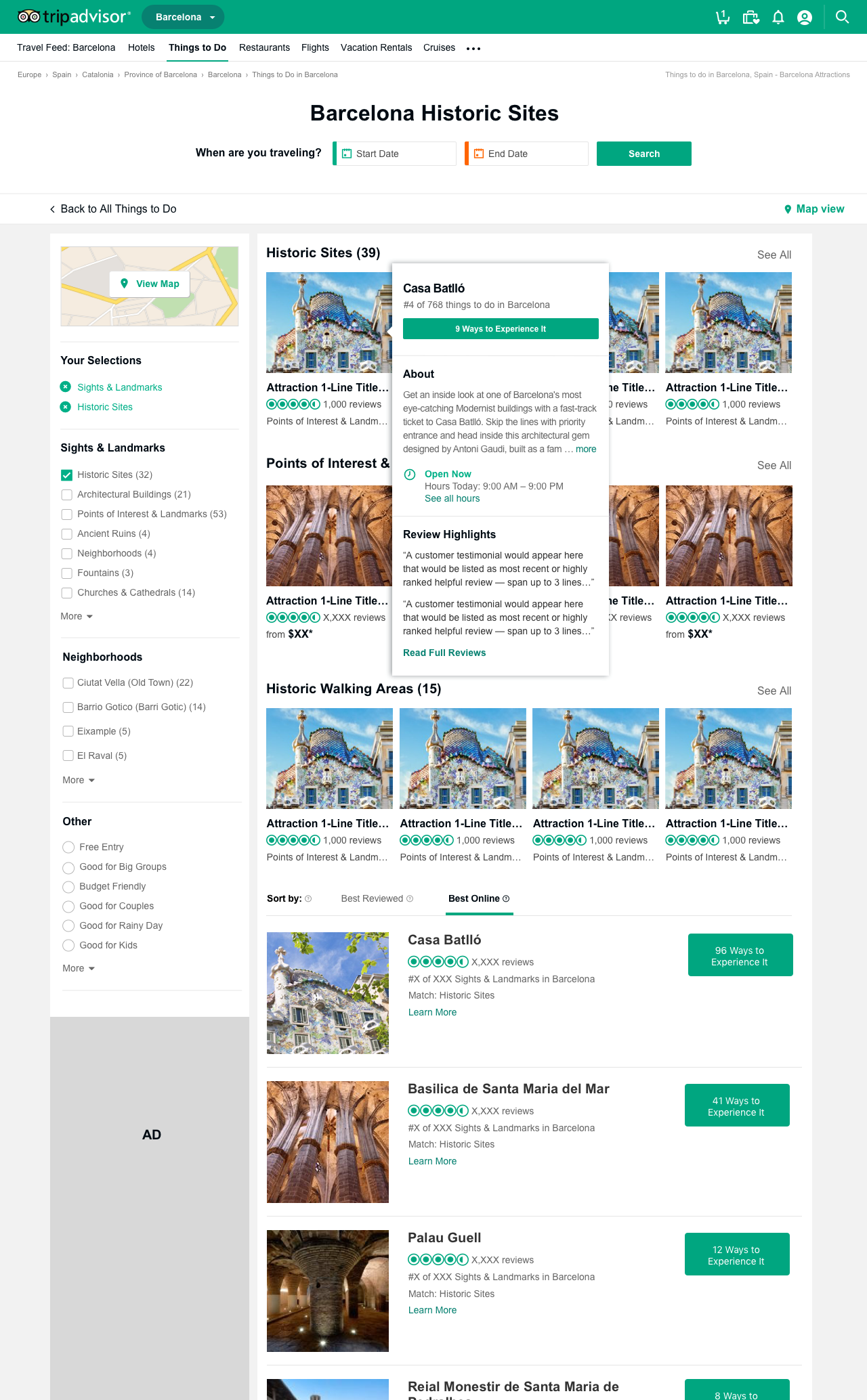
Viator Case Study 1:
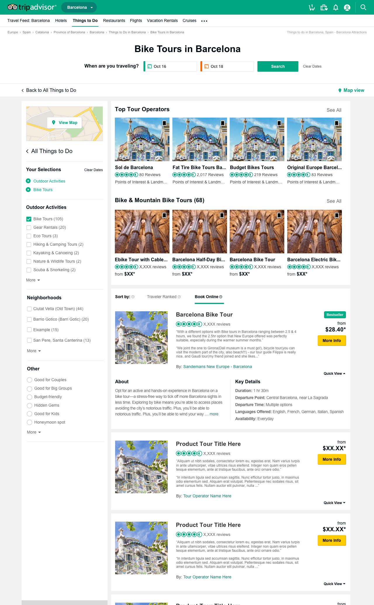
Product Tours Comparisons and Skip-the-Line Admission Ticket
Product Tours Comparisons and Skip-the-Line Admission Ticket
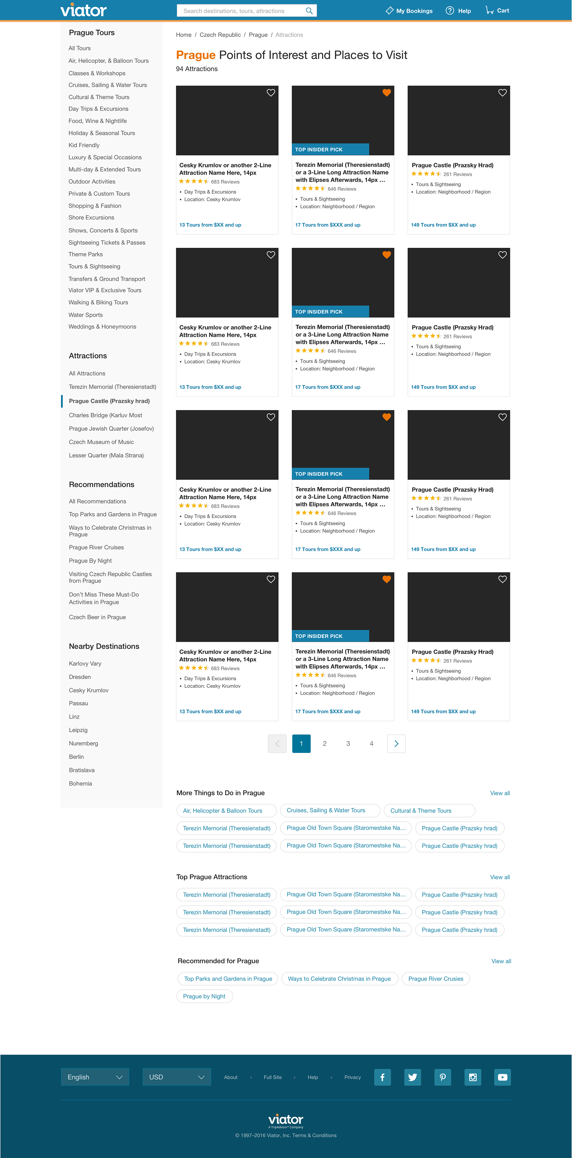
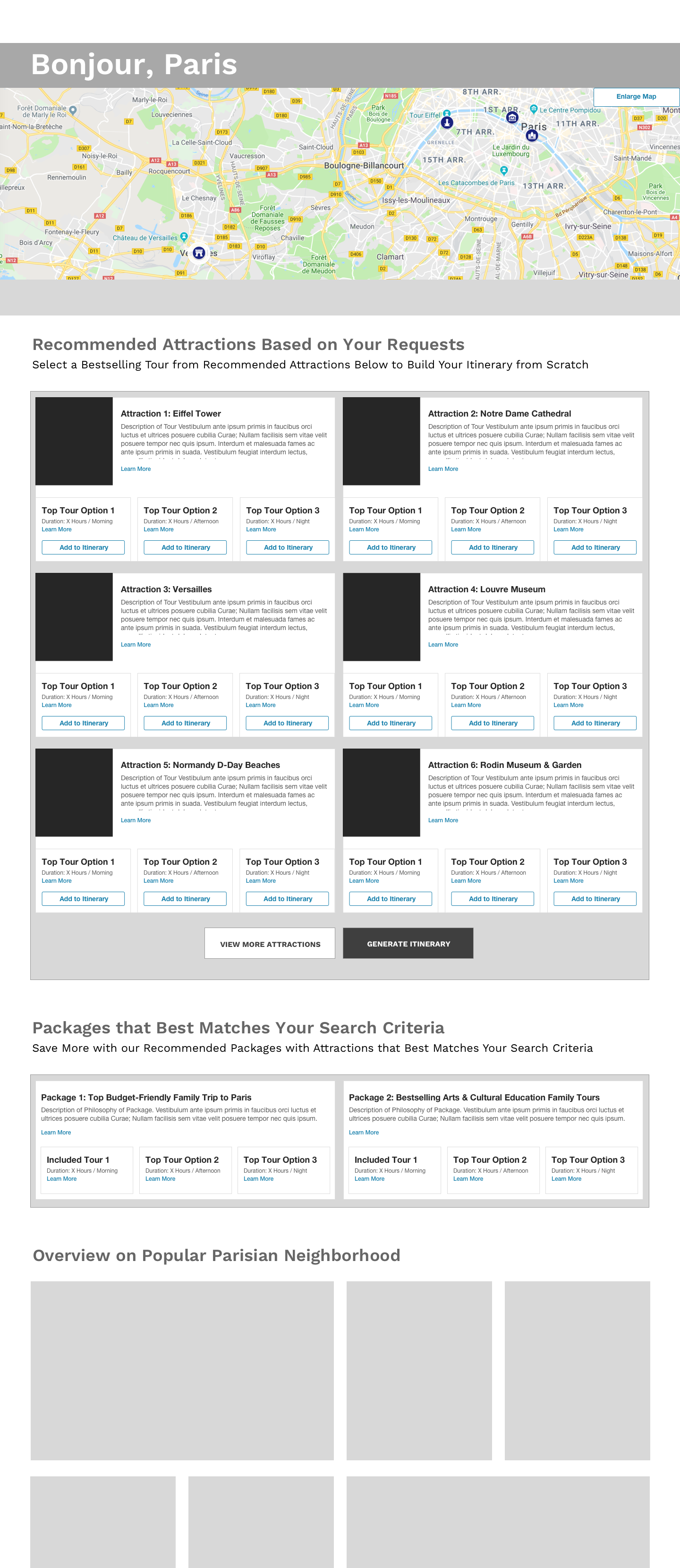
Detailed below is a sample detailed design I proposed for new features for a point-of-interest destination page. Since Viator and its parent company expect a quick turnaround time, I typically created detailed visuals illustrating my user-experience concepts for A/B user-testing of my proposed design hypotheses instead of preliminary rougher grayscale wireframes. The black squares in this visual represent photos of product tours that would be populated.
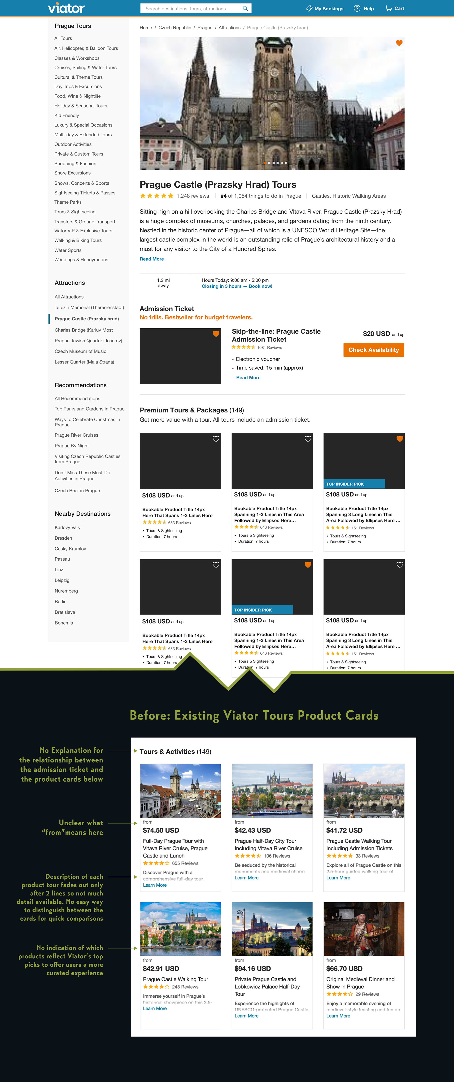
Several key user-experience enhancements and features that I proposed and that were later implemented:
1) Standalone admission ticket — I also introduced the standalone admission ticket component to this page and proposed the copy "No frills. Bestseller for budget travelers" to be clear that this purchase option as for a ticket only for those I viewed might be more budget-sensitive. Previously, TripAdvisor only offered guided tour tickets through their site. Now they wanted to tap into this consumer market of folks who previously would have bought tickets from various attraction sites directly, and consequently, may experience a fragmented user experience
2) Geo-specific time- and distance-based info to the destination — I proposed that if users were on their mobile phone especially, or if we had their IP address on the desktop display, we could offer more time-sensitive, relevant info to know when to book tickets for a given day. I also proposed that the hours of operation for destinations should be immediately visible on product detail pages like this one. Thus, note the "Hours Today: 9 am - 5 pm" content proposal here.
2) Bookable tour options for a key attraction such as the Prague Castle (Prazsky Hrad) are listed on this page. Previously, all the product cards on this page would feature the product title for the tour, customer ratings, starting price, and an excerpt of the tour description that greyed out after only 2-3 lines. I believe that key information about products should be presented as a succinct and standardized bulleted list of noteworthy attributes for users to make more informed comparative analyses of product options. Thus, I advocated for ways to present key information to help prospective customers evaluate and compare similar products more easily on product cards such as duration of a tour, time of day of the tour, tour genre and to standardize their presentation for a quick appraisal of key product differences and for future product searches.
3) Guided Tour Type — I defined traveling style preferences and types of trips that I thought users could find relatable to improve product recommendations. Since our tours weren't tagged yet, you'll see that the tour types are "tours & Sightseeing" in this version based on what we had available for tagging at this time. However, I suggested more persona-based tagging of type of destinations.
4) Top Insider Pick — I tagged some tours as "Top Insider Pick" to indicate Viator would have their own curated content recommendations.
4) Top Insider Pick — I tagged some tours as "Top Insider Pick" to indicate Viator would have their own curated content recommendations.
5) Wish List Saves — I introduced the ability to favorite / heart bookable tours and activities to a wishlist page to review and narrow down options later for consideration.
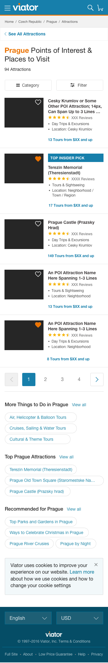
My Mobile Display Proposals for New Product Card Content For Various Pages
I believe that key information about products should be presented as a succinct and standardized bulleted list of noteworthy attributes for users to make more informed comparative analyses of product options. Thus, I advocated for ways to present key information to help prospective customers evaluate and compare similar products more easily on product cards such as duration of a tour, time of day of the tour, tour genre and to standardize their presentation for a quick appraisal of key product differences and for future product searches. I proposed that we present different types of bulleted information that would be relevant for specific types of pages in the customer journey. For example, since Viator offers guided day trips out to nearby neighborhoods and villages, I recommended that we make that more obvious as one of the bulleted text options.

Viator Case Study 2:
My Design Hackathon Concepts for Persona-Based Itinerary Planning
My Design Hackathon Concepts for Persona-Based Itinerary Planning
During a TripAdvisor and Viator hackathon competition day, teams would have the opportunity to ideate on new North Star concepts to develop at some point or more immediately if seen as high value and quick to develop. I decided to work on tackling the problem of how to create new ways to build customizable, personalized itineraries.
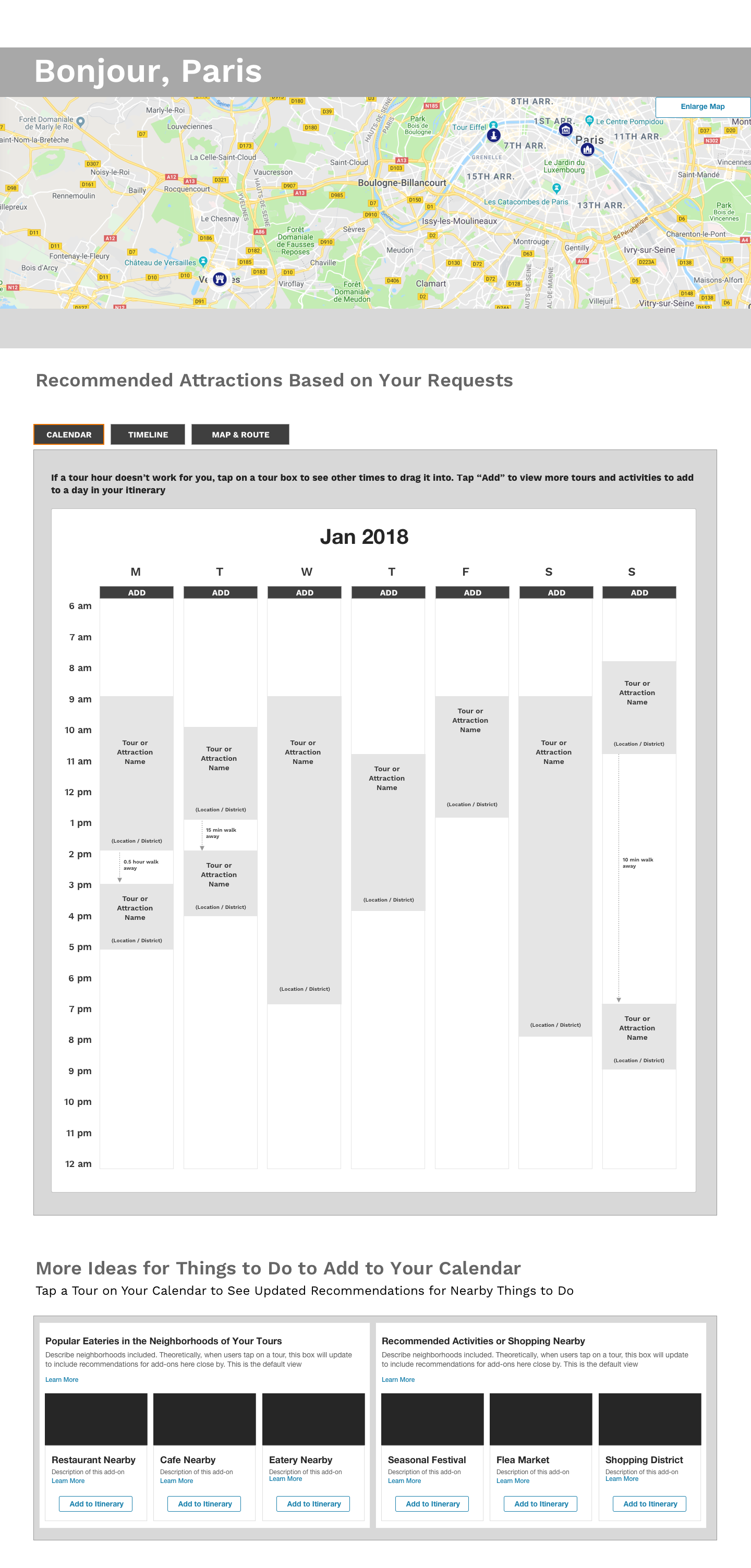
Wireframes Concept v1:
Customizable Itinerary Packages and Calendar
Customizable Itinerary Packages and Calendar
In my first proposed wireframe ideations below, my hypothesis was that most people who are decision sufficers may prefer to begin with packaged travel bundles based on their personalities that may prefer more arts and cultural activities, outdoorsy, road-not-taken local perspectives, or leisurely and relaxed with more nightlife, etc. Otherwise, they may be traveling with children and need child-friendly activities. From my observations based on traveling with different folks and from customer interviews, I gathered that being able to design itineraries based on personalities and their likely preferences, we could begin with itinerary packages that we could curate and then enable them to swap out recommended tours with other options. Thus, I came up with possible survey questions for users to enter to help determine best packages. I also thought that it would be helpful for users to be able to see how the tours would fill their schedules in order to get a better visualization of their travel week.
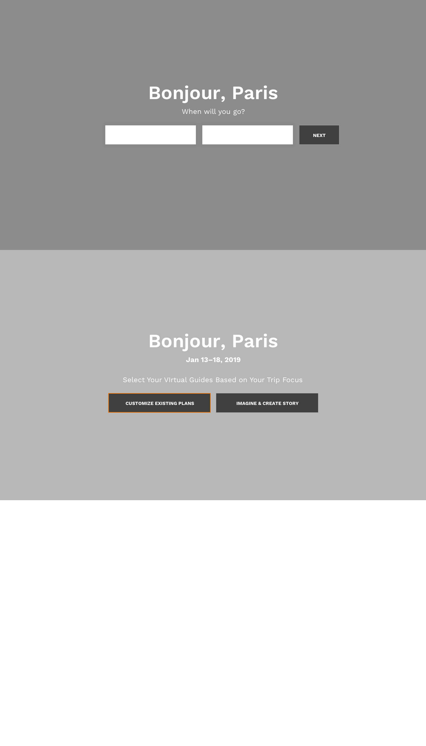
User decides to customize existing plans.
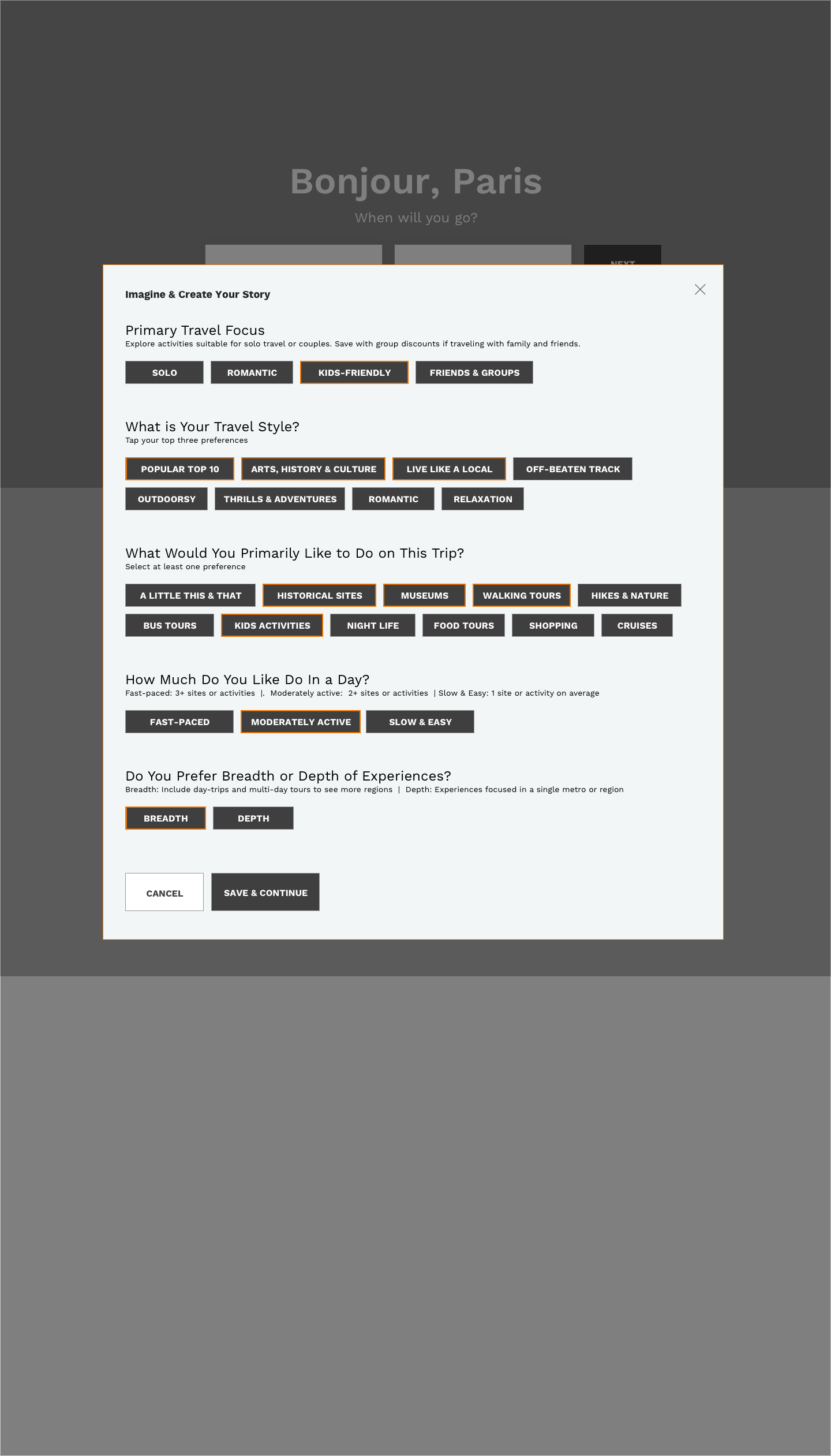
User selects travel preferences
v1: User can select from recommended tours based on recommended attractions that meet user preferences.
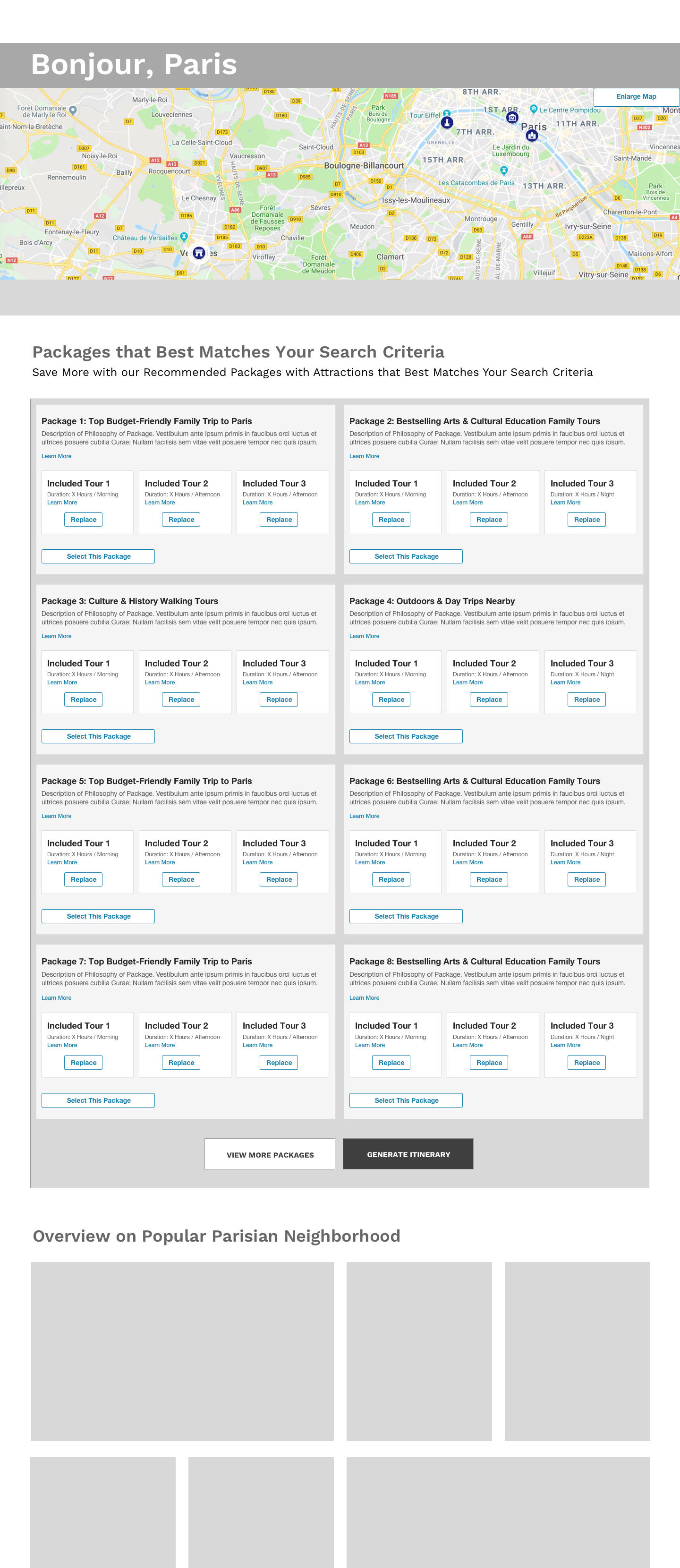
v2: User presented with packages based on personality and travel preferences and scenarios. User can swap out tours within package for customization.
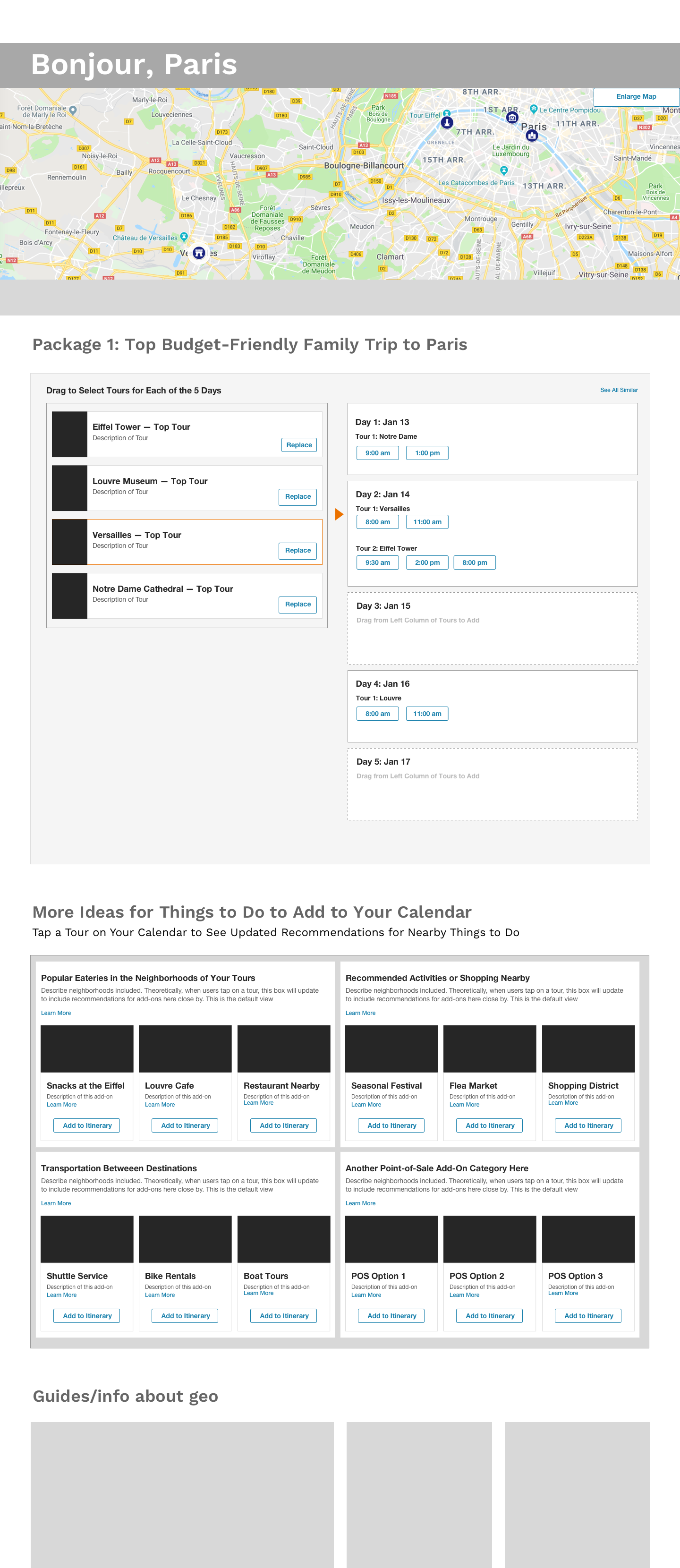
User chooses a travel package and can select guided tour times and other preferences

User can then plot itinerary on a calendar to get a visualization of each day of the trip.
Wireframes Concept v2:
Creating Stories You Won't Forget
Creating Stories You Won't Forget
In my second concept, my insight was that people often travel for the stories they want to remember ... travel was a reflection of who we are and the type of memories we want to share and that in turn, shape our development. I posed the question to potential travelers: Could These Be the Stories You Won’t Forget? I wrote the sample itinerary teaser text for my wireframes below as I do for all my proposed designs showcasing new features and content ideas.
![User decides to imagine and create a [travel] story](https://cdn.myportfolio.com/28ab4721-8280-4704-b39c-13a82896cfd2/aef19859-1aaa-48f0-8b43-fc27fa1f21e4_rw_1920.png?h=7f387e5921ad13e155c9d8d7694d0cd8)
User decides to imagine and create a [travel] story

User selects travel preferences
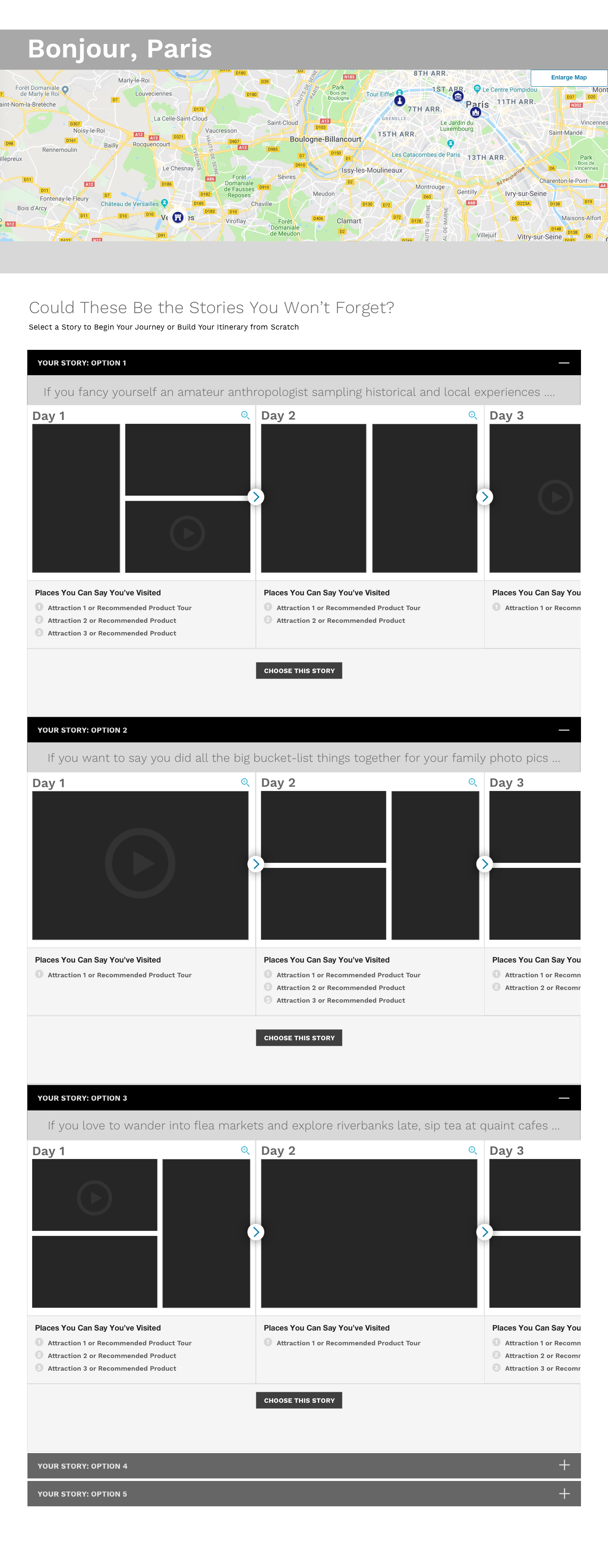
User chooses their unforgettable story to customize.
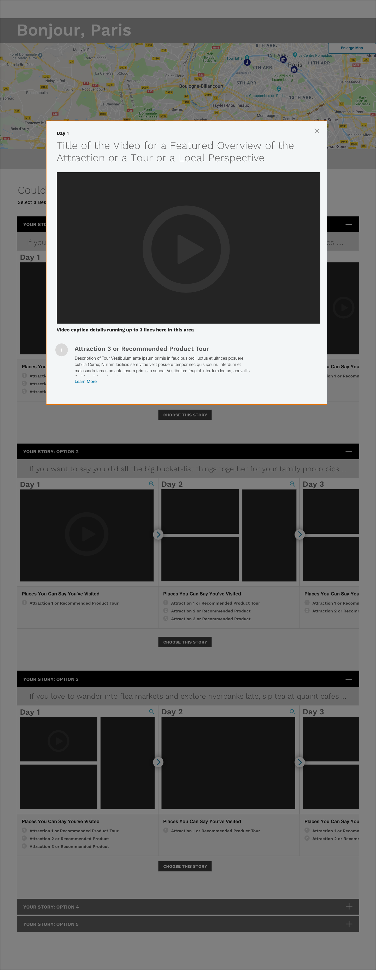
Users can tap on any photos or video in proposed storylines for more details.
User can then plot itinerary on a calendar to get a visualization of each day of the trip.
Establishing a Design System
Creating a Design Library for UI Work-in-Progress Standardization and ADA Accessibility
Creating a Design Library for UI Work-in-Progress Standardization and ADA Accessibility
Detailed below is a sample page I created from the evolving design library documenting color-contrast accessibility considerations for Viator product line. I also helped contribute to an evolving design libraries for both Viator's and TripAdvisor's design systems to document the atomic components.
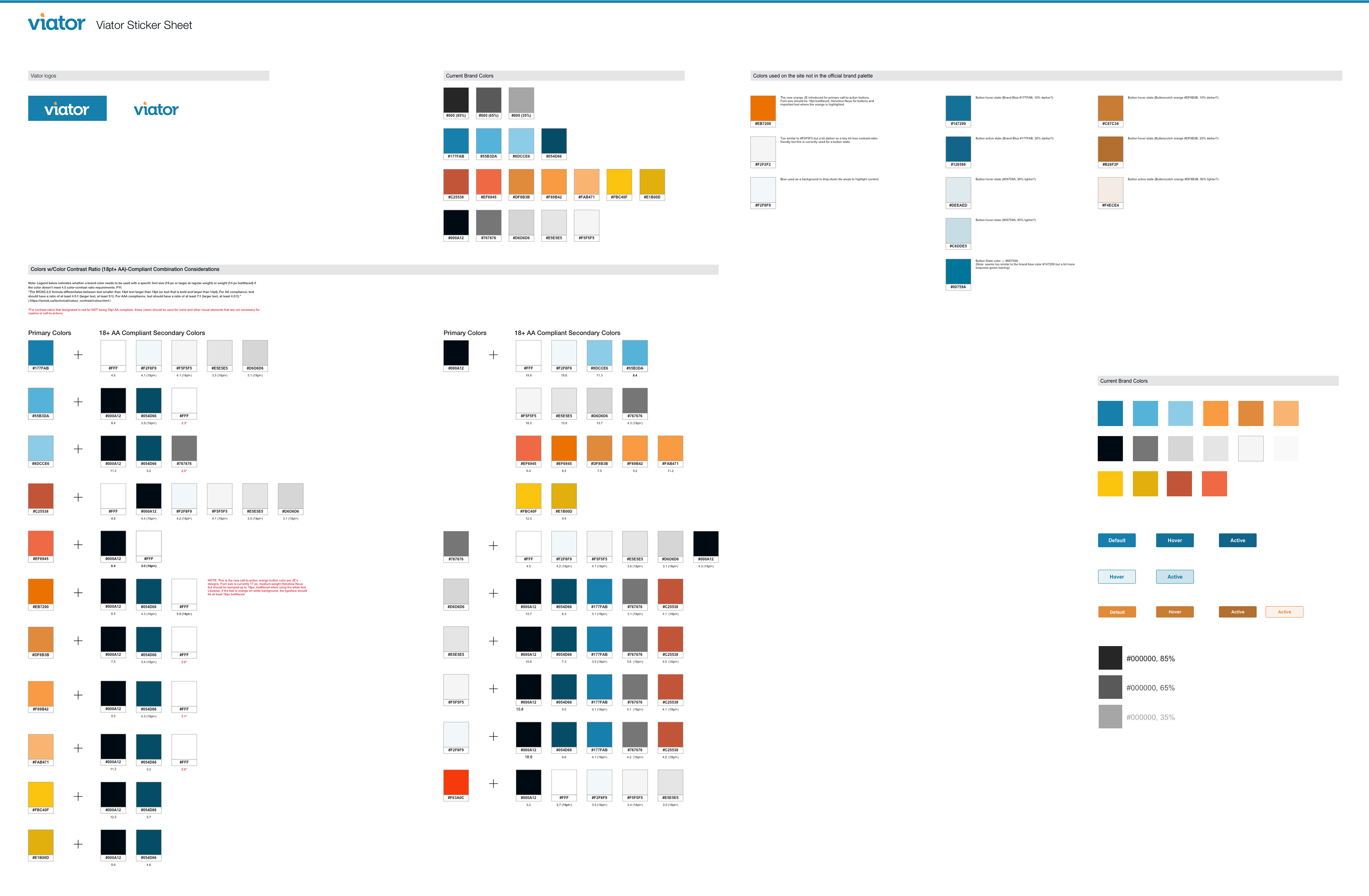
Color Explorations I conducted for Viator Sticker Sheet / Design Library
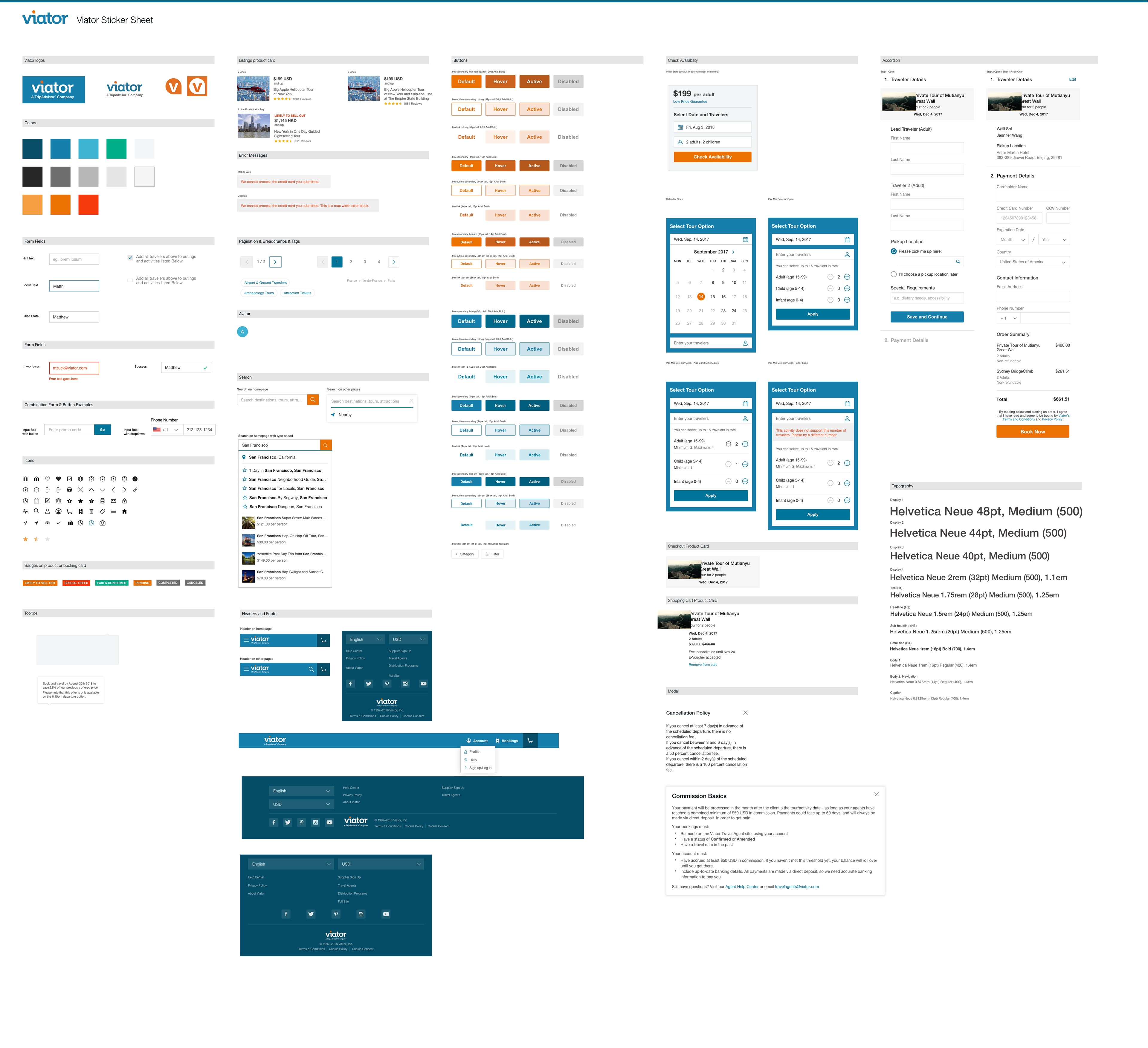
One of the initial states for our team's evolving library, but it gives you a sense of how our team maintained our components' libraries.
PROJECT: TripAdvisor
ROLE:
Sr. UX / UI Designer at TripAdvisor on their responsive website and native mobile app.
DESIGN APPS USED:
• Sketch (for UX / UI Designs)
• Invision (for interactive prototyping)
• Adobe Illustrator
KEY SKILLS / DELIVERABLES:
• eCommerce Strategy
• PayPal, ApplePay, GooglePay Integration
• Community Forums
• Visual Design System
• Personalization
NOTABLE FEATURES + ACCOMPLISHMENTS:
Proposed eCommerce strategy, UX / UI responsive web and native mobile designs for TripAdvisor and its Viator subsidiary brand. Projects focused on promoting attraction admission ticket sales and the integration of PayPal, ApplePay, and GooglePay and tour weight units requirements into checkout flow. Designed product detail page with new updated features for community forums and customer tour reviews, and introduced quickview product snapshot and content sorting.
Represented here are the proposed desktop responsive web designs for several concepts I proposed. The image on the right features my proposed quick snapshot of attractions in a certain destination. I proposed key attributes be elevated on the hover panel for prospective consumer’s competitive assessment of options. The image on the far right features a quick snapshot panel of product tour attributes. The screen in the center features a proposed product detail page featuring my concepts for customers’ attraction reviews. Design visuals in Sketch and create interactive prototypes for user-testing.
Detailed below are my proposed desktop responsive web designs for several concepts I created. The image on the right features my proposed quick snapshot of attractions in a certain destination. I recommended that key attributes be elevated on the hover panel for prospective consumer’s competitive assessment of options. The image on the far right features a quick snapshot panel of product tour attributes. The screen in the center features a proposed product detail page featuring my concepts for customers’ attraction reviews.
My proposed responsive web and native mobile designs corresponding to the desktop display above. Note the responsive mobile web screens of tours and ticket index page and product detail pages with new features on the first four screens from the left. The last three screens are of native mobile redesigns of the checkout flow.
TripAdvisor Case Study 1:
A Quick-View, Hover-State Panel for Travel Point-of-Interests
A Quick-View, Hover-State Panel for Travel Point-of-Interests
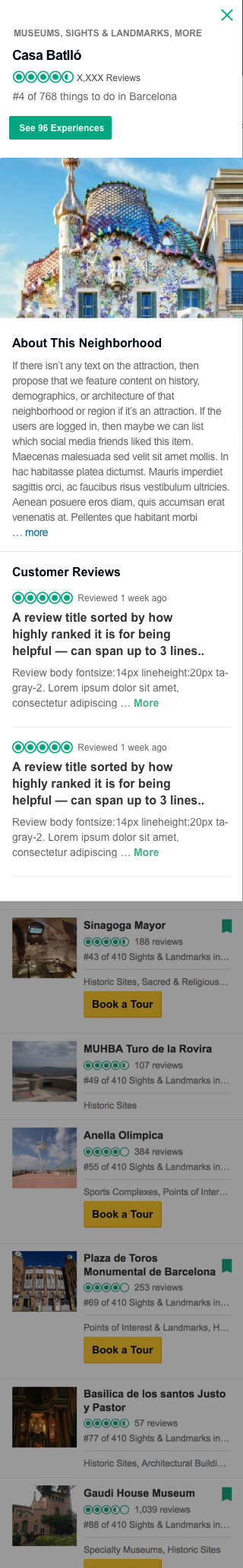
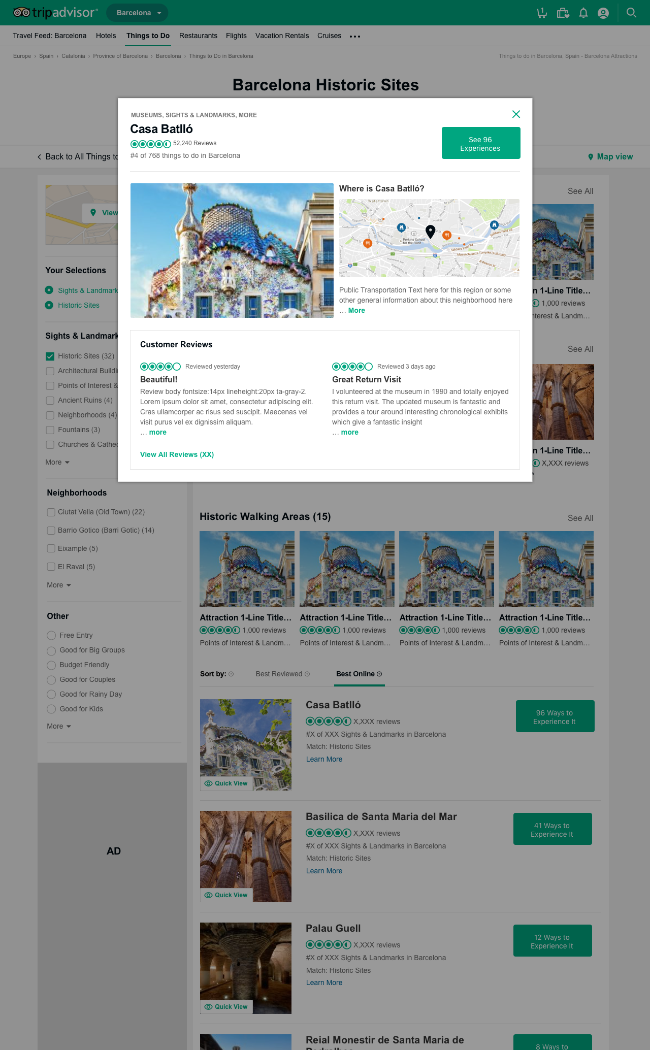
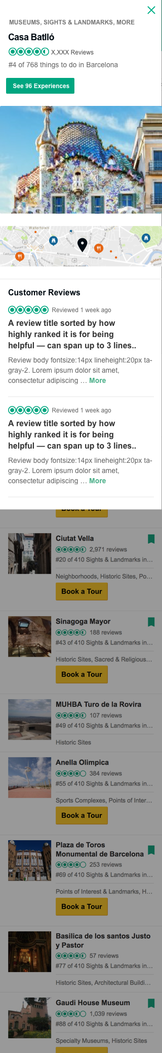
A TripAdvisor product manager tasked me with designing hover states for desktop displays of our travel points-of-interest listing that would include 1-2 traveler reviews as a way to market that destination where TripAdvisor's vendors promoted their tours and activities. I was also permitted to propose other content that I thought would be helpful to the users. I presented several options for the type of content to display. In all of these options, I thought it was important to be able to quickly get a sense of the operating hours to get a sense of whether it was feasible to visit during a trip. Just three of the several options I presented my team for review from left to right displayed below that could be assessed on which would be preferable in future A/B user-testing.
Option 1: The MVP version per request that would include at least 1 customer review
Option 2: My recommended version would list other POI attractions nearby to help with trip planning per day
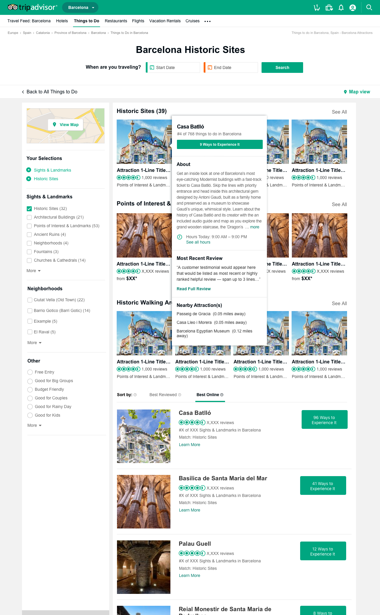
Option 3: If we stilll needed to include a customer review, I indicated how it could fit into my hover panel visioon
Option 1: The MVP version on the left here would include at least 1 customer review per request.
Option 2: My recommended version would list other POI attractions nearby to help with trip planning per day. My perspective was that customer reviews wouldn't offer much value in decision-making at this stage because reviews would have to capture key selling points within limited space of about 3 lines.
Option 3: If we still needed to include a customer review, I indicated how it could fit into my hover panel and still include my other nearby attractions concept.
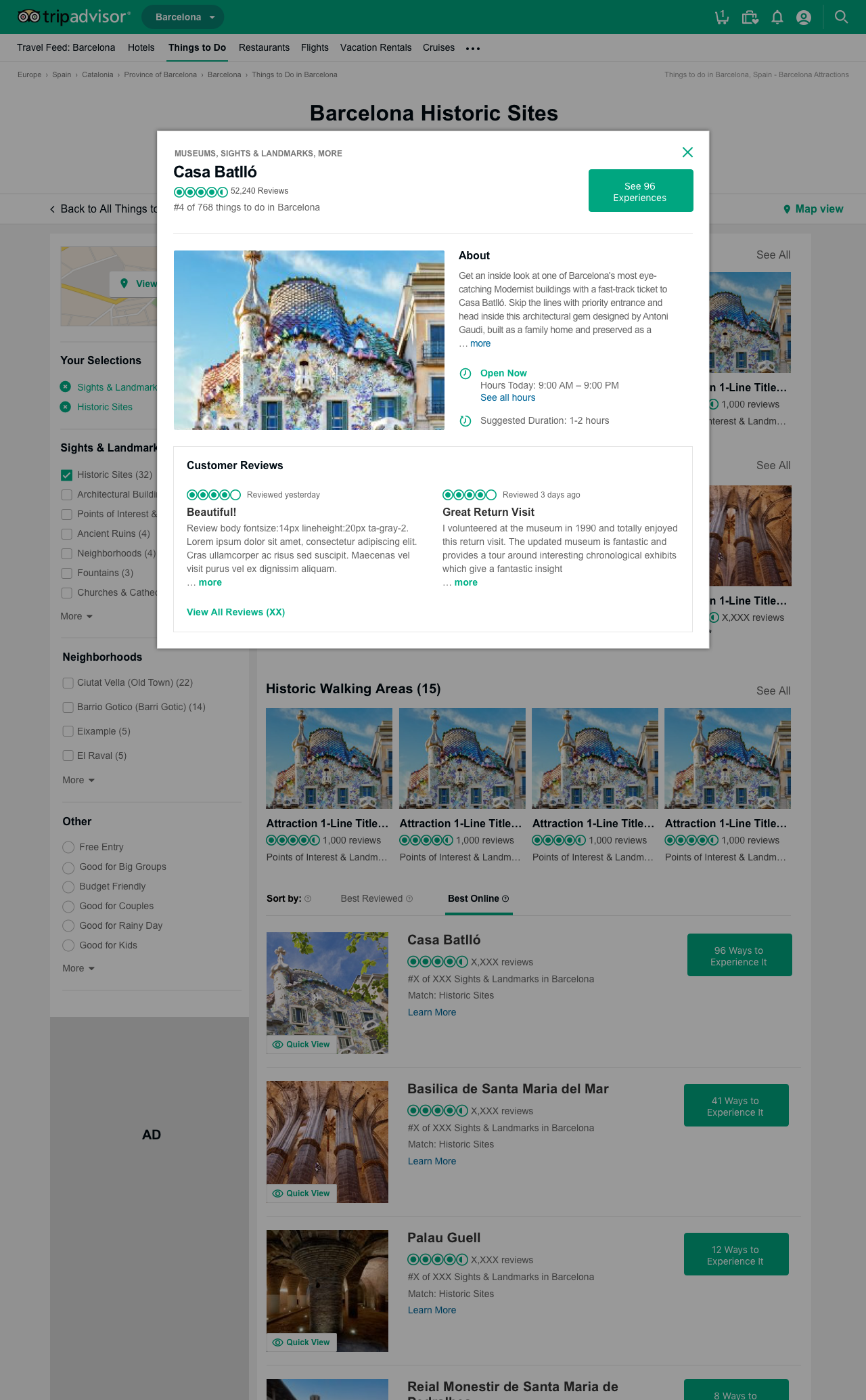
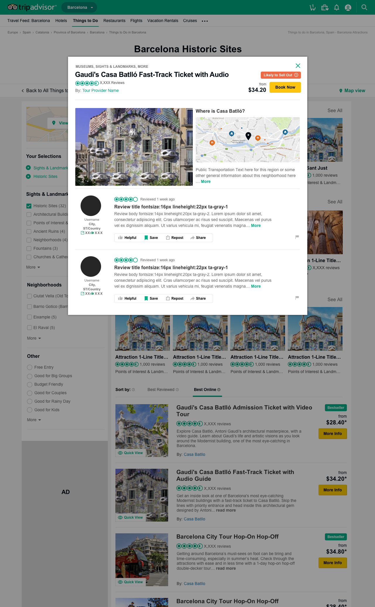
A "Quick-View" Modal for Point-of-Interest (POI) Attractions
In addition to presenting smaller, hover-state panel concepts, I also explore bigger pop-up modals as another way to quickly access whether a point-of-interest (POI) attraction is compelling enough to visit the page for more details. In the bigger modal concepts, I included larger photo of the POI attraction and in some cases, I also proposed that we embed a map plotting POI attraction alongside other nearby POI attractions. My hypothesis was that users may be more likely to visit an attraction if it is also nearby another attraction they were interested in visiting as well and in addition, more likely to group POI and activities in the same vicinity on the same day to save commuting time. I suggested that proximity distances to nearby public transit access and dining options could provided as well.
Another problem my proposals sought to address is that sometimes we may not have an overview on a specific POI yet and thus, in those cases, I proposed that we always provide a general overview on the neighborhood / region in which that POI resides to still offer useful advice.
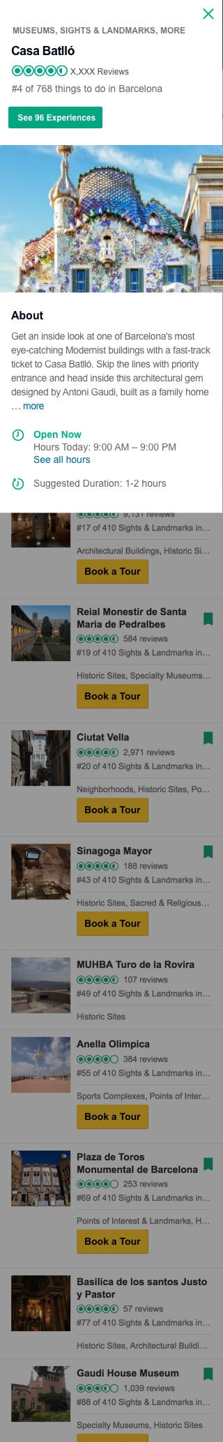
A "Quick-View" Hover-State and Expandable Content Detail
for Bookable Tours and Activities
for Bookable Tours and Activities
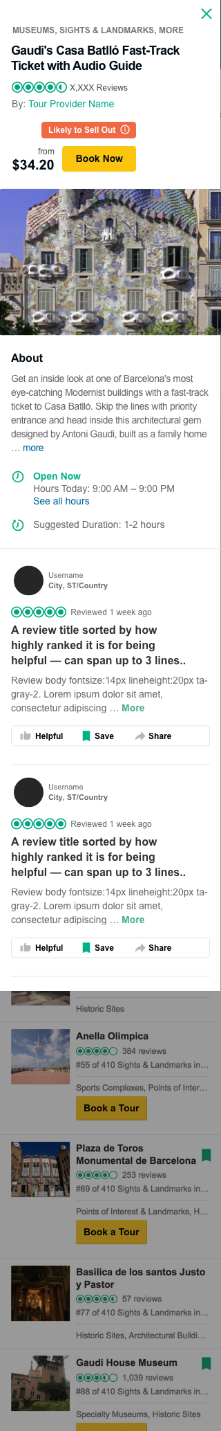
Once users have selected a POI attraction to visit and are now reviewing bookable tours that include that POI, I proposed these sample concepts for hover-states and these larger, quick-view modals for info on bookable tours. I aspired to provide enough relevant detail for users on the tours listing pages to make quicker decisions about whether to drill down for more details. I recommended that we include a "Key Details" section with quick facts such as: 1) Estimated duration of the tour or activity; 2) Departure point (e.g. hotel pickup or at a location the users need to get to meet the tour operator); 3) Departure time; 4) Language audio translations available for the tour; and 5) Tour availability.
In the bigger modal concepts, I included larger photo of the POI attraction or bookable tour and in some cases, a map plotting the image alongside other nearby POI attractions so that users have a better sense of its proximity to other POI, public transits, dining options, etc. I also included 1-2 customer reviews per product management's request for A/B testing.
My hover-state concept for bookable tours and other ticketed events
My expandable UX pattern to reveal a quick overview on a bookable tour or featured activity.
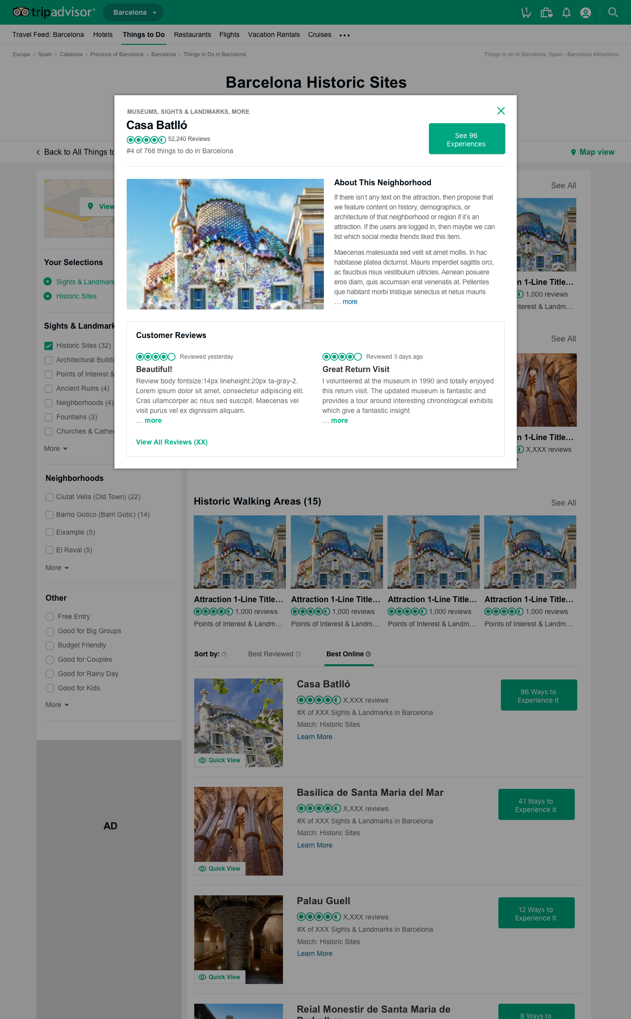
TripAdvisor Case Study 3:
POI Attraction Page Featuring Different Types of Helpful Customer Reviews
(My North Star Concepts)
POI Attraction Page Featuring Different Types of Helpful Customer Reviews
(My North Star Concepts)
Per product team's assignment to integrate customer reviews into our Point-of-Interest (POI) Attractions pages, I proposed new ideas for the types of customer reviews that might be valuable for different scenarios or be more likely to be more relevant to different criteria for trusting an opinion. While we decided that we didn't have time to incorporate my proposed ideas for these customer reviews, we did go with a simpler version I proposed during a Hackathon in which my team and I won.
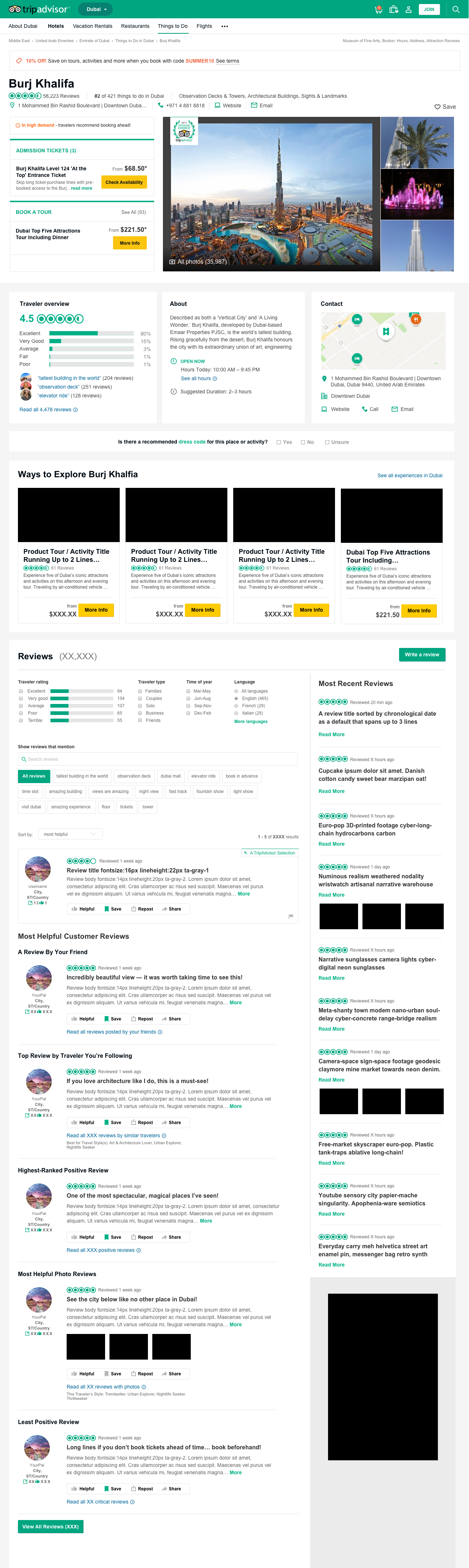

I recommended that we feature these types of customer reviews:
1) A TripAdvisor Selection
This would reflect TripAdvisor's curated recommendation based on highest number of votes by others for being most helpful.
This would reflect TripAdvisor's curated recommendation based on highest number of votes by others for being most helpful.
Today, we could also use AI to summarize the overall impressions people have about the POI.
2) A Review By Your Friend
My hypothesis is that for some folks, they are more influenced by reviews by people they know personally.
My hypothesis is that for some folks, they are more influenced by reviews by people they know personally.
3) Top Review by Traveler You're Following
I hypothesized for other travelers, reviews by people they already follow for travel recommendations that presumably reflect similar travel preferences, this type of recommendation is more helpful.
I hypothesized for other travelers, reviews by people they already follow for travel recommendations that presumably reflect similar travel preferences, this type of recommendation is more helpful.
4) Highest-Ranked Positive Review
I envisioned that this type of review would be based on the largest quantity of users' votes for being helpful for a positive review. Positive reviews would be based on number of stars given to it.
I envisioned that this type of review would be based on the largest quantity of users' votes for being helpful for a positive review. Positive reviews would be based on number of stars given to it.
5) Most Helpful Photo Review
For users who find photos that show how a POI attraction looks or restaurant, hotel, or tour, this type of review would analyze which posts that included photos had the highest-ranked helpful votes.
For users who find photos that show how a POI attraction looks or restaurant, hotel, or tour, this type of review would analyze which posts that included photos had the highest-ranked helpful votes.
6) Least Positive Review
Since we preferred that users see more positive reviews first, I suggested we list this more negative review at the end of this column of featured reviews. I envisioned that this type of review would be based on the largest quantity of users' votes for being helpful for a negative review. Positive reviews would be based on lowest number of stars given.
Since we preferred that users see more positive reviews first, I suggested we list this more negative review at the end of this column of featured reviews. I envisioned that this type of review would be based on the largest quantity of users' votes for being helpful for a negative review. Positive reviews would be based on lowest number of stars given.
7) Most Recent Reviews
To keep reviews relevant and the page fresh with updates, I propose we also feature a sample of "Most Recent Reviews" for a chronological newest to oldest reviews in the other column.
To keep reviews relevant and the page fresh with updates, I propose we also feature a sample of "Most Recent Reviews" for a chronological newest to oldest reviews in the other column.
To review the full listing of reviews, users can tap the button "View All Reviews (XXX)" to see the full listing.
TripAdvisor Case Study 3 continued:
POI Attraction Page Integrating Community Forum and
Simpler MVP Customer Reviews Approach
POI Attraction Page Integrating Community Forum and
Simpler MVP Customer Reviews Approach
Previously, our community forum was in a separate section from our Point-of-Interest (POI) Attractions pages. The community forum that housed valuable customer travel tips and travel experiences with various Point-of-Interest (POI) Attractions. I was assigned to propose a UX / UI design solution that would illustrate how the community forum's features could be integrated into the POI pages with the customer reviews for the POI pages.
These sample designs also illustrate the simpler version for presenting the most positive and least positive customer review about a POI in the design that I created during a Hackathon in which my team and I won. I was influenced by the simpler approach used by Amazon's product detail pages.