PROJECT: EBSCO Learning's Financial Fit EdTech —
Responsive Mobile App, Supplemental Worksheets (PDFs), Instagram Social Media Ads
Responsive Mobile App, Supplemental Worksheets (PDFs), Instagram Social Media Ads
ROLE:
Principal Sr. Interactive Designer
KEY SKILLS / DELIVERABLES:
• Competitive Analysis
• Innovation Ideation
• Dashboard Designs, Typeahead, financial literacy education, Financial Search Results,
• UX / UI Visual Design
• UI Design Library
• Supplemental Educational Printouts
• Instagram Social Media Ads Design and Copywriting
DESIGN APPS USED:
• Figma (wireframes + detailed UI designs)
• Adobe Illustrator
PROJECT OVERVIEW / CONTEXT:
EBSCO Learning provides research databases, e-journal and e-package subscriptions, book collection development and acquisition management. It is a major provider of library technology, e-books, and clinical decision solutions for universities, colleges, hospitals, corporations, government, K12 schools and public libraries worldwide. EBSCO was interested in offering more products to their suite of educational services. Many polls have often indicated that people expressed their wish that there had been financial literacy courses taught in their high schools and colleges. Based on those studies, EBSCO decided to launch "FinancialFit", a personalized financial literacy app for Gen Y and Z. practical issues from budgeting, renting and purchasing a home; funding higher ed, retirement planning, etc.
SOLUTION:
I was the principal UX / UI visual designer conceptualizing, designing, and launching the new product line in collaboration with EBSCO's entrepreneurial product director.
I designed UX wireframes, journey maps, and visuals in Figma for responsive web apps that provide personalized educational services targeting prospective Gen Z and Y users and business professionals. Created UI design library of components.
I also created supplemental educational worksheets as printouts to support the web app. In addition, I designed instagram social media ads and other ads for viral marketing promotion of product lines. Wrote and edited copy for the web apps, supplemental materials, and ads.
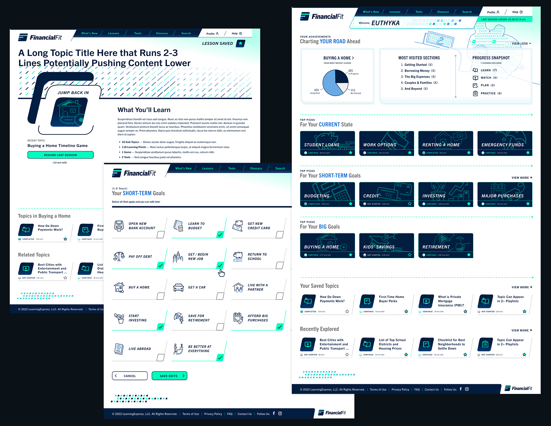
Sample Final Design Concepts for Development and Product Launch
Featured below are several page designs below that I created for EBSCO Learning's FinancialFit b2c financial literacy app based on a design direction that EBSCO chose for look and feel from previous versions I proposed (please scroll down to see initial design artifacts I created in the process).
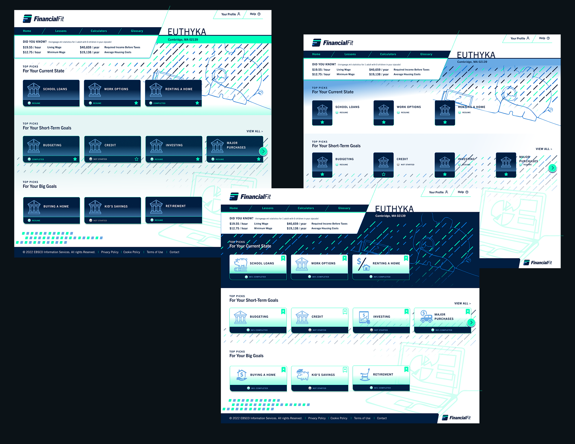
On the far right is a homepage design featuring my proposed dashboard analytics capturing a pie-chart overview on how much of the unit has user "Euthyka" has studied in her most recently studied topic e.g. "Buying a Home" in this scenario. I also proposed that the users get a listing of their 5 most visited sections to get a high-level view the distribution and depth of their studies based on their most visited sections. Users can also see a snapshot of their progress snapshot based on content formats they have chosen to study e.g. written lessons, videos, lesson plans, and practice worksheets. Users can access buttons to continue lessons for their "Current State" topics of interest or toward learning more to meet their short- and long-term goals.
The design on the far left is my proposed topics page that would offer an overview on the lesson plan and a button to either begin or resume their last session as in this case for users who have already started a lesson. I included carousels to see more included subtopics within a given lesson or access a carousel to see a related carousel.
The center image features an index page listing all the available lessons users can select to add to their short-term goals to learn. Users can enter these goals during onboarding process and laterr edit their short-terms goals on their personal profile page.
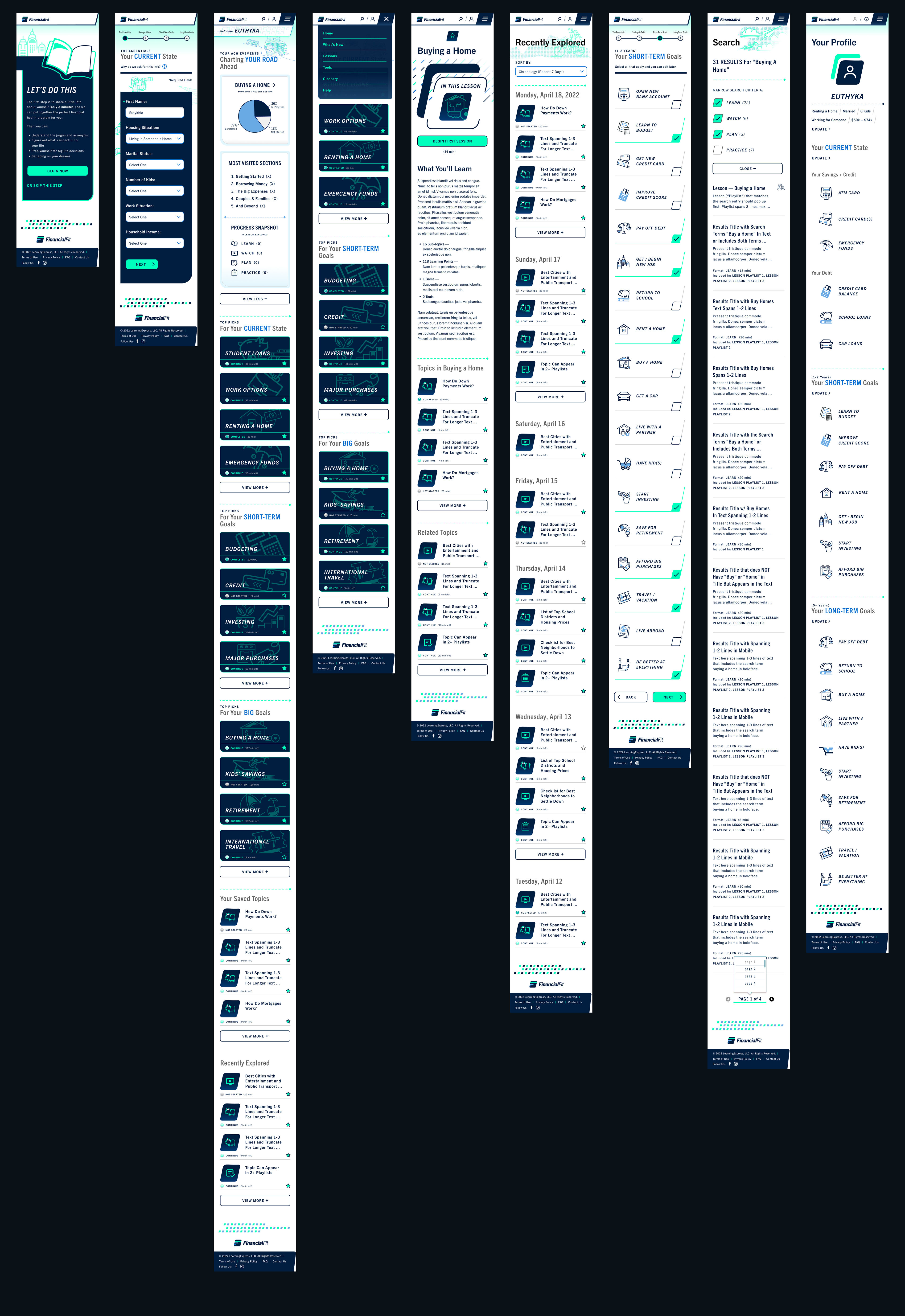
Sample mobile page designs detailed below corresponding to the desktop designs that I created for EBSCO Learning's FinancialFit b2c financial literacy app. The first two screens depict a couple screens in the onboarding sequence in which new users would be to enter key personal details, demographic information, and their current state, short- and long-term financial goals. The inputs would help to populate the user dashboard and profile pages with specific information to keep track of their metrics toward reaching their goals.
PROCESS DETAILS
Define Phase
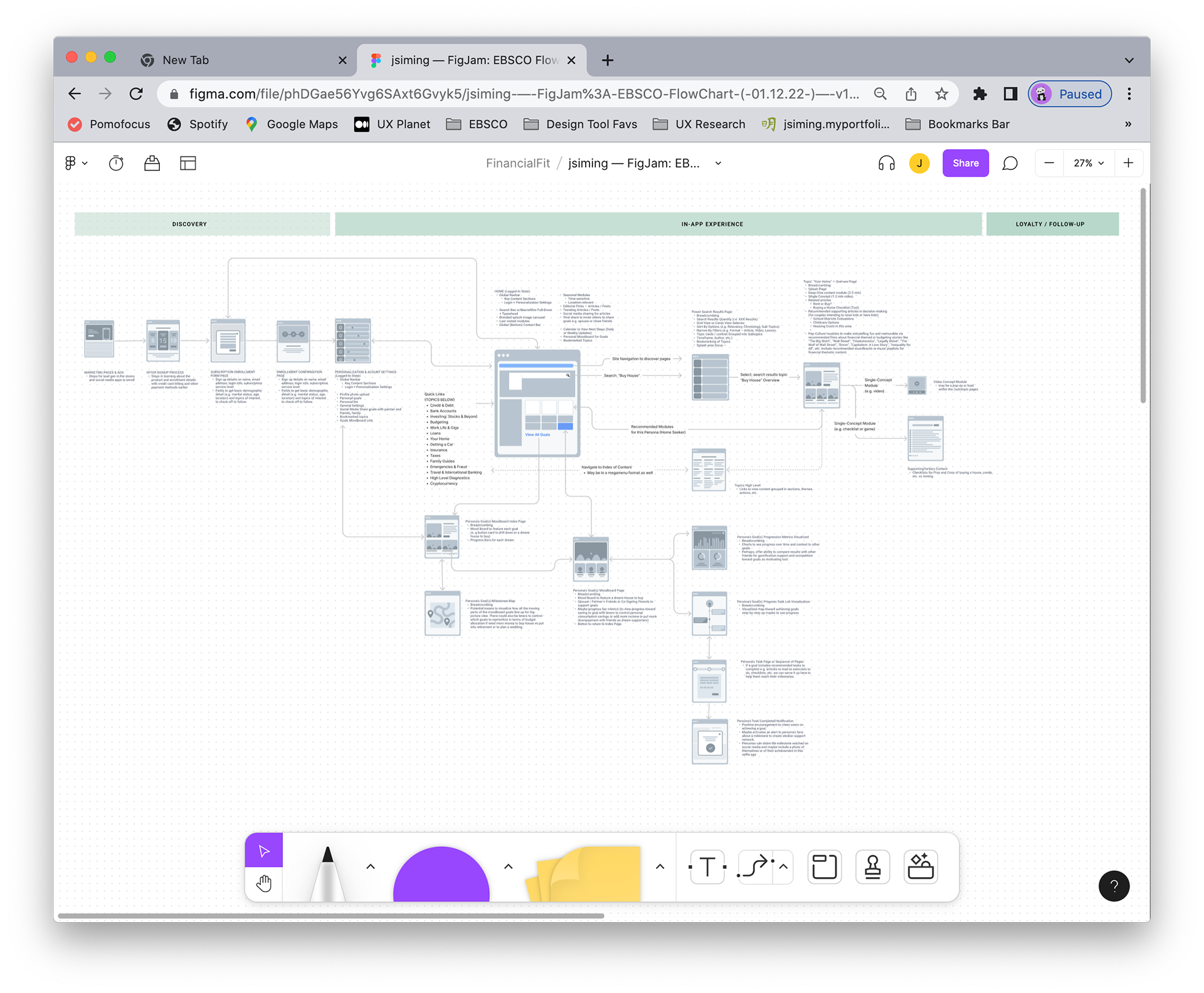
Featured below is my diagrammatic prospective customer journey that presented my vision for new product features that the app could potentially offer. This customer journey that I created in FigJam was reviewed by EBSCO product director to take into consideration for future product development scopes. I mapped out the steps users might take through the new app as a blue-sky exercise.
Ideate / Design Phase
Establishing the Brand Aesthetic + UX
Homepage Visual Design (Round 1)
Establishing the Brand Aesthetic + UX
Homepage Visual Design (Round 1)
Featured below are just some of the many options I proposed to EBSCO as potential creative directions for look and feel. These design directions in this first round included the new features I envisioned such as data analytics that would feature more relevant localized standard of living statistics on housing, transportation, etc. as well as other factors such as minimum wage, living wage, salary, etc. I hypothesized that by being able to pull in real-time data on these standard of living metrics, it would ensure that housing and budgeting considerations could be more specific.
In these proposed homepage designs, I explored different button treatments that would direct users to their respective lessons and topics of interest. I put in placeholder icons in the buttons with the intention that I would replace them with unique icons once a design direction was chosen
First batch of designs I presented my EBSCO product director included these homepage design look and feel directions.
Ideate / Design Phase
Redefining the Brand Aesthetic + UX
Homepage Visuals (Round 2)
Redefining the Brand Aesthetic + UX
Homepage Visuals (Round 2)
I further refined the design options once we discovered that development team could NOT yet include my proposed ideas of populating the homepage dashboards with localized standard of living statistics relevant to each logged-in users based on they lived and other demographic inputs they volunteered during their onboarding steps to launch and personalize the app. Hence, I recommended we go with including interesting factoids that the users would find informative and relevant to assessing their financial goals. To illustrate my concept of presenting factoids that could be updated regularly or at least, cycling through a few stats every once in awhile once the users log in, I proposed the following key stats that I found fascinating when I first heard of the report. The factoid I suggested is on much the average American reported they needed to earn as their minimum annual income for their emotional well-being.
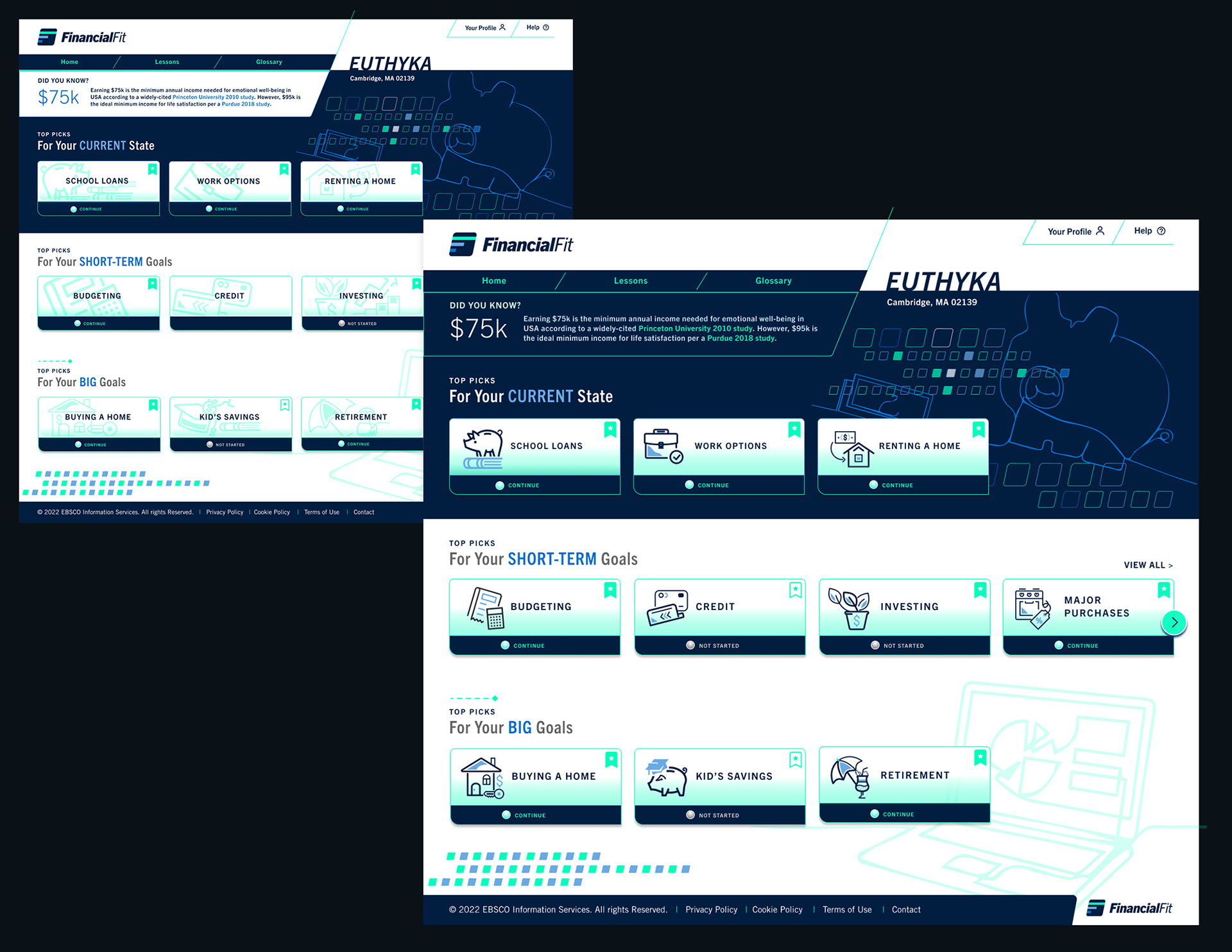
Second batch of designs I presented my EBSCO product director included refinements to the homepage dashboard concepts that EBSCO's product director chose.
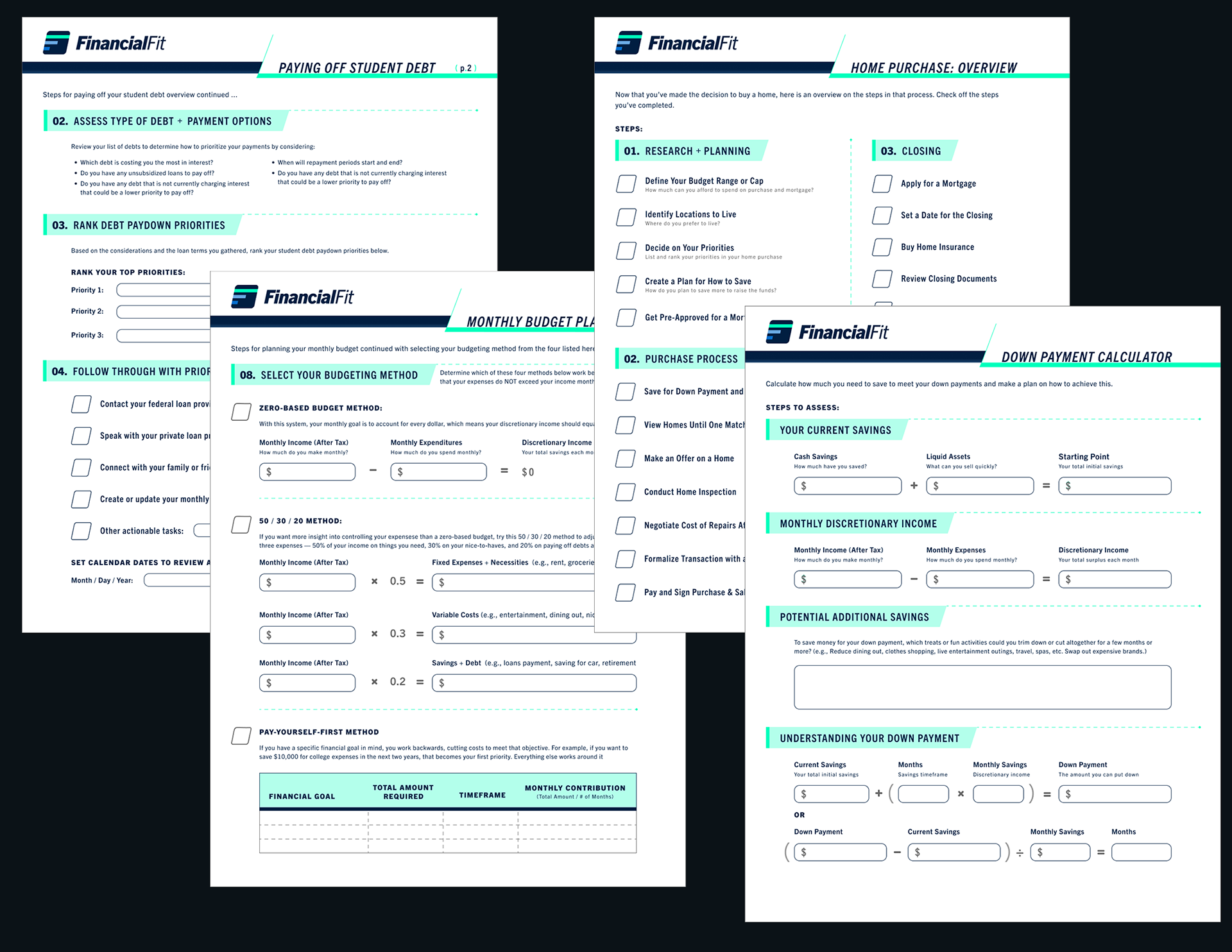
Sample Supplemental Printable Worksheets for Financial Fit App:
Detailed below are sample printable worksheets that I designed as PDF downloads to accompany our Financial Fit tutorials that would enable our users to keep track of their financial planning for monthly budgeting, rainy day savings, student debt paydowns, home purchase, retirement investments, etc. I analyzed the Google spreadsheet and documents to get the conceptual gist of the content and type of form fields needed. The initial documents designed to accompany our financial education tutorials were created by EBSCO's financial education experts. I then grouped the content that EBSCO educational content team provided me by relevancy in "content chunking" UX strategy to be more concise. I formatted our advice into numbered or ordered listing of step-by-step for more straightforward, instructional formatting. I wrote copy and edited further to get the content into as few pages for a PDF document as necessary and aimed to put similar content on the page so they could sometimes act somewhat as standalones. My designed these worksheets with thee intention that they look cohesive visually with the FinancialFit apps that I designed and the visual components were included in my FinancialFit UI components library to reference common color palette and typographic scaling.
Ideate / Design Phase
Standardizing the Platform UX for All EBSCO Products
Defining a Common Global Navigation for Content Drill Down within Each EdTech and Pivot to Other EBSCO Products
Standardizing the Platform UX for All EBSCO Products
Defining a Common Global Navigation for Content Drill Down within Each EdTech and Pivot to Other EBSCO Products
Next steps: I envisioned that FinancialFit would eventually convert these worksheets into interactive forms that users can update their financial details on the FinancialFit app as logged-in user so the app could offer more relevant, personalized content to users. I proposed that the product team work to develop the databases to capture these user inputs.
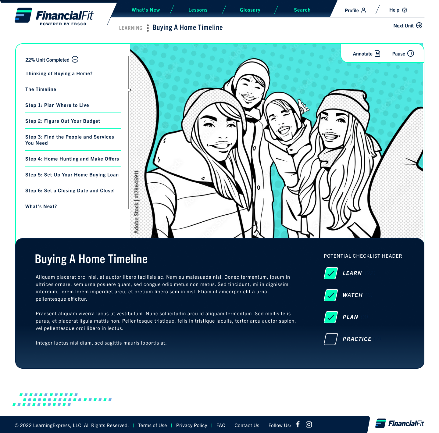
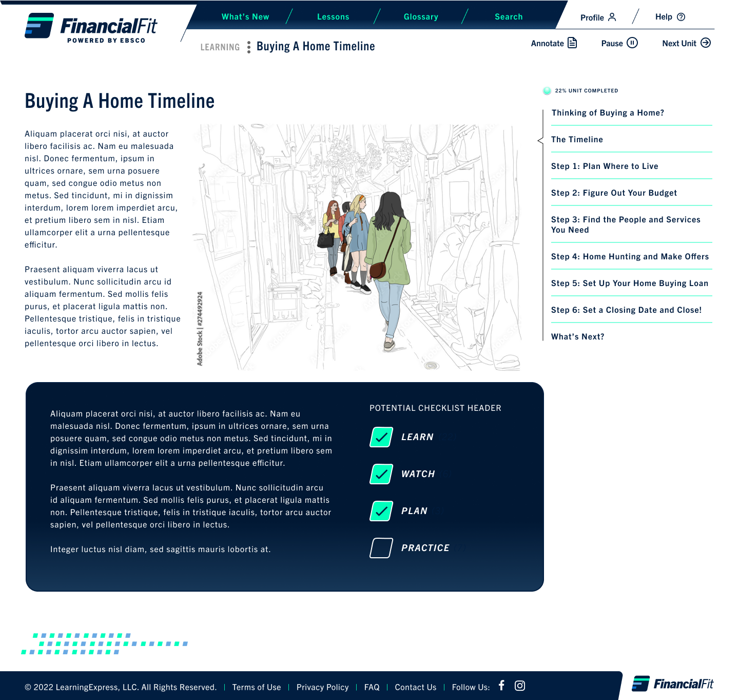
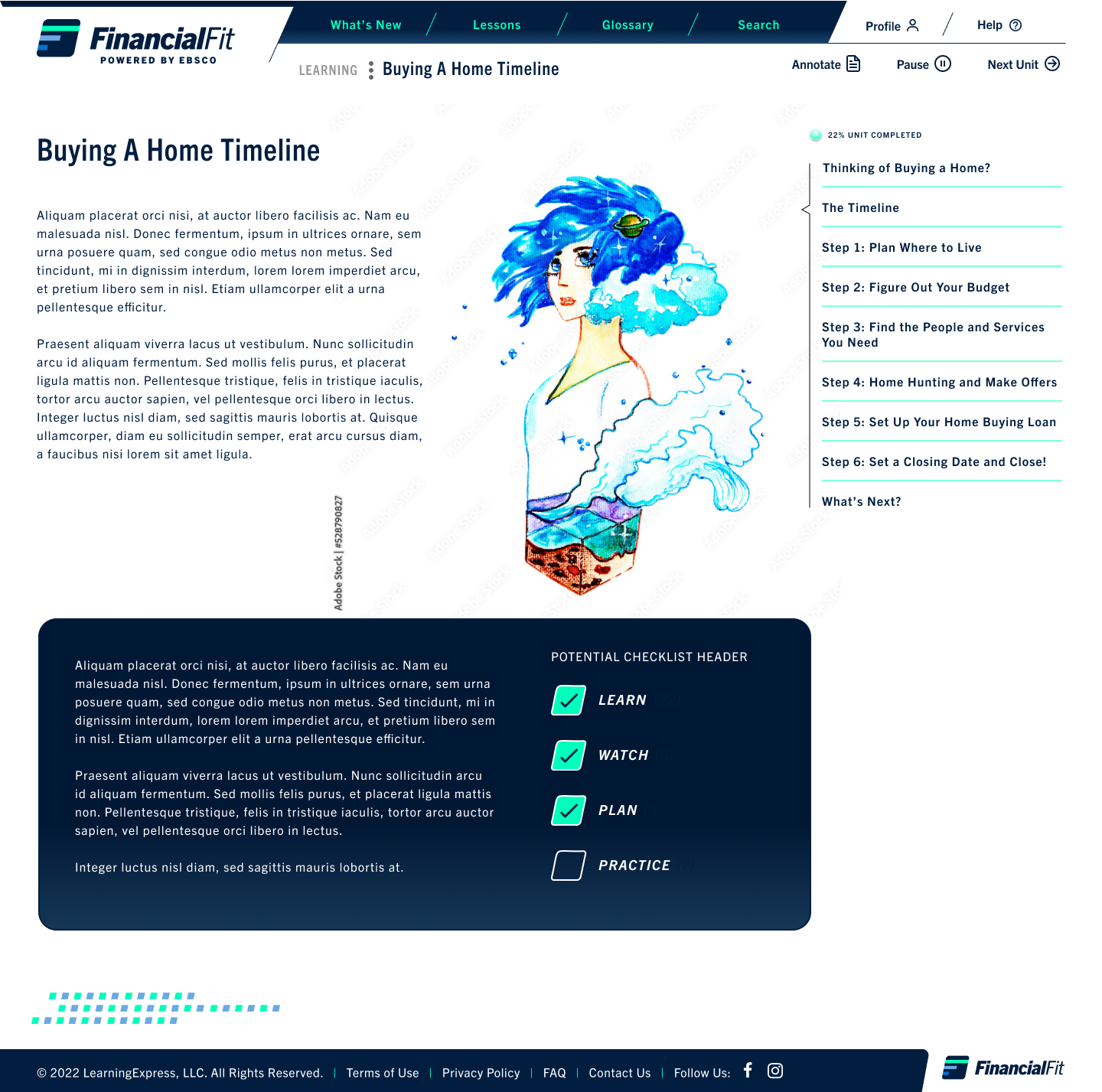
Featured below are several initial sample designs I proposed for a future scope where we would aim to streamline the tutorial course frameworks across our learning platforms. In my proposal for product innovation future scope developments, I plugged in my supplemental worksheet designs that I created earlier into a potential redesign of the tutorial navigation scheme. I envisioned that the FinancialFit app would eventually house truly interactive worksheets for users to access and keep track of in their personalized dashboards.
In addition, I proposed page designs that would feature the sample illustration styles from the mood board above that I compiled to offer EBSCO's product team a sense of how the tutorial illustration animations could potentially look within my framework.
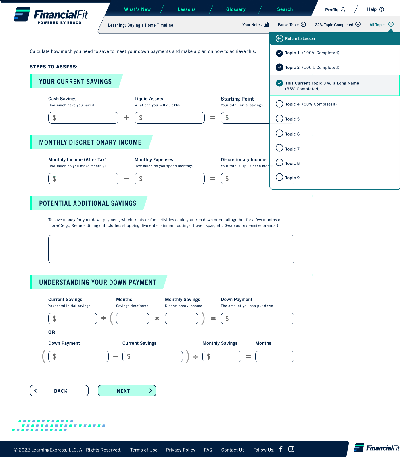
Design v1: "All Topics" navigation menu in top menu
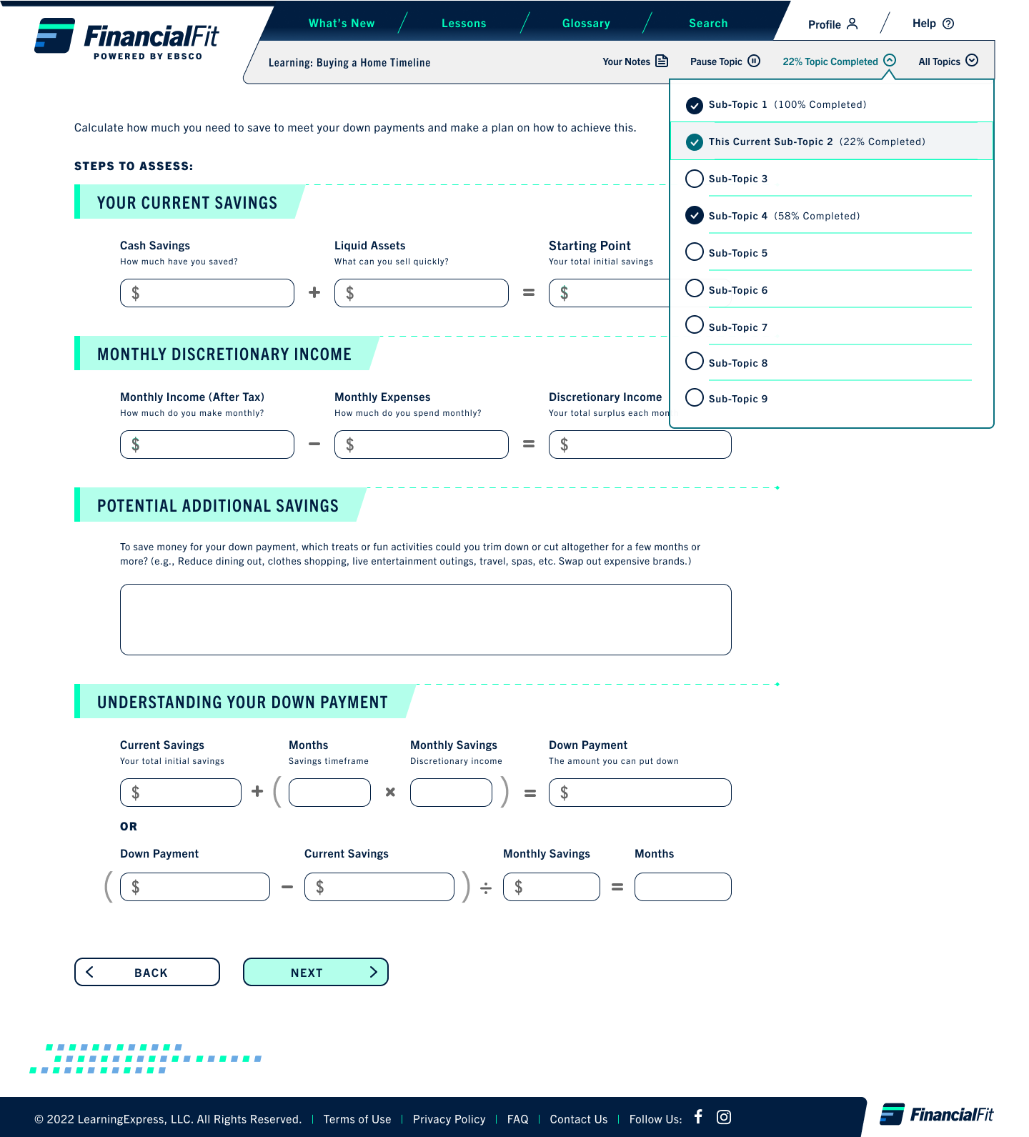
Design v1: Subtopics menu features % of that topic completed in top menu
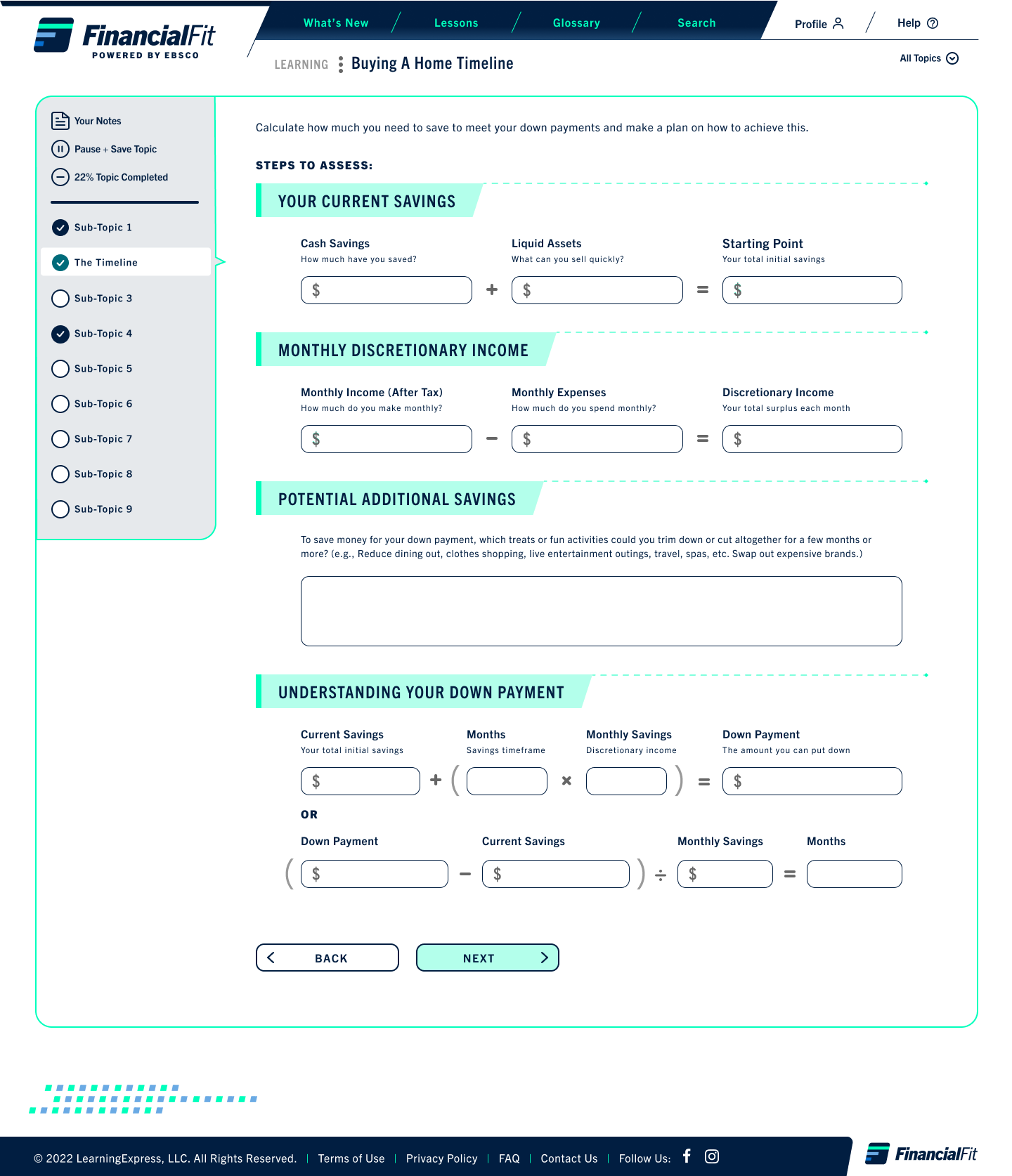
Design v2: All topics specific actions on the sidebar while top menu features access to other topics
Defining Sub-brand Expressions
Logo / Identity Design: Updating the FinancialFit logo with Brand Hierarchy Considerations
Logo / Identity Design: Updating the FinancialFit logo with Brand Hierarchy Considerations
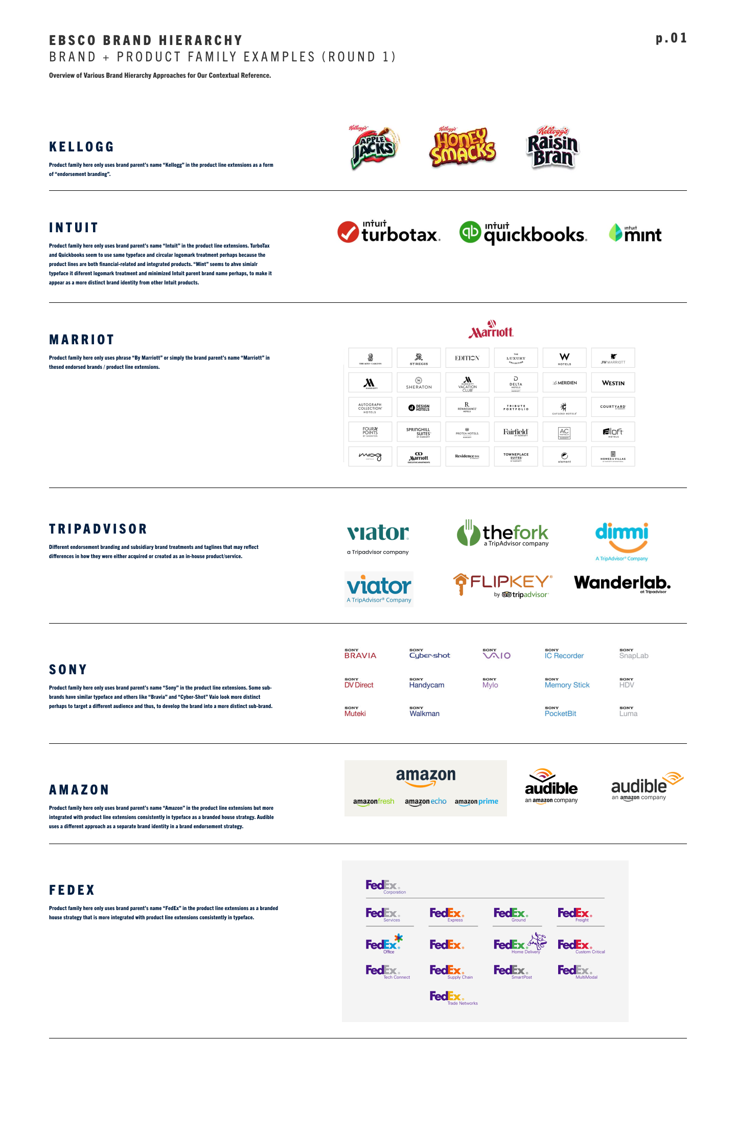
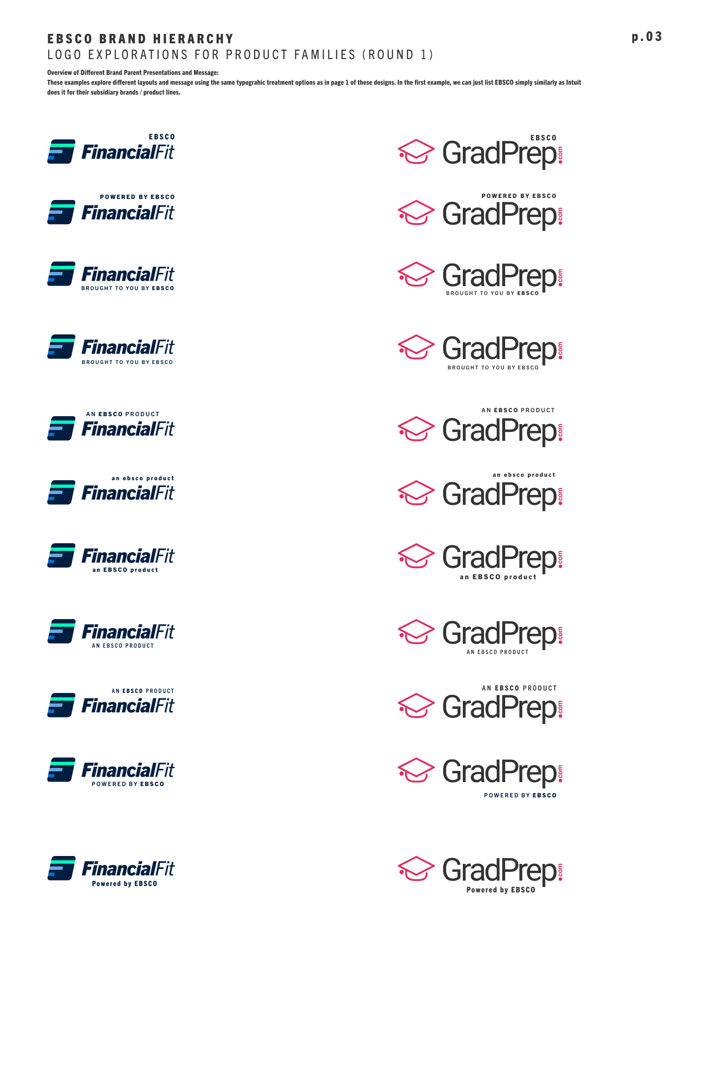
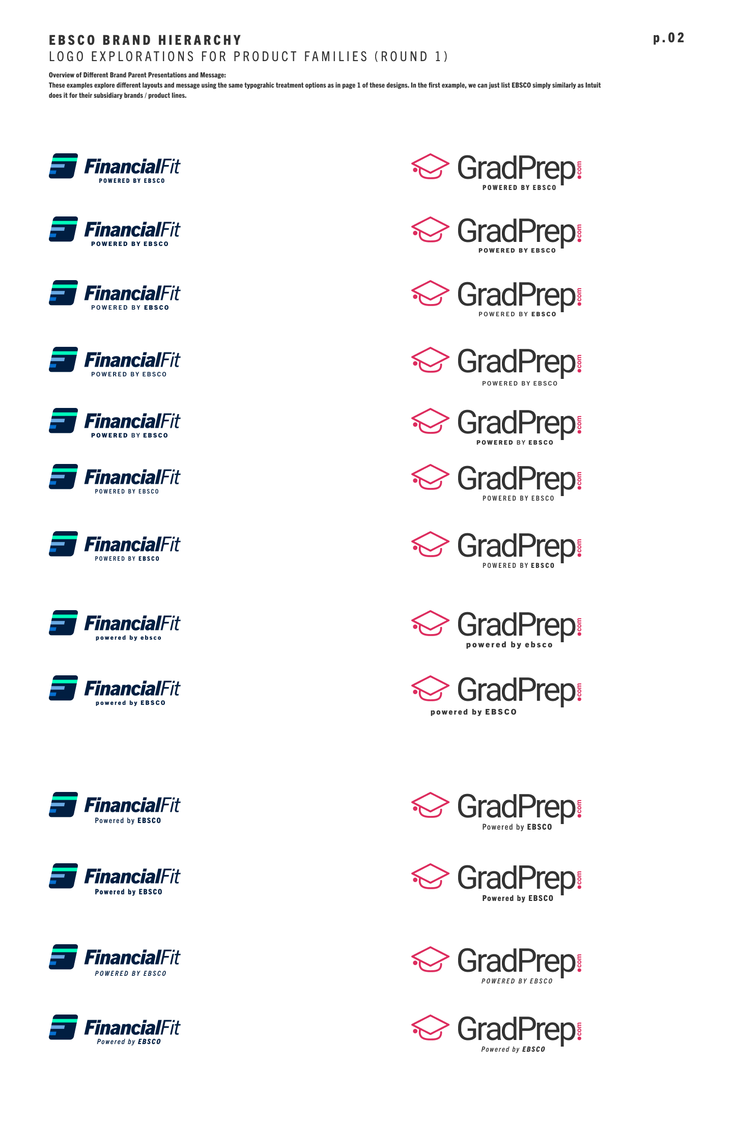
Detailed below is my documentation and writeup on the initial research on how other companies with subsidiaries represent their brand hierarchies that I shared with EBSCO's Product Director and team for their consideration. I then designed two pages of logo brand updates. My proposed designs took into consideration on how the brand hierarchies layout may look on FinancialFit apps and supplemental PDFs.
My Proposed Courses Tutorial Framework Redesign
Defining Potential Illustration Styles for FinancialFit's EdTech Tutorials to be Implemented in Future Scopes
Defining Potential Illustration Styles for FinancialFit's EdTech Tutorials to be Implemented in Future Scopes
FinancialFit product management team was working with three different agencies or consultants for three different purposes for their product launch:
1) UX / UI design of the product app FinancialFit — I designed the app's design as well as some brand positioning and social media marketing.
2) Educational content — an agency specialized in creating the actual financial educational content that featured animated illustrations for all the lessons. The content would live inside my UX / UI visual app framework.
3) Brand Identity — The original identity design and marketing of the app were created by another creative agency. When I started working with FinancialFit, this agency had already created the logo design, brand color palettes.
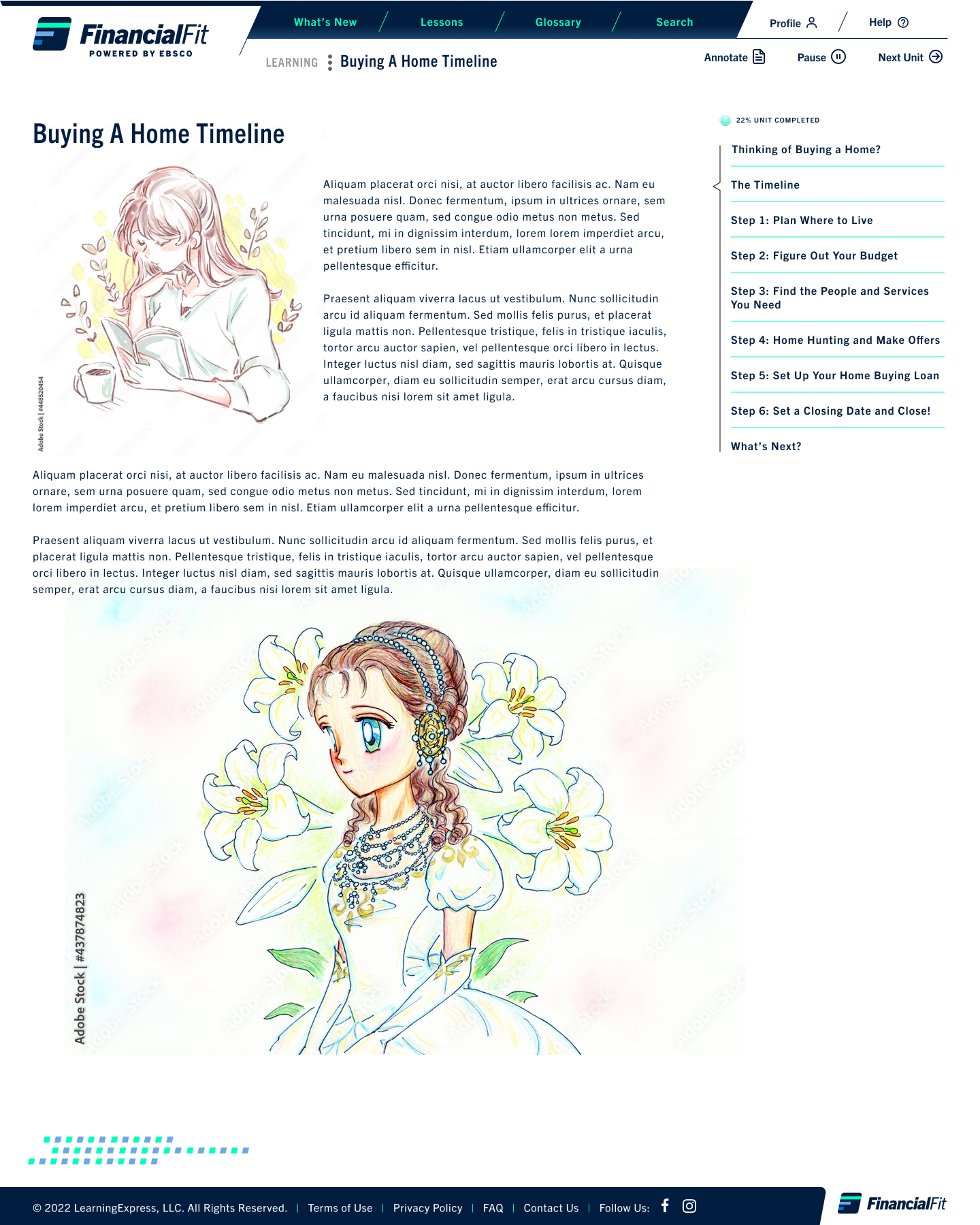
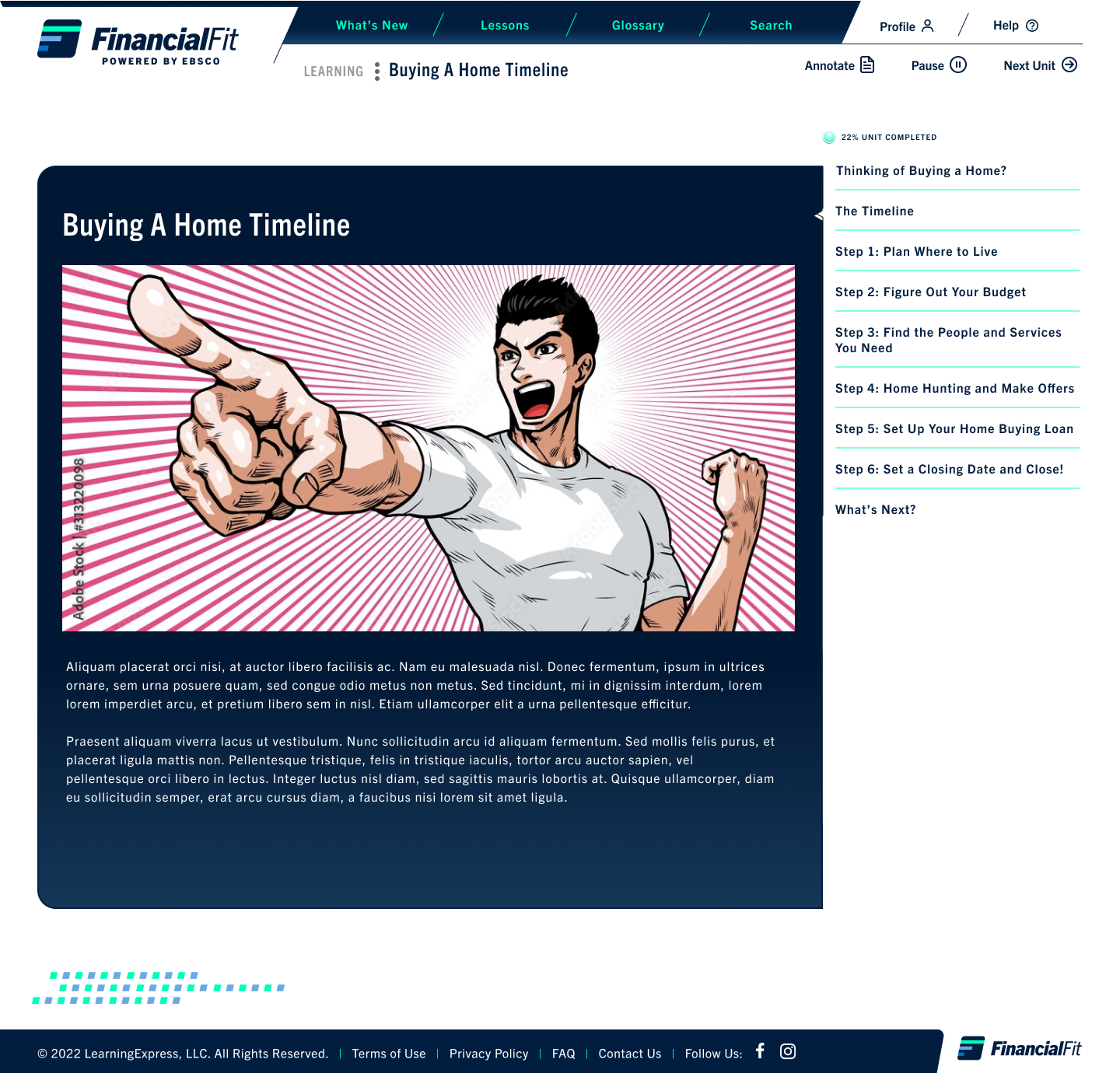
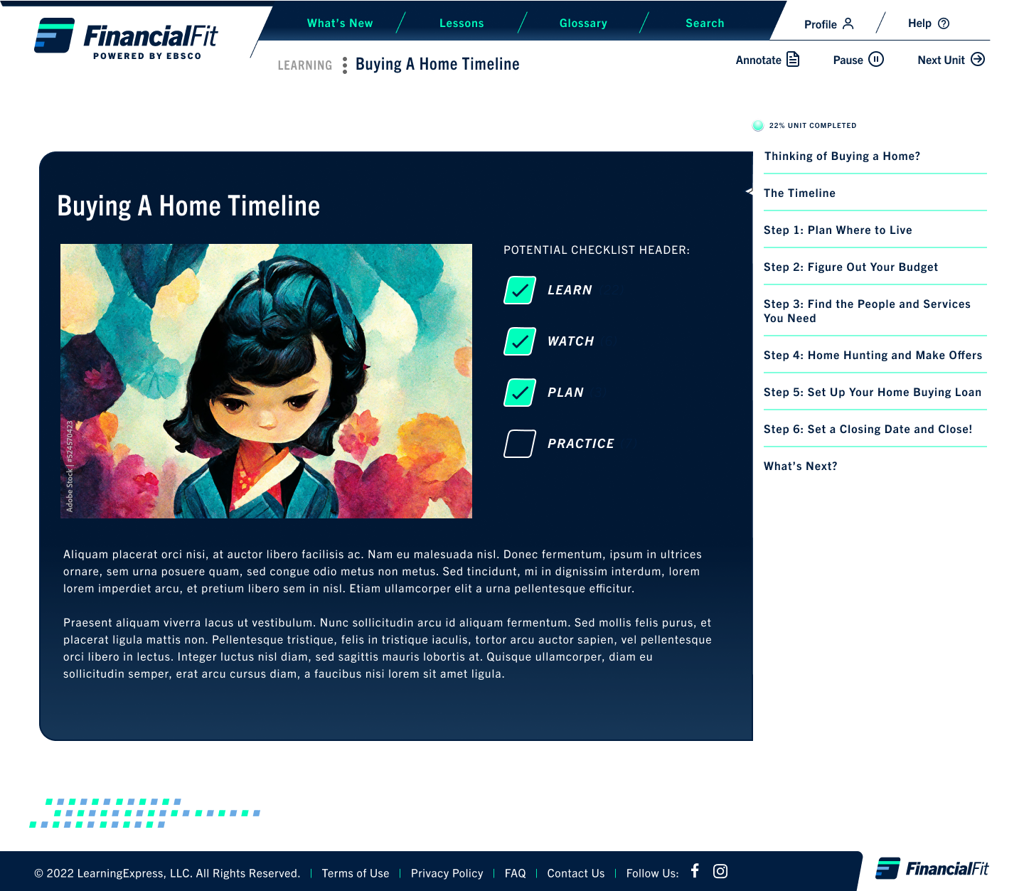
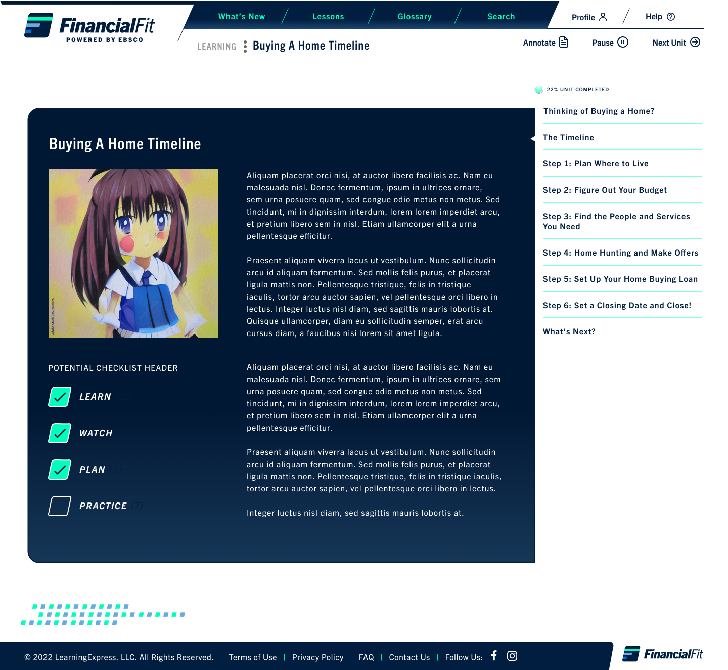
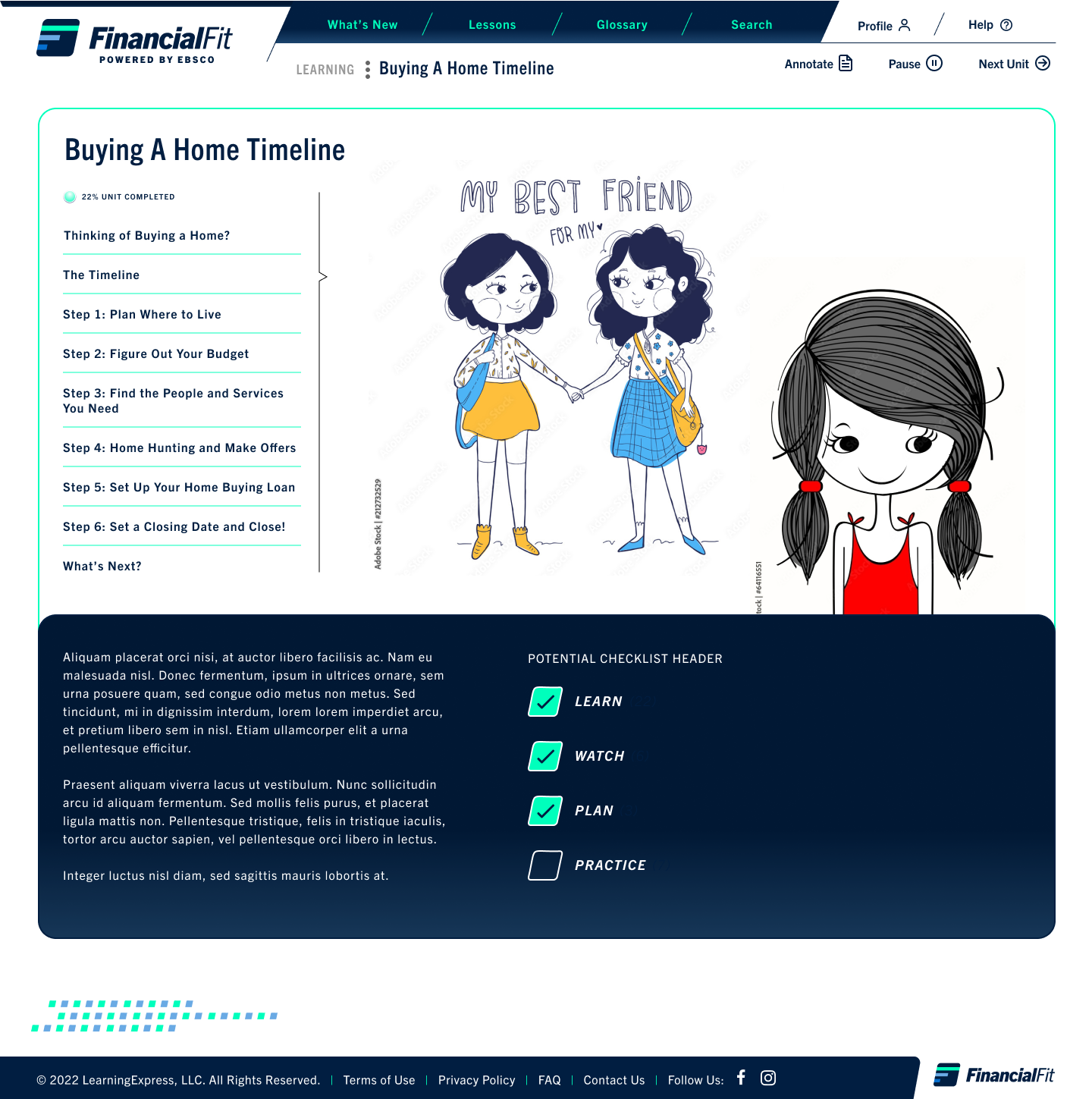
While I didn't create the illustrations for the tutorial, I compiled the following different illustration styles in my mood board for EBSCO to consider featured here below. The educational content designers created stick figures-based illustrations at first so I suggested in my first design, ways to do some more minor tweaks to that agency's designs. Following that initial page, I proposed other design styles I thought would have more appeal for future release.
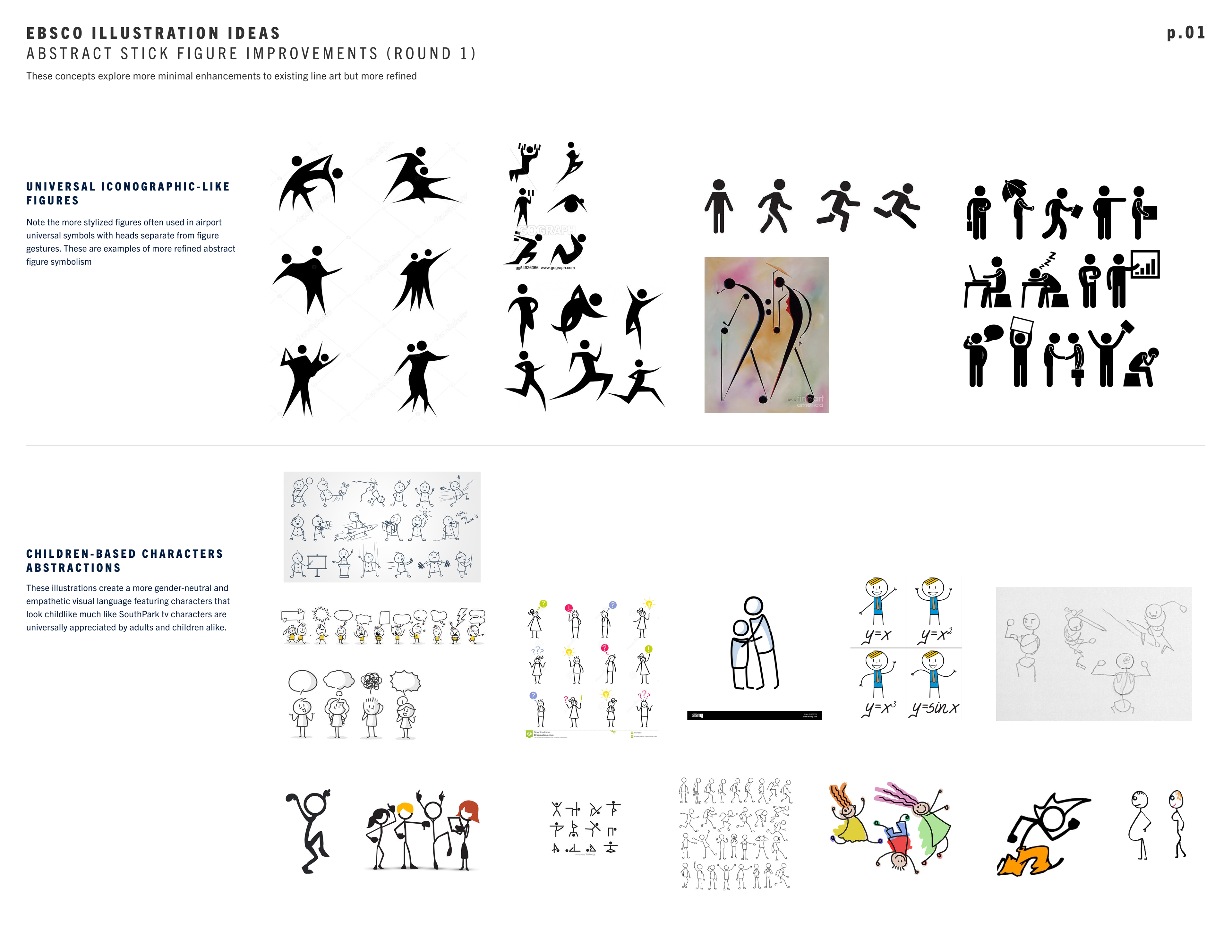
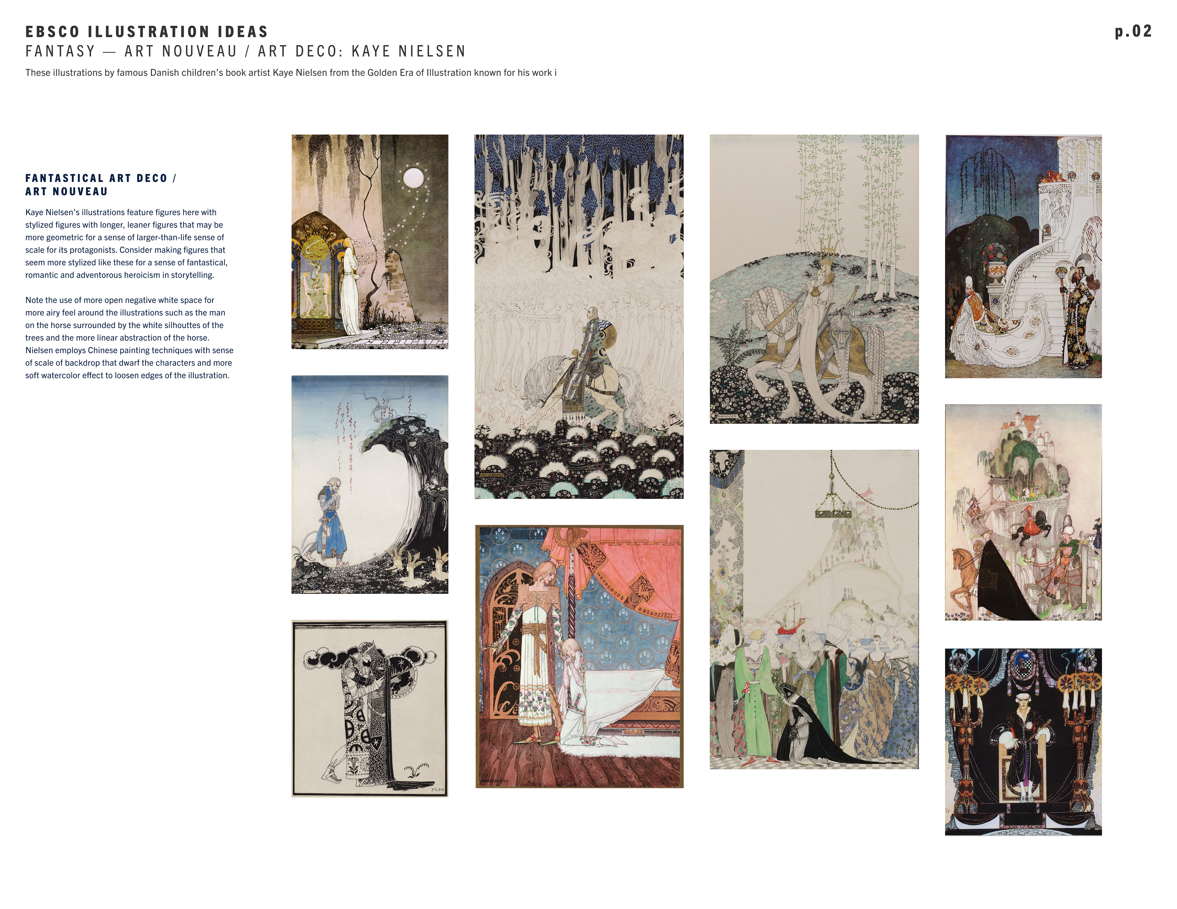
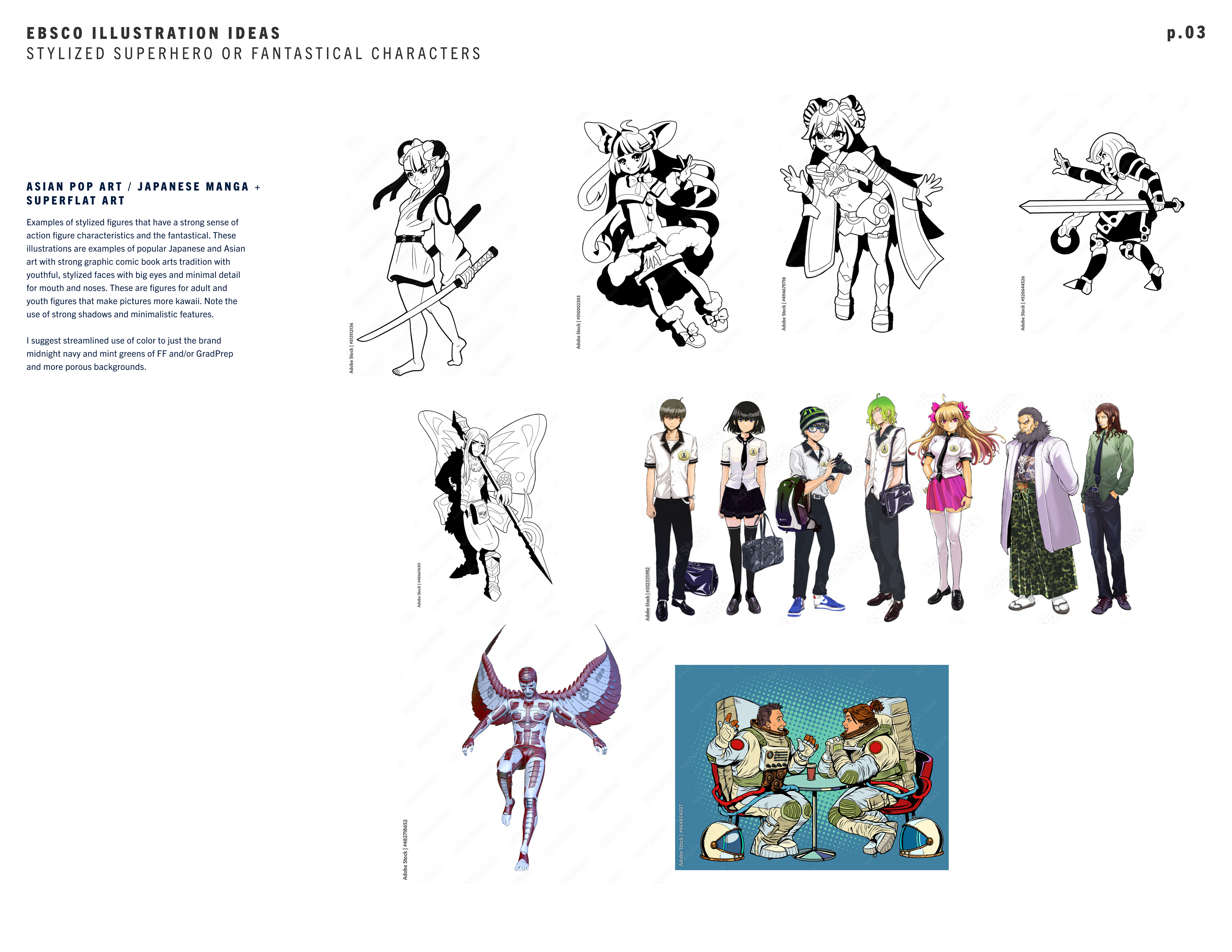
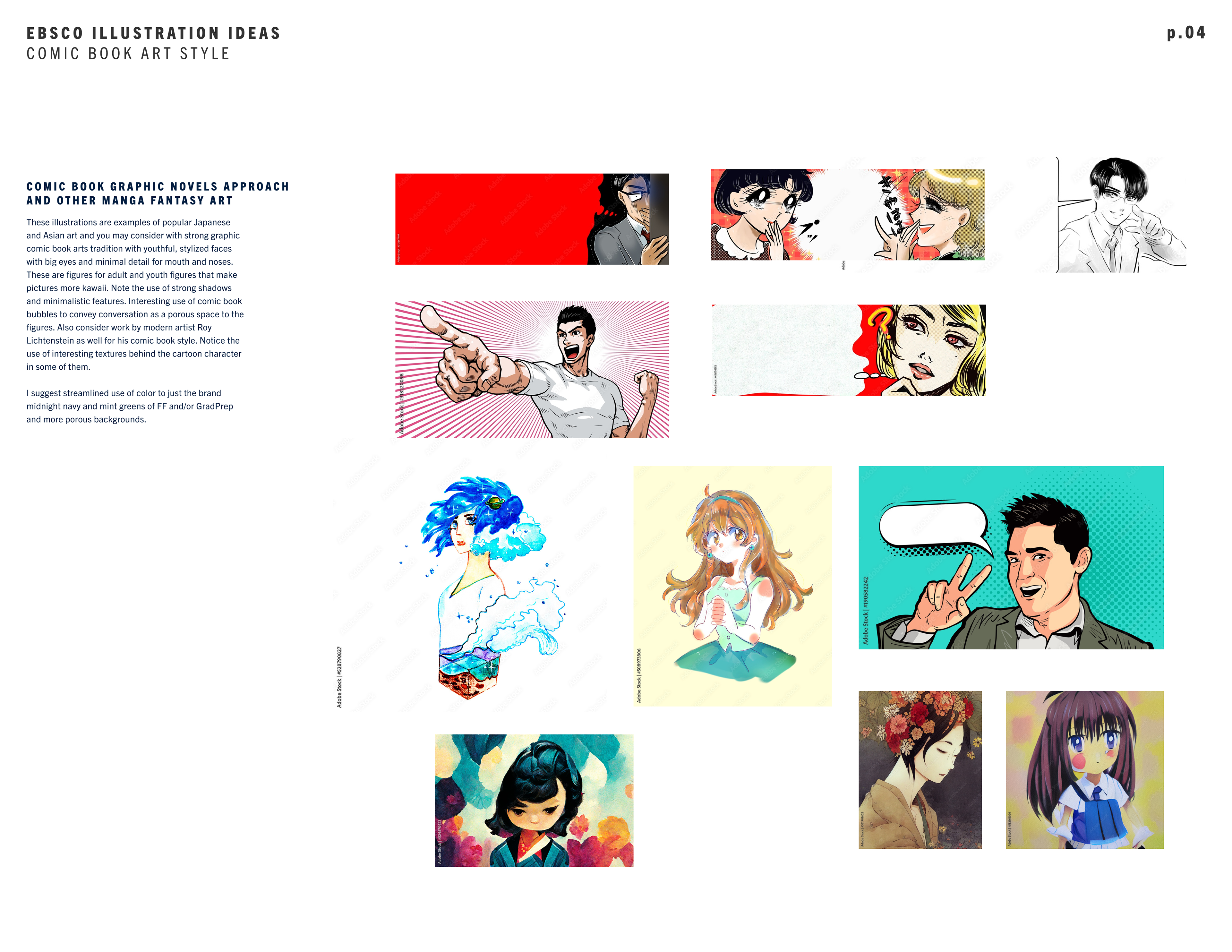

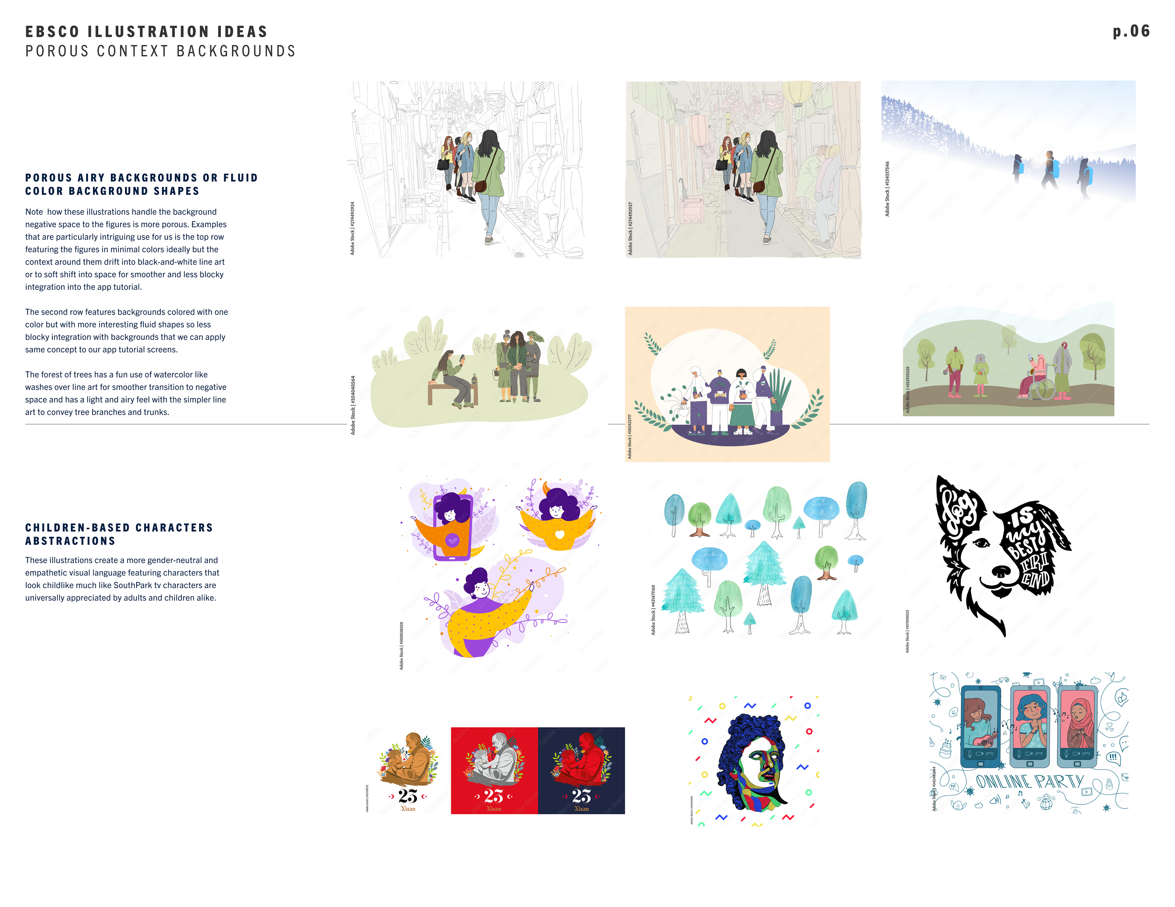
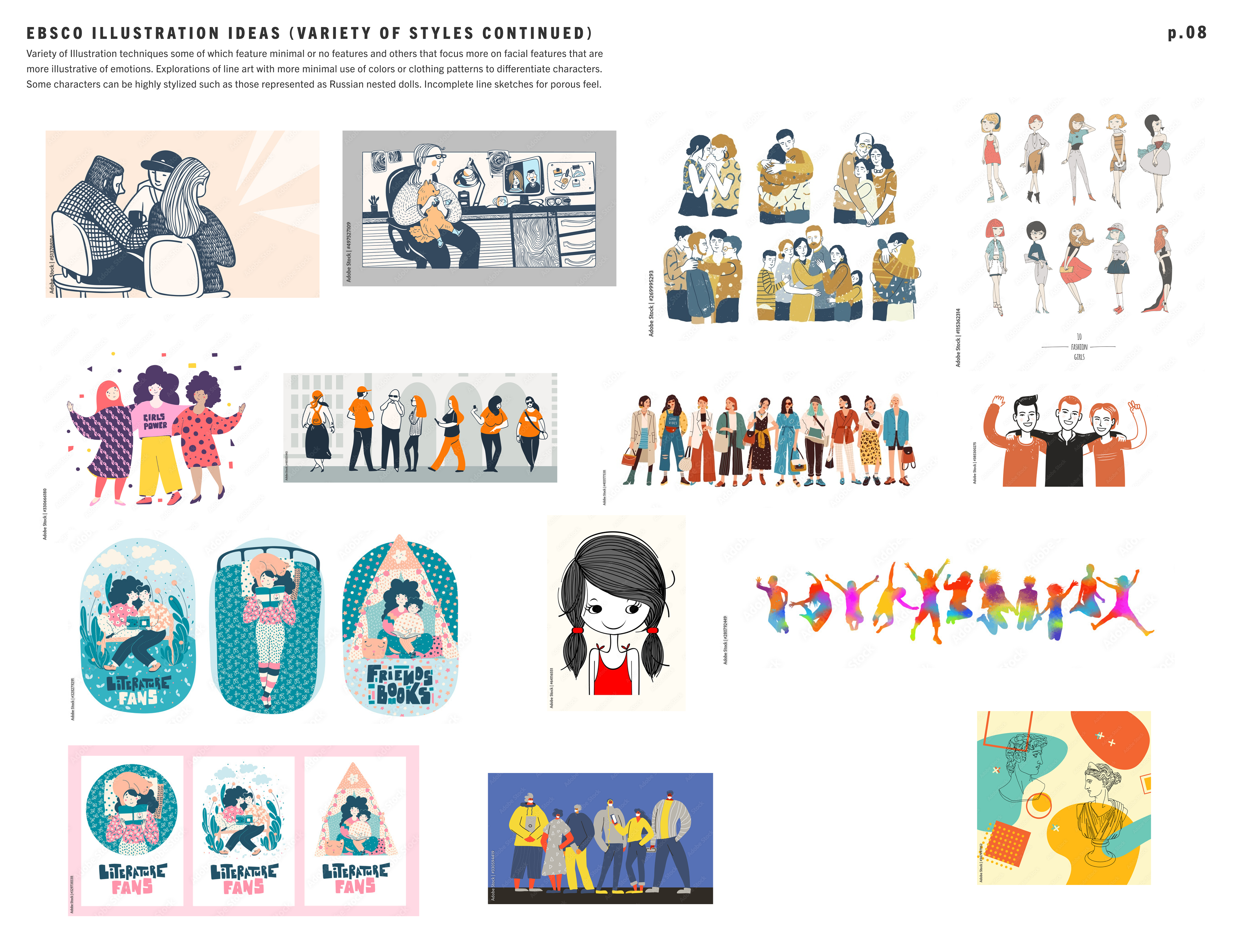
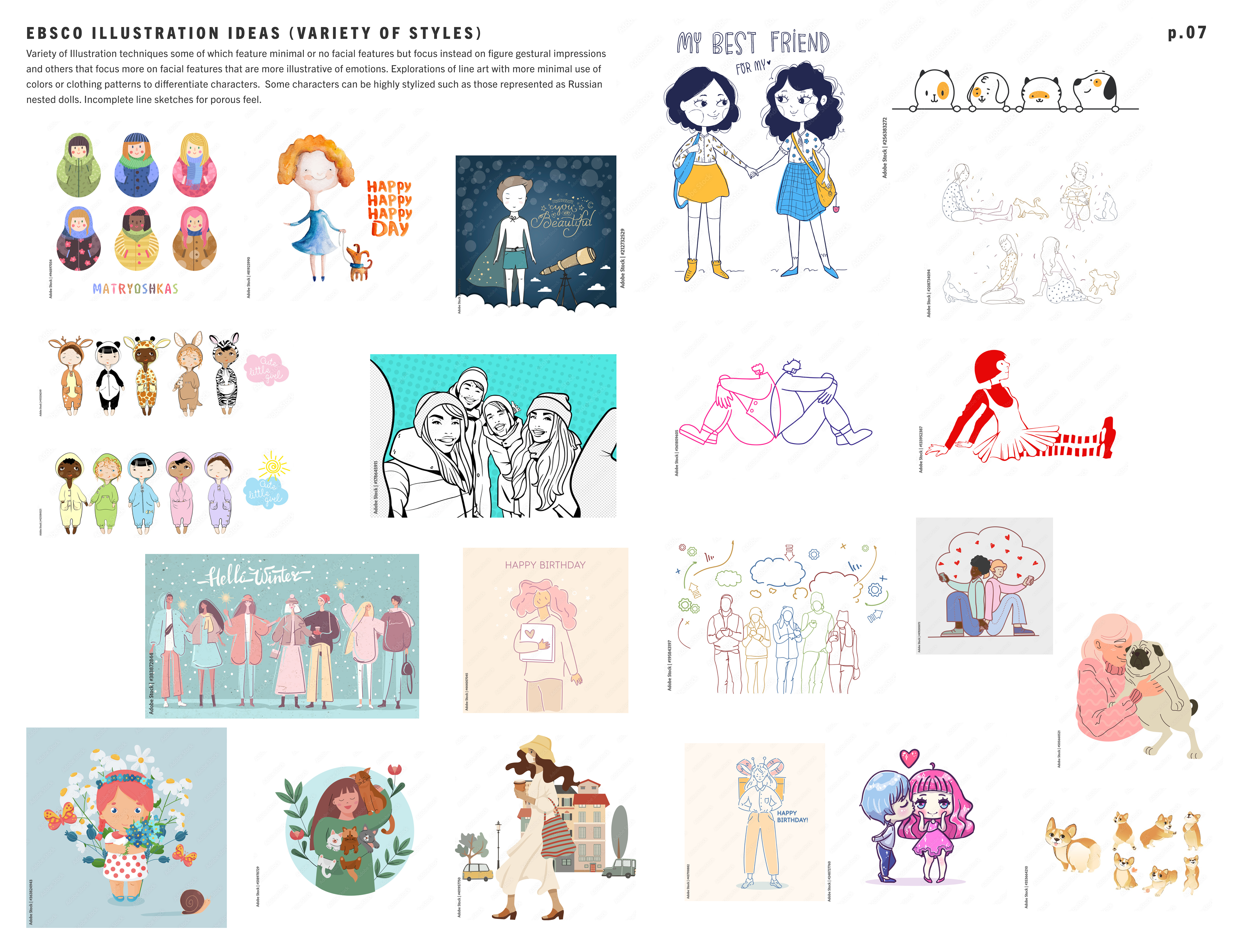
I plugged some of the illustration styles that I compiled from above and into my initial course tutorial frameworks featured below in order for the EBSCO product team to et a feel for how these illustrations would feel within my proposed UI visual designs of the app. I thought this would offer them some art direction and brand positioning that they can direct their educational content creators to generate based on my proposed visuals. In general, I chose graphic illustration styles influenced by Japanese anime, manga, and Chinese and western punchy comic book graphics since I hypothesized that they were illustration styles that were definitely popular with American anime film viewers and comic book readers and would appeal to Gen Z, millennials, and Gen X.
Fantastical Asian art
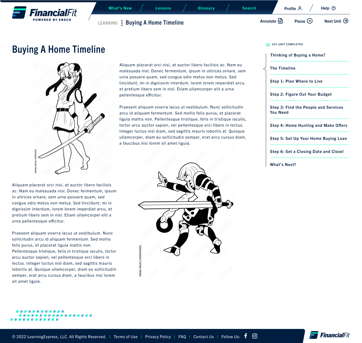
Japanese anime superhero to appeal to the artist
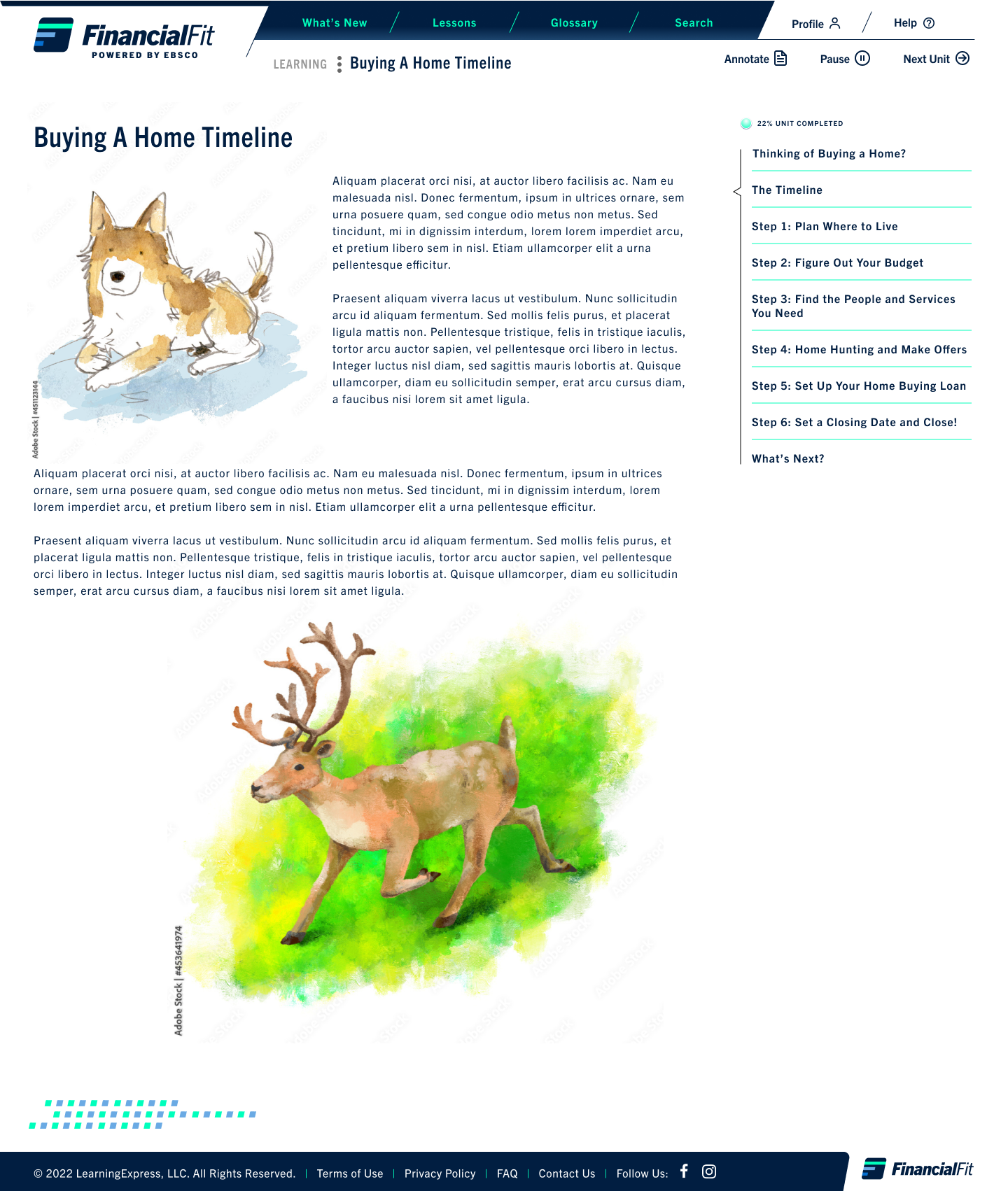
Miyazaki style of watercolor painting
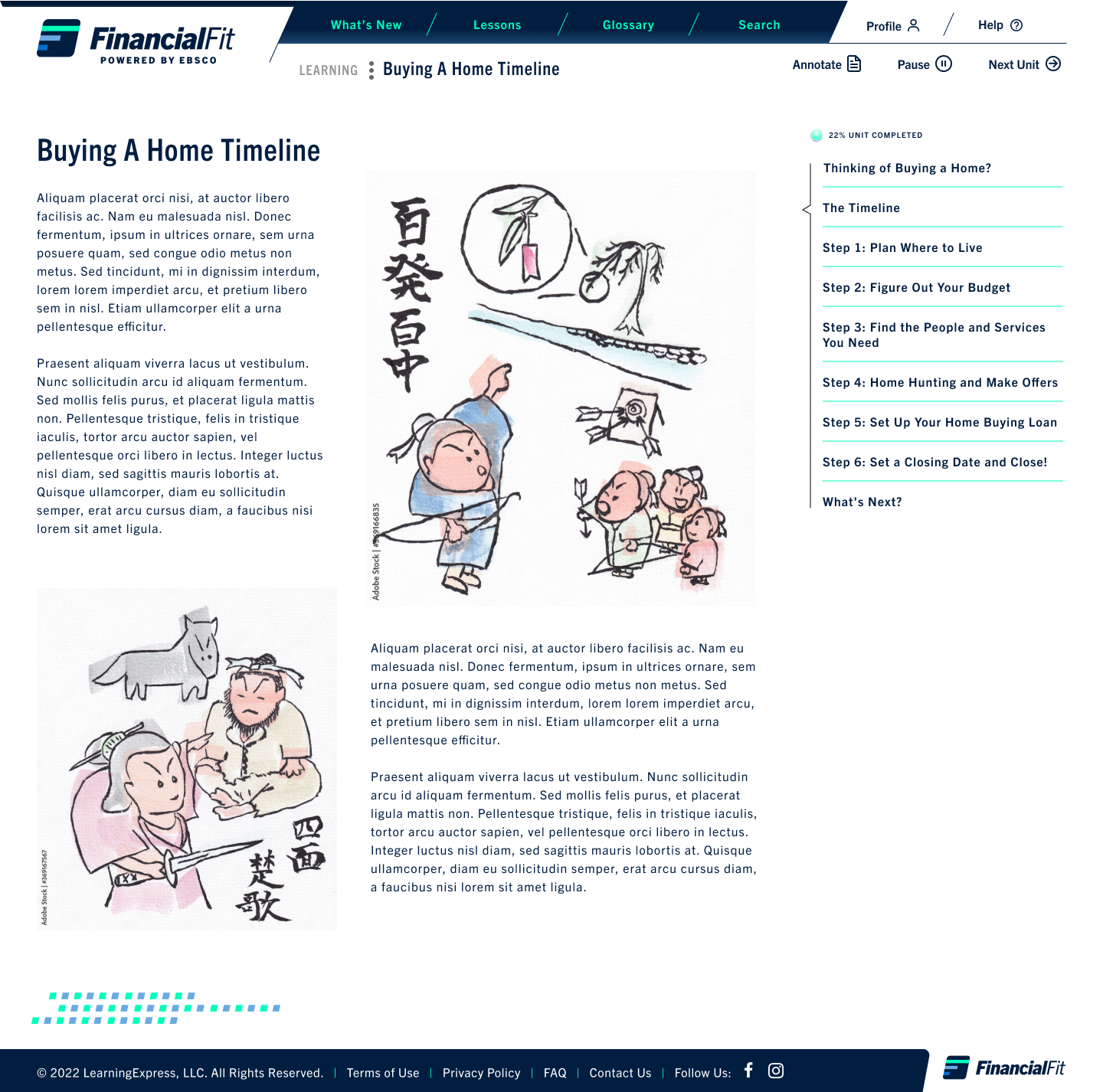
punchy Asian graphic design for more assertive feeel
Establishing a Design System
Creating a Design Library for UI Work-in-Progress Standardization
Creating a Design Library for UI Work-in-Progress Standardization
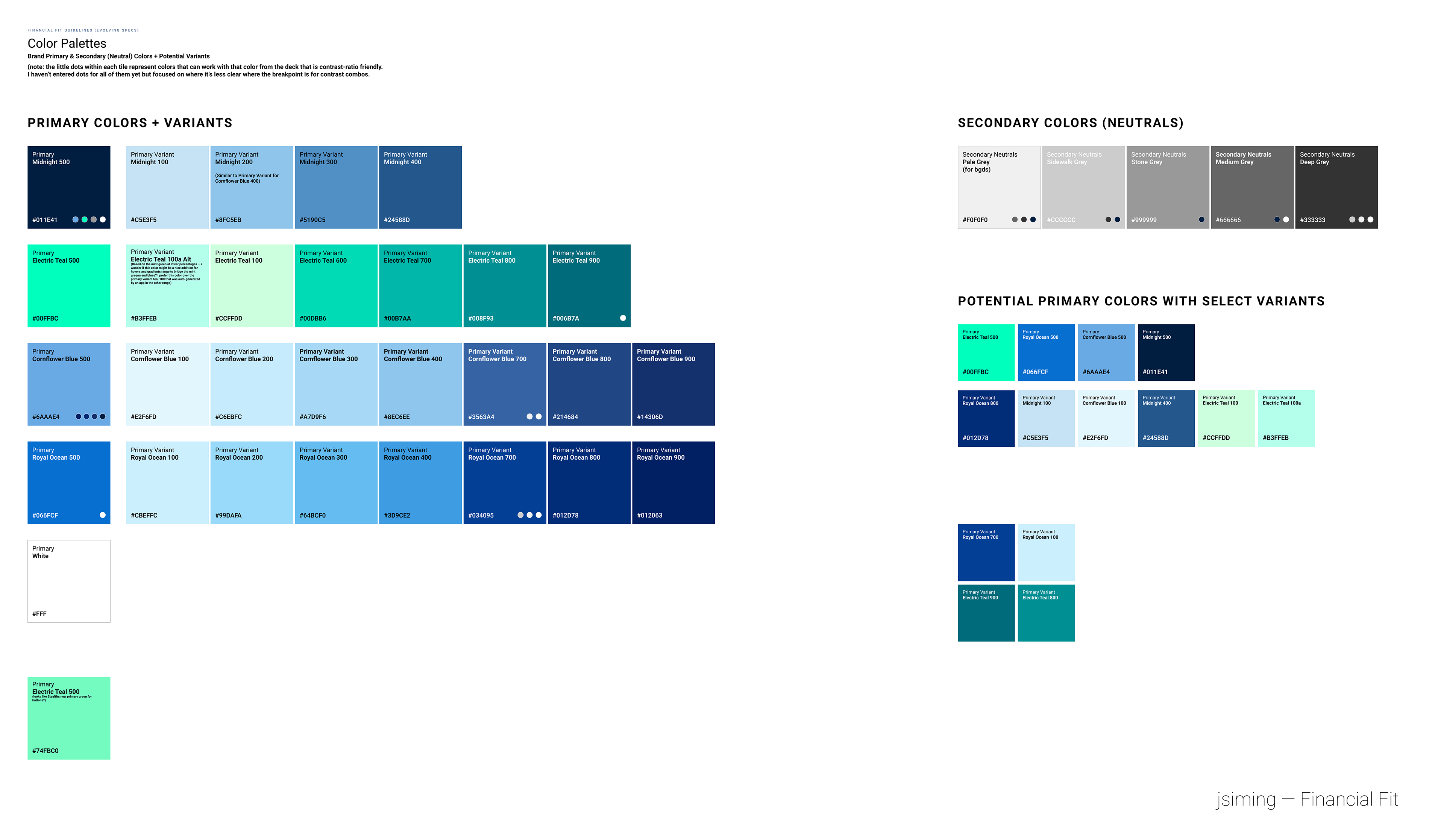
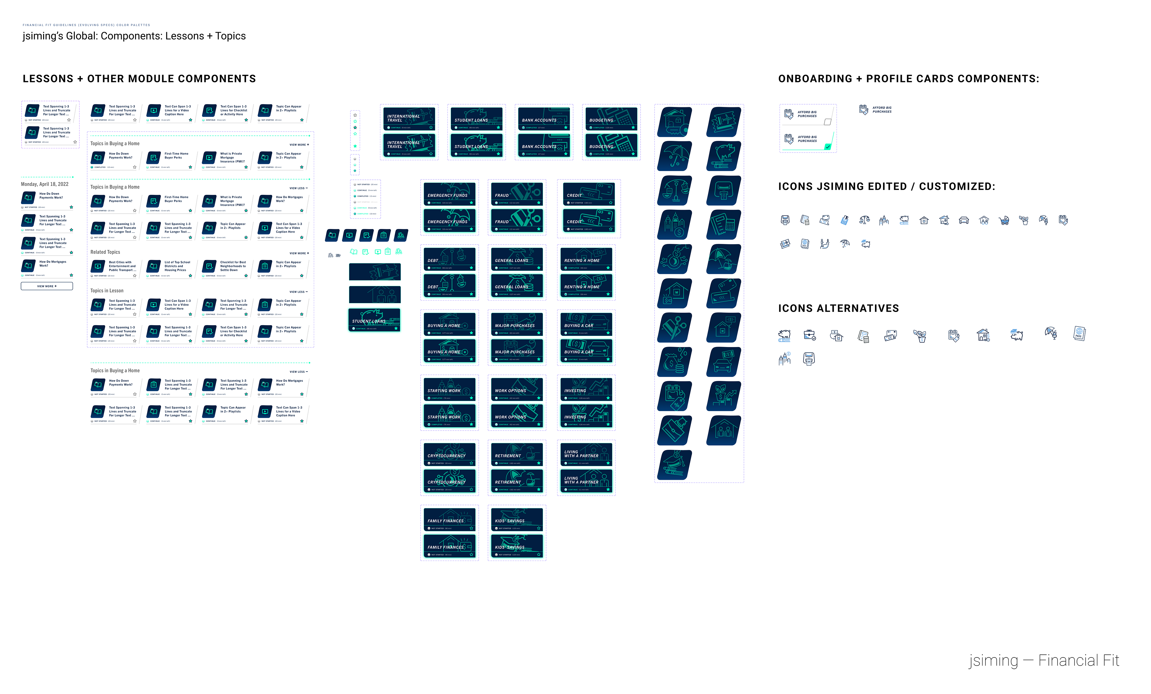
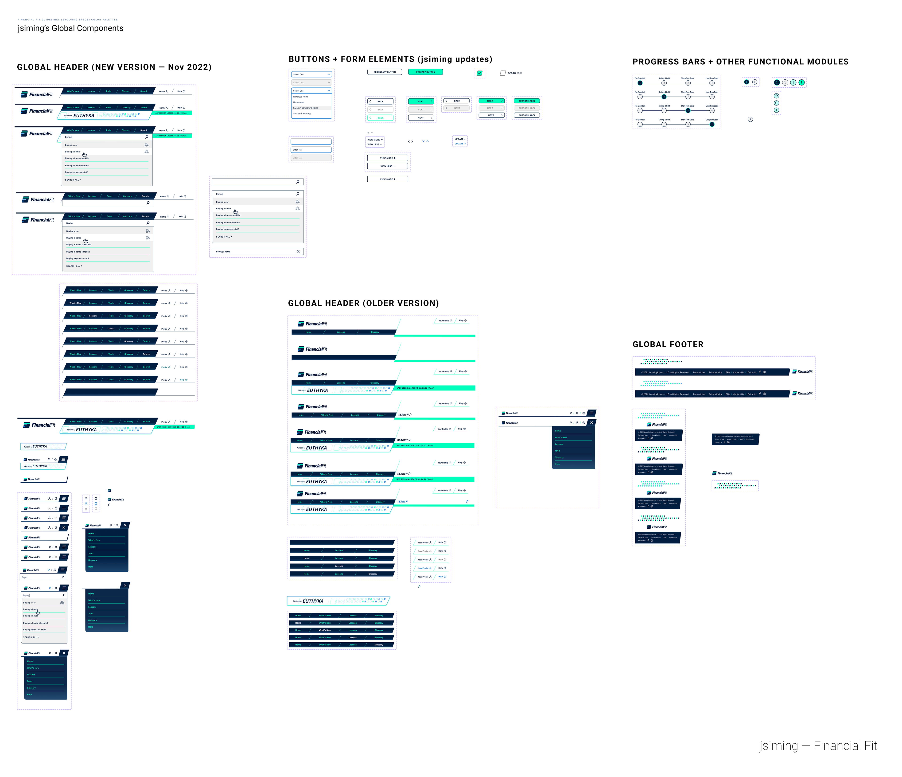
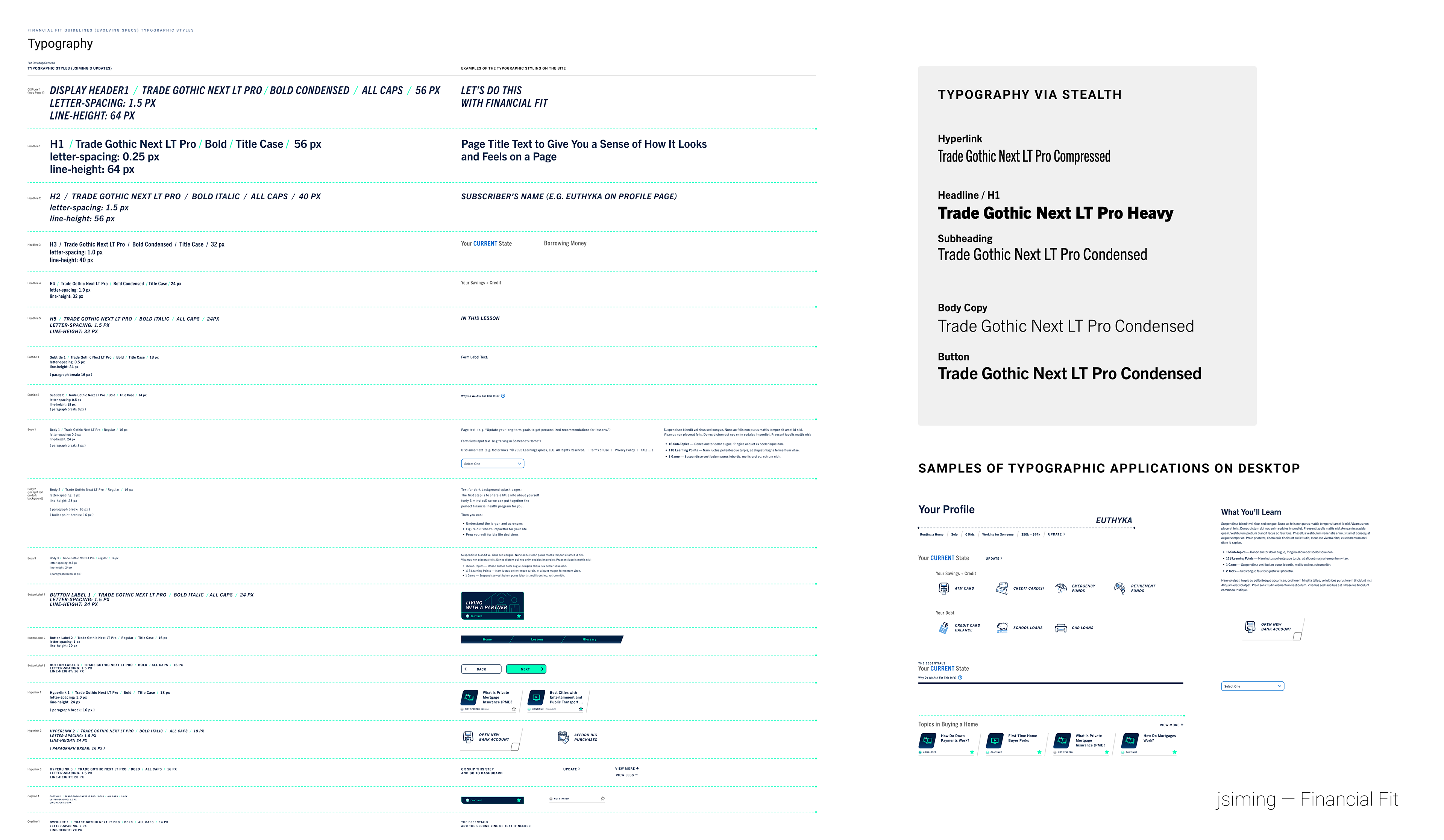
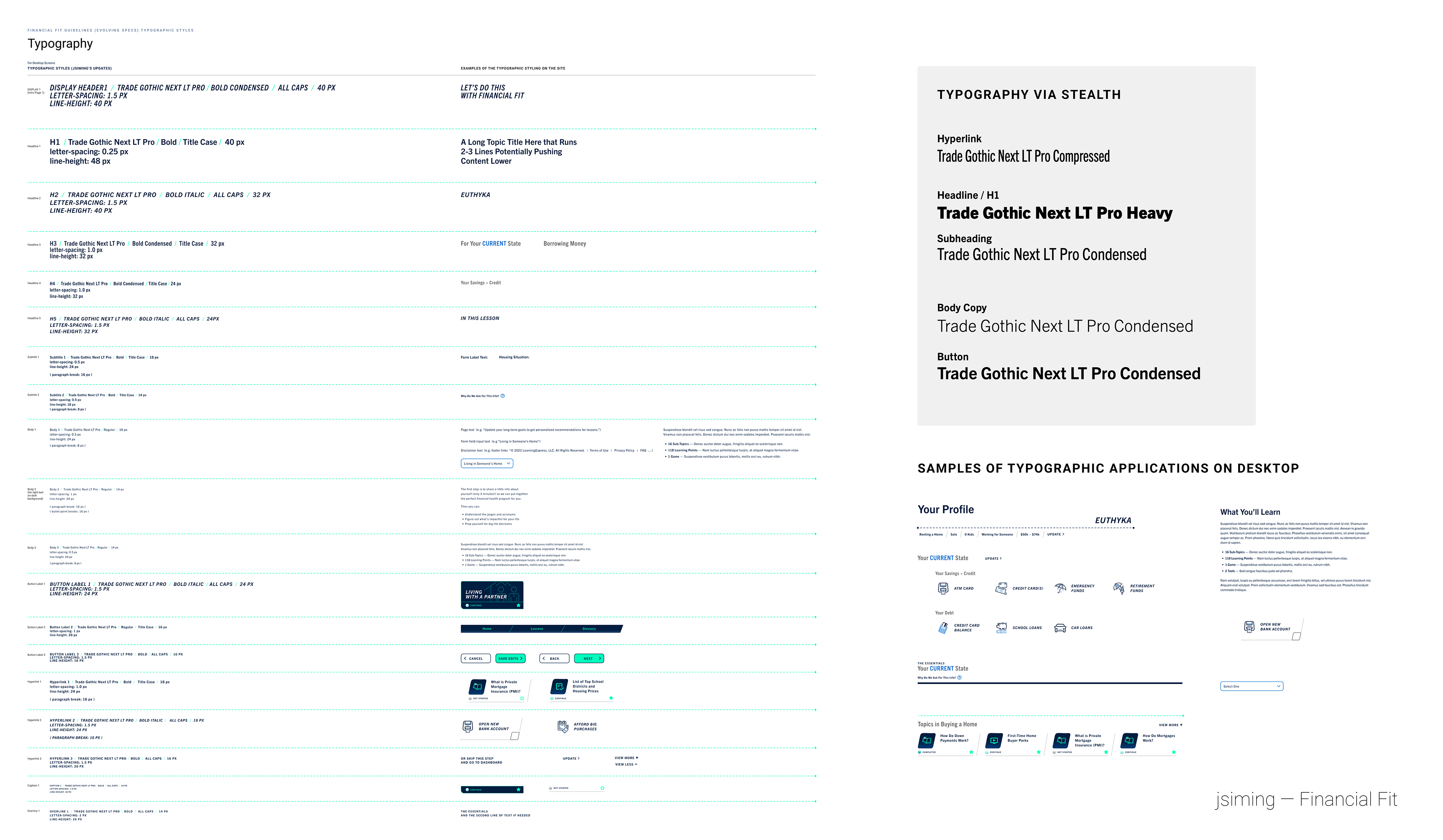
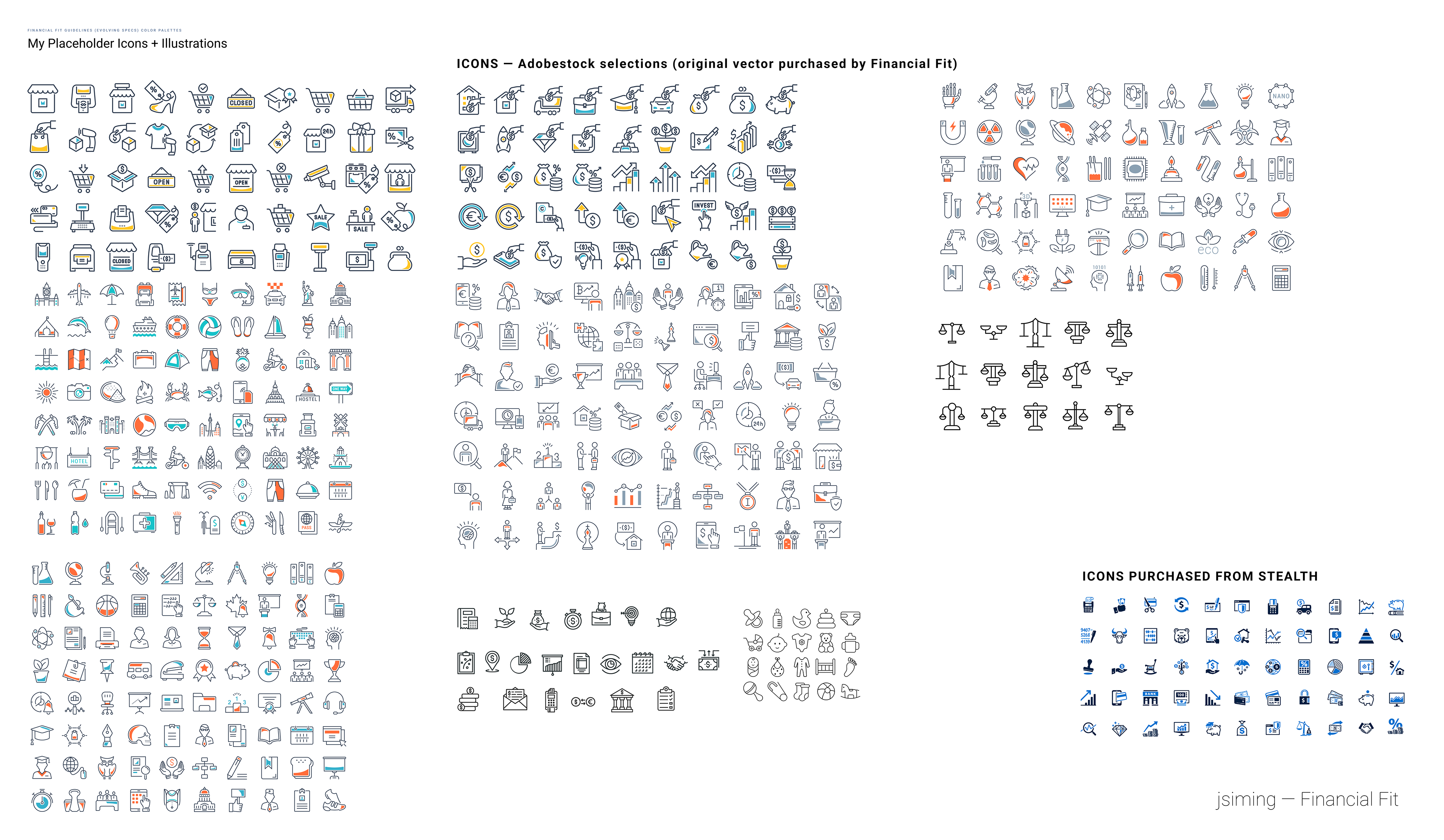
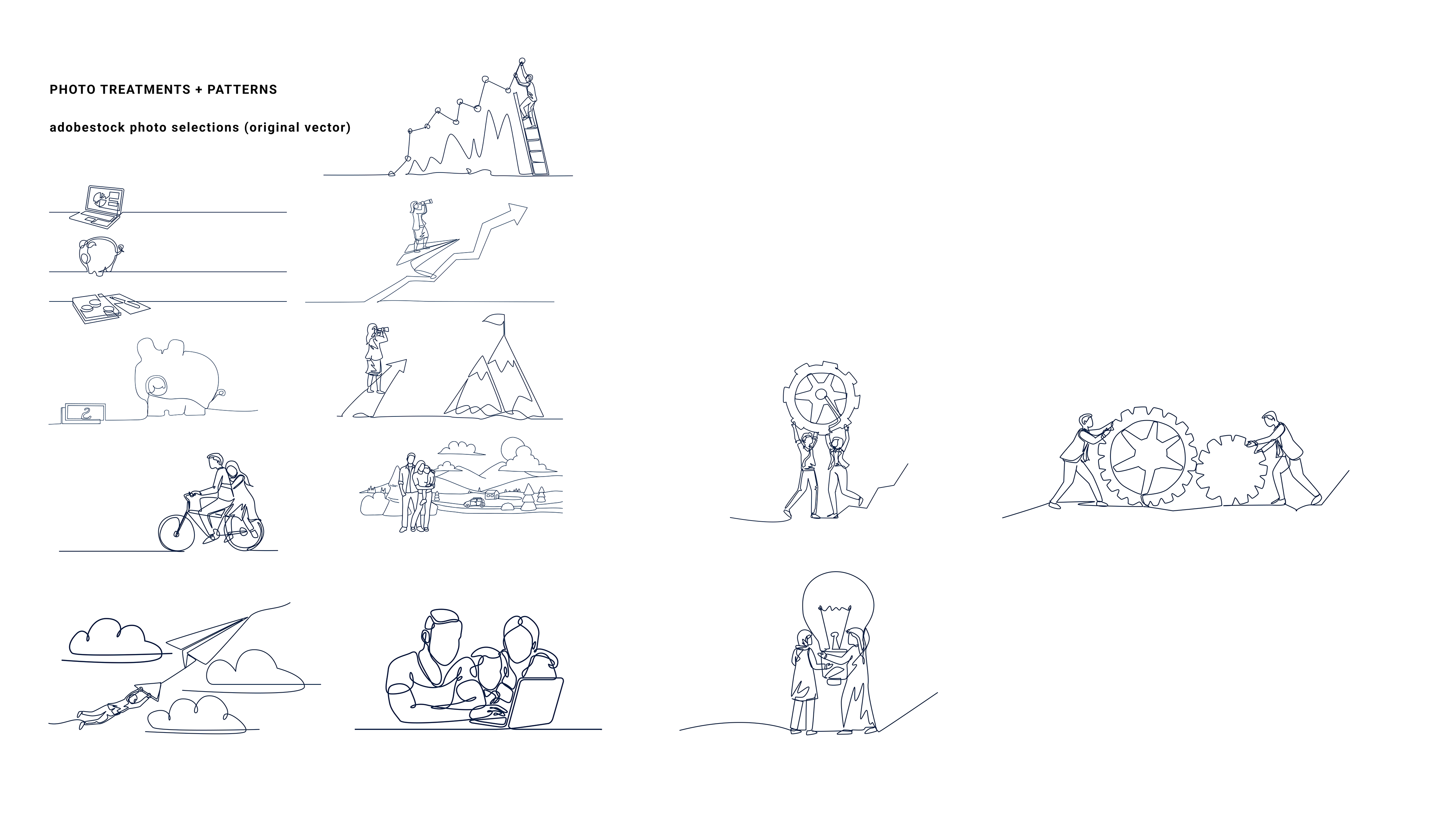
Detailed below is my evolving design library documenting the atomic UI components I created for FinancialFit and styleguide to standardize the color palette, typographic treatment, and other brand characteristics. Here are some sample pages of my design library as a work-in-progress.
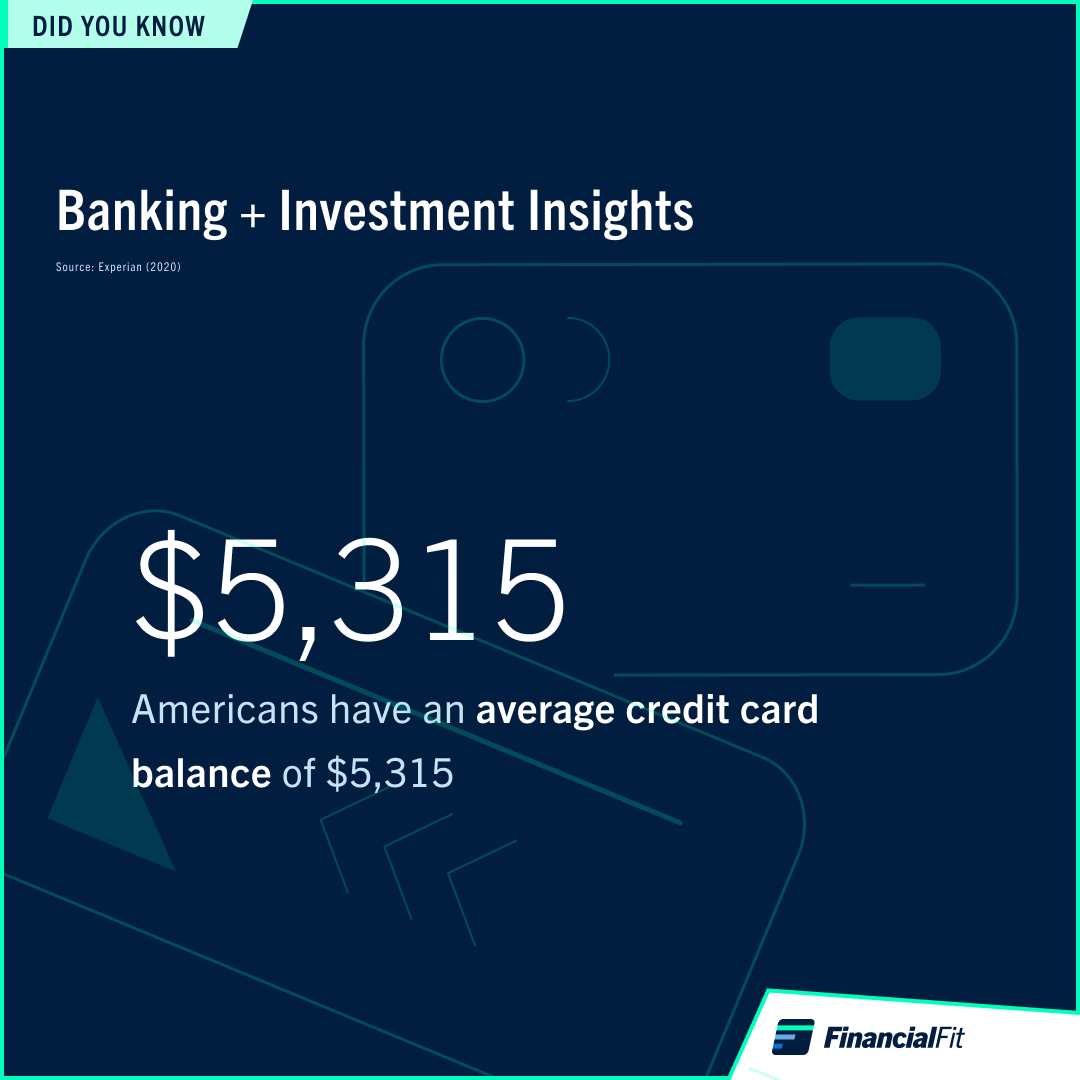
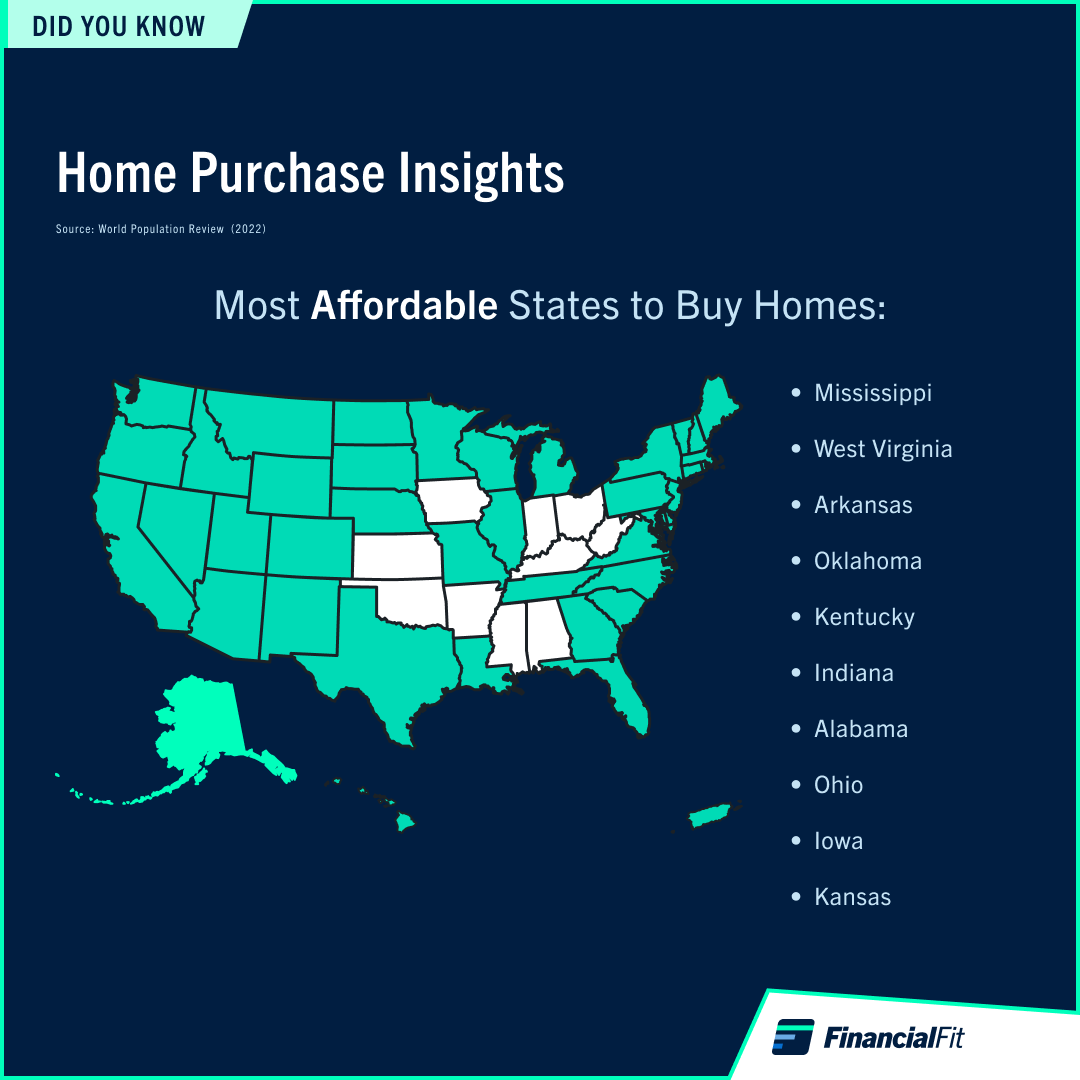
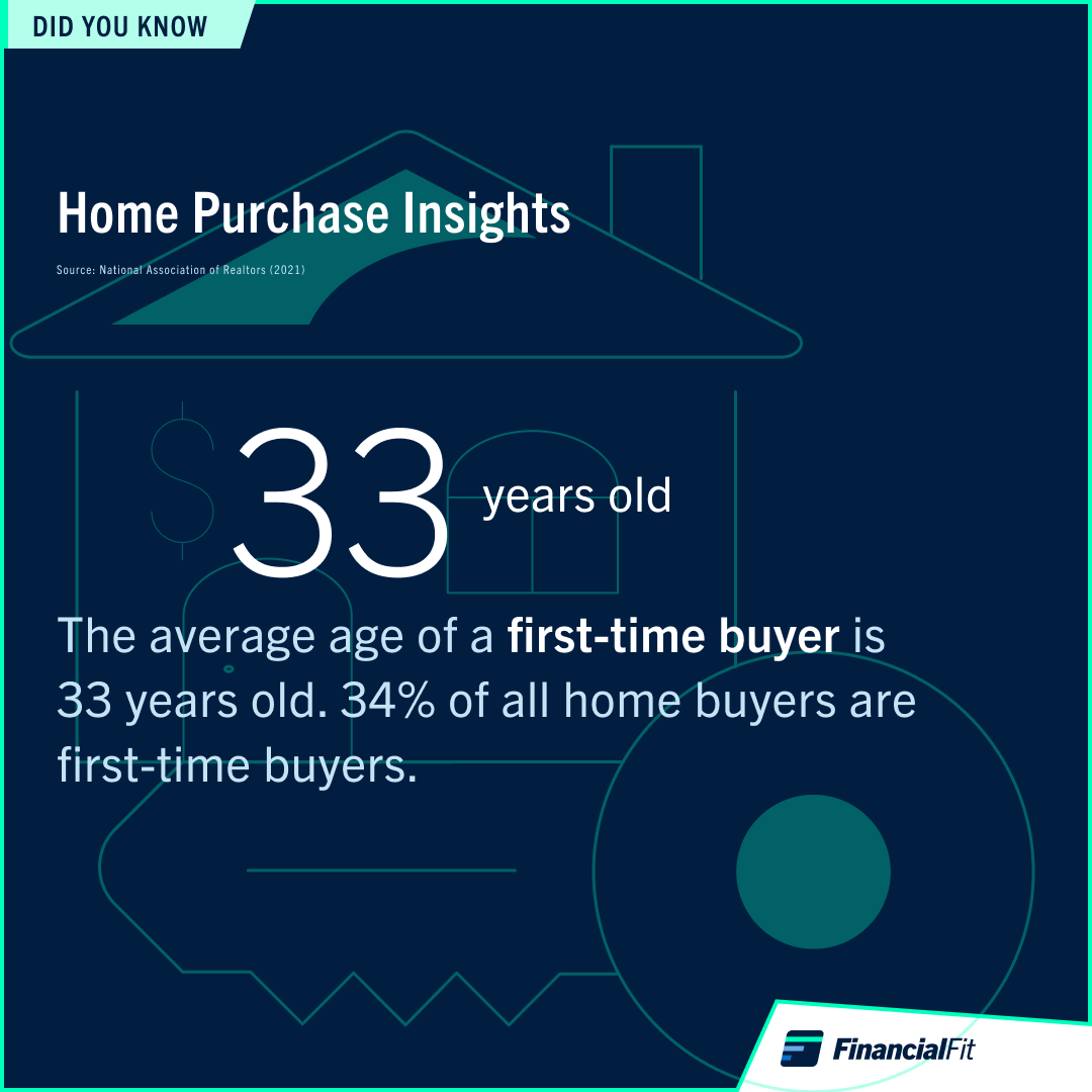
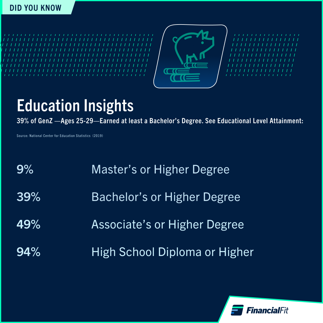
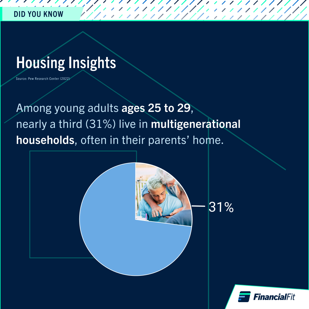
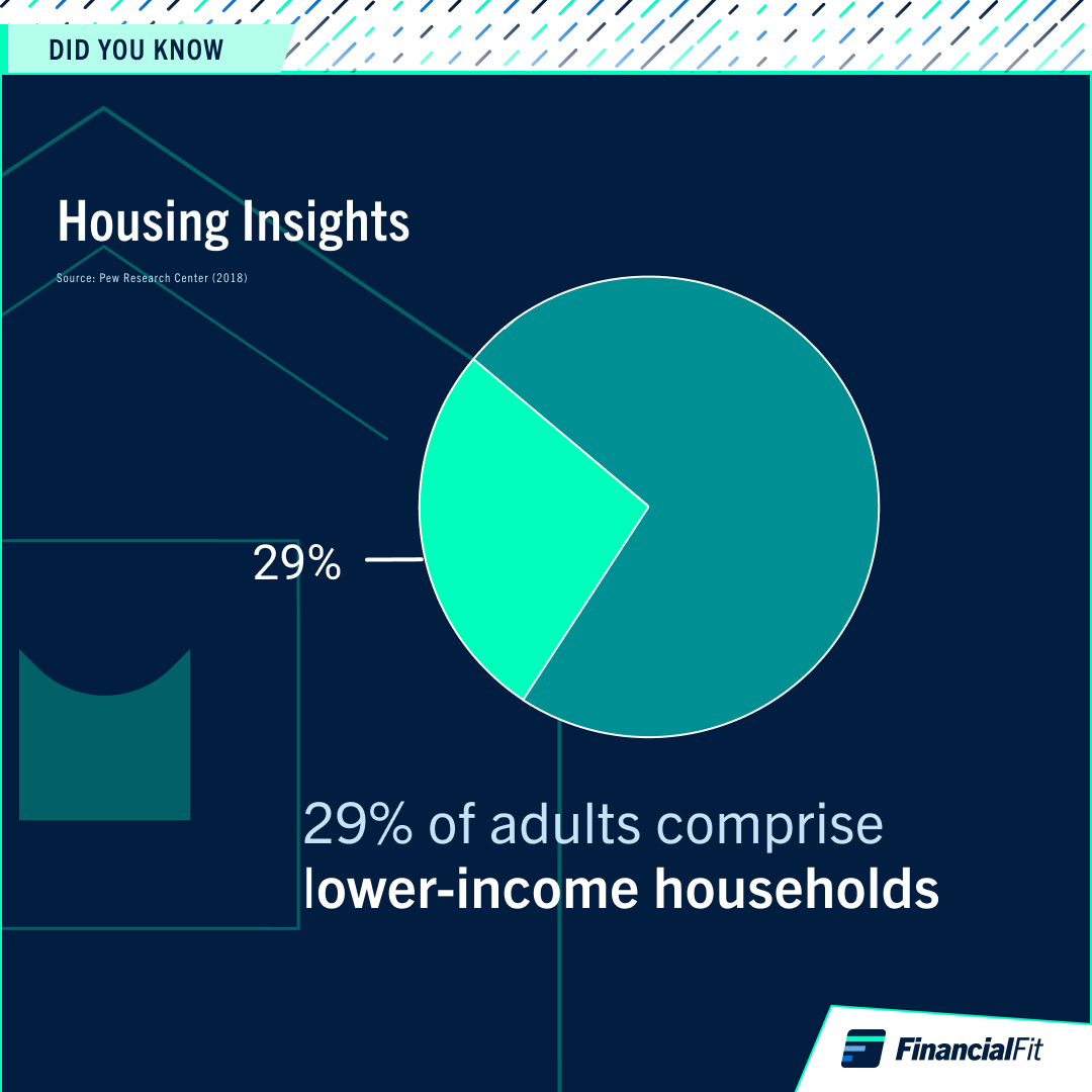
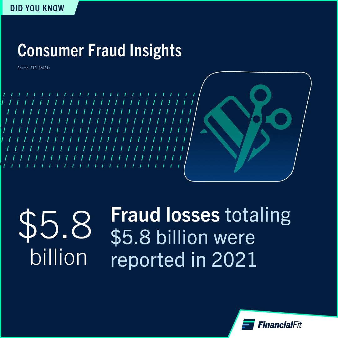
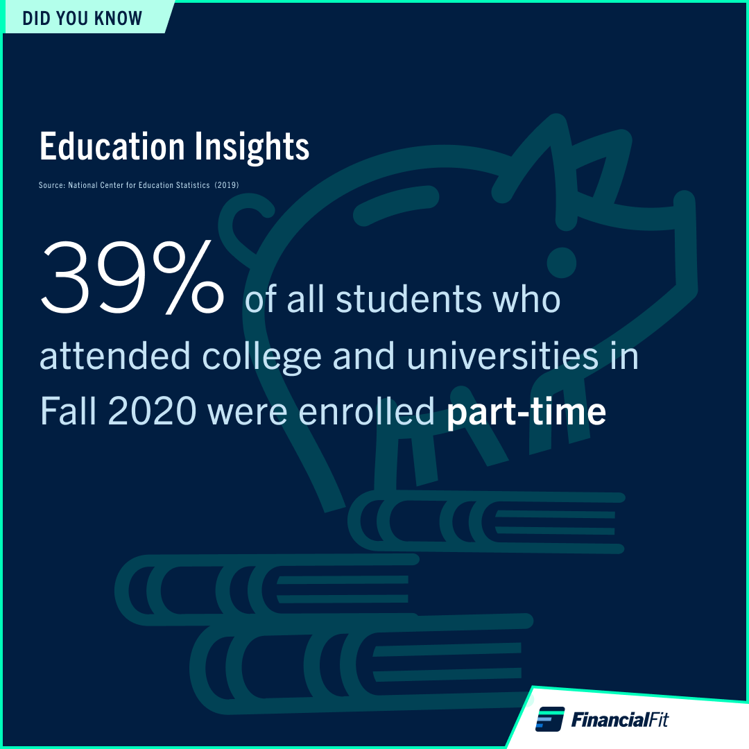
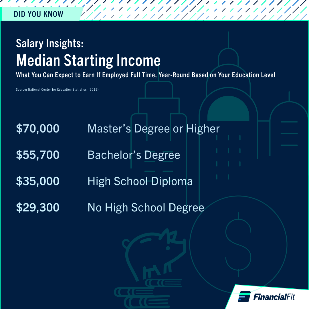
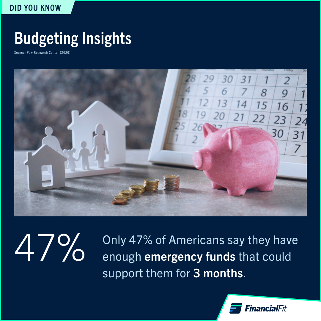
Social Media Promotion of FinancialFit
Socioeconomic Trends Research + Designing Instagram Infograph Ads
Socioeconomic Trends Research + Designing Instagram Infograph Ads
Featured below are the Instagram infographs that I created to build FinancialFit's reputation as the edTech that Gen Z and Y users predominantly could trust to advance their financial literacy. EBSCO's Product Director decided that we would feature social media ads frequently to generate interest in our product lines and help build a social media following. I then recommended to the EBSCO management team that we create Instagram infographs featuring noteworthy financial quotes and statistics that would demonstrate EBSCO's expertise and understanding of the socioeconomic concerns of their prospective customer base.