PROJECT: MHE — International Division
( International eCommerce Sites Standardizaton )
( International eCommerce Sites Standardizaton )
ROLE:
Principal UX / UI Designer tasked with the UX and UI visual redesign of the International Division’s eCommerce responsive mobile website. MHE’s textbooks and digital adaptive learning edTech products are designed for faculty, students, admin, and professionals.
KEY SKILLS / DELIVERABLES:
• Big-Picture, Bluesky Product Ideation
• International eCommerce Strategy for PreK-12, Higher Ed, Professionals Divisions
• High-level Wireframes Features Ideation
• eCommerce High-Fidelity Visual Designs
• Personalization and Persona-Segmentation Strategy
DESIGN APPS USED:
• Omnigraffle (annotated wireframing)
• Sketch (detailed UX / UI Designs)
• Photoshop (detailed UI designs)
• Invision (interactive prototyping)
PROJECT OVERVIEW / CONTEXT:
McGraw-Hill Education (MHE) is one of the top three giants in the PreK-12 edTech and textbooks publishing sector that includes Savvas (Formerly Pearson PreK-12) and Houghton Mifflin Harcourt. While the higher ed and PreK-12 divisions were working on this integrated eCommerce platform integrating their divisions into one b2b consumer experience, MHE International division needed a redesign of their eCommerce websites to standardize all their disparate international eCommerce websites content presentation and user-experiences into one singular look-and-feel and consumer experience for a cohesive international brand presence. MHE tasked me with collaborating with the directors of eCommerce in the MHE Boston division and the MHE headquarters in the UK to redesign the eCommerce experience that would serve as a template for the other international eCommerce offices to translate and customize as needed to market their unique product lines.
NOTABLE FEATURES + ACCOMPLISHMENTS:
I proposed the concept of "Lifetime Learner" that would offer a roadmap of services to help students navigate from PreK-12 to higher ed and professional life. I also identified the need for students to be able to be able connect their academic education into practical work experiences i.e. translate theory into practice with products paired up with each industry when possible such as MHE's medical simulations product for the pre-med student. Furthermore, I recommended connecting alumni, students, and faculty in new community platforms for future-state product roll-outs. To that end, I designed high-level concepts for homepage dashboards illustrating these community concepts as well means to improve personalization and efficient eCommerce experiences with account preferences setup, shop and checkout flows, wish lists, etc. Collaborated with UK directors of eCommerce and digital strategy, technology leads, and UX team. Given the short timeframe to launch interim site within a couple months, these screens represented a scaled-down MVP version of the site for back-to-school launch.
UX / UI High-Fidelity Design Solutions:
MHE International eCommerce Site Template Designs
(Responsive Mobile Web — Desktop Display for MVP eCommerce Site)
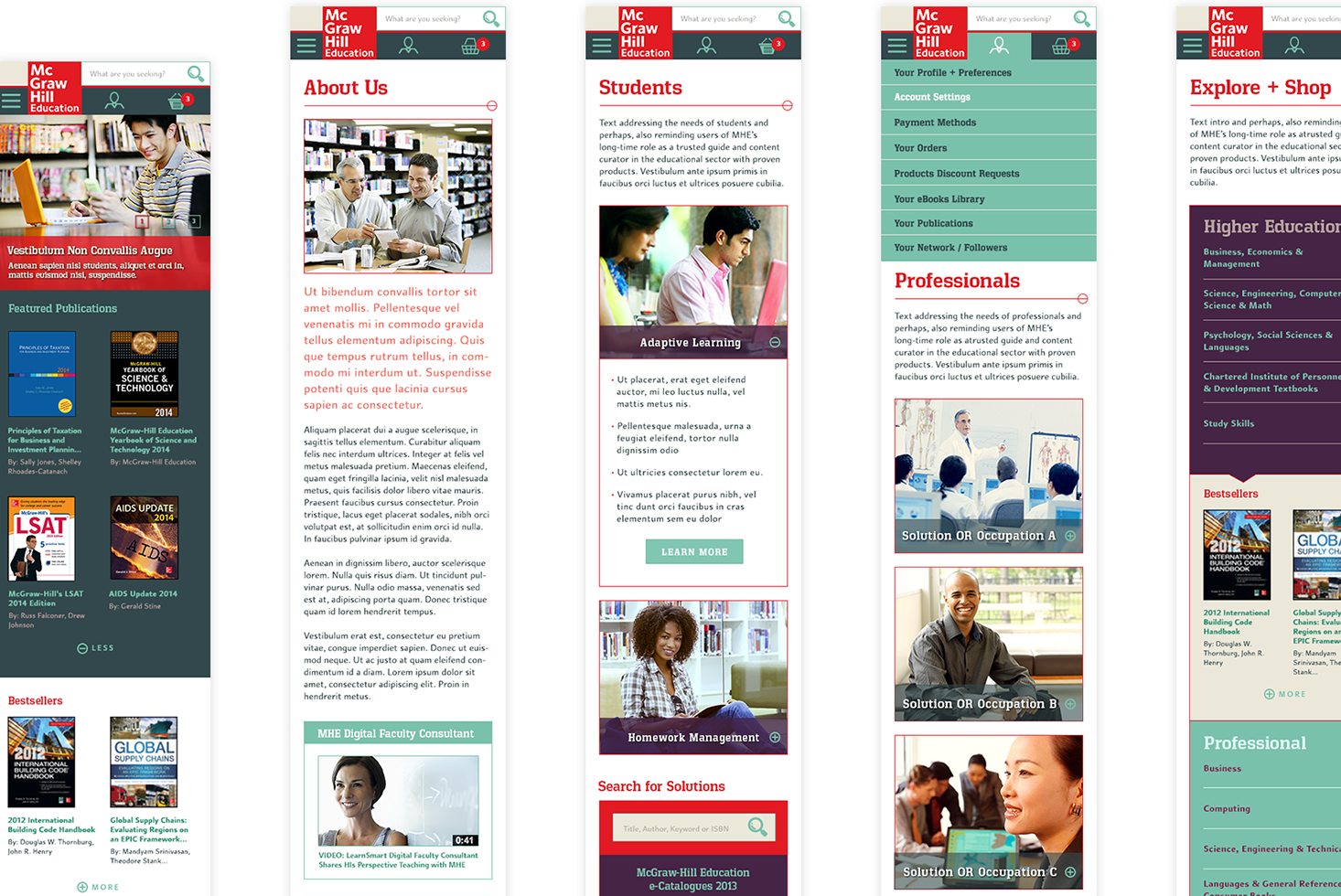
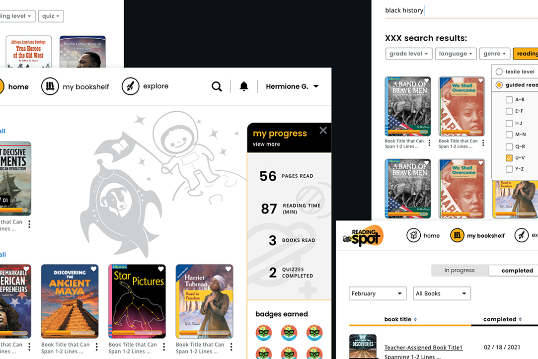
I proposed UX and visual designs for MHE’s international divisions’ new responsive e-Commerce websites inspired by new brand guidelines. New brand colors included: red, mint green, deep hunter grey-green, coral, beige, eggplant purples and sangria mauves. Represented below on the far left is the homepage, featuring new publications and bestsellers. The center page is the MVP version of the “Explore & Shop” page design concepts. The screen on the right is a proposed MVP design for persona-segmented overview pages on recommended products to buy for faculty and students. I wrote the following copy for these pages as placeholders and high-level framing of content and desired features.
MHE International Division
(Corresponding Mobile Web Display)
(Corresponding Mobile Web Display)
MHE International — eCommerce Shop Page
(My Initial UX / UI design concepts — for desktop display)
(My Initial UX / UI design concepts — for desktop display)
PROCESS DETAILS FOR INTERNATIONAL DIVISION:
IDEATE + PROTOTYPE PHASE
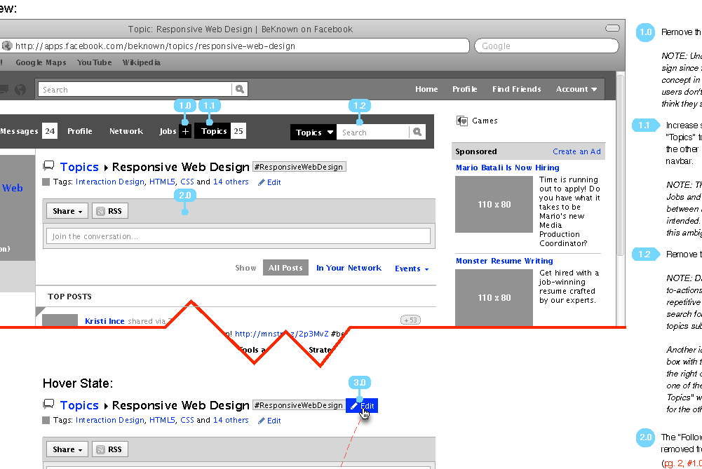
Annotated Wireframes Proposals
Annotated Wireframes Proposals
During my initial ideate phase on the McGraw-Hill International website redesign project, I proposed a big-picture, North Star vision for the International eCommerce websites with e-community capabilities. I recommended that we position the company's brand as a lifetime learning partner that would connect academic theories to practical real-world applications via our adaptive learning and product simulation apps. In my following MHE International eCommerce Blue Ocean Ideation document (PDF) below, I created annotated wireframes illustrating my proposal for new service services concepts and features for stakeholders' considerations. These wireframes were blue ocean concepts I initially proposed to the UK directors with my dashboard and product innovation ideas.
PROJECT: MHE — PreK12 & Higher Ed Divisions
( eCommerce Sites Integration )
( eCommerce Sites Integration )
ROLE:
Sr. UX / UI Designer on MHE’s eCommerce responsive website design.
Lead UX strategist on MHE's content strategy team and on the search, find, and filtering strategy team.
KEY SKILLS / DELIVERABLES:
• Big-Picture Product Ideation
• Multi-Business Divisions eCommerce Strategy
• Extensive Content Strategy
• Personalization and Persona-Segmentation Strategy
• Search + Browse Strategy
• Product Bundling, Cross-Sells, Up-Sells,
Volume Discount, Single-Ticket Sales Designs
Volume Discount, Single-Ticket Sales Designs
• Visual Design System / Components Library
• Accessibility + User-Testing
DESIGN APPS USED:
• Omnigraffle (annotated wireframing)
• Sketch (detailed UX / UI Designs)
• Photoshop (High-Fidelity UI designs)
• Invision (interactive prototyping)
PROJECT OVERVIEW / CONTEXT:
McGraw-Hill Education had acquired multiple edTech companies over the recent years and was working to streamline their product lines and help users become more informed about their new adaptive learning products. MHE was developing a unified eCommerce platform experience for both their higher ed and PreK-12 markets that would enable a personas-driven yet integrated eCommerce shopping experience in the cases that their customers had multiple eCommerce personas with different consumer needs and behaviors. For example, a MHE user may be a PreK12 teacher and also, have children in high school and college and thus, would wish to explore products from both PreK12 and higher ed divisions. That PreK-12 teacher may also even be a member of a school board for their district and serve as an admin on the site. Our objective was to empower users to become more informed consumers of our products, enabling them to search, discover, and, compare our new adaptive learning products more effectively.
NOTABLE FEATURES + ACCOMPLISHMENTS:
As a Sr. UX / UI Designer on the eCommerce team of McGraw-Hill Education (MHE), I worked primarily on the browse and search teams and the lead UX strategist on the content strategy team. I was nominated by DPG (Digital Platform Group) eCommerce product management for recognition of my accomplishments on UX and content strategy efforts. During the years I worked on the MHE eCommerce team, Product Management team reported 60% revenue increase within a year following the work we completed on the website integration work. In addition, HigherEd eCommerce earnings increased by 15% in 2017, exceeding the combined net revenue of top three distribution partners (Barnes & Noble, Follett, and Amazon). 12% YOY web traffic growth since 2014.
Represented below are UX concepts for PreK-12 schools’ site integration with higher ed in collaboration with MHE’s Product Managers, stakeholders, business analysts and Sapient fusion teams. I was the principal UX strategist on the e-commerce content strategy team — introduced IA and lead gen content strategy to templatize digital platform product marketing microsites, key discipline portal pages, news article pages, and redesigned the global navigation experience with persona-segmentation. Created AEM (Adobe Exchange Manager) content modules that would enable MHE stakeholders to customize their content and build out their microsites later. Website design inspired by new brand colors included: red, mint green, deep hunter grey-green, coral, beige, eggplant purples and sangria mauves. These designs represent the FIRST version of the site redesign.
Proposed search filtering and browse experiences. Primary UX strategist on the e-commerce content strategy team — introduce IA and lead gen content strategy to templatize digital platform product marketing microsites, key discipline portal pages, news article pages, and redesigned the global navigation experience with persona-segmentation.
As the primary UX strategist on the e-commerce content strategy team, I introduced the information architecture and lead gen content strategy to templatize digital platform product marketing microsites, key discipline portal pages, news article pages, and redesigned the global navigation experience with persona-segmentation. Proposed search filtering and browse experiences.
When determining which features to develop for desktop and mobile platforms, I considered which specific demographic were more likely to use the mobile interface for their research and transactions and which ones would prefer researching solutions and tasks on desktop. For example, user studies and secondary research indicates that higher ed students use mobile phones more while PreK-12 administrators tend to prefer to do their research and transactions on a desktop computer.
EMPATHIZE / DISCOVERY PHASE
Researching the Edtech and Publishing Industry
Researching the Edtech and Publishing Industry
When I was appointed the role of lead UX / UI Designer on the content strategy and search-and-browse teams at McGraw-Hill Education, my initial design thinking steps began as follows in the empathize / discovery phase:
1) Comprehensive audit and analyses of all existing documentation from stakeholder interviews and user personas, scope roadmaps, spreadsheets documenting all 300+ MHE microsites that need to be represented in the new site, brand guidelines, etc.
2) During my secondary research, I read news articles and industry studies on the edtech and publishing sectors and trends that impacted them to better empathize with my various target user personas including Prek-12 admin and district boards, PreK-12 parents and students as well as higher ed faculty and students, etc. I even watched Scott Thurman's award-winning documentary "The Revisionaries" (2012) to learn more about the politics of content inclusion in textbooks between state boards and school districts such as on the topics of evolution, climate change, historical perspectives.
3) Conducted competitive analysis of industry competitors for peers in the field to get a sense of how they were positioning themselves in terms of their content strategy, information architecture, and general user-experience through their sites
4) Documented the site architecture of the existing site and user-flows through the existing site for the various logged-in personas in wireframes and the define phase.
To better understand the context of the PreK12 and higher ed publishing and edtech sectors challenges and how our primary target audiences — PreK-12 students and parents, PreK-12 teachers and administrators, Higher Ed students and faculty, etc. — would use the site, I created this rather unconventional user-flow on the right here. This user-flow represents persona-driven call-to-actions and industry's consumer purchasing context. I included some of my persona profile notes on this page based on researching the various concerns and interests of our target audiences.
EMPATHIZE / DISCOVERY PHASE (continued) ...
Defining Target Audiences and Persona Privileges and Customer Journeys via Wireflows, Personas-Segmented Navigation
Defining Target Audiences and Persona Privileges and Customer Journeys via Wireflows, Personas-Segmented Navigation
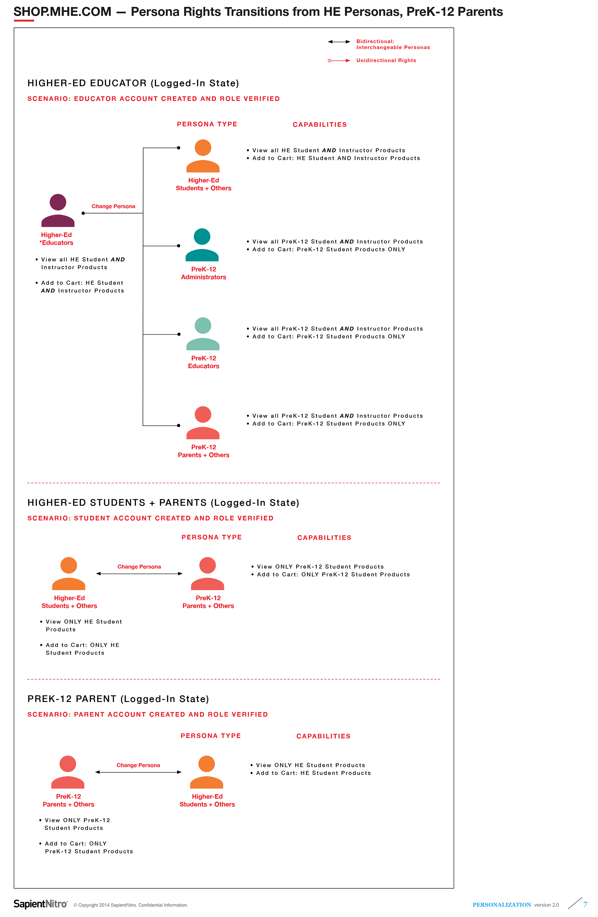
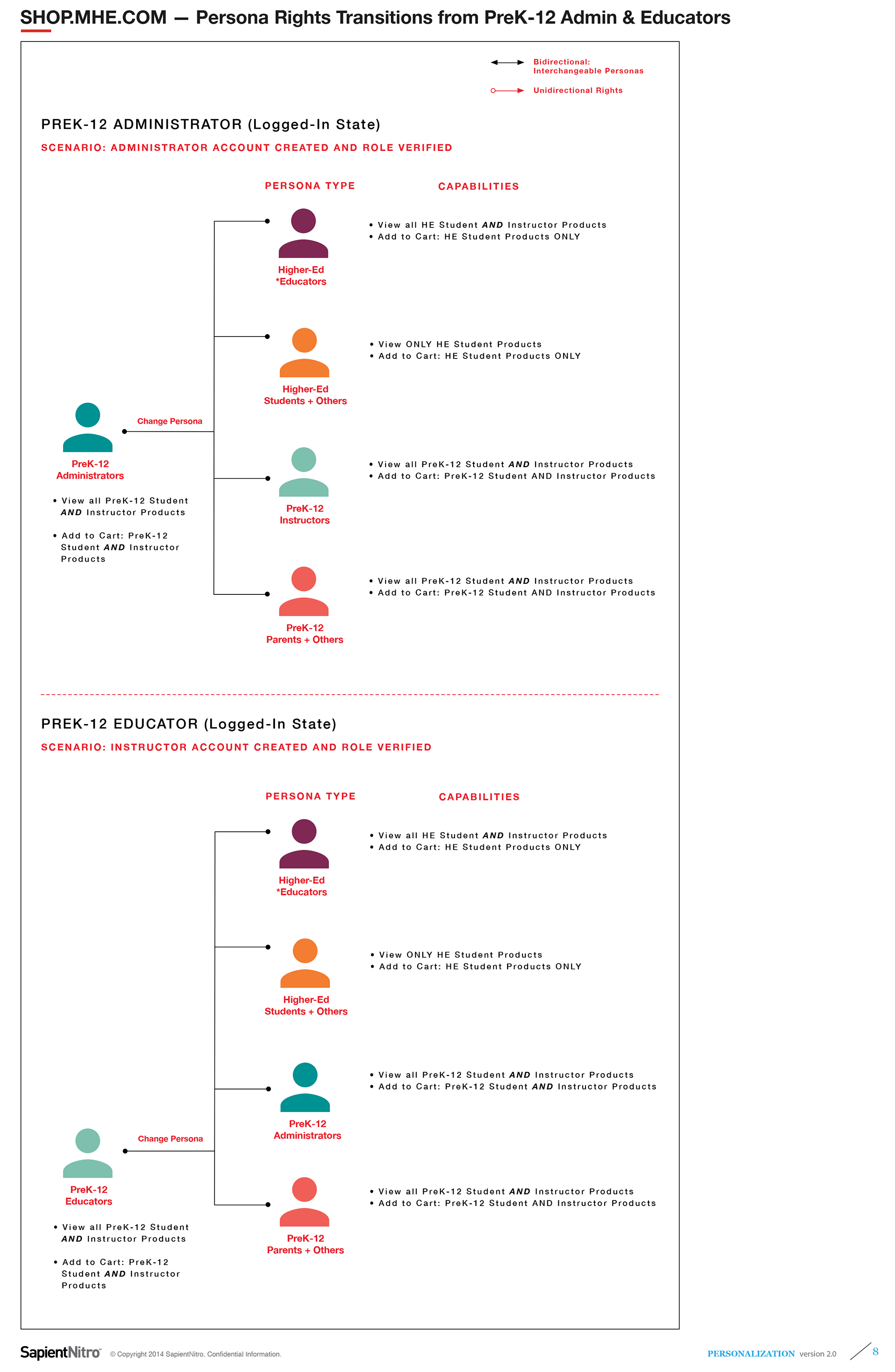
Detailed below are sample UX requirements gathering discovery documents that I created with alignment diagrams illustrating customer journeys for our five key demographics — PreK-12 students and parents, PreK-12 teachers and administrators, Higher Ed students and faculty, etc— once they had logged in.
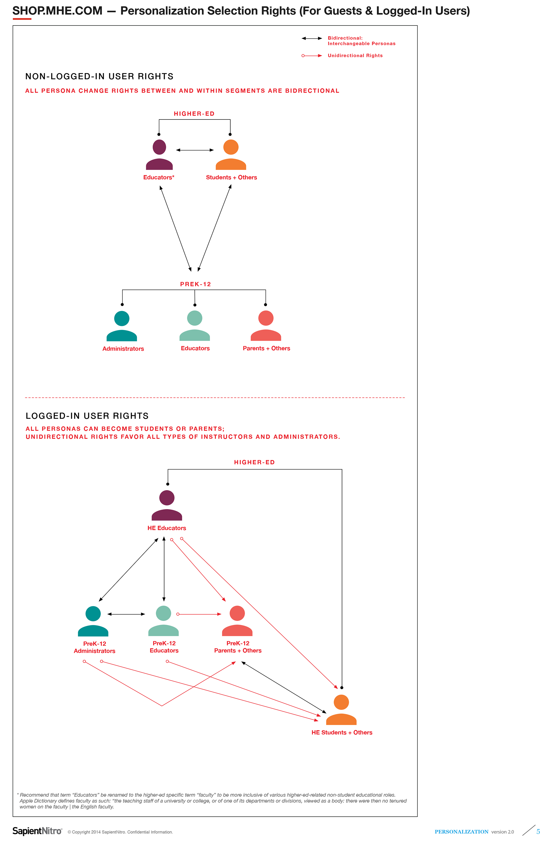
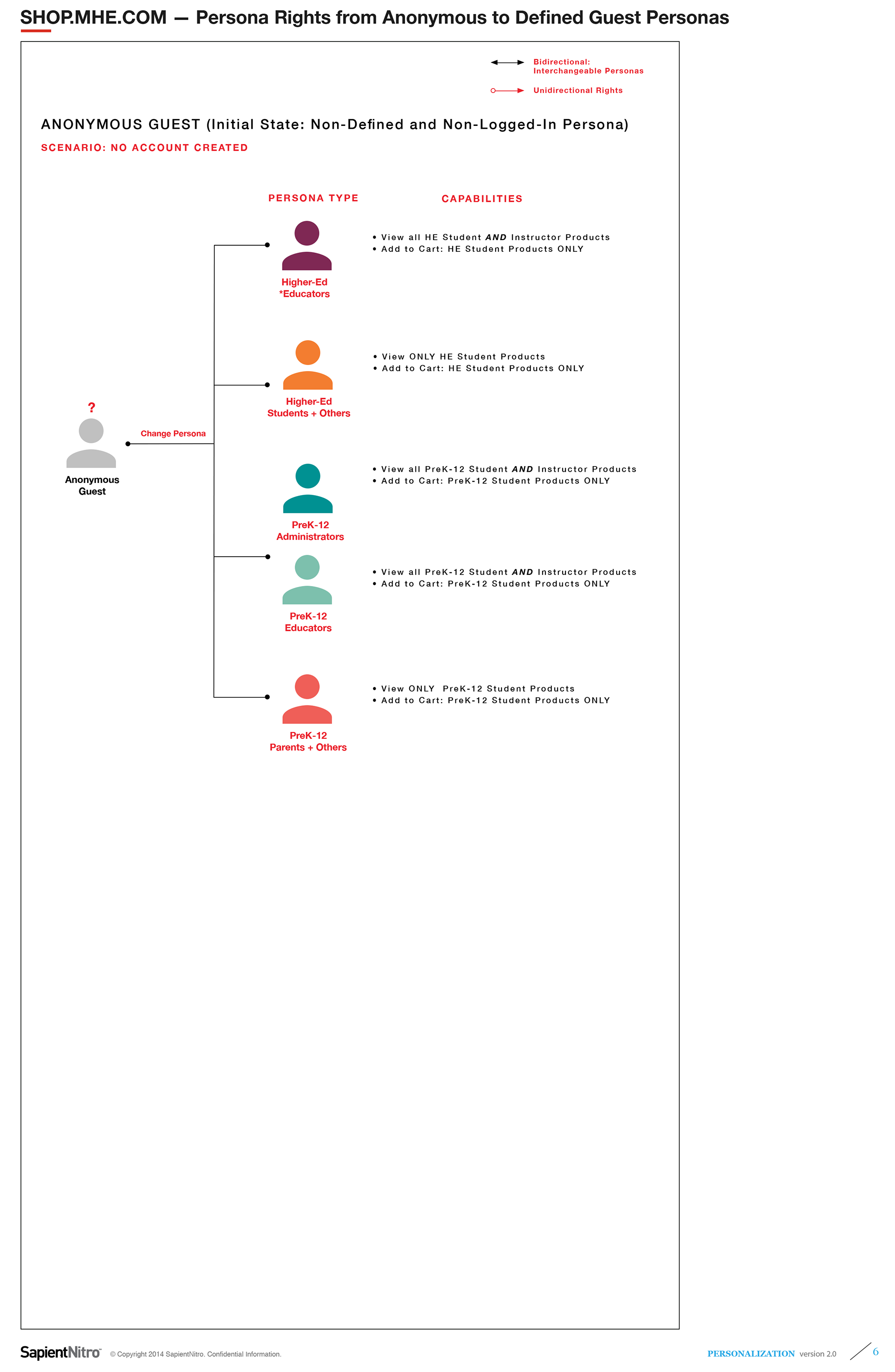
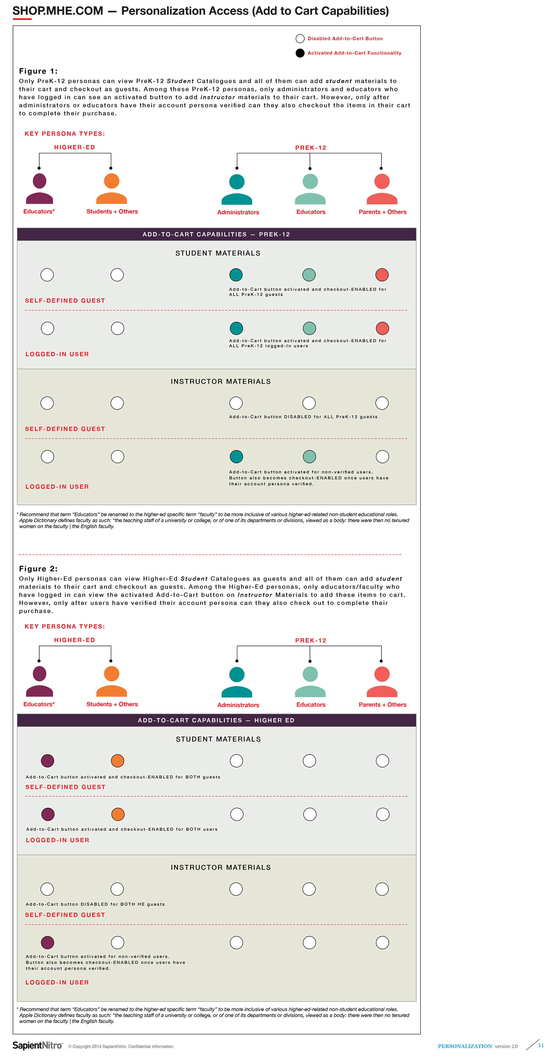
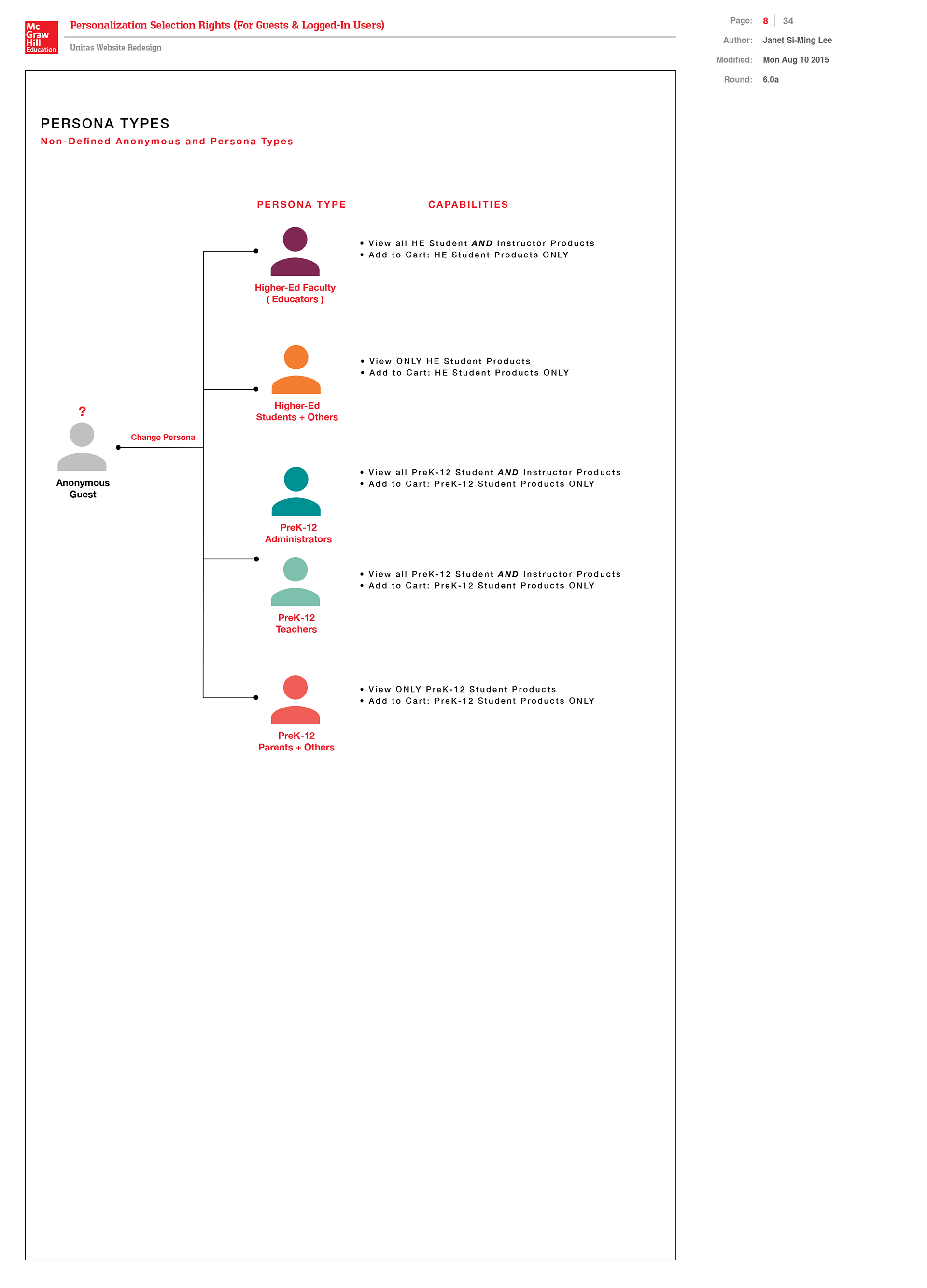
Persona-Segmentation User Rights and Capabilities
Detailed below outlines the differing content privileges, consumer needs, and call-to-actions specific to each of the five personas and accounting for the anonymous. My diagrams below also illustrate the user-flow for anonymous guests who have not logged-in yet. I color-coded screens based on each proto-persona and company division so that it would be easier to quickly interpret the various pages with persona-segmented content and functionalities. These diagrams represent the persona-segmentation rules for proto-persona interchangeability— whether bidirectional or unidirectional— for access to PreK-12 and Higher-ed student and instructor catalogues and their respective add-to-cart functionalities.
PreK-12 and Higher Ed Personas-Based Navigation and Wireflows
In my wireflows below, I color-coded each of the five key personas in MHE's Pre-K12 and Higher Ed markets and illustrated the key webpages they would access. On each of these pages, I indicated their primary call-to-actions when they navigate through the new platform that would integrate the eCommerce experiences of two primary divisions into one site platform experience.
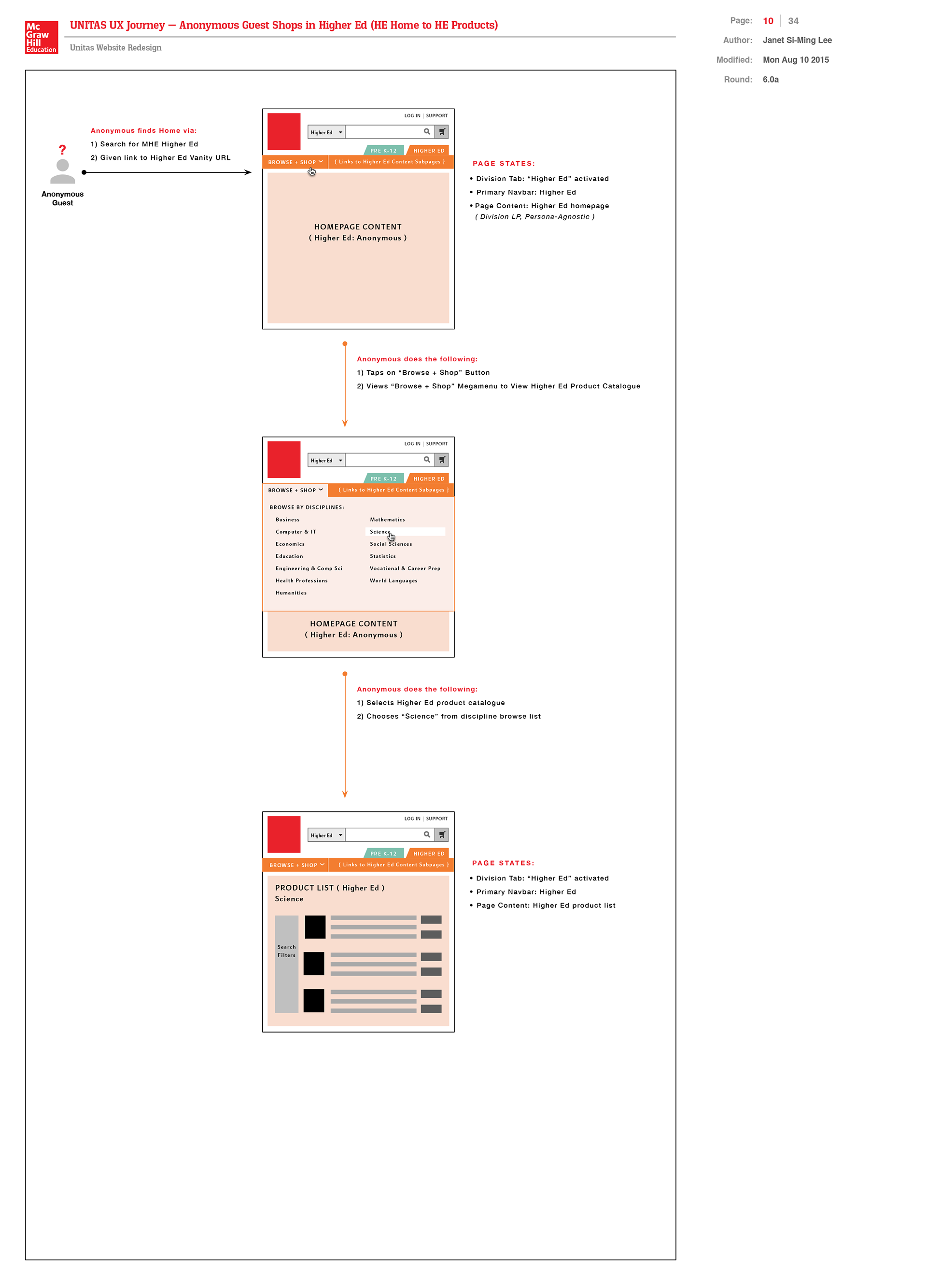
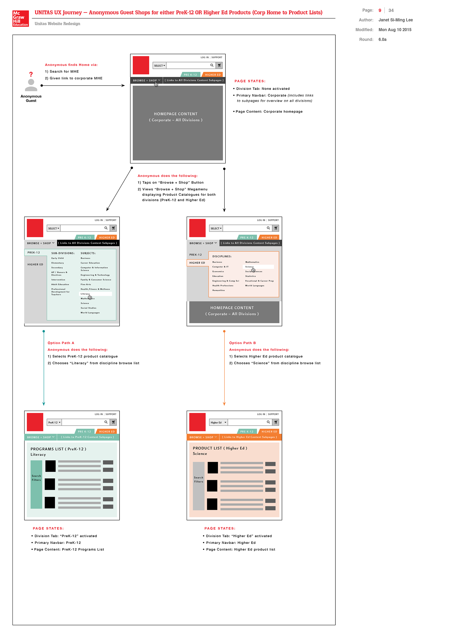
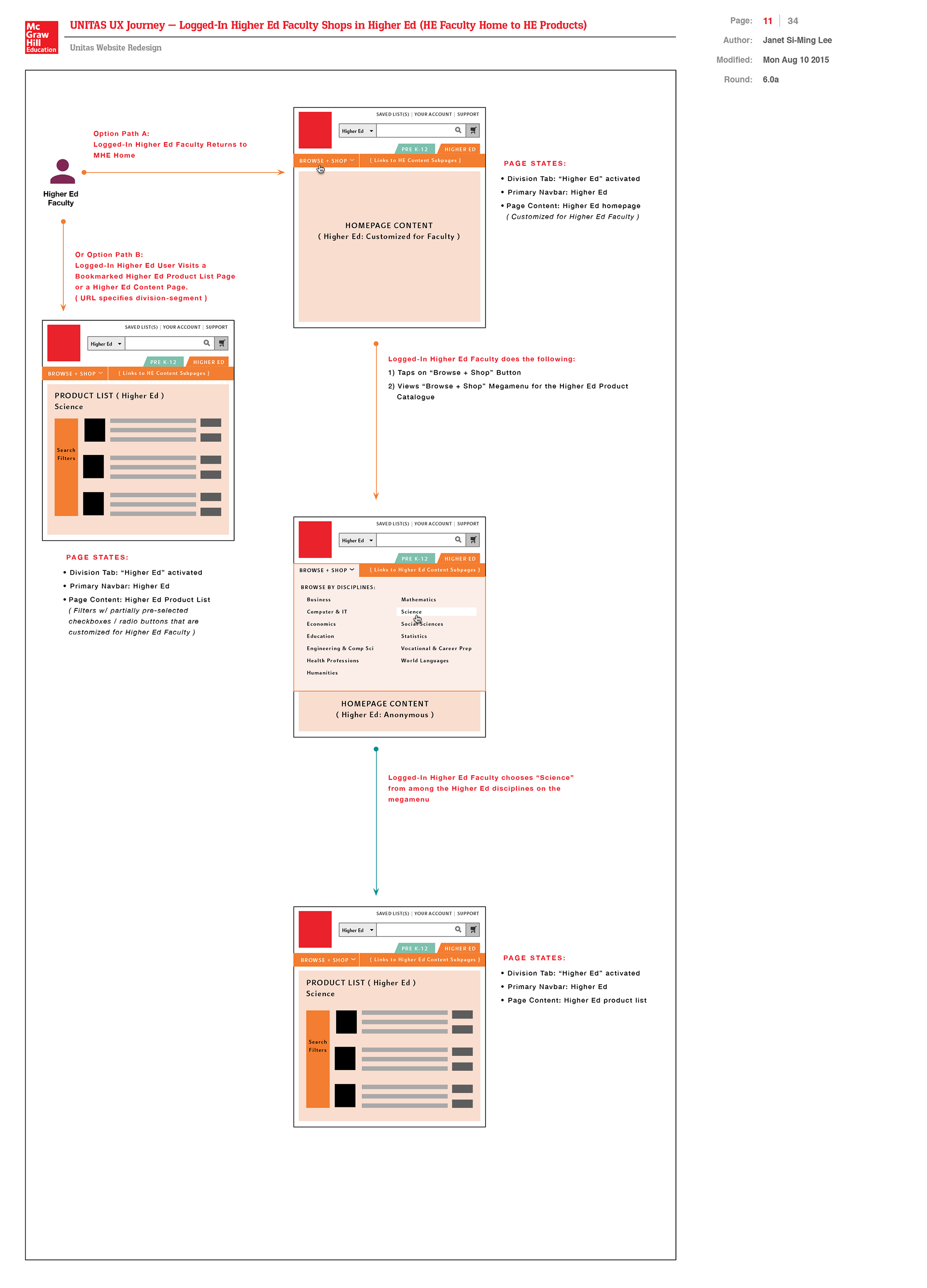
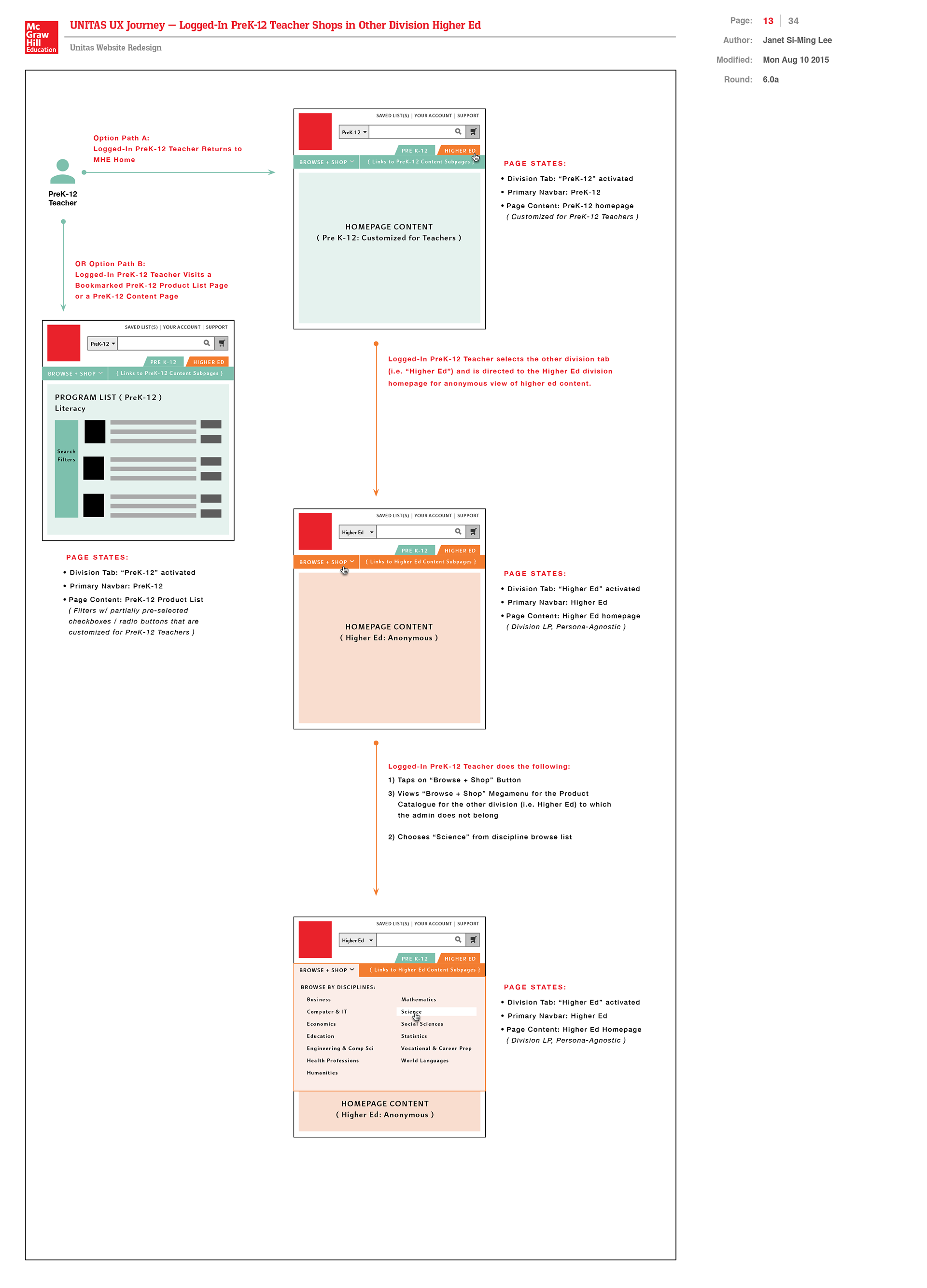
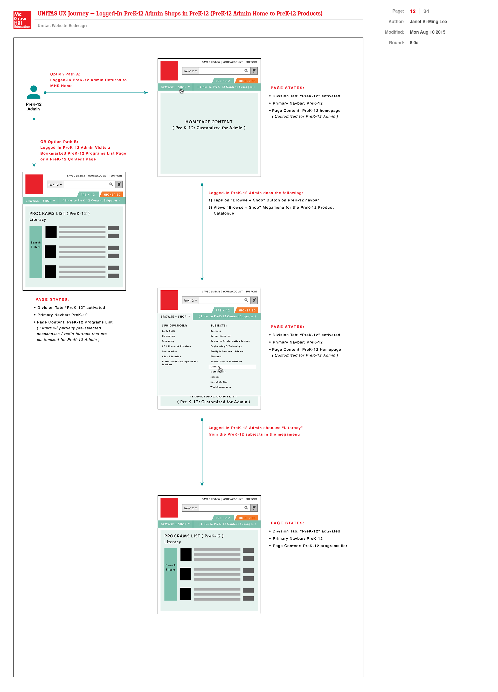
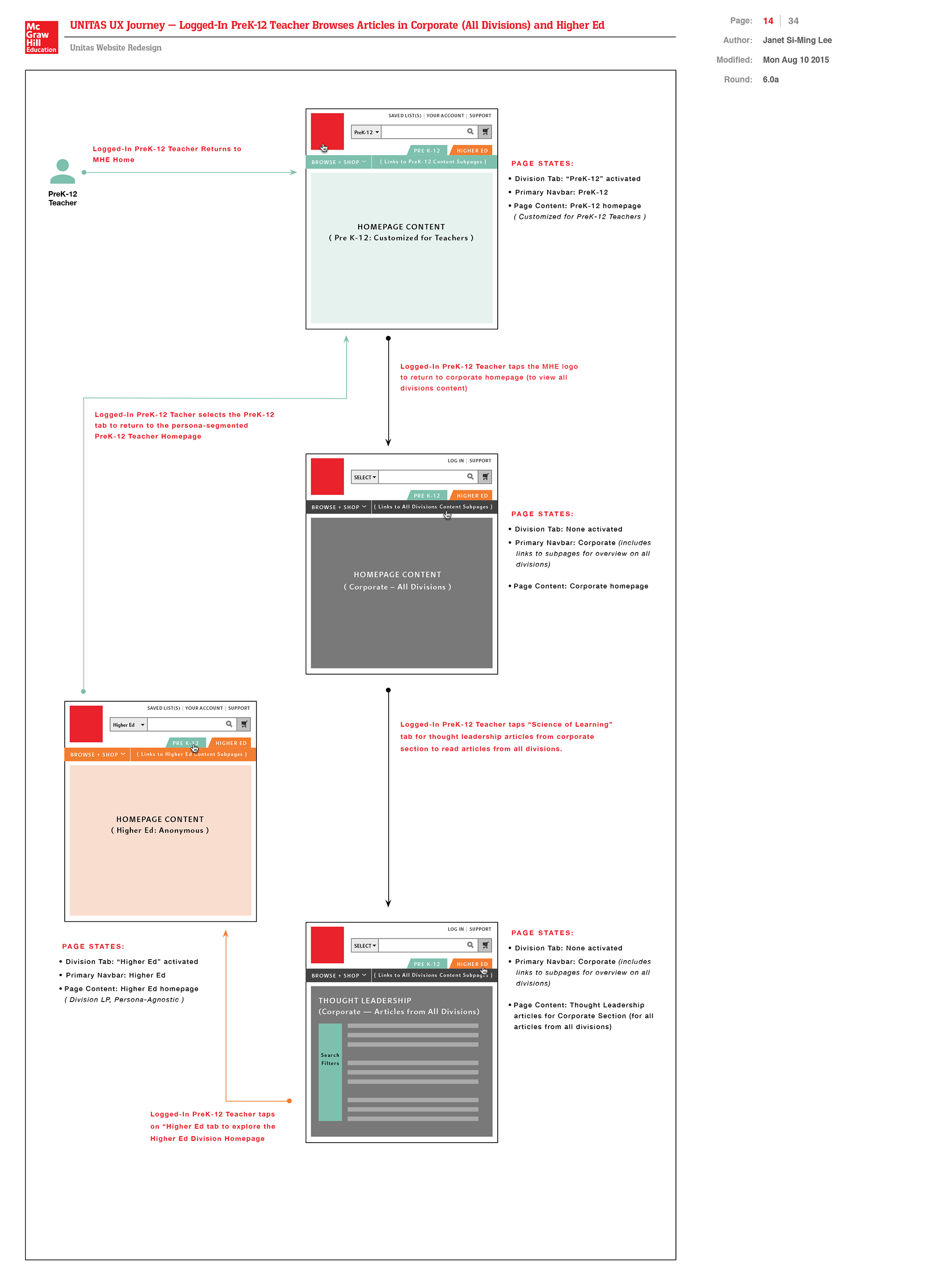
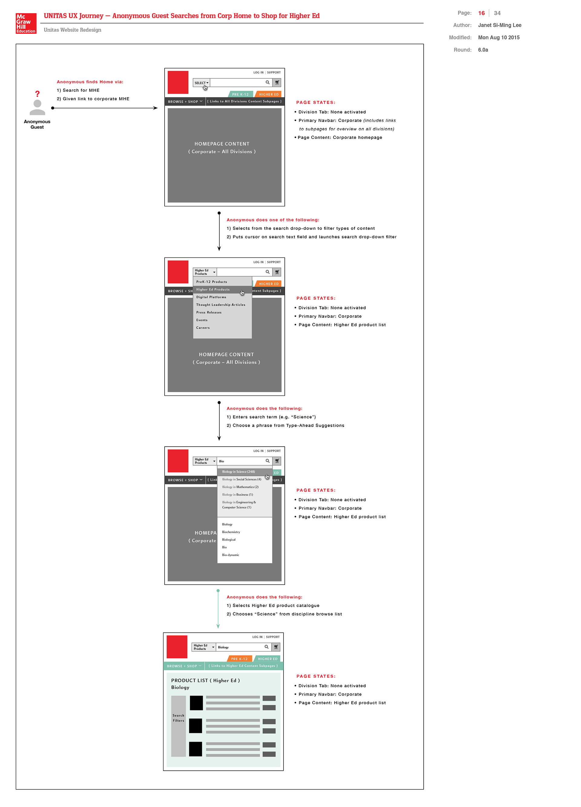
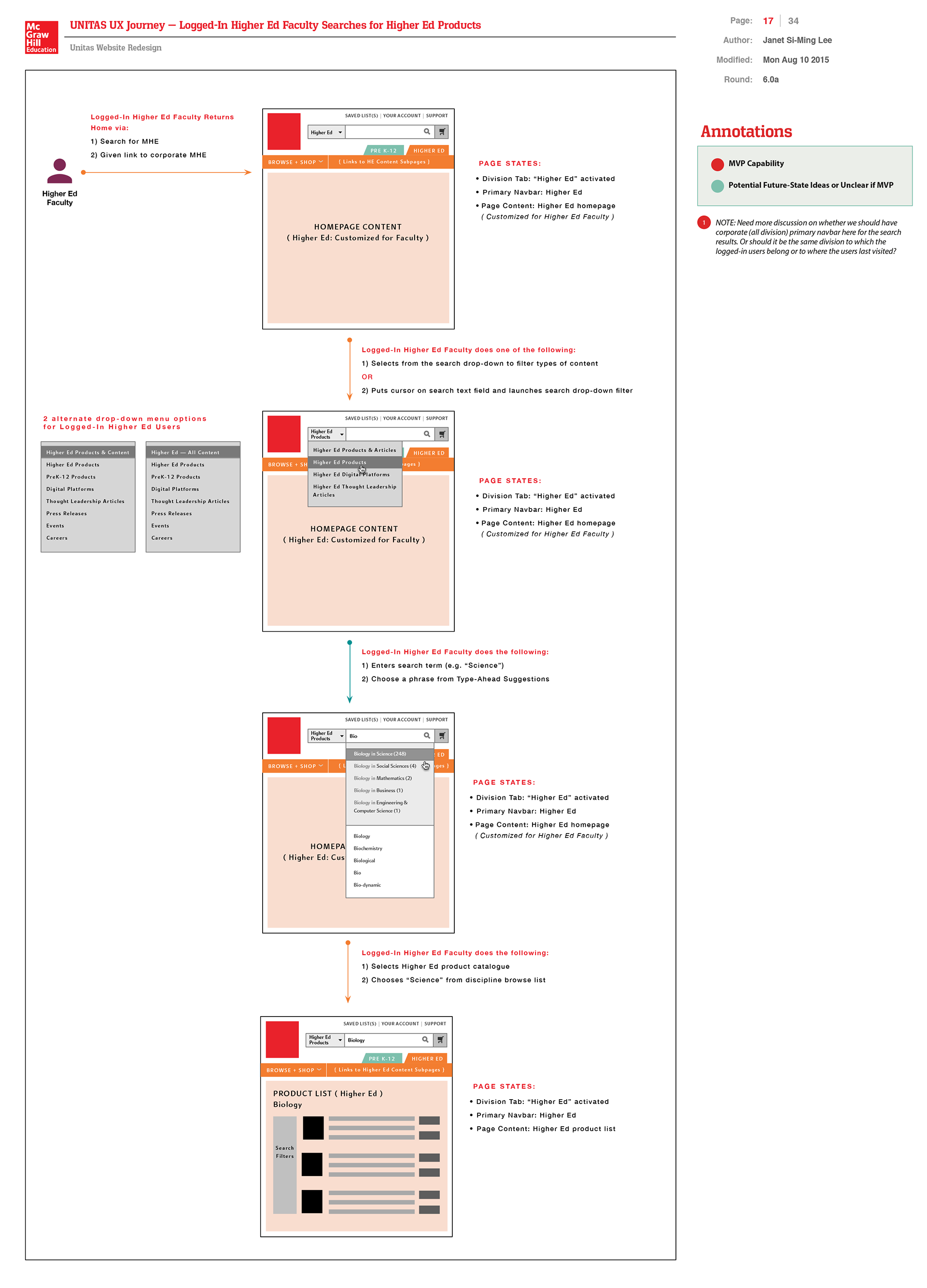
In this wireflow below, I illustrated the paths that PreK-12 site users could potentially navigate through the site from the homepage to discover key call-to-actions and content sections that then connect to pages as they browse the site for MHE's digital products. The pages are represented as wireframes abstracting these sections.
Higher Ed Faculty and Students' Personas-Based Navigation and Journey Map
In my unconventional journey map below, I detailed the proposed journeys for higher ed faculty and students as they navigate through our rMHE integrated eCommerce platform. I listed my premises for each of the two customer personas and the types of questions and needs that the personas are likely to have that our eCommerce experience would seek to address.
DEFINE PHASE
Content Strategy to Define Content Templates and Key Pages to Prioritize and Build
Content Strategy to Define Content Templates and Key Pages to Prioritize and Build
As the primary UX strategist on the e-commerce content strategy team, I introduced the information architecture and lead gen content strategy to templatize digital platform product marketing microsites, key discipline portal pages, news article pages, and redesigned the global navigation experience with persona-segmentation. Proposed search filtering and browse experiences.
Please find links to content strategy documents (pdfs) that I authored:
1) MHE Unitas High-Level UX Objectives and Content Strategy
(Browse & Search Conceptual Framework in UX Flow Proposal)
(Browse & Search Conceptual Framework in UX Flow Proposal)
My Content Templatization Strategy Steps:
1) Reviewed all existing documentation that MHE's vendor Sapient created earlier in the year for MHE that listed all of the 300+ PreK-12 program microsites and other types of microsites. Took into consideration how Sapient categorized these various types of microsites.
2) Devised my own categorization schemes for key types of programs and microsites, integrating some of Sapient's ideas if I considered them relevant.
3) Prioritized which types of content microsite templates were most needed and scale quickly to offer the most MLP / MVP (Minimum Loveable / Valuable Product) to stakeholders and prospective customers.
4) Decided to focus on creating disciplines / subject-based landing pages first especially for our STEM subjects where adaptive learning products was most in demand. In addition, other key templates to build included digital platform product marketing microsite to standardize our navigation and content structure for how we would market and provide continued customer support for these products.
5) Assessed existing Adobe Exchange Manager (AEM) content modules that had the Sapient backend team had already coded for our components library that could be used to compose a new content template. This would enable development team to save on time and resources.
6) Created black-and-white wireframes to propose new layouts using existing components but customized with relevant content to create a new compelling story about MHE's services and market products for each grade and discipline to create a new compelling story about MHE's services and market products for each grade and discipline.
7) Determined if there are any new modules that our developers should create that the current components library does not have for my new wireframe proposals.
IDEATE PHASE
Annotated Wireframes Proposing New Content Template Designs and Persona-Specific Call-to-Actions
Annotated Wireframes Proposing New Content Template Designs and Persona-Specific Call-to-Actions
After a general consensus on the pages to build based on my content strategy proposal, my next task was to create wireframes to propose user-experience page sequences for the content templates we defined as top priority. Here are sample wireframes that I created previously for the MHE eCommerce Unitas initiative of creating an integrated PreK-12 and higher ed platform to get a sense of the strategic ideation I did. As with any standard web design experience, we began with the homepage design as an entry point for all our target audiences and to reintroduce McGraw-Hill Education as a global thought leader in next-gen edTech and partner to schools and universities in providing the textbooks that provide the educational foundation needed for preparing students for professional development.
Content Page Type 1:
MHE Homepage
(Initial Wireframe Ideations)
MHE Homepage
(Initial Wireframe Ideations)
While MHE was working with their digital agency vendor Sapient during their initial new 100-day higher ed site rollout, I was working on the MHE international eCommerce website project. When my work was completed for the September school season for the international division, I was pulled into the next phase of the MHE multi-divisions eCommerce project — the integration of PreK-12 and higher ed.
These wireframes below represent just some of my MHE homepage content and feature concepts during the ideation phase. I wrote annotations associated with the red numbered dots explaining my proposed concepts for integrating PreK-12 and higher ed personas-driven experiences. My layout explorations here focused on integrating articles and other educational tips to help reinforce MHE's brand as an expert in the educational publishing space. I wrote the copy in these wireframes to focus on different narratives including sector segmentation, explicit persona-targeted content to establishing MHE as a lifetime learning partner and an international thought leadership. My goal in these wireframes was to keep content sticky with fresh new content and direct our target audiences to the sections of the site that would meed their needs.
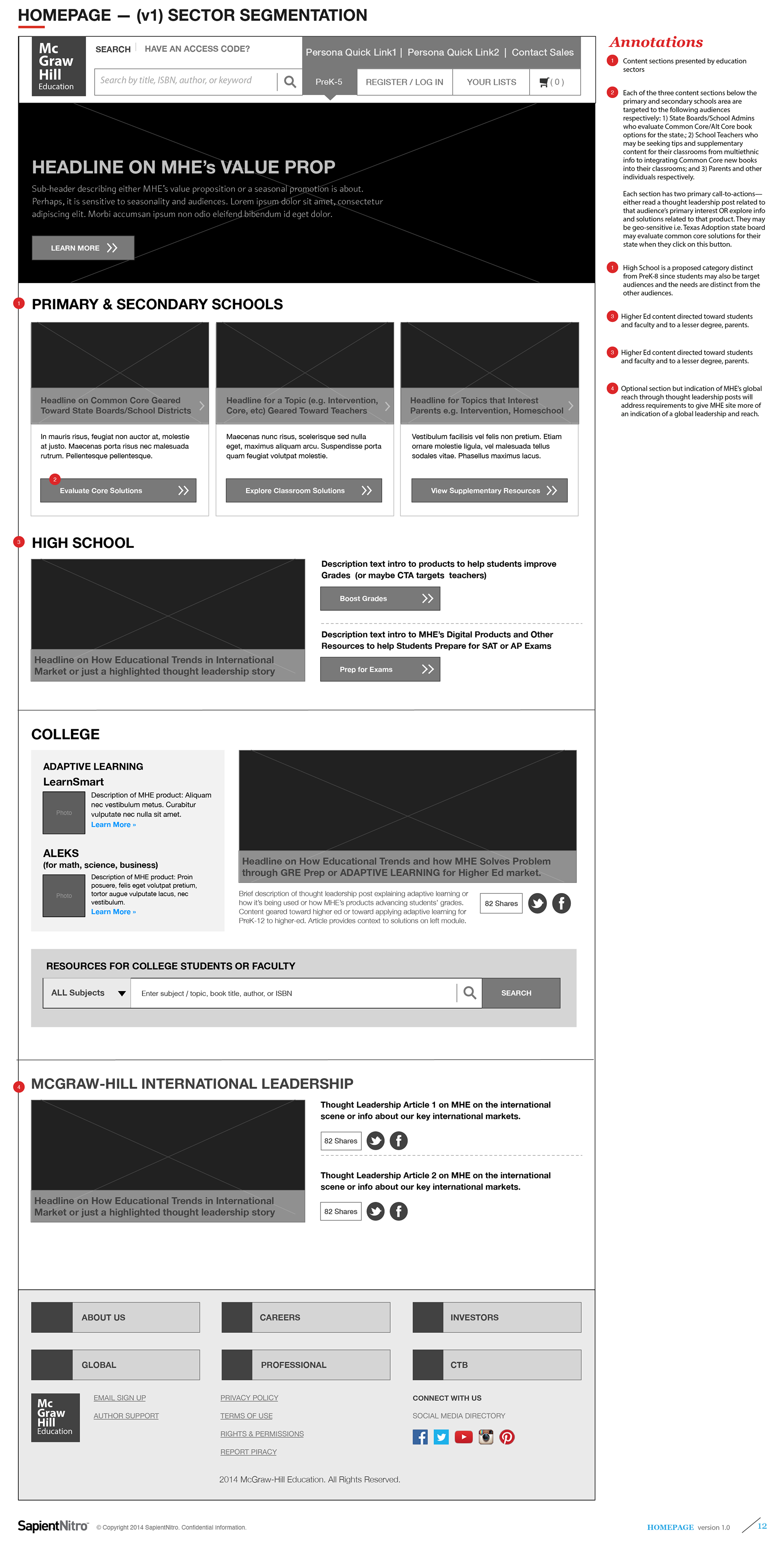
PreK12, Higher Ed, and International Sectors segmentation (v1)
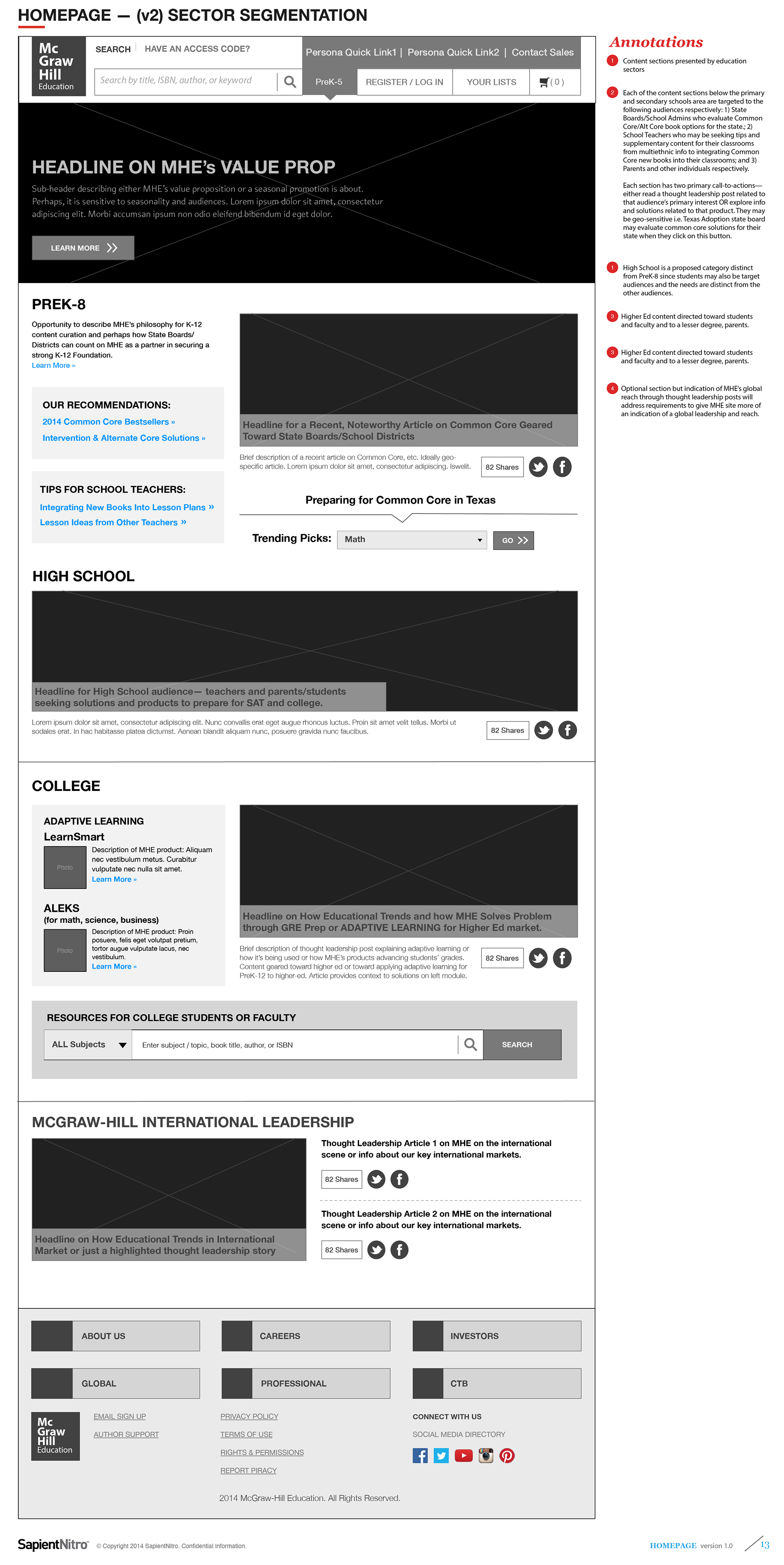
PreK12, Higher Ed, and International Sectors segmentation (v2)
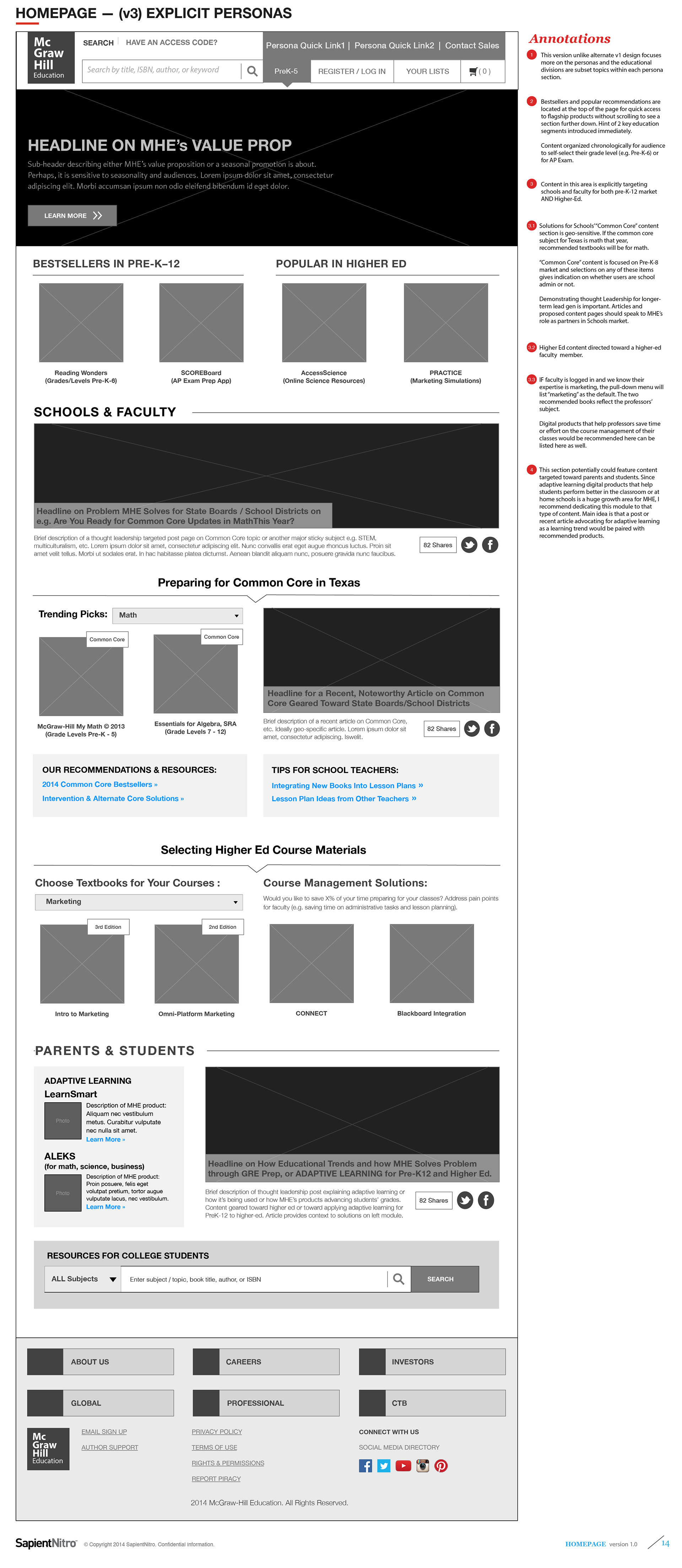
Explicit Personas-Based Content Strategy (v3)
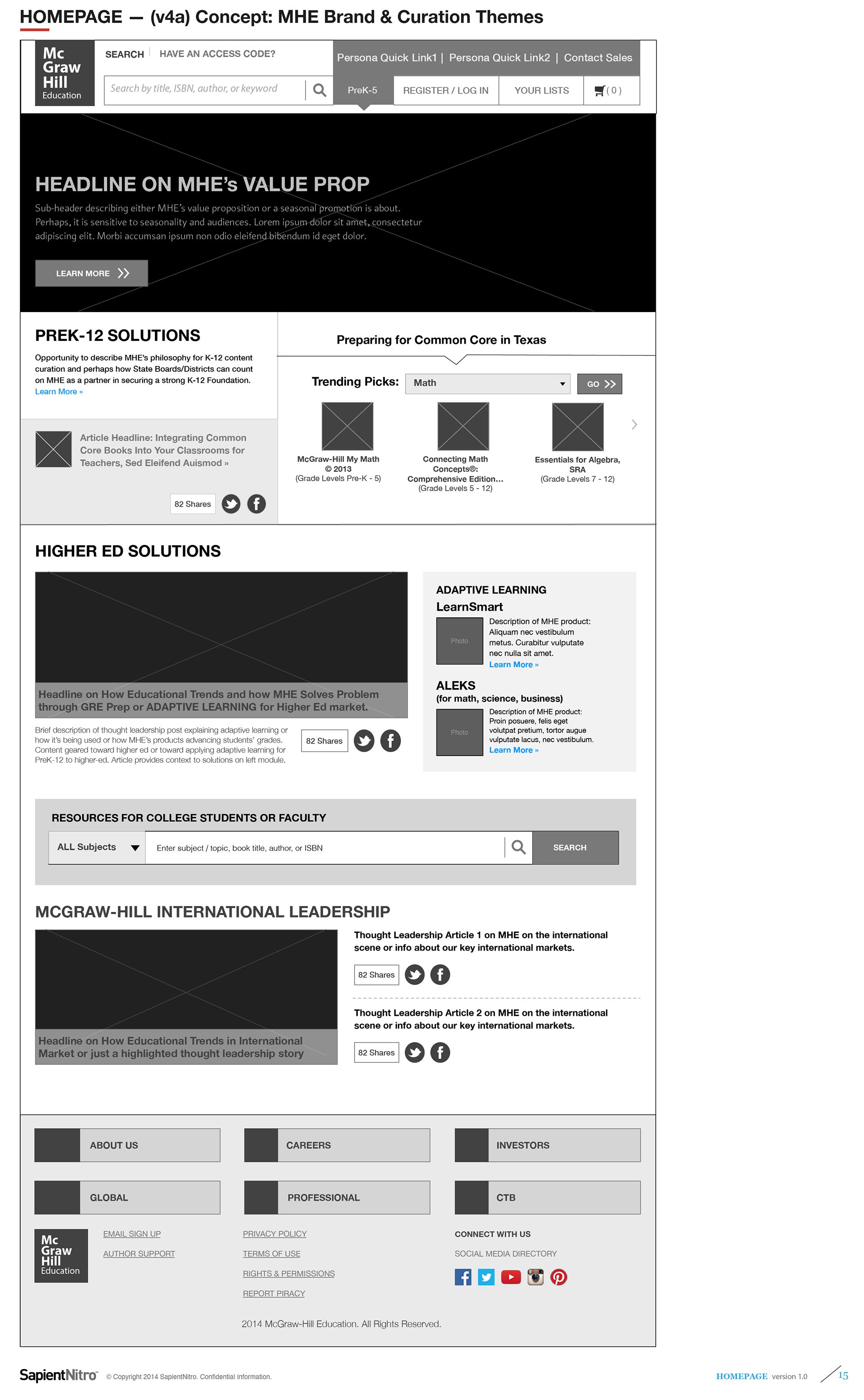
MHE Brand + Curation Themes (v4)
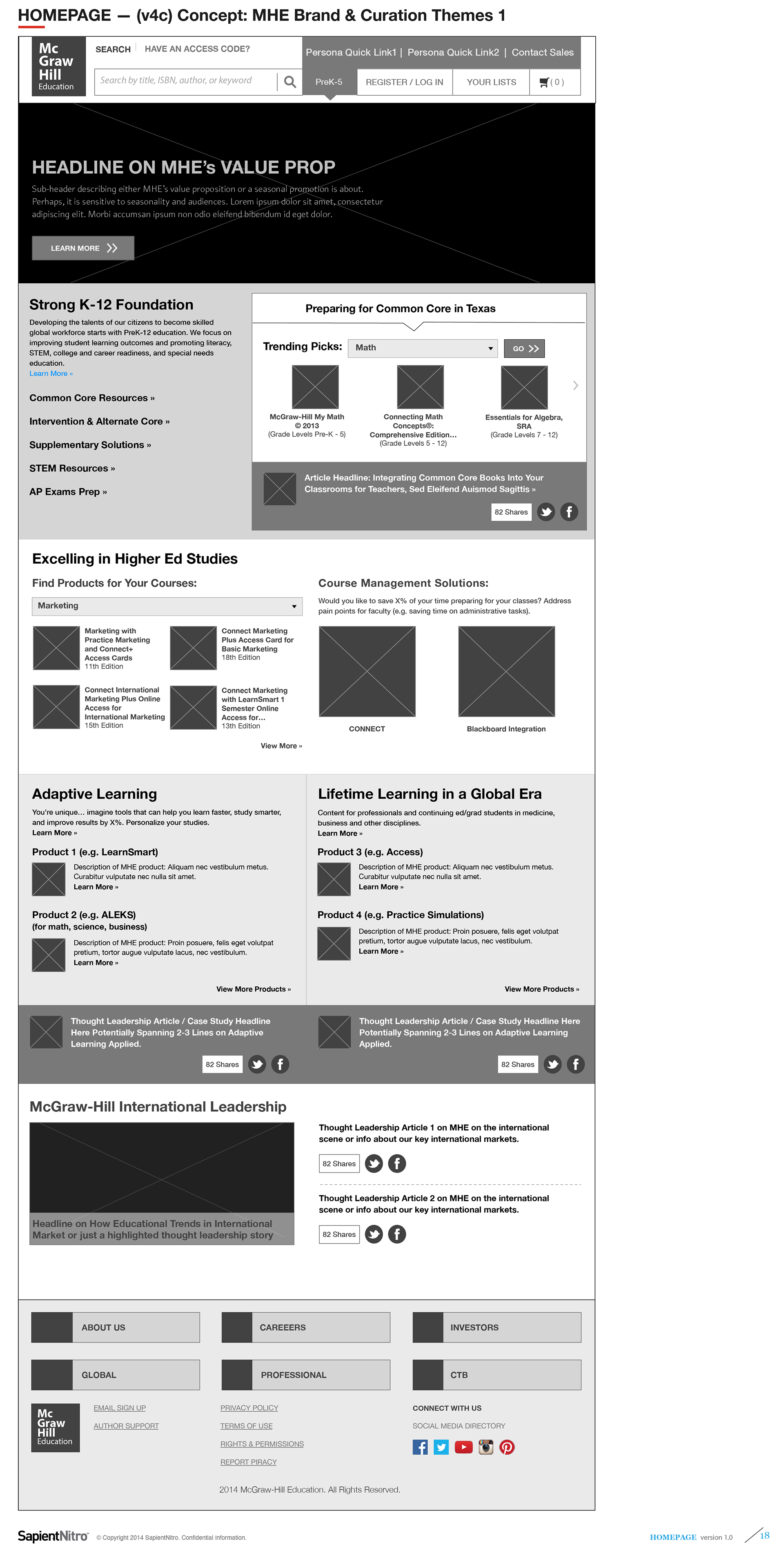
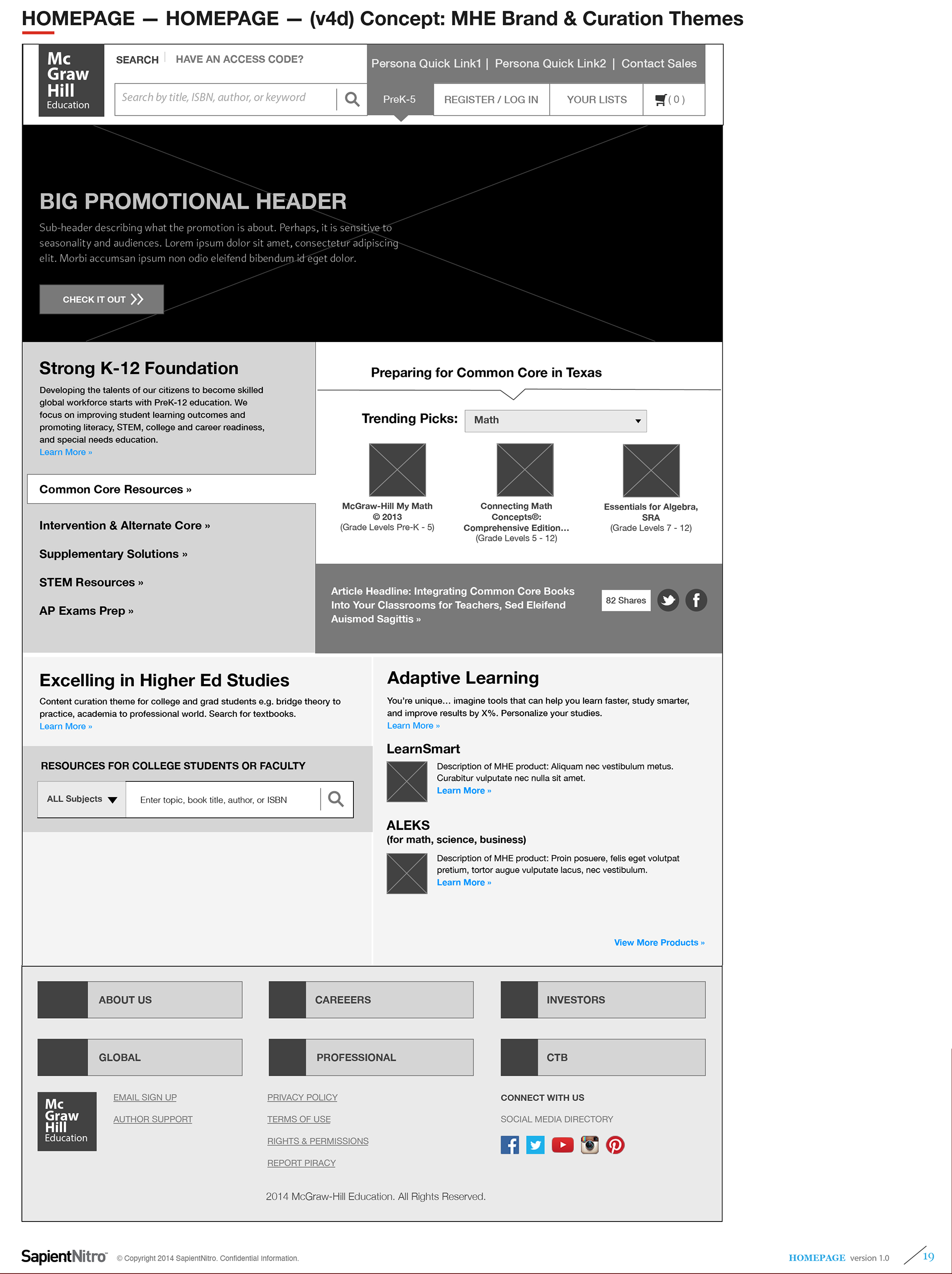
My New Streamlined Homepage Wireframe Proposal
(Based on Atomic Modular Components):McGraw-Hill Multi-Divisions eCommerce Homepage Concepts
(Based on Atomic Modular Components):McGraw-Hill Multi-Divisions eCommerce Homepage Concepts
In this proposed wireframe concept, I streamlined the homepage functionality removing personalization ideas when since more geospecific customization and personalization wouldn't be available yet. In this proposal, I present more customer testimonial-based approach toward marketing our products and services for the PreK-12, Higher Ed, Professional, International Divisions These wireframes illustrate my recommendations for reaching different demographics for each business unit — PreK-12 students, teachers, administrators; Higher Ed students and faculty; international students and faculty markets. I also strove to create new page narrating our services using modular components we had already created to save on backend development time and costs for release.
Content Template Type 2:
Disciplines Hubs Templates
(Scope 1 — Initial Wireframe Ideations)
Disciplines Hubs Templates
(Scope 1 — Initial Wireframe Ideations)
As part of my content strategy recommendations, one of the key template pages we needed was one based on subjects / disciplines. The number of core disciplines covered in elementary school was fairly limited to foundational topics — math, science, English / literacy, and social studies. However, in high school and colleges, students are introduced to more discipline specialization such as algebra, geometry, biology, chemistry, physics, English grammar, English literature, world history, American history, etc. In this case study, I created discipline hub template page concepts for "science" since its a subject with a much deeper granularity for secondary school and college. Detailed below are template concepts that I explored initially while working on the Sapient-MHE fusion teams. In these initial designs, I focused more on presenting articles and other content to establish MHE as a preeminent thought leader in the education sector. Since Sapient already presented navigation drill-downs in a horizontal presentation, I followed Sapient's interaction pattern for drill-down method for accessing sub-disciplines.
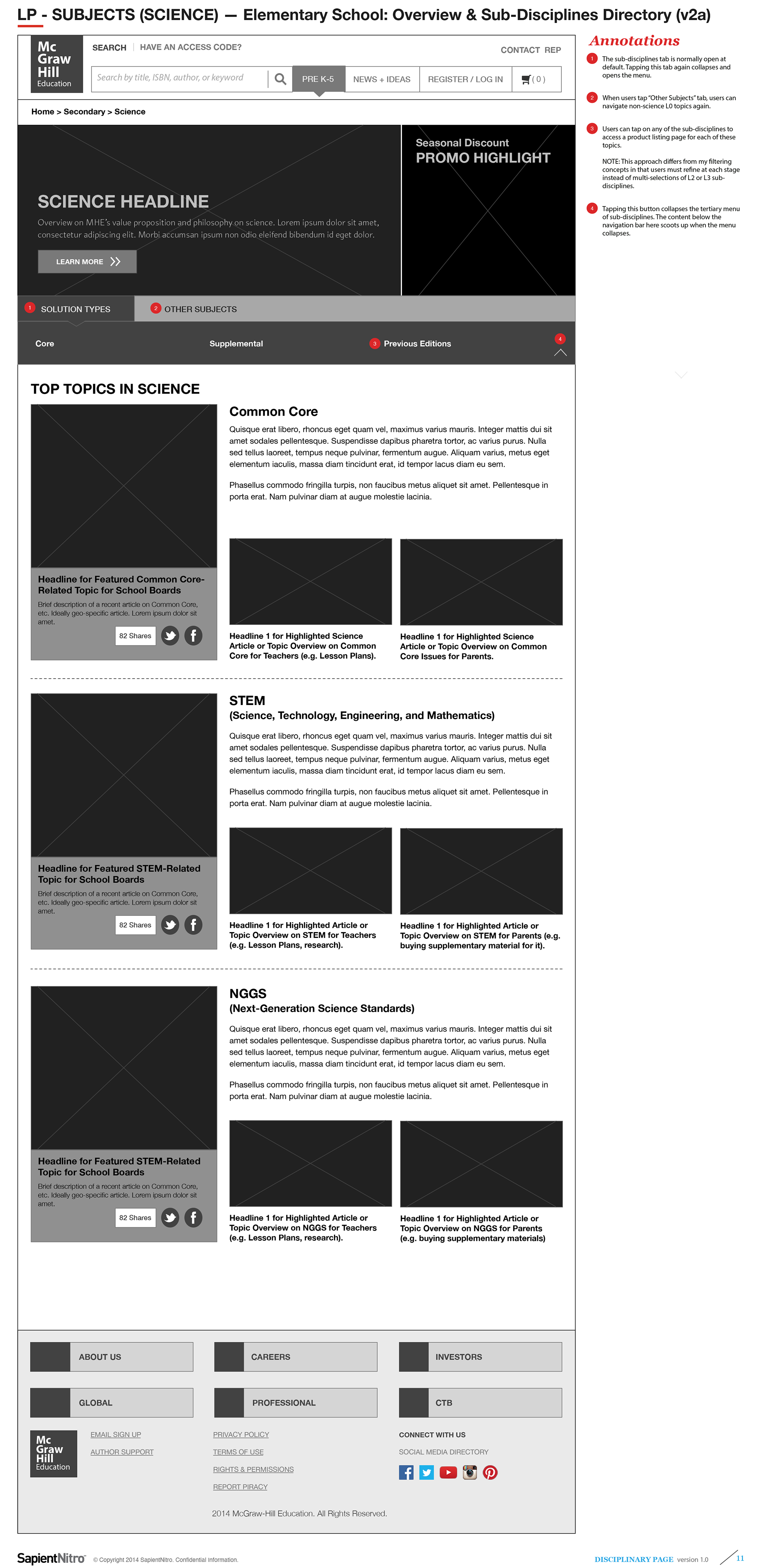
PreK5 Science Topic with Sub-Disciplines drill-down and Articles (v2)
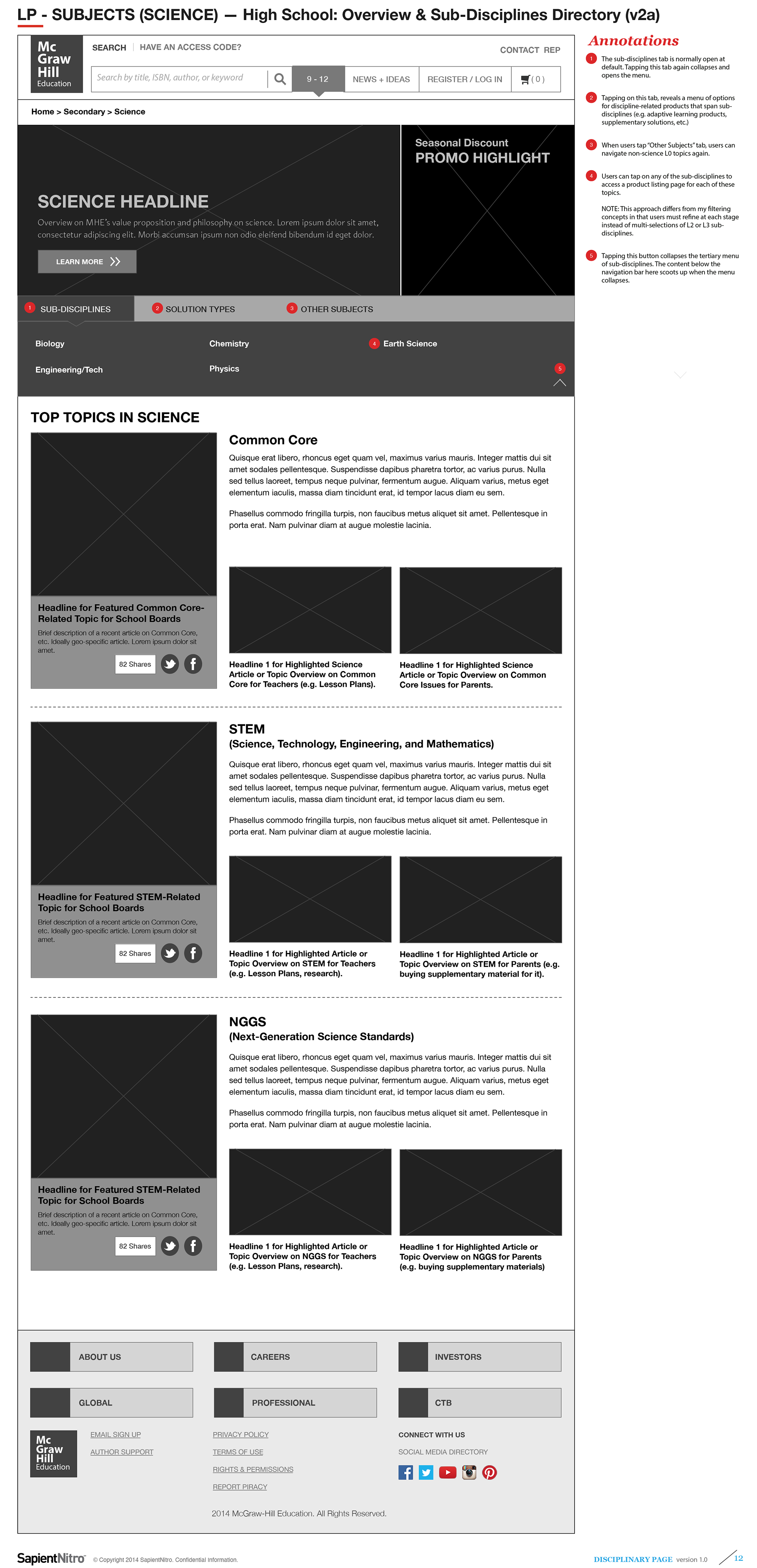
High School Science Topic with Sub-Disciplines drill-down and Articles (v2)
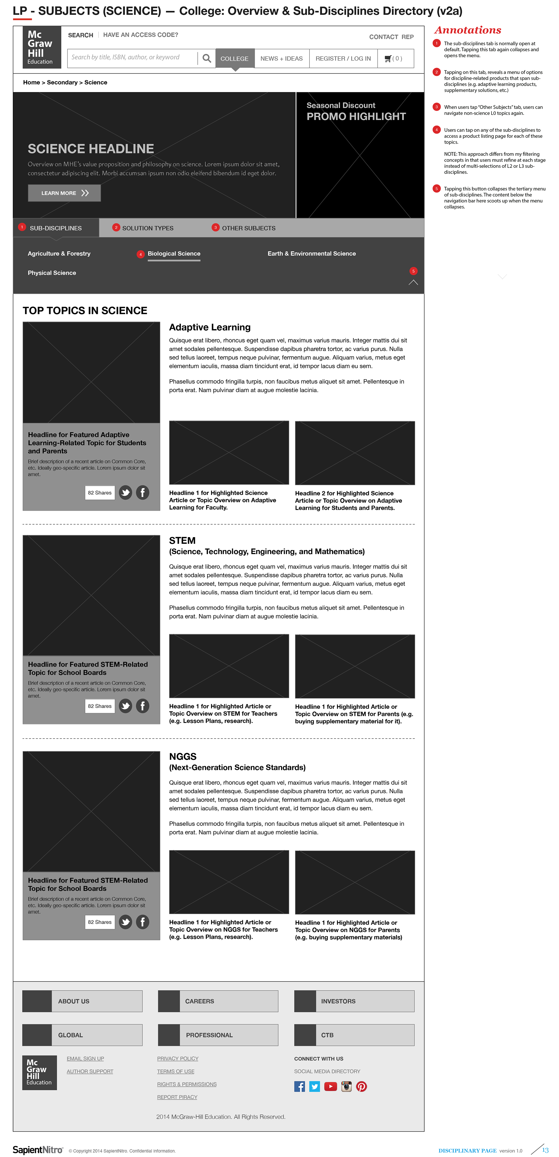
College Science Topic with Sub-Disciplines drill-down and Articles (v2)
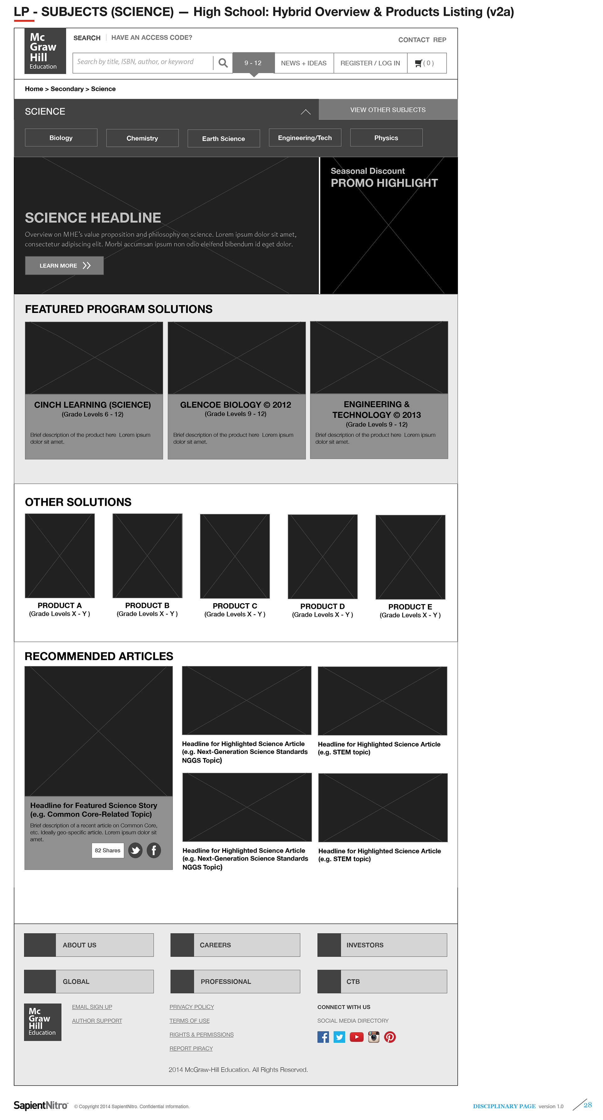
High School Science — Hybrid Products + Articles (v1)
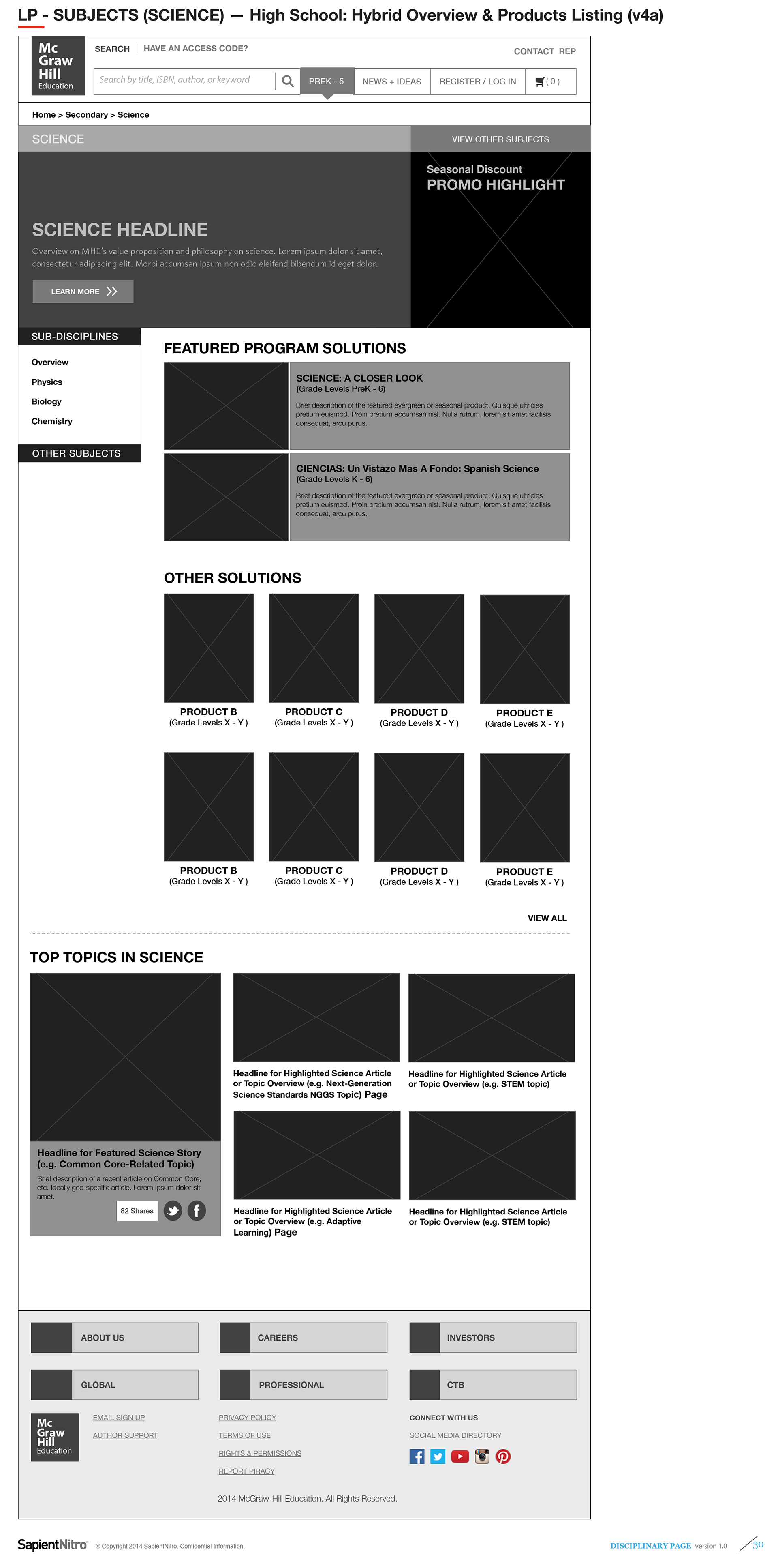
High School Science — Hybrid Products + Filters + Articles (v2)
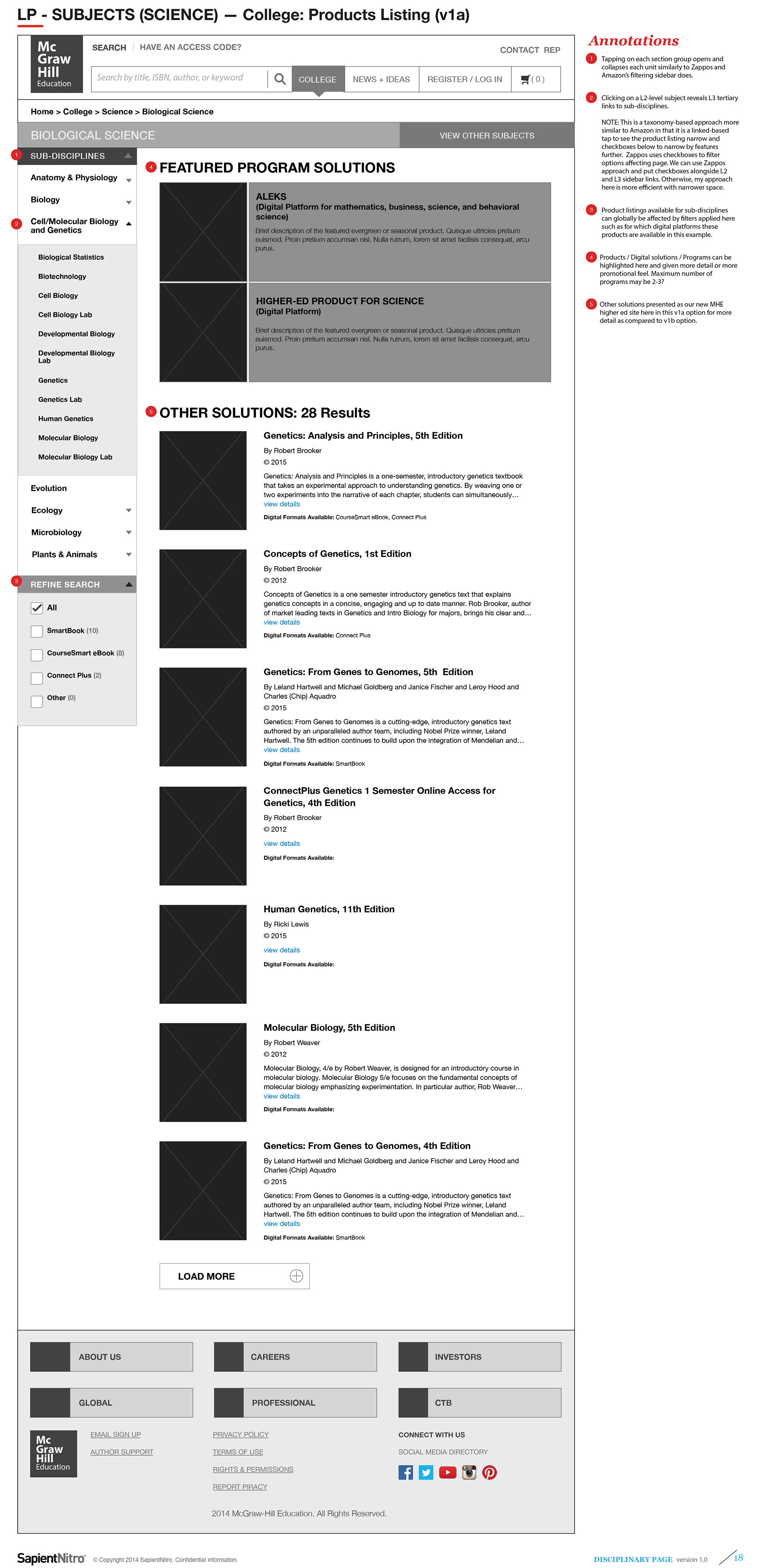
High School Science — Hybrid Products + Filters (v1)
Content Template Types 2 + 3:
Disciplines Hub and Sub-Divisions Landing Pages
(Scope 2 — Wireframes Featuring Modular Components)
Disciplines Hub and Sub-Divisions Landing Pages
(Scope 2 — Wireframes Featuring Modular Components)
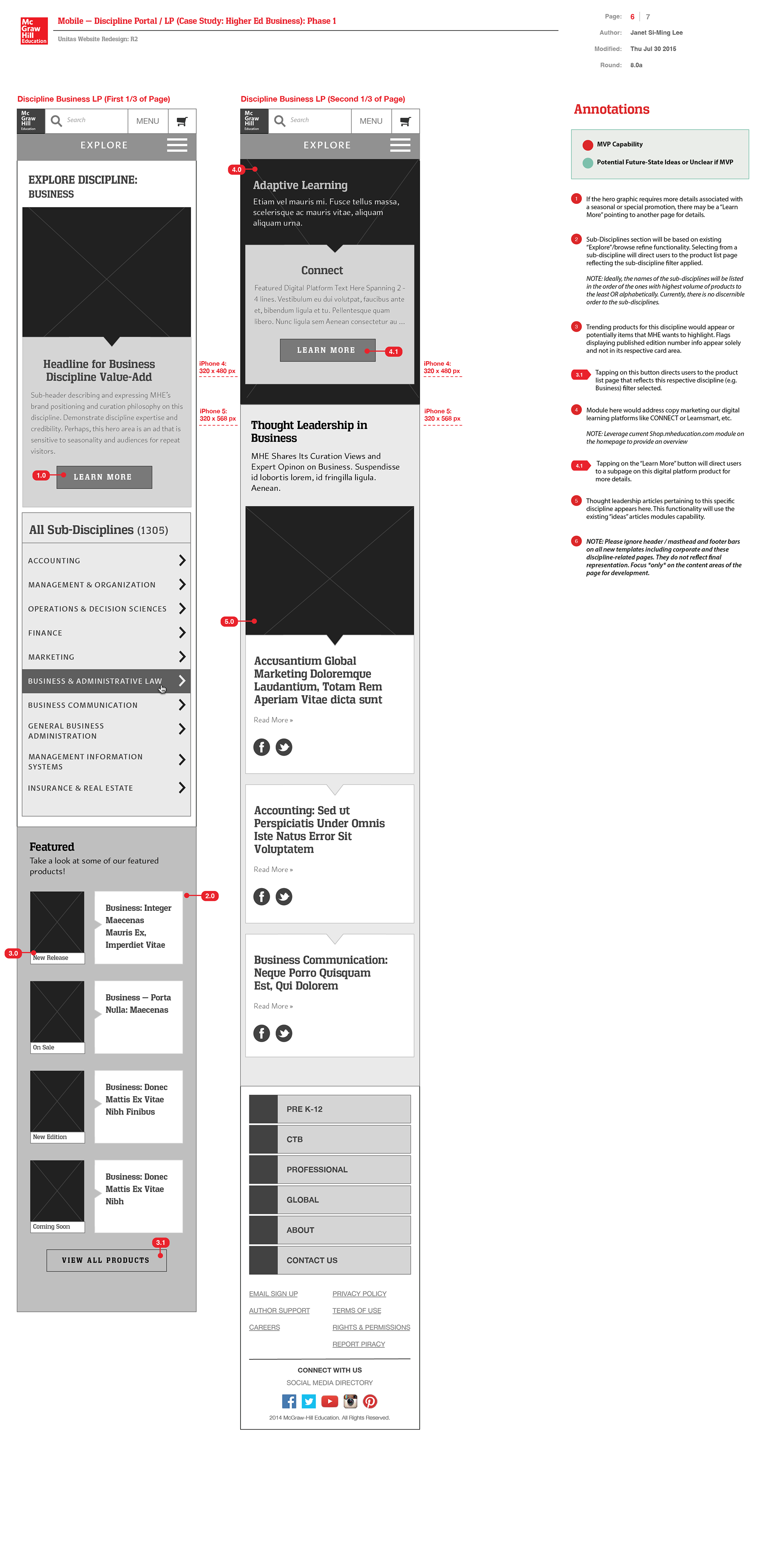
In these new discipline landing page wireframe explorations, I proposed a new content and interaction design presentations based on components that the Sapient-MHE fusion development team had built as content modules to be populated by our MHE PreK-12 and higher ed content authors. My layouts aimed to narrate a story of our services for the PreK-12 and higher ed markets using existing modular components. When we didn't have the components built yet, we may introduce new components for developers to build if they are versatile enough to be used for both our PreK-12 and higher ed market segments for new page templates.
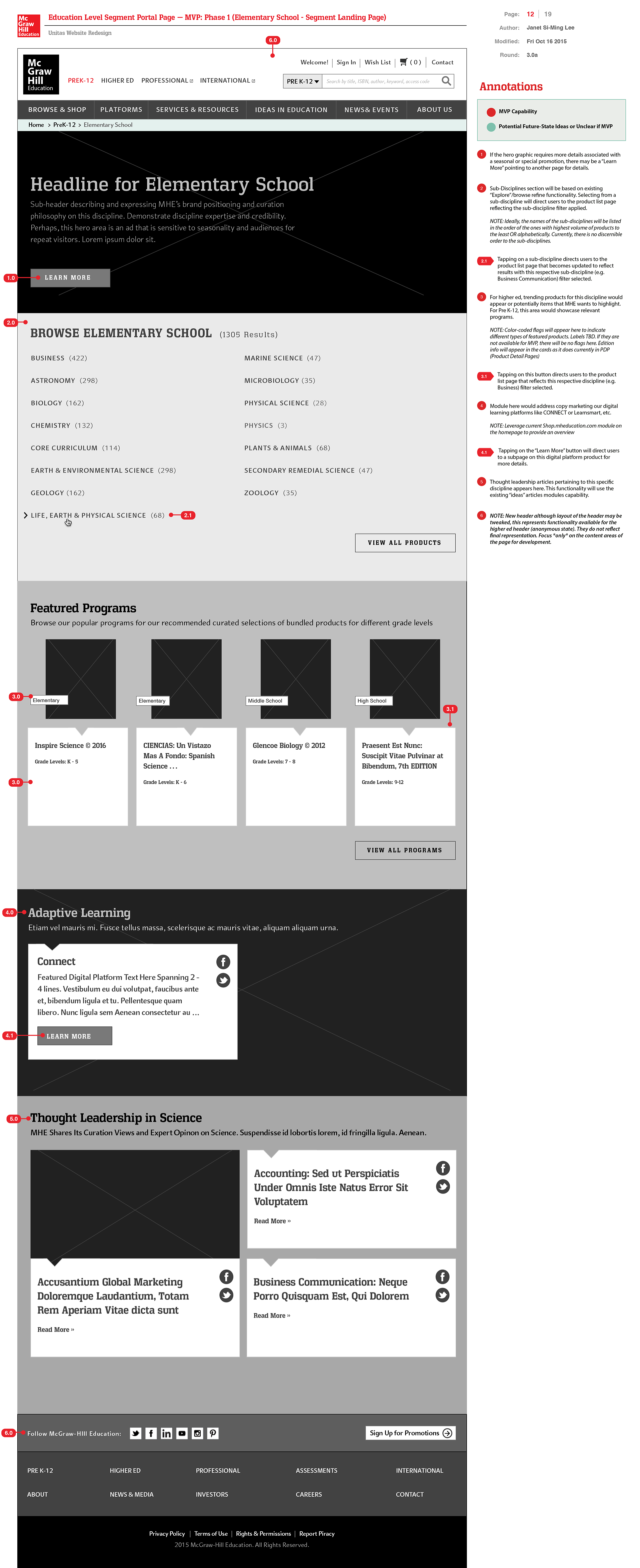
PreK-12 — Elementary School Segment Landing Page (Case Study: Anonymous Guests Browsing for Products)

PreK-12 segment search results for Programs and Orphan Products

Filter by School Grade Level
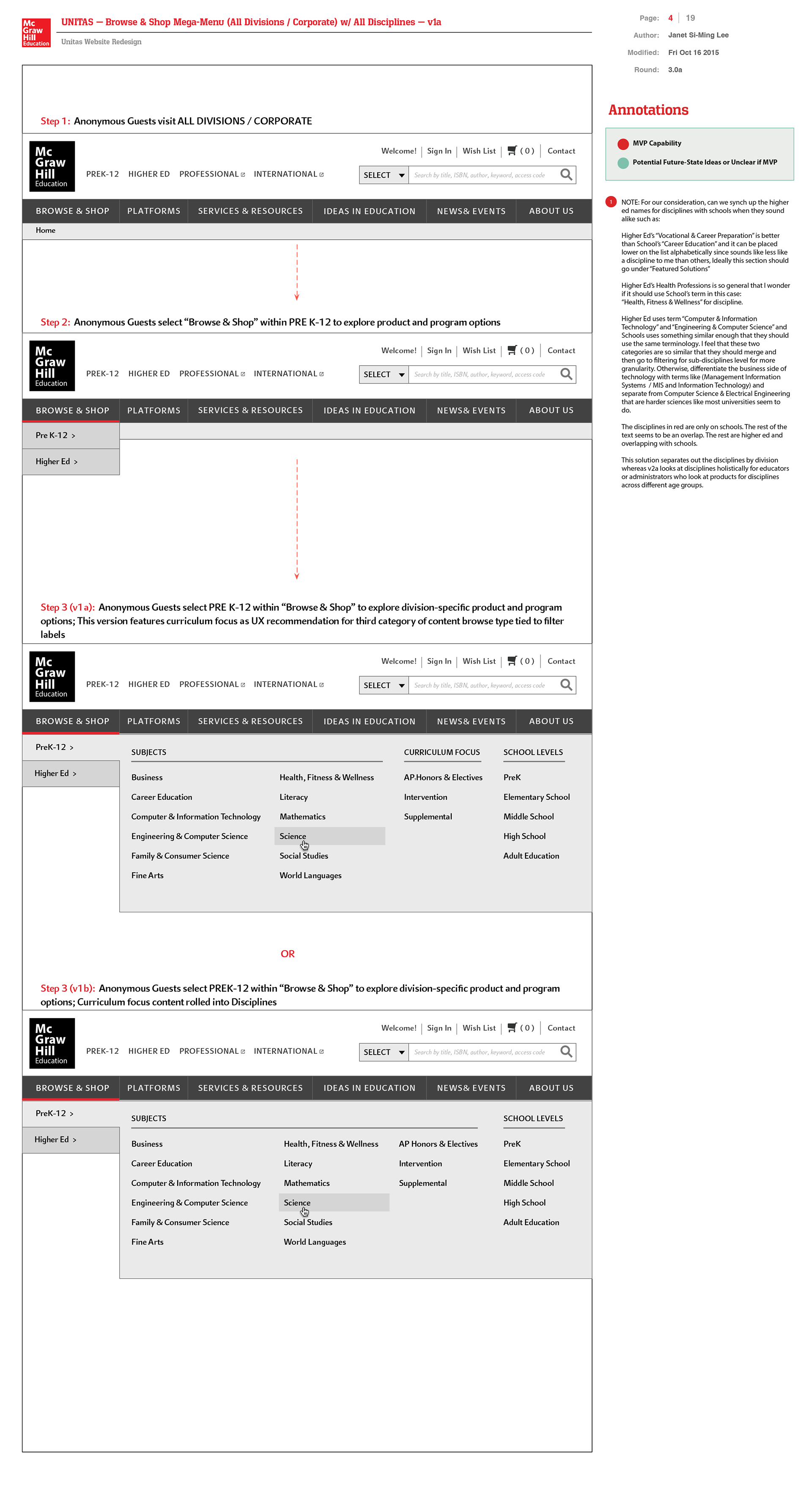
Product Catalogue Mega Menu for PreK-12 ( Case Study: Anonymous Guests Browsing for Products in PreK-12 )
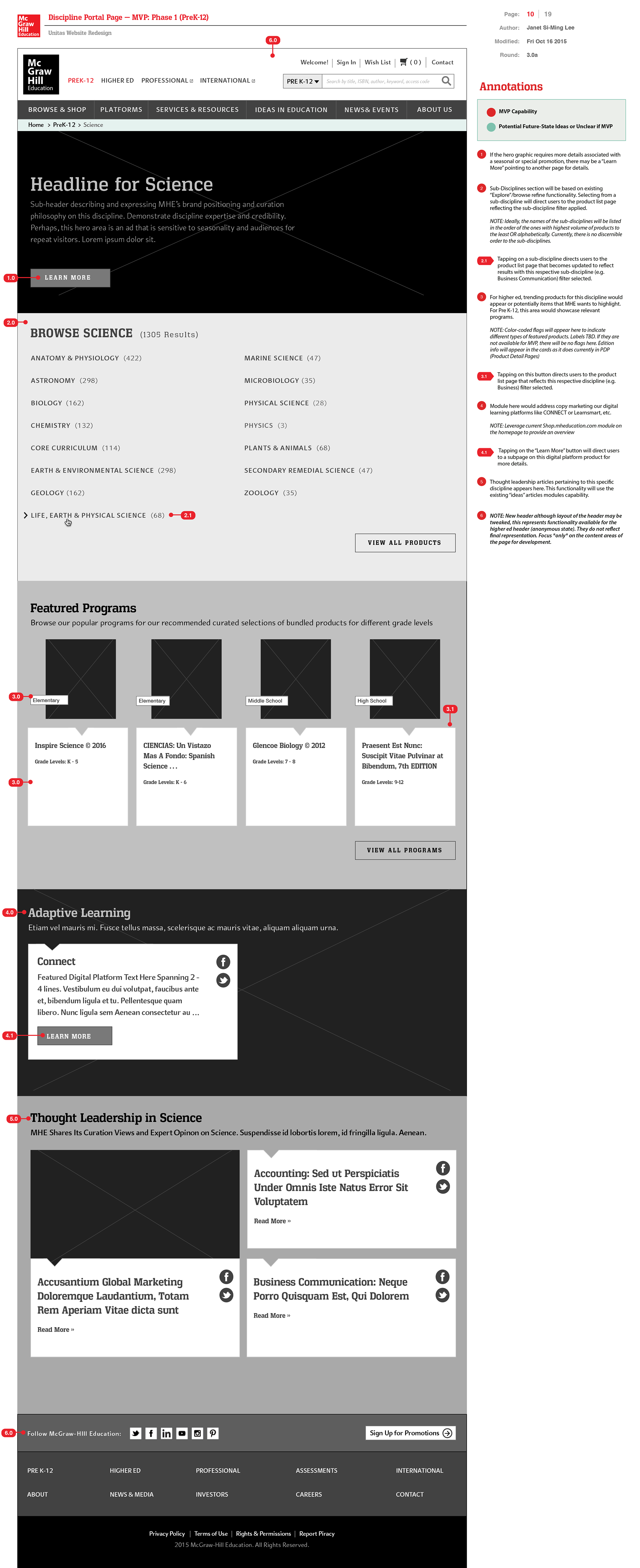
Discipline Landing Page — PreK-12 ( Case Study: Pre K-12 Science )

PreK-12 Sub-Discipline Drill-Down to Products & Programs w/ Micro-Filtering ( Case Study: Anonymous Guests Browsing for Products in PreK-12 for Tier 1 and Tier-2 Sub-Disciplines )
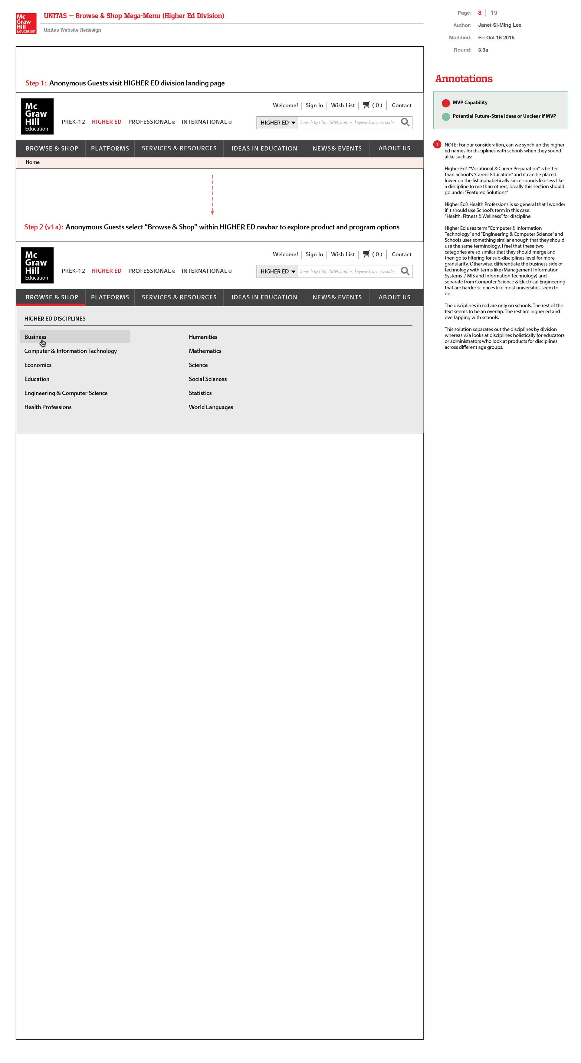
Higher Ed Products Catalogue ( Case Study: Anonymous Guests Browsing for Products )
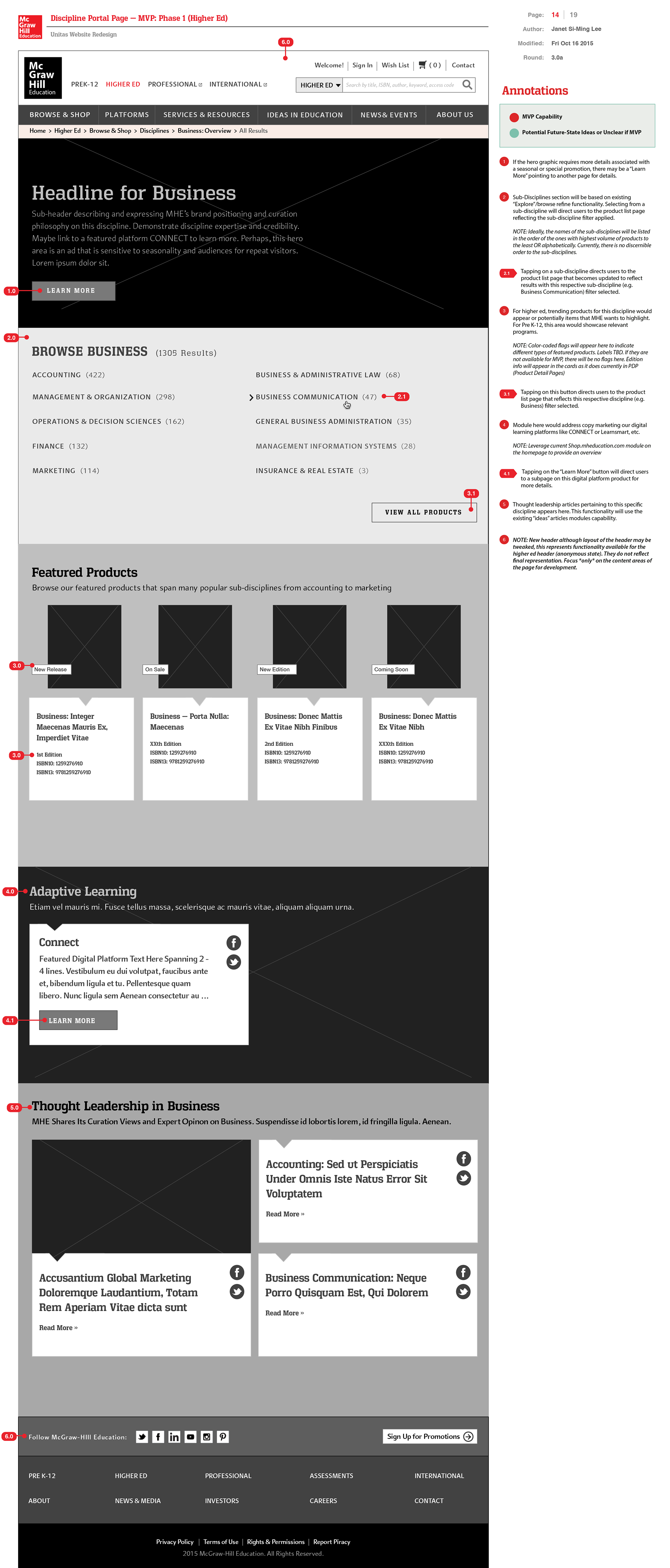
Discipline Landing Page — Higher Ed (Case Study: Higher Ed Business)
Content Template Type 4:
Product-Related Marketing
(Scope 2 — Wireframes with Modular Components)
Product-Related Marketing
(Scope 2 — Wireframes with Modular Components)
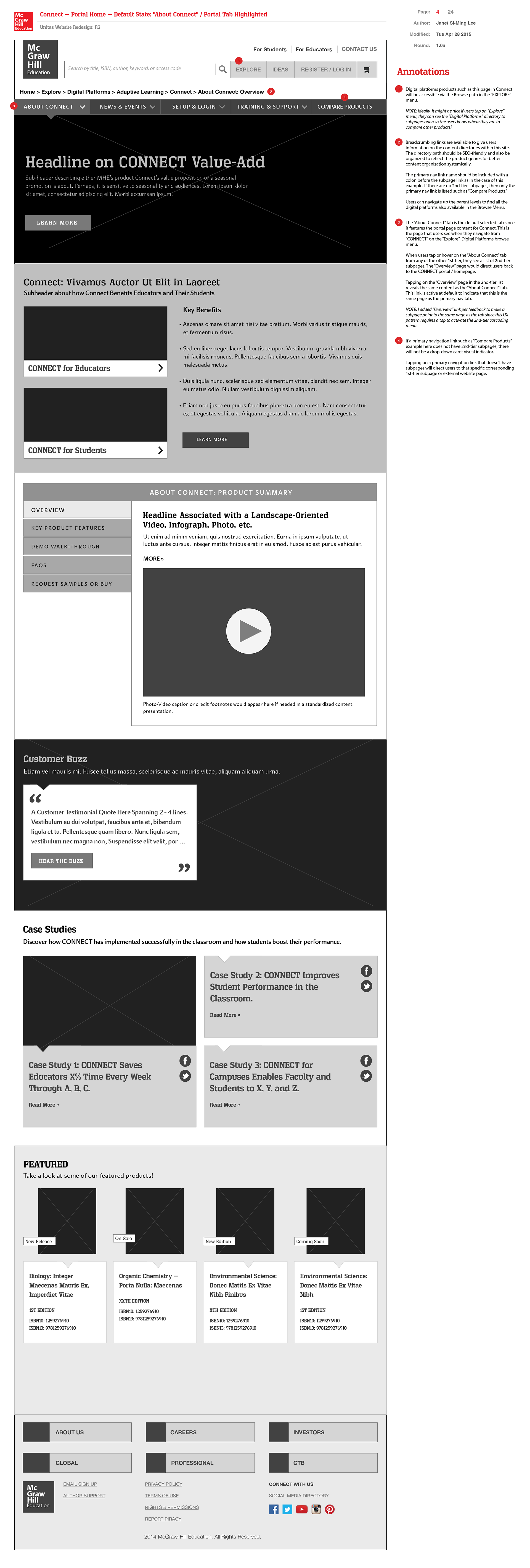
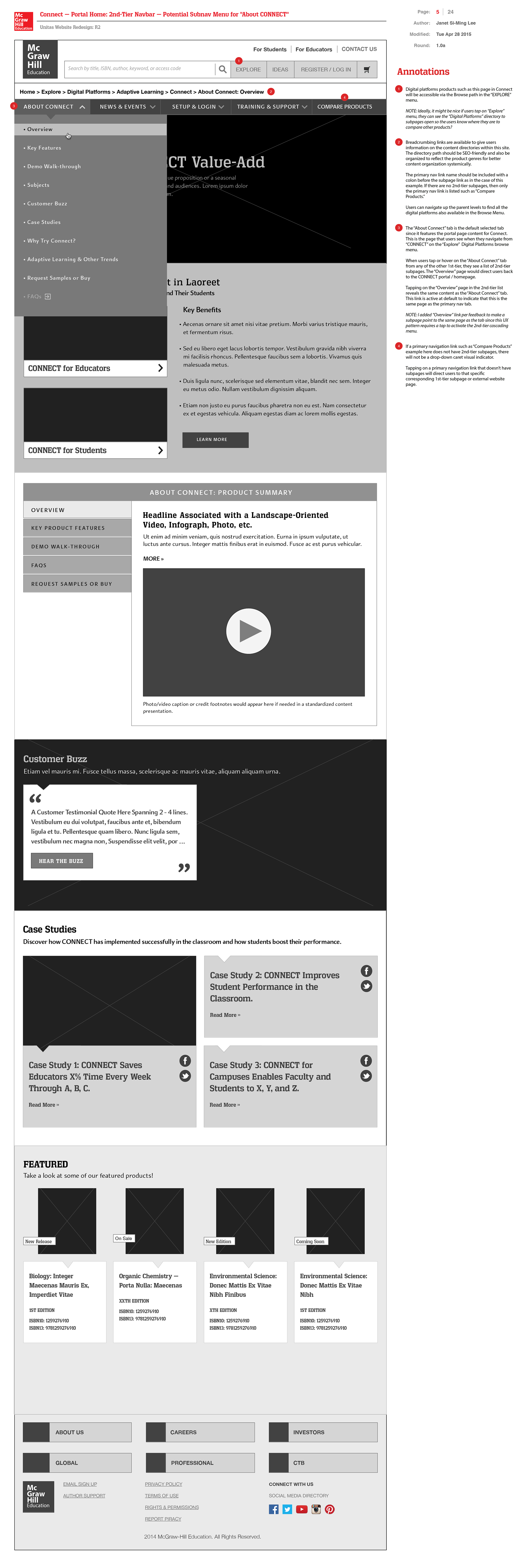
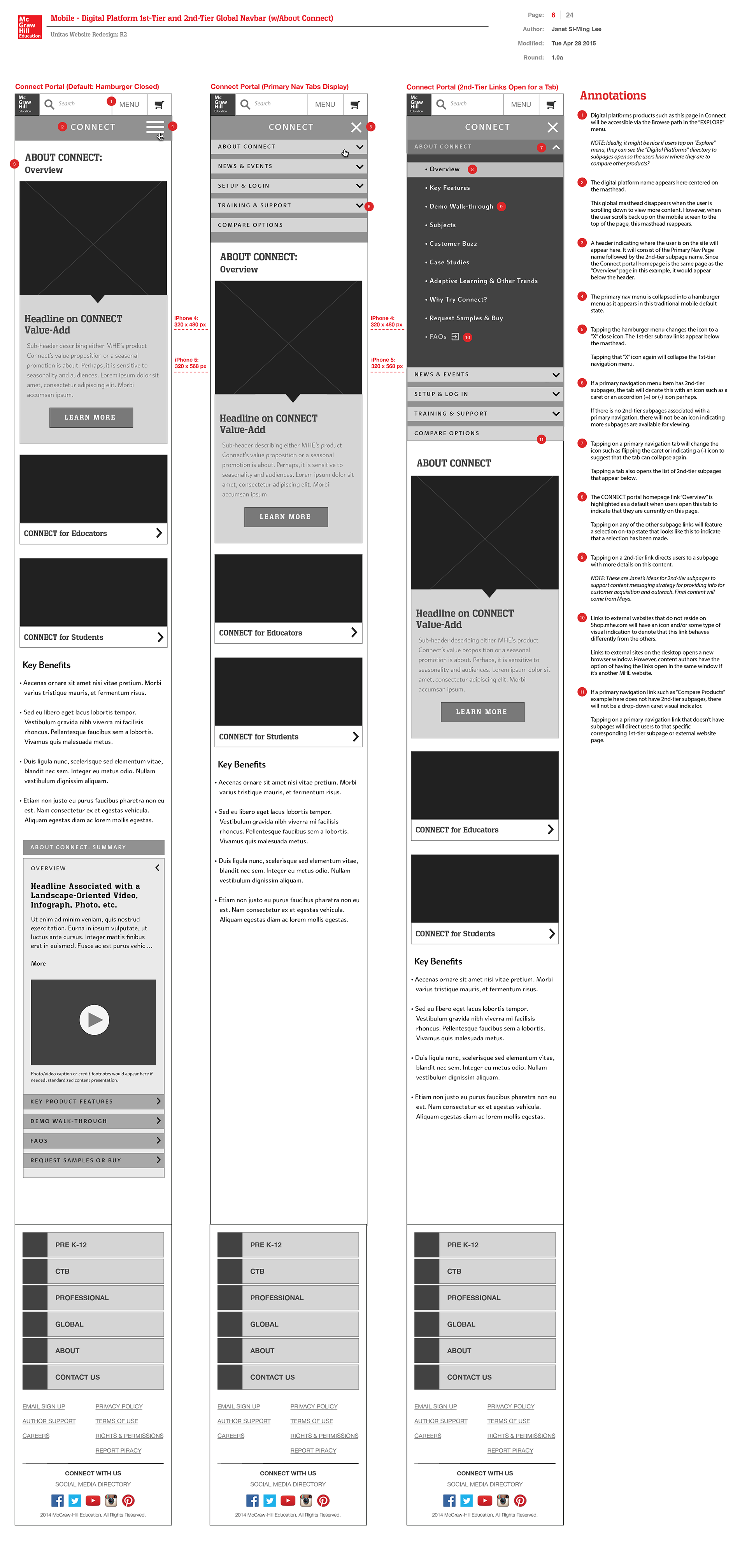
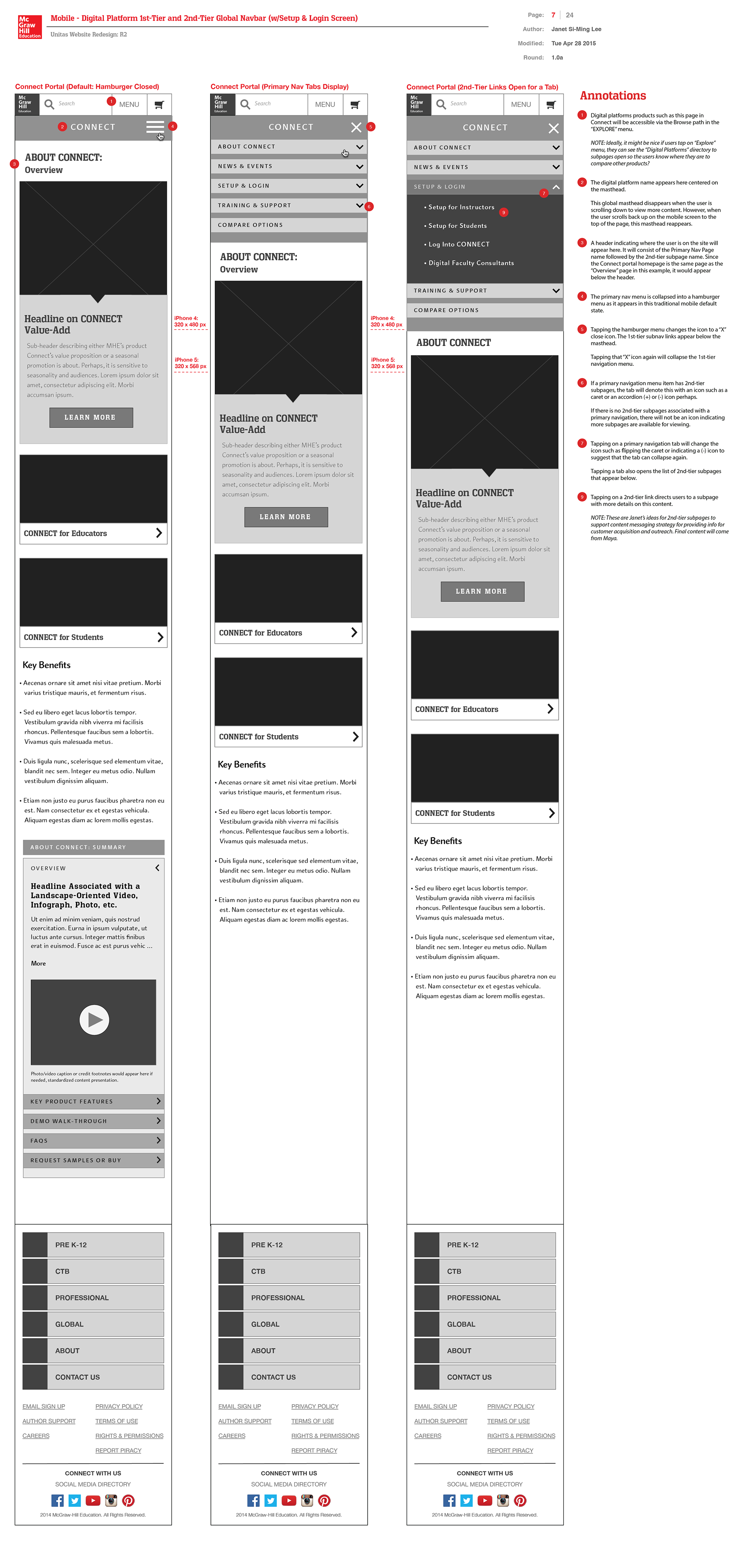
As the lead content design strategist auditing our existing 300+ microsites and key templates that need to be built for our new integrated eCommerce platform, I identified product-related marketing microsite as the next content template type to design. I created wireframes featuring Connect as our case study example for a microsite design. McGraw-Hill Education's digital platform Connect is one of our flagship higher ed courseware that includes Smartbook (a digital version of the printed textbook), coursework administration and data analytics for professors to assess student performance. It includes my recommendations for content strategy to market their digital applications designed for faculty and students. This my wireframe proposal for a content-authorable template that leverages existing content modules we had already designed and developed to save on engineers' time and cost.
Search Results Pages
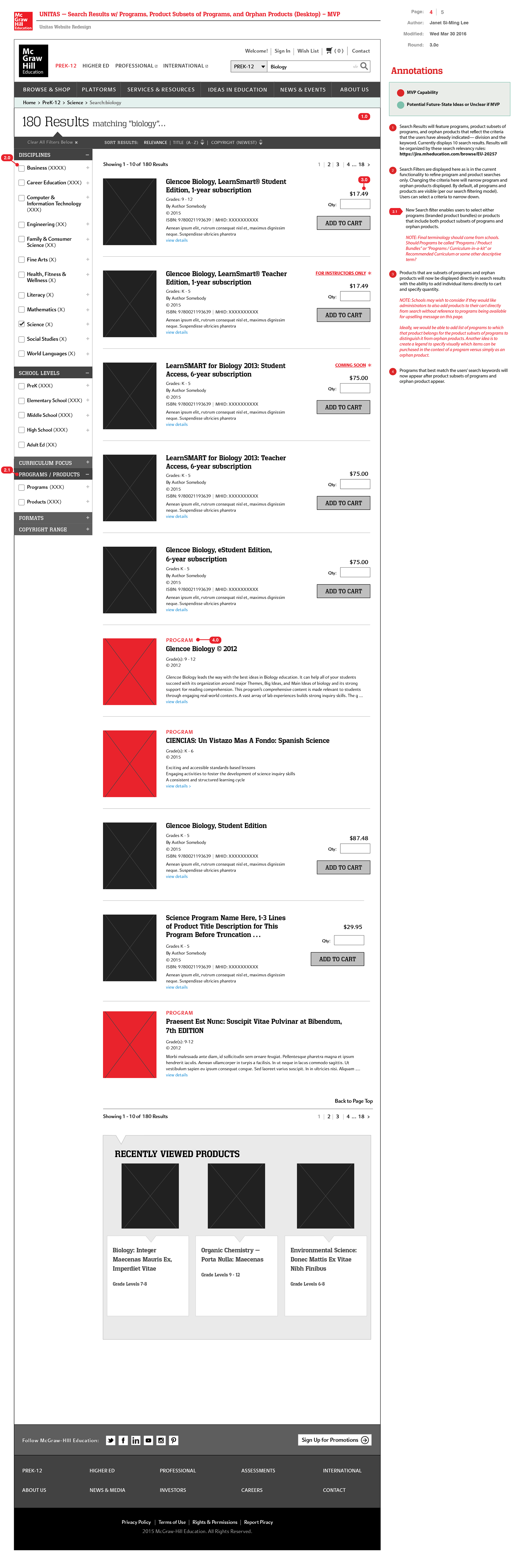
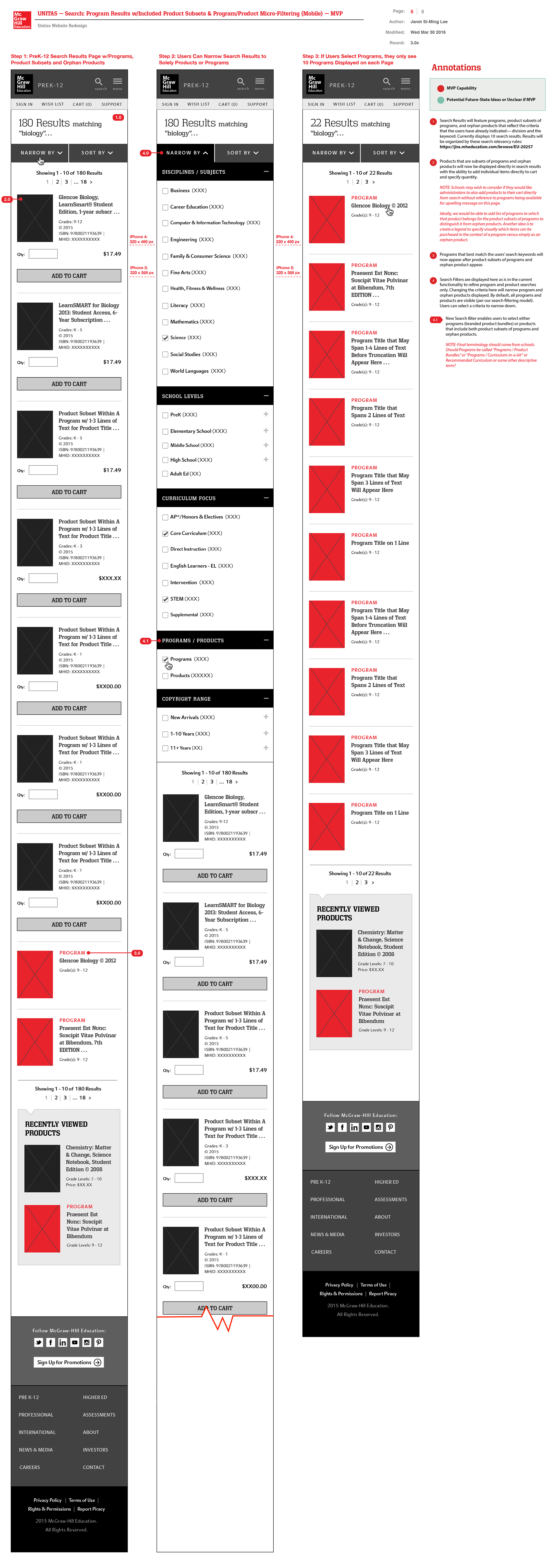
In determining the search filtering strategy, my hypothesis was that more students were entering interdisciplinary majors as a reflection of the rising interdisciplinary nature of fields. In fact, my college major was an interdisciplinary major in media arts / design that included web communications, eCommerce and marketing courses at MIT as well as digital fine arts. In addition, my secondary minor was in psychobiology including courses in psychology and biology. Indeed, my secondary research and analysis of interdisciplinary courses available at universities confirmed my observation as well. Thus, I proposed changes to Sapient's drill-down navigation approach toward browsing for products for certain disciplines in the first project scope. My new UX design solutions would enable users to multi-select checkboxes for various disciplines for more targeted search results instead of the navigation drill-down that would force students to narrow search only within a discipline branch. My solution instead would enable more flexibility in variations in how different colleges described their disciplines. Our books and other adaptive learning products were tagged with multiple disciplines for that discovery flexibility.
In my wireframe proposal below, I feature a search results page featuring programs (bundled products) and individual product subsets of programs and orphan products (PreK-12) that can be purchased as standalones. In this case study and project sprint below, anonymous guests searching for products will now see product subsets of programs in addition to orphan products and programs surfaced in search results. For my wireframe proposals, I design for desktop and a corresponding mobile displays. I color-coded programs in red and individual products in black boxes.
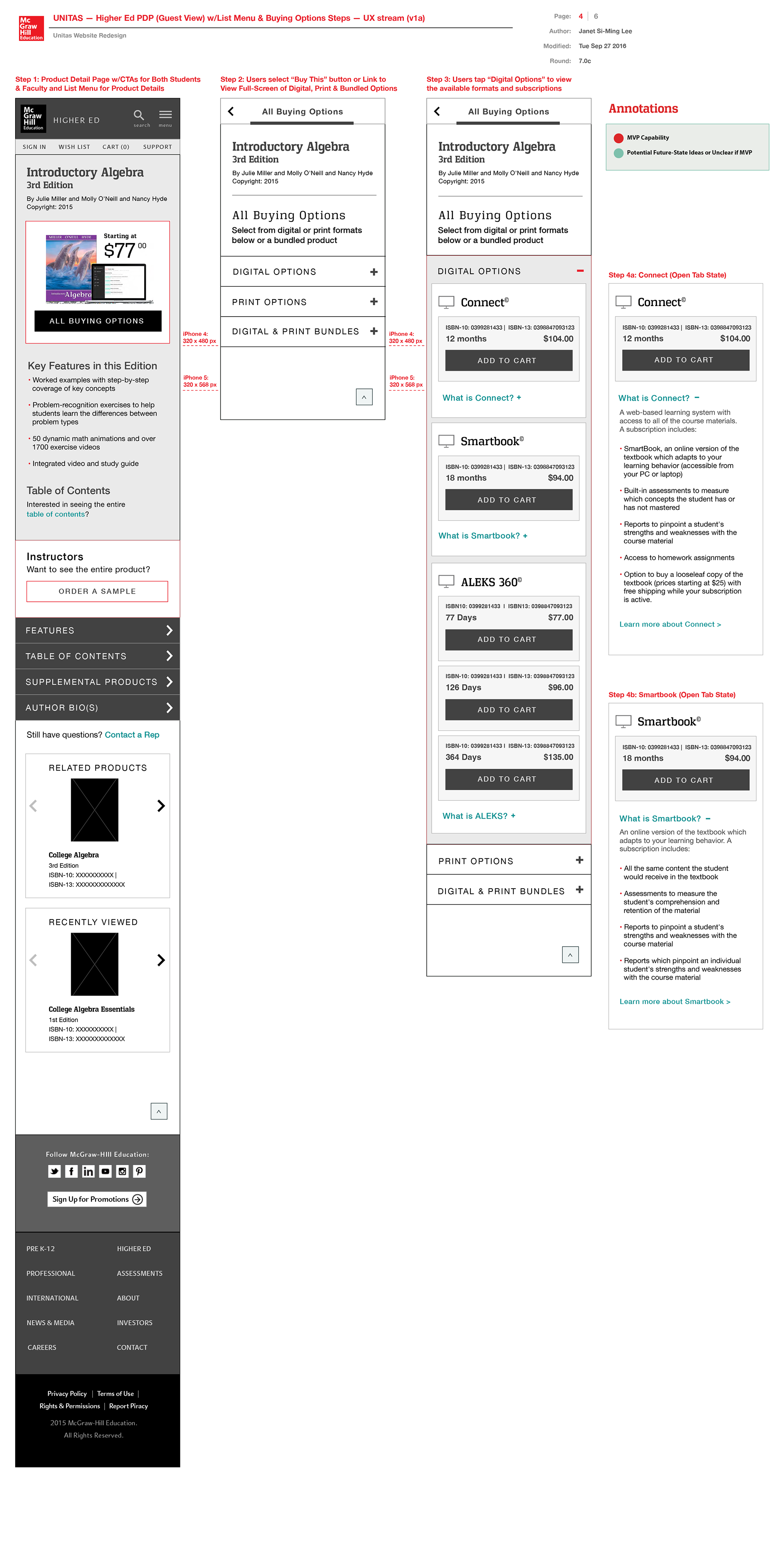
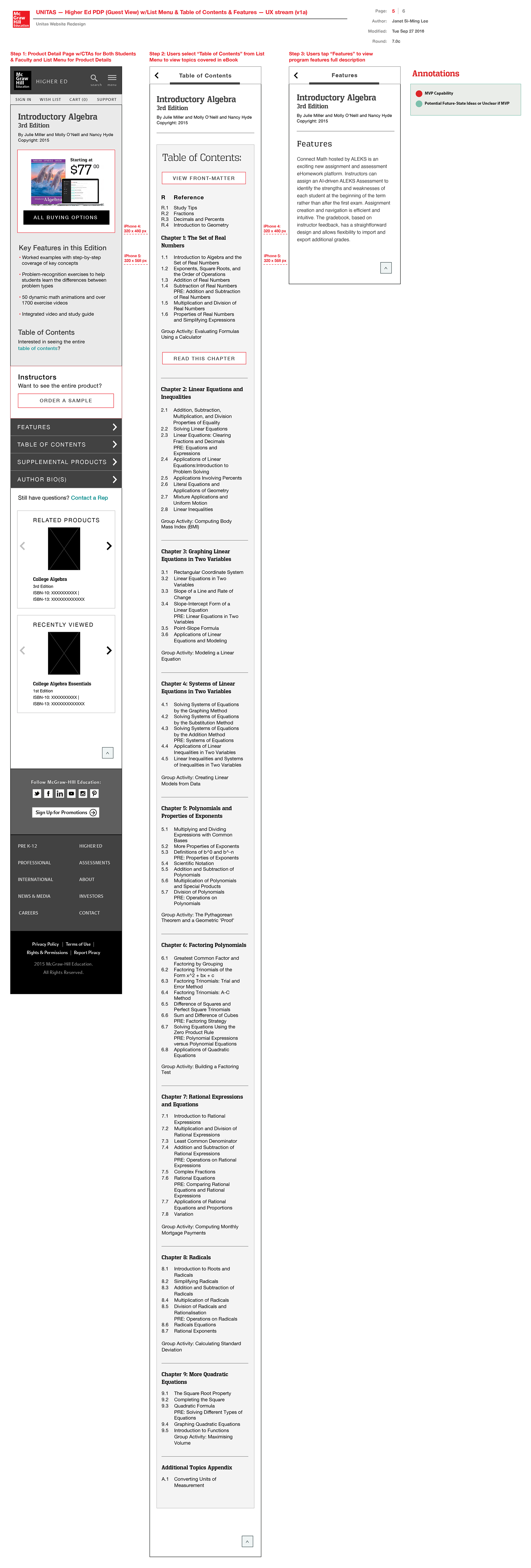
Product Detail Pages
Visualized below are my proposed wireframes illustrating the mobile experience for the product detail pages. Higher ed students are presented with the ability to buy a subscription to MHE's adaptive learning product Connect if their professors use it to teach their courses. If their professors are not using Connect for their course instruction and administration, students can subscribe to Smartbook, a subset of Connect's services. ALEKS is another adaptive learning product that MHE offers for math-specific content. Key information sections I proposed: table of contents, supplemental products, author bios, product features. My recommendations also included presenting information edition comparison info to enable users to make more informed decisions on whether they wish to pay more for a newer edition if there is a substantial difference in editions. I created accordion tabs-based presentation of content for a compact.

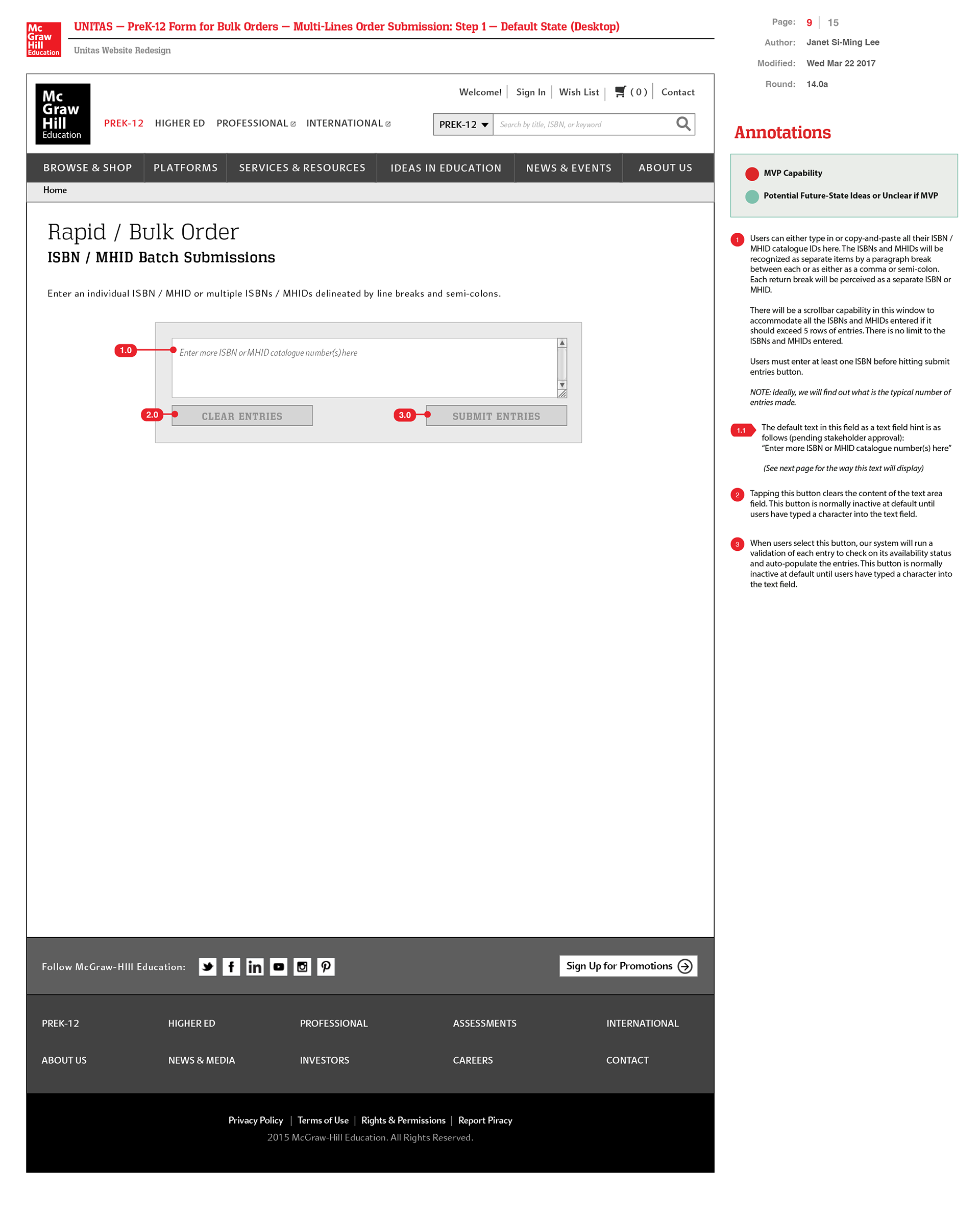
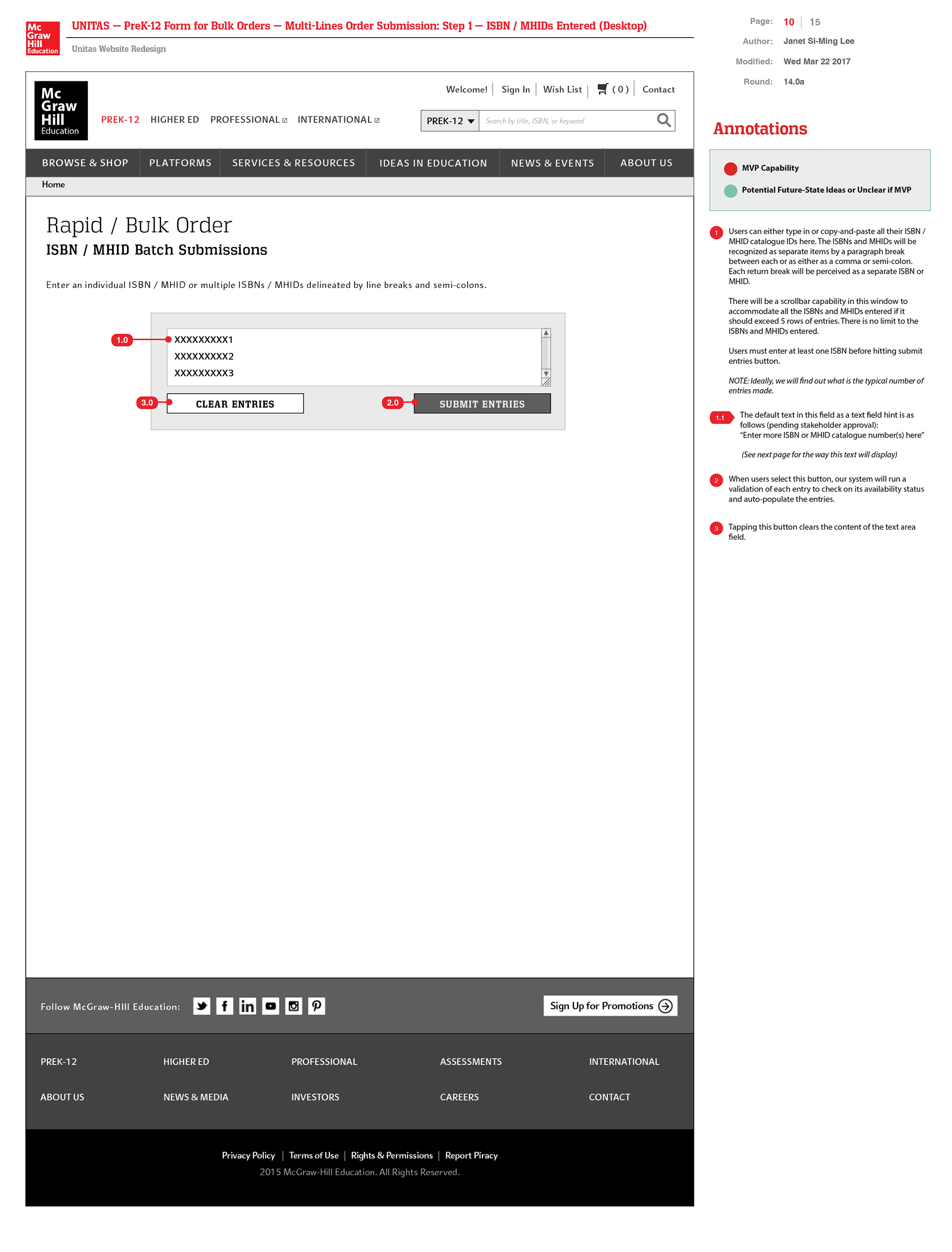
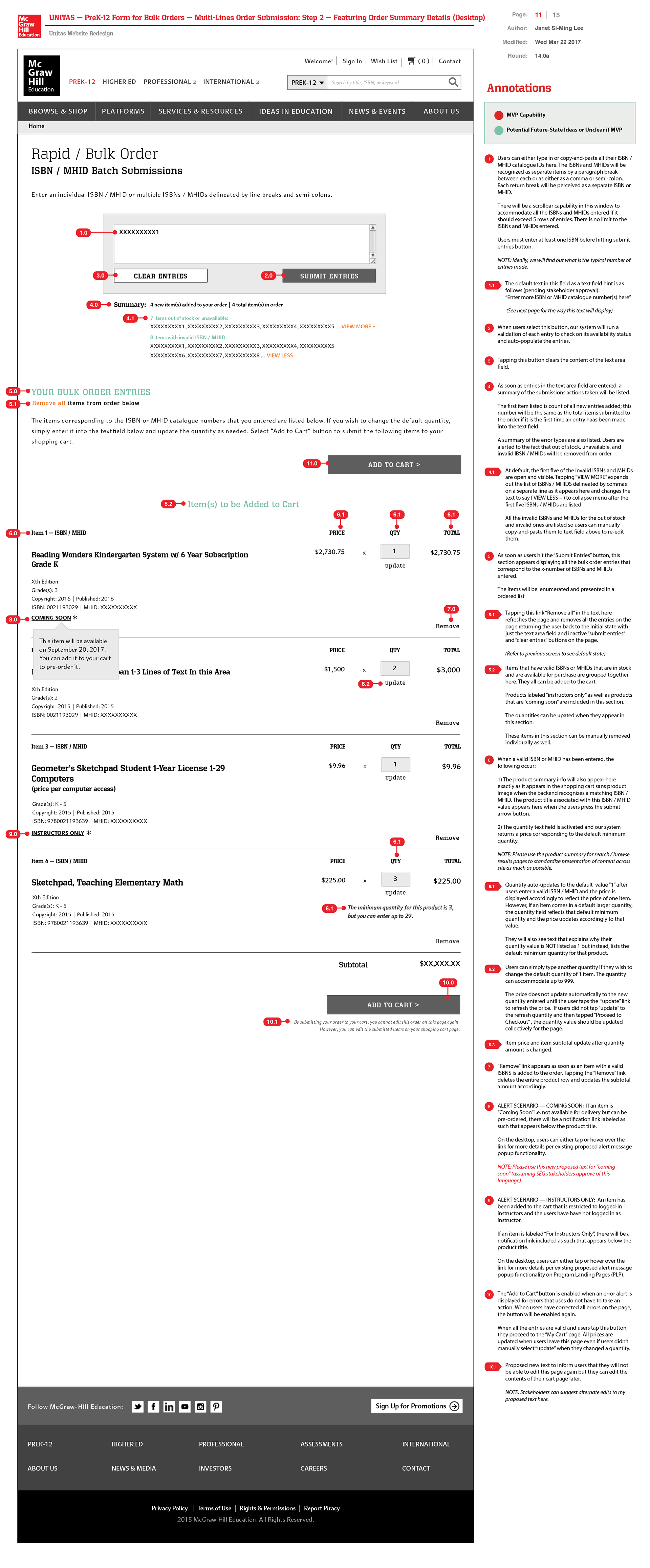
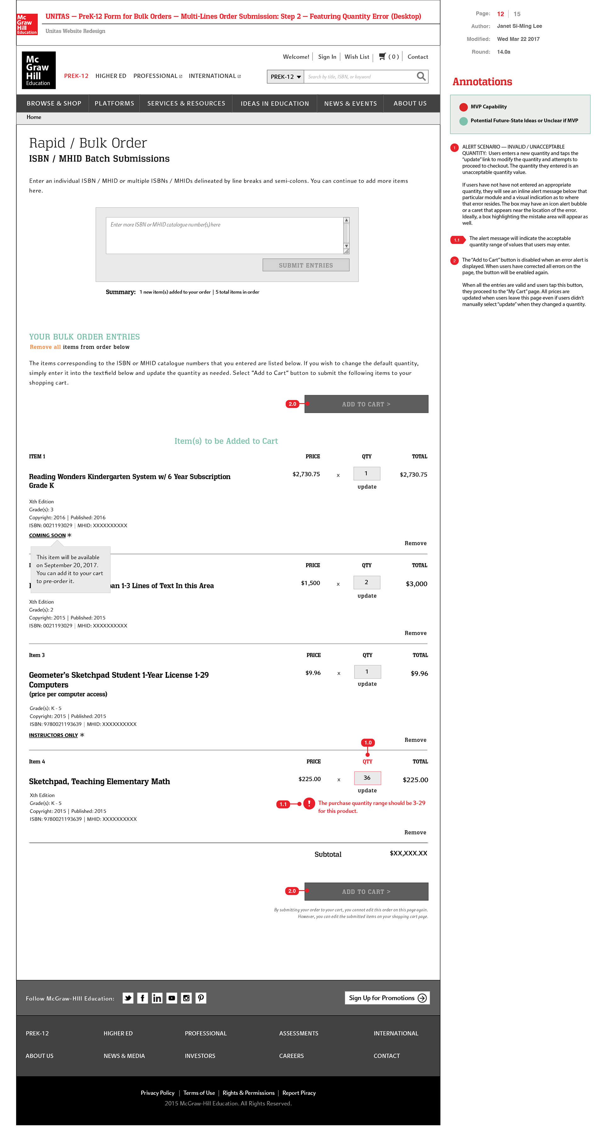
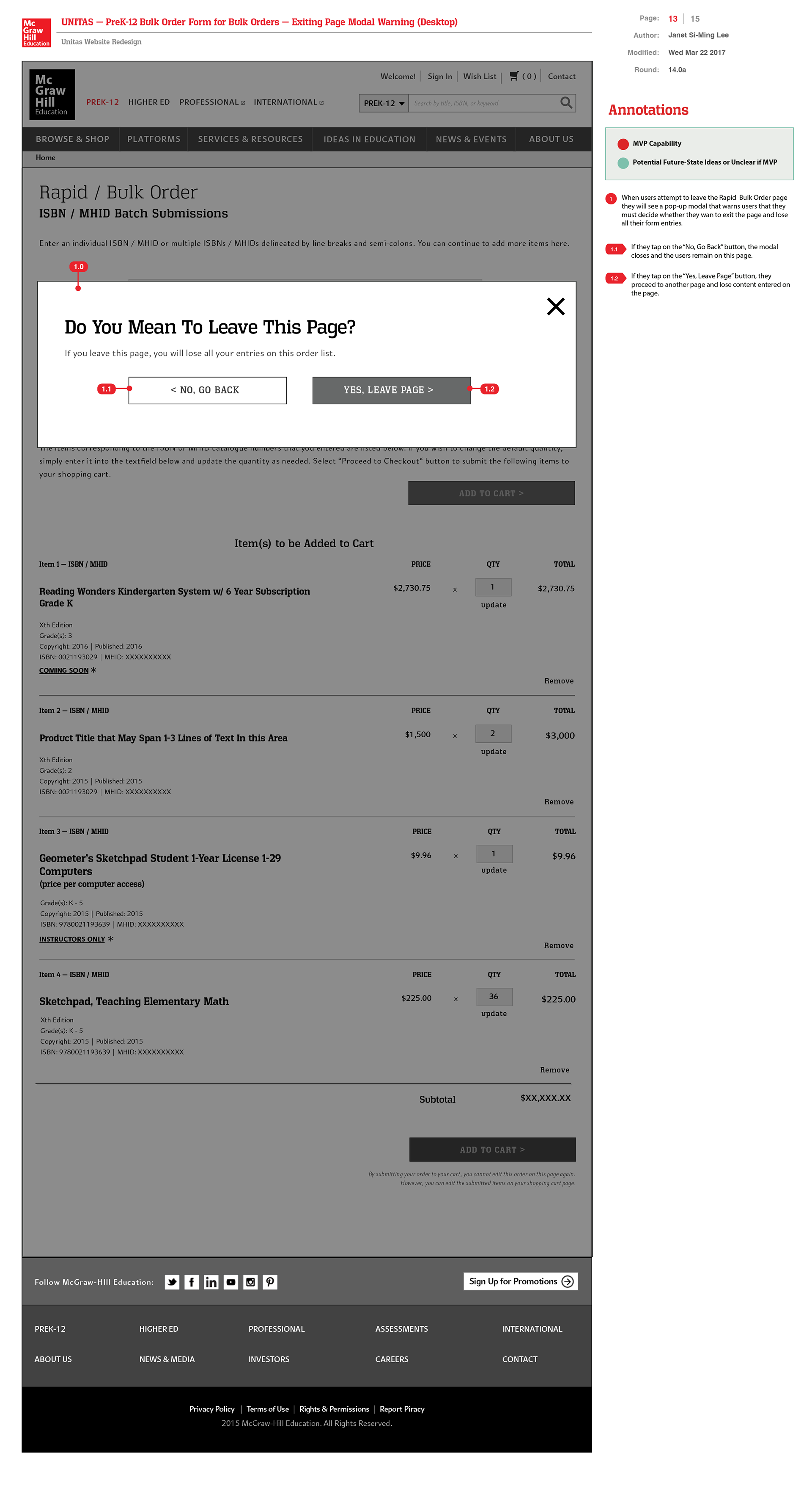
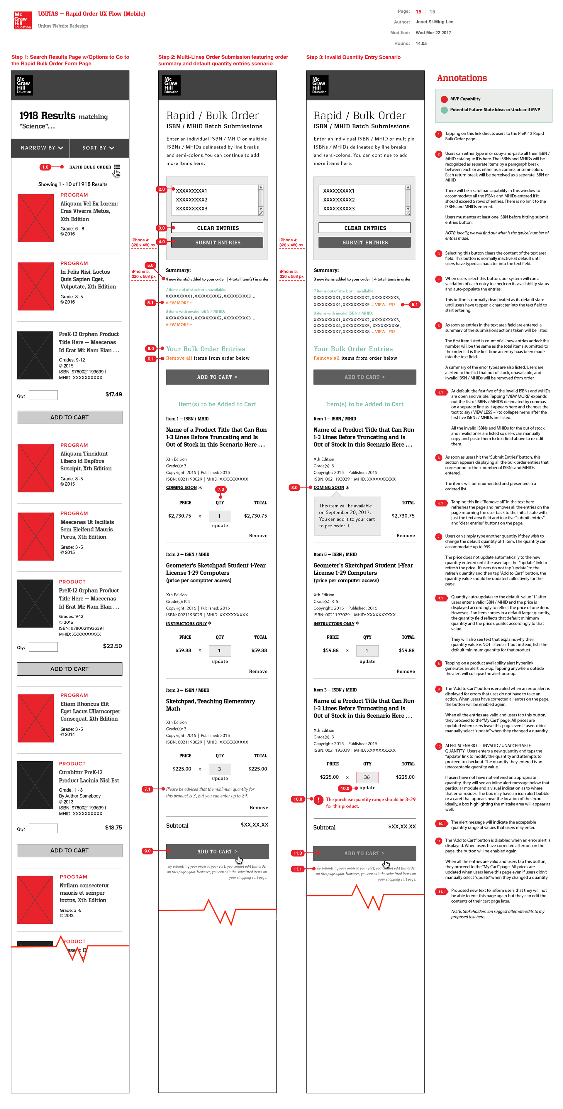
Rapid Bulk Orders UX Sequence
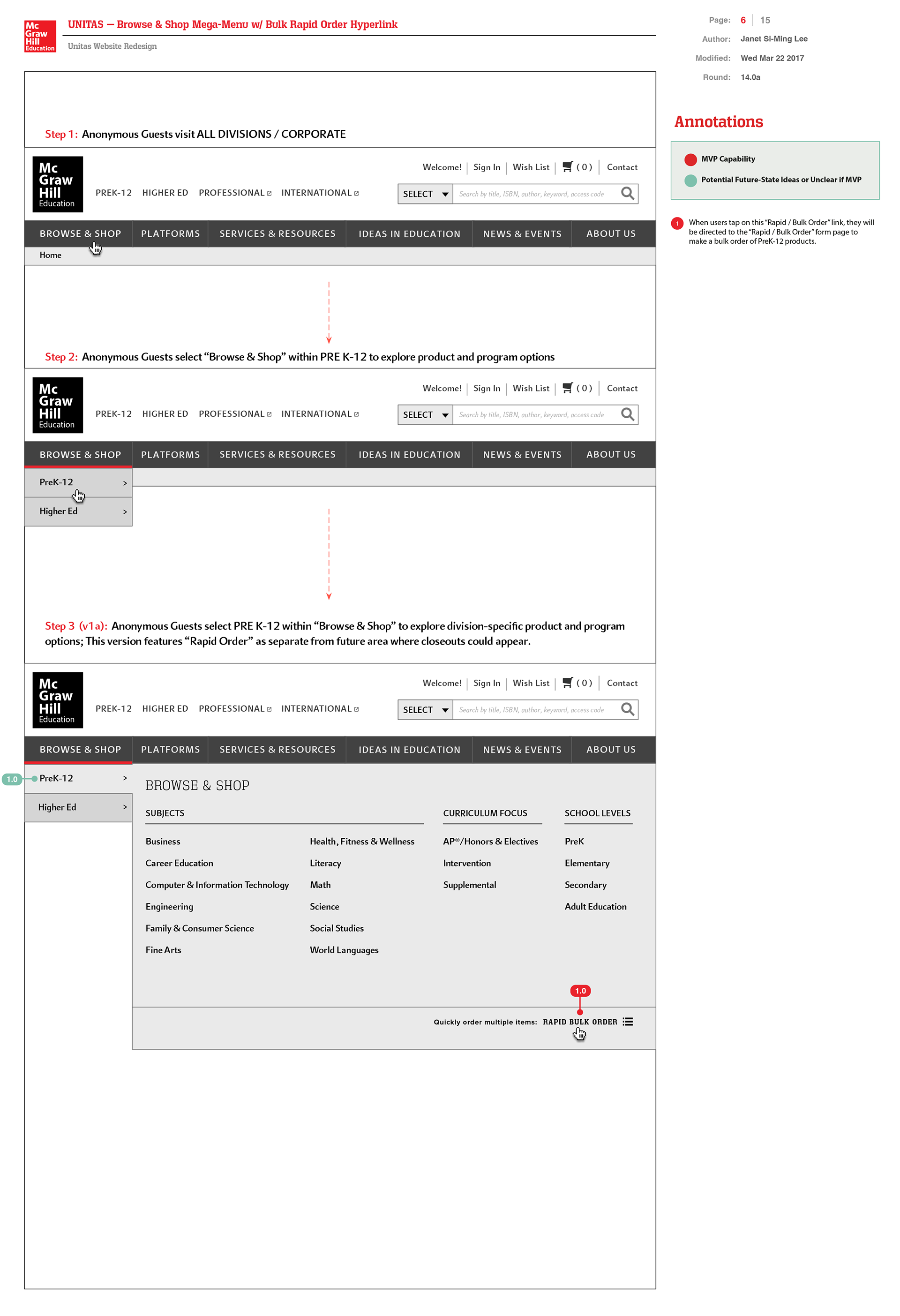
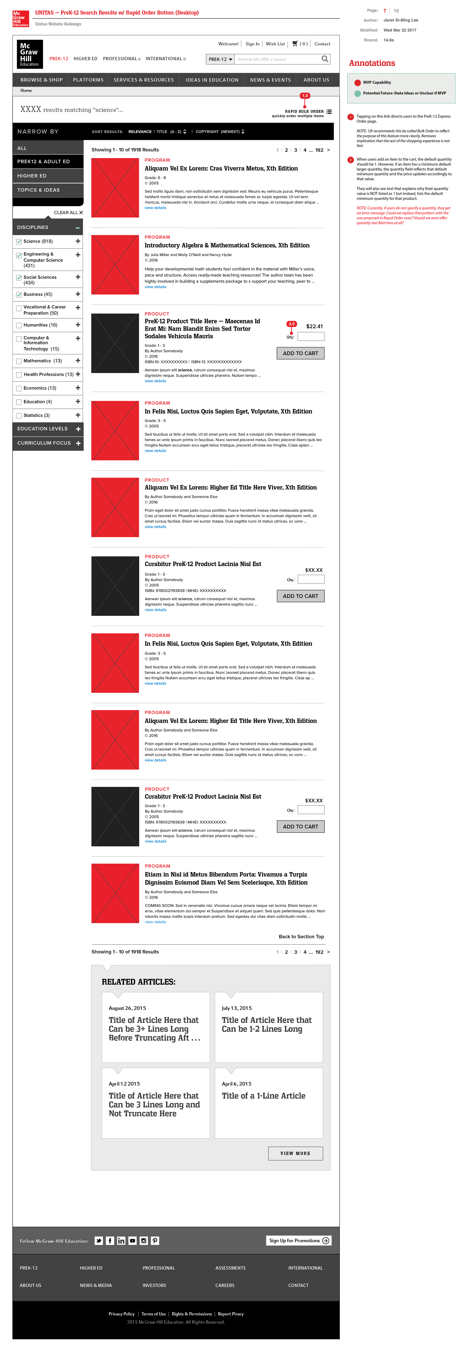
I proposed this sequence of annotated wireframes illustrating how users could conduct rapid bulk order products via ISBNs and MHIDs entries. Users also wanted an ability to update quantity via a +/- feature per product team’s request. I also added a “Rapid Order” button on Search Results page for quick access to the form page in the interim. I included a link to "Rapid Order" within “Browse & Shop” megamenu for PreK-12. Shopping Cart page updated to have a similar quantity updating UX process. I also proposed standardizing the product summary details further to include published info as well as the copyright.

PROTOTYPE / DESIGN PHASE
High-fidelity UI Visual Designs + WCAG Accessibility Design Styleguide
High-fidelity UI Visual Designs + WCAG Accessibility Design Styleguide
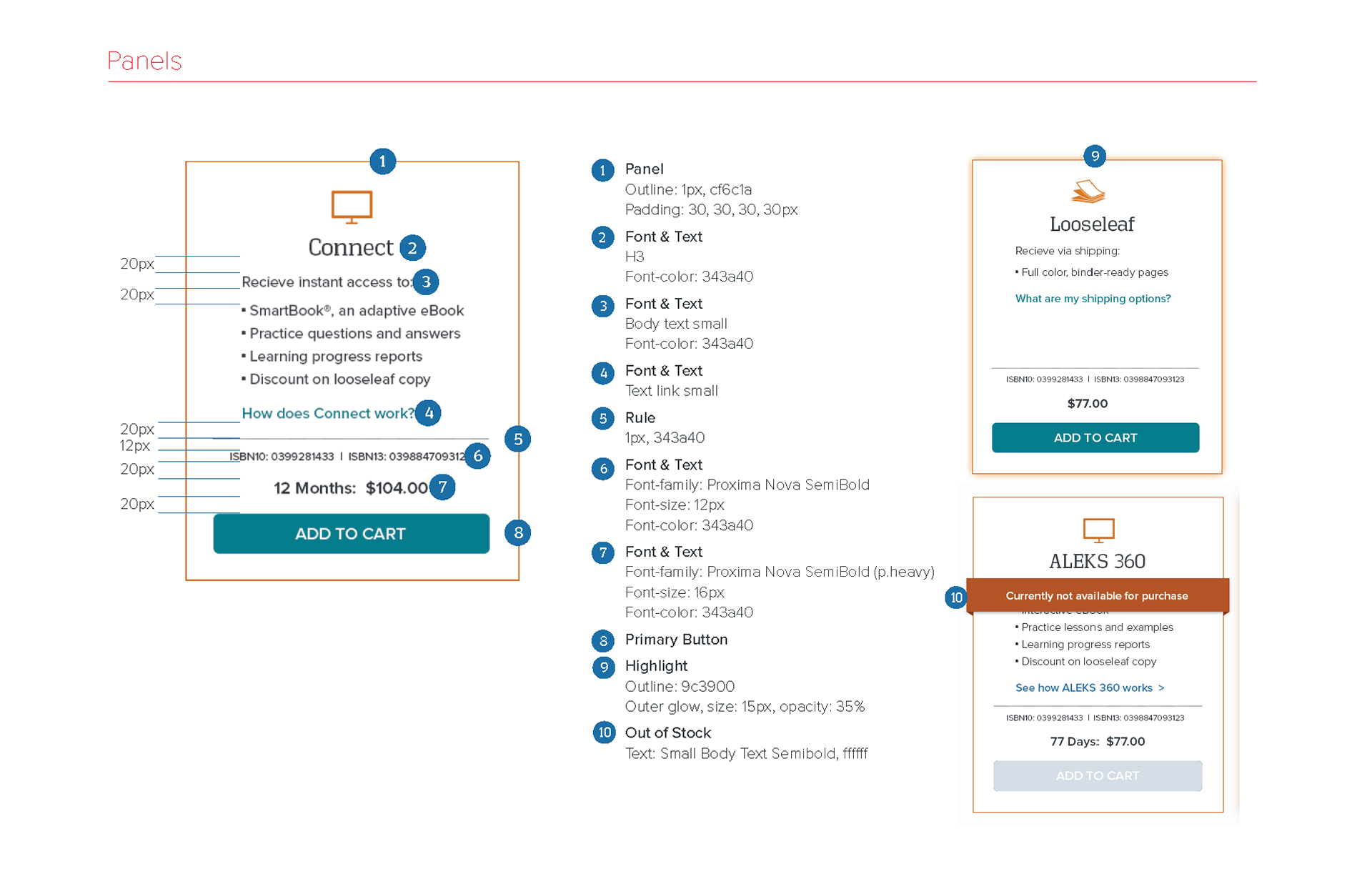
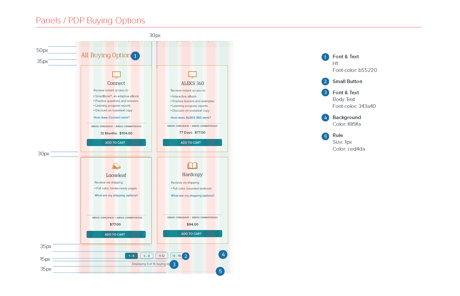
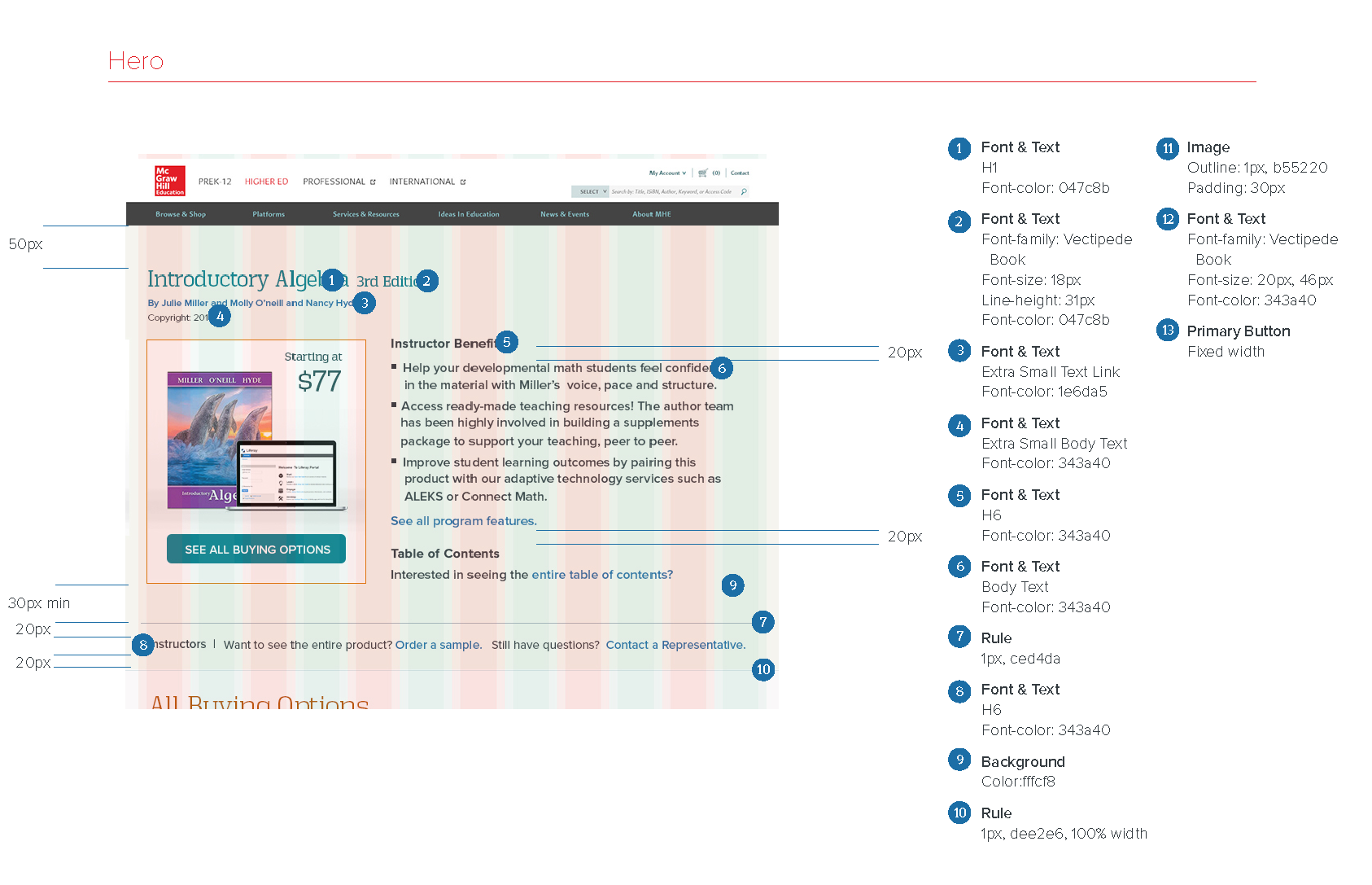
Here is just an example of one of the styleguides that I created back then with redlines documenting the colors and typography specs of each page design for desktop and mobile states as well as for their interaction states. I included details such as CSS margins and padding details, etc as well in my Adobe Indesign file. At this time, our team was still designing in Photoshop and later, we moved to using Sketch for designs. Since we didn't have the capability for devs to look at the code from a Figma file, the redling process was more involved process then. As part of my proposed methodology then, I included a page of interaction notes followed by redline visual specs. Here's just a sample visual design screens to get a sense of my process.
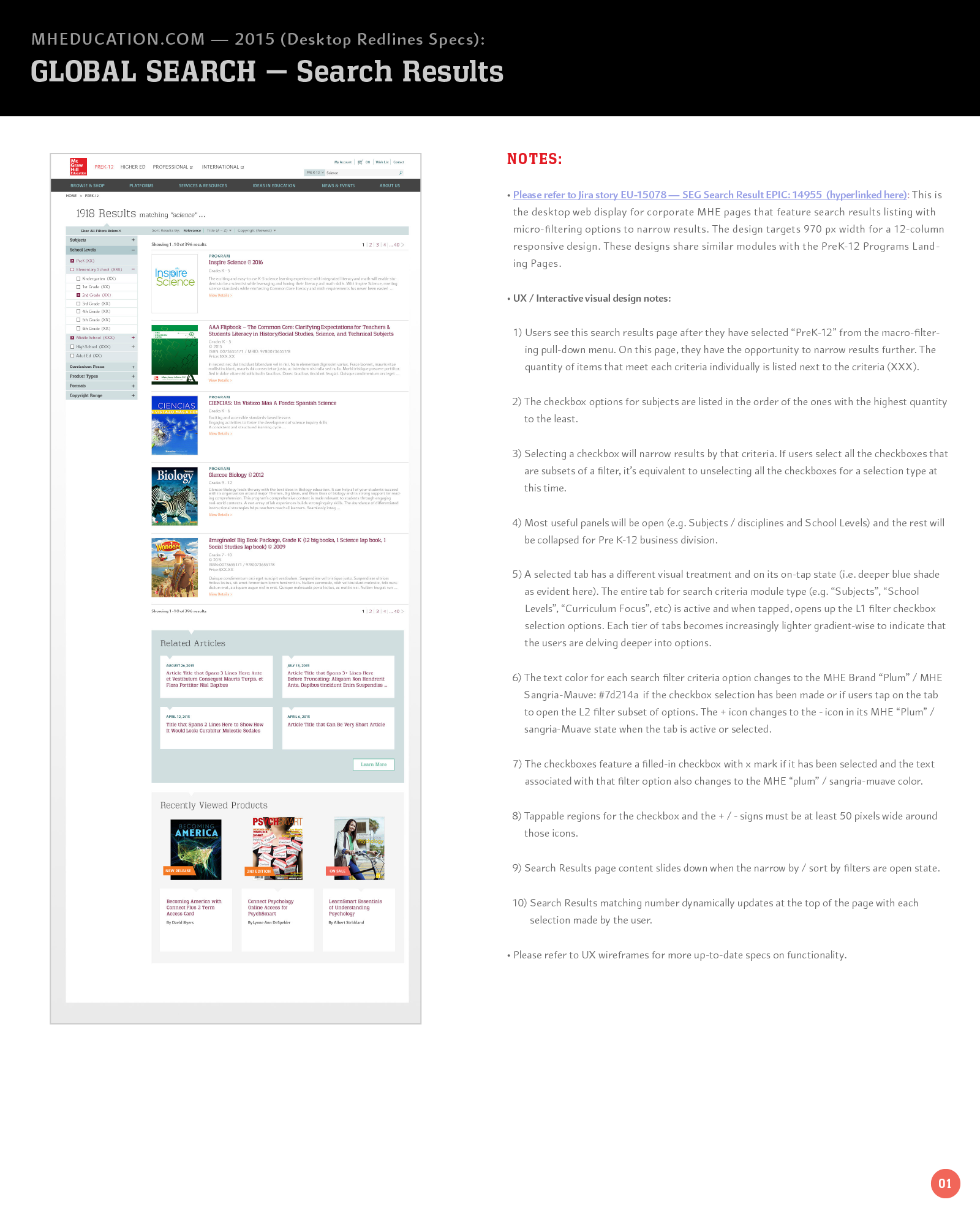
Desktop Search ResultInteraction design notes (p1)
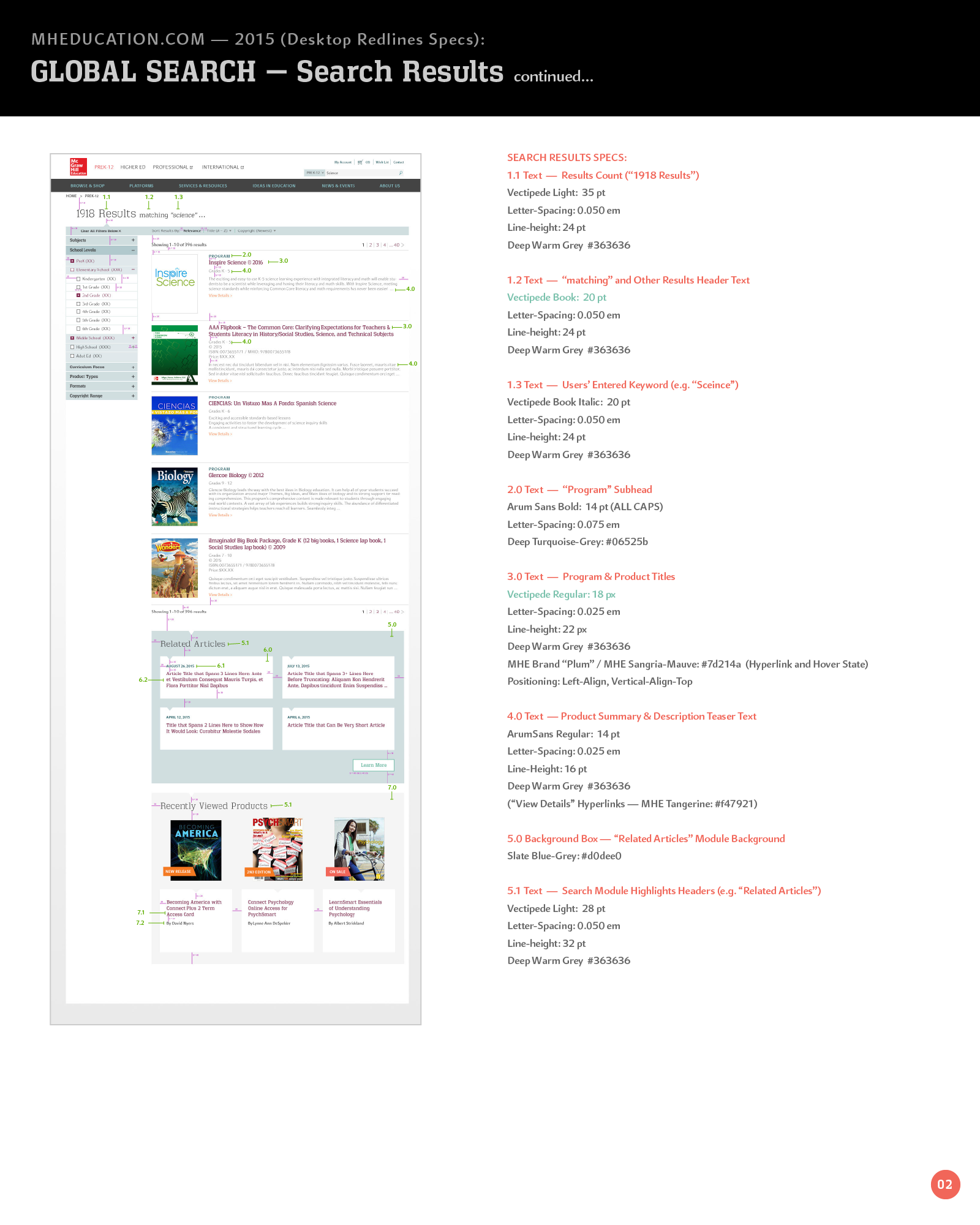
Desktop Search Results Visual design redline specs (p1)
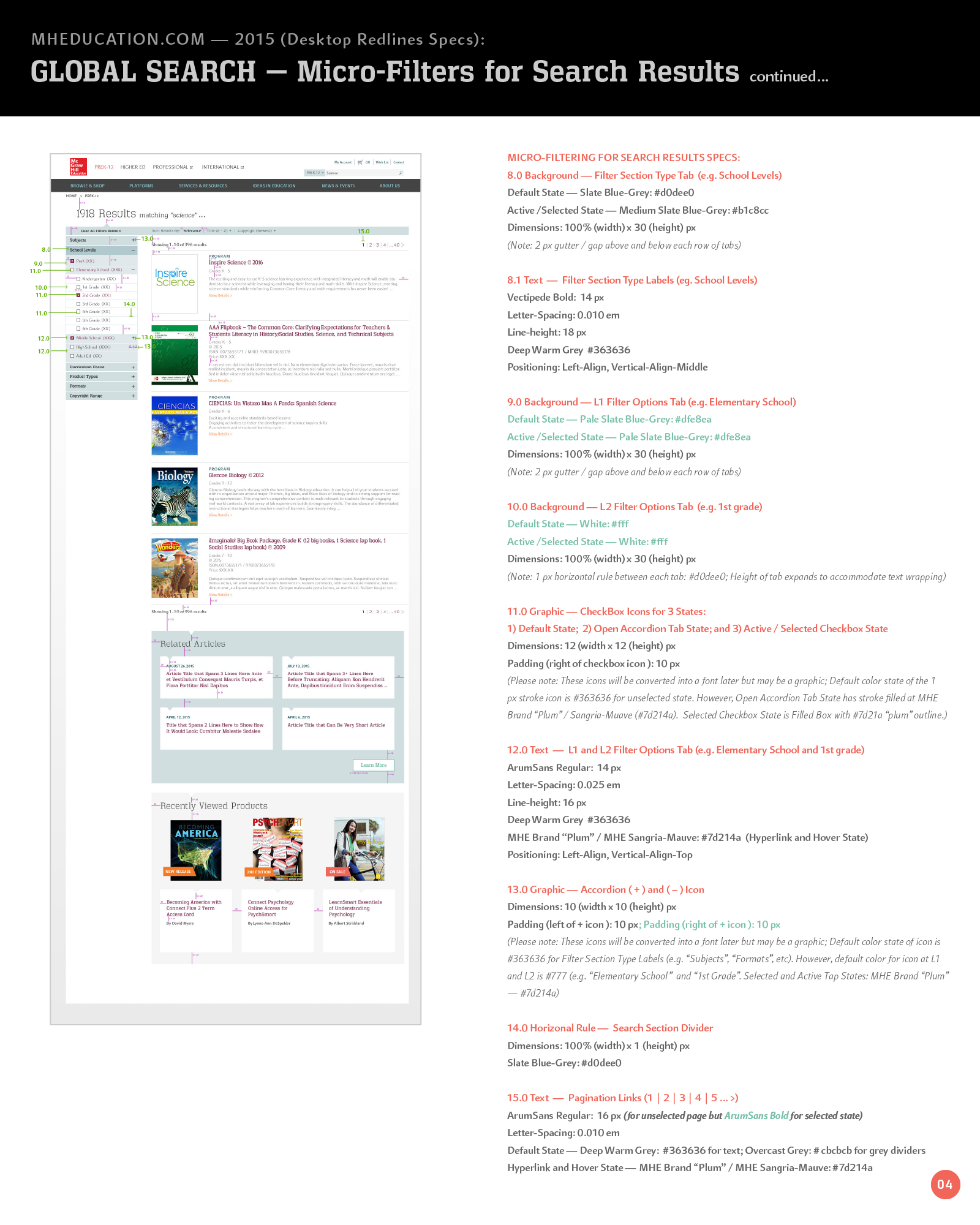
Desktop Search Results Visual design redline specs (p2)
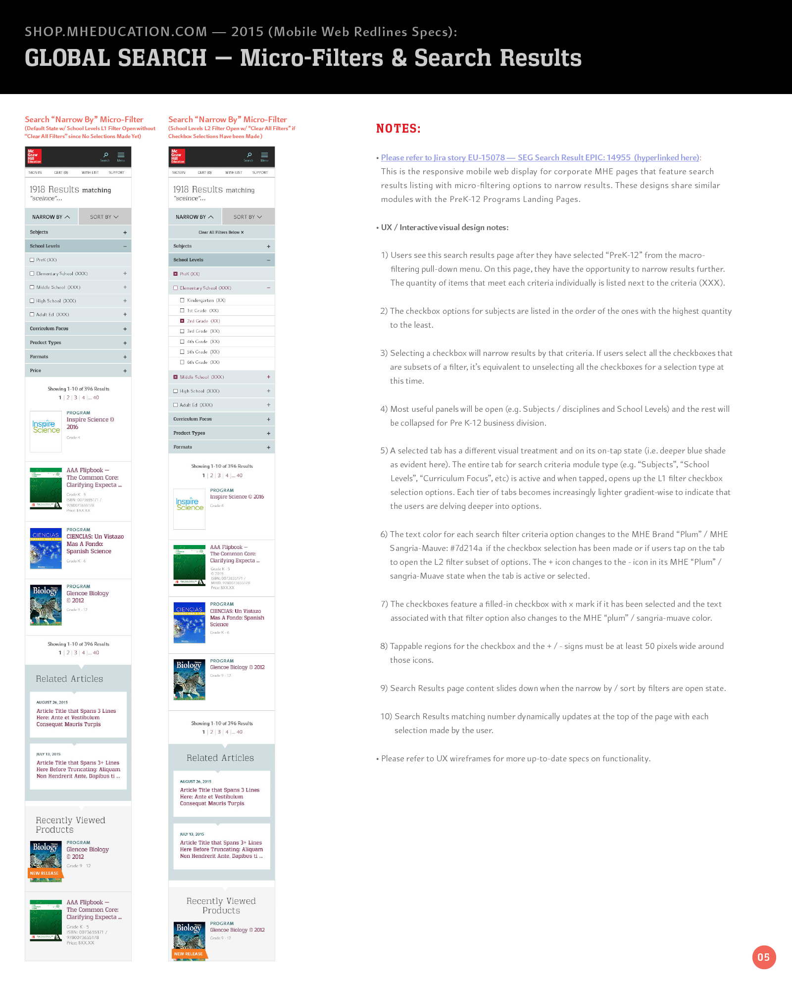
Mobile Interaction notes for Search Results Page
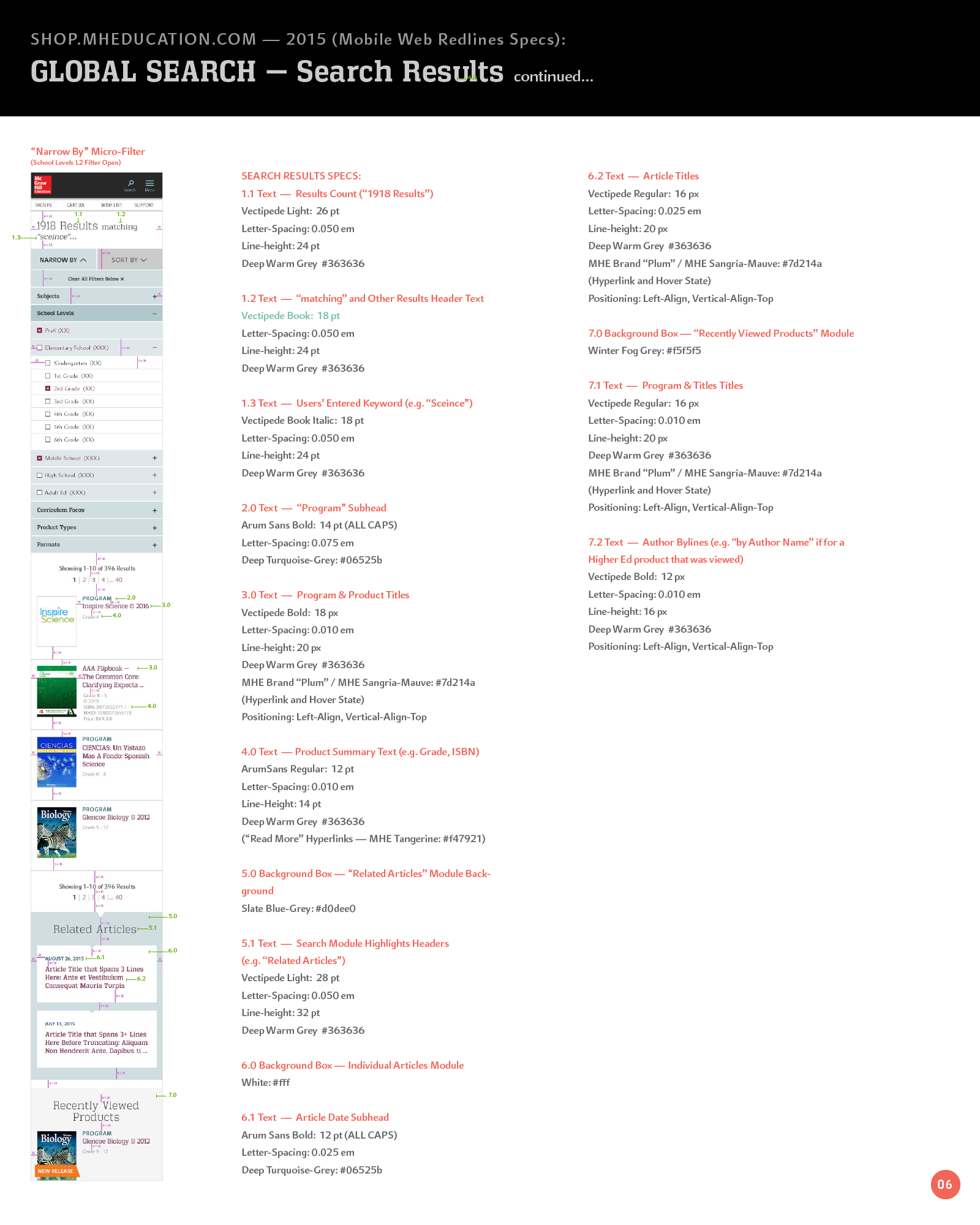
Mobile Visual design redline specs (p1)
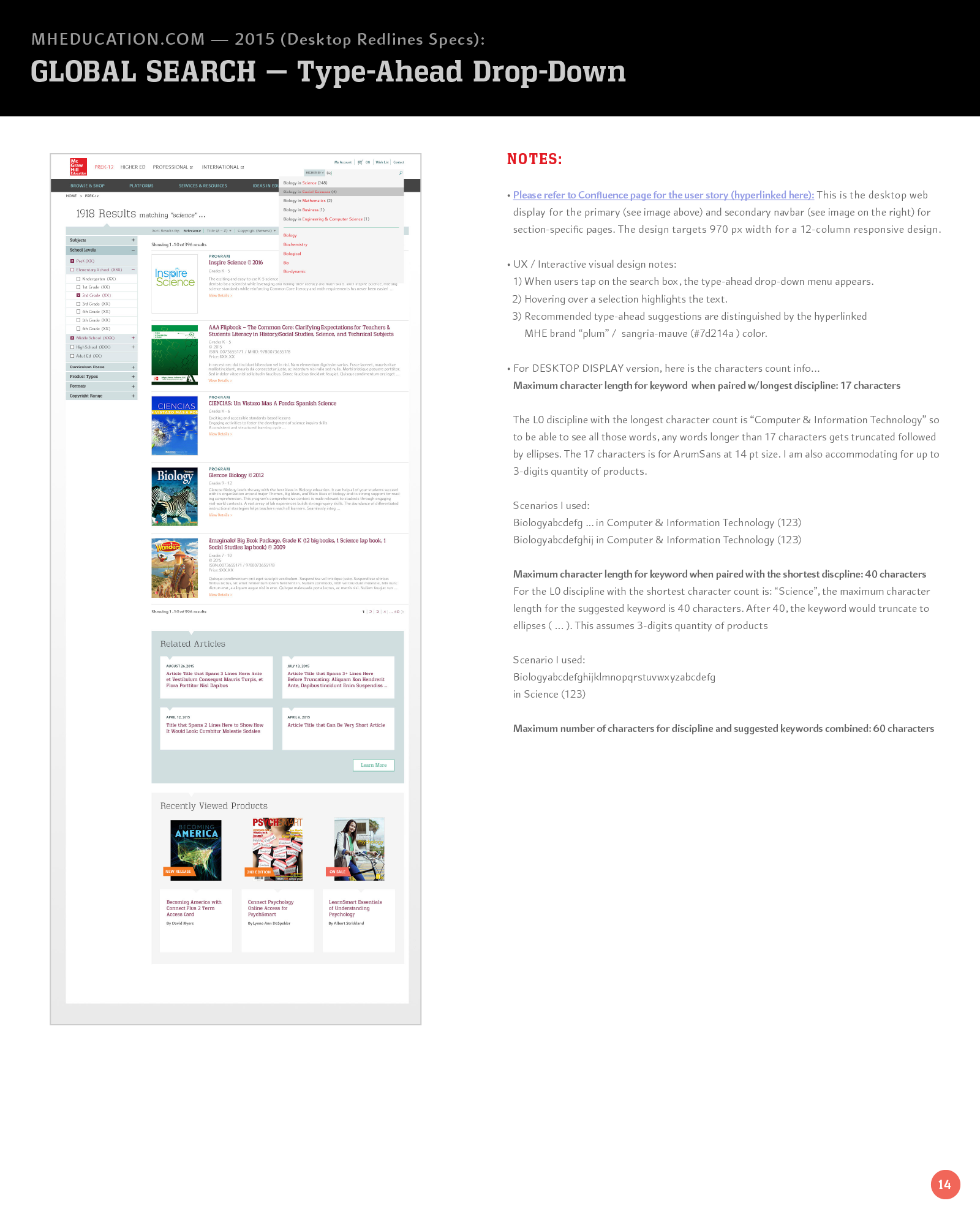
Desktop Interaction notes for Typeahead menu design
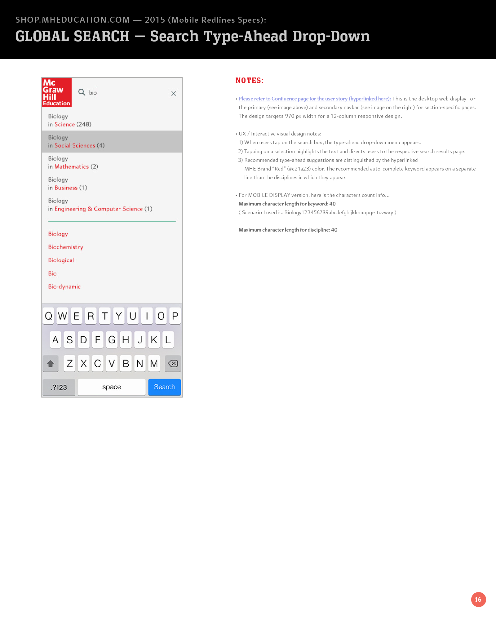
Mobile Typeahead Interaction Notes
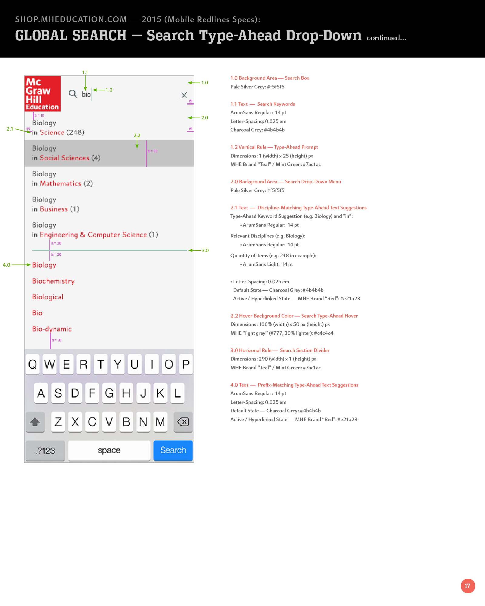
Mobile Typeahead Visual design redline specs (p1)
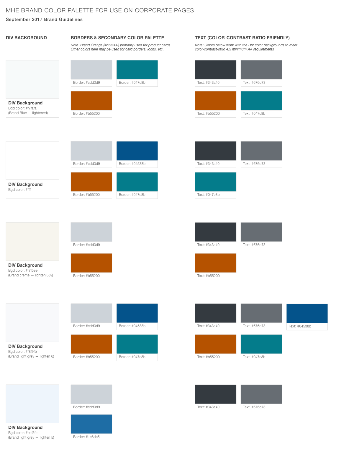
WCAG Accessibility Design Styleguide
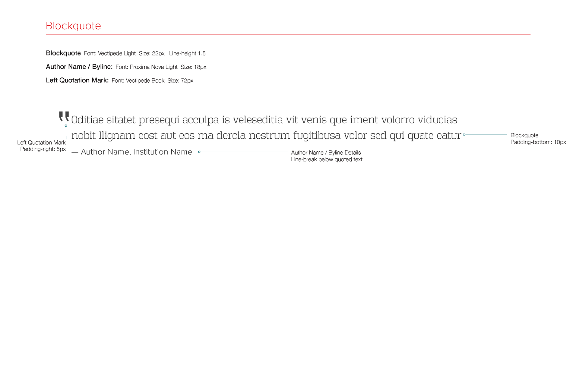
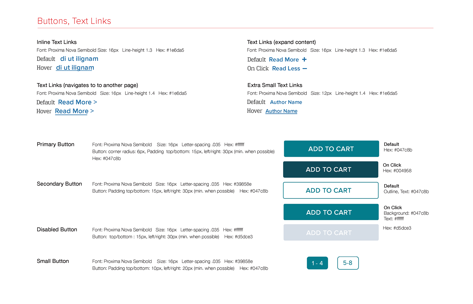
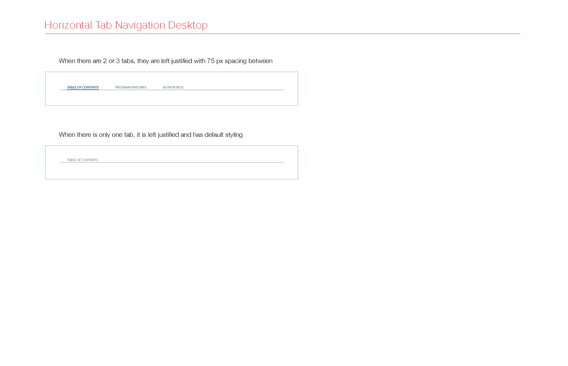
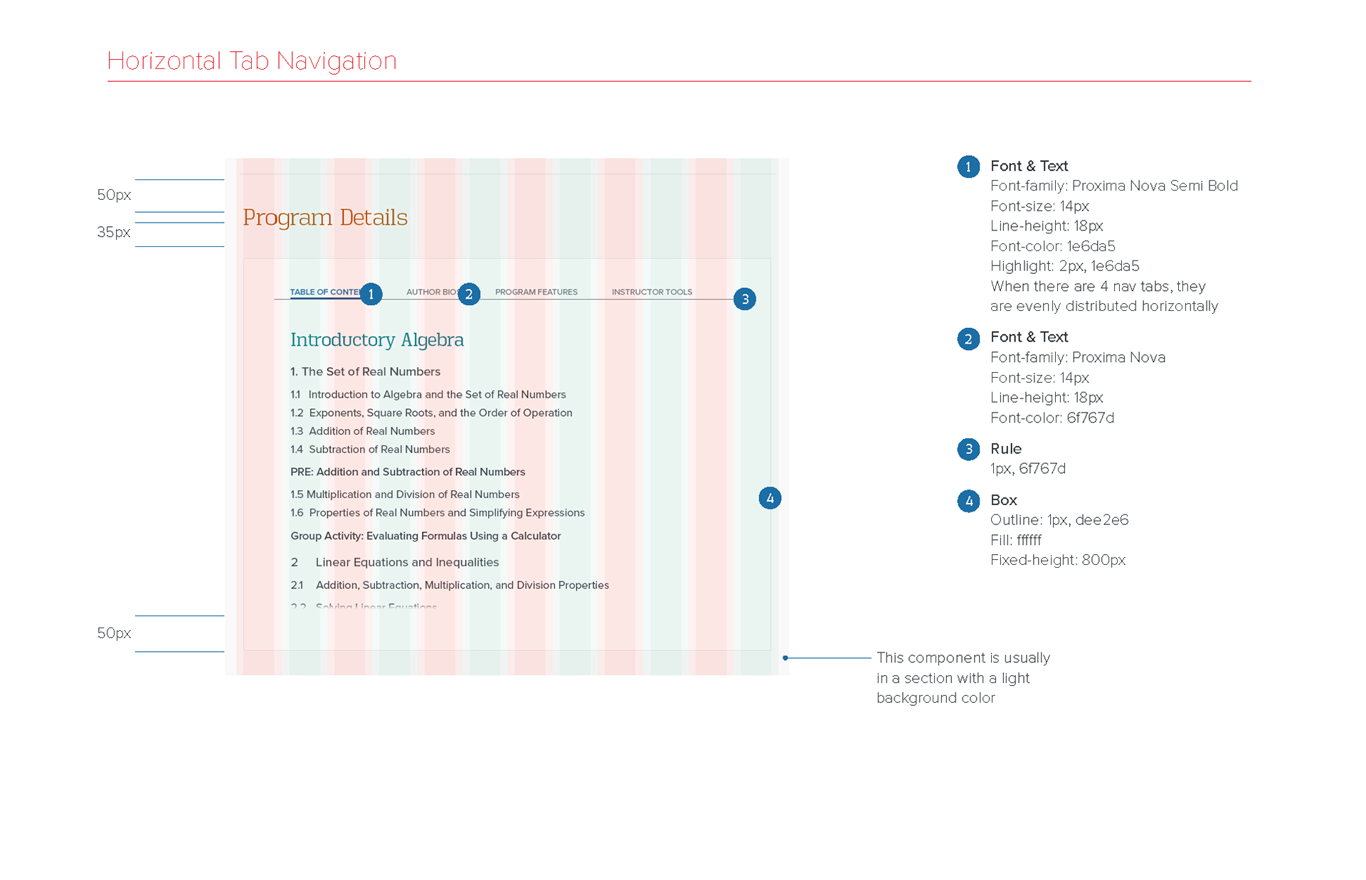
Here is an example of a. visual design styleguide document that I created that details my recommendations for color palette combinations to meet American Disabilities Act (ADA) accessibility requirements. This color palette is based on a third redesign of MHE's website where the MHE stakeholders moved away from the Sapient fuchsia and mint-green color palette.
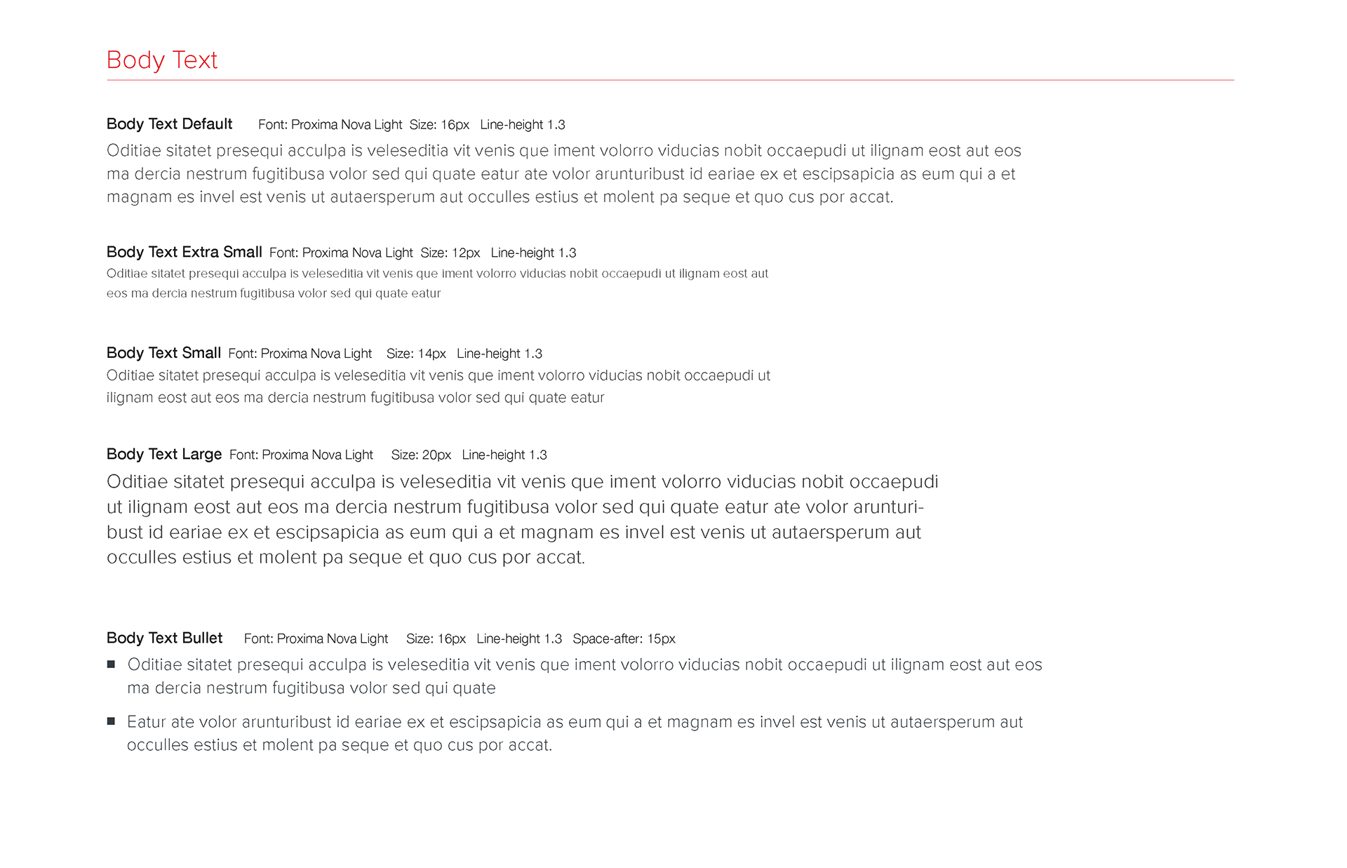
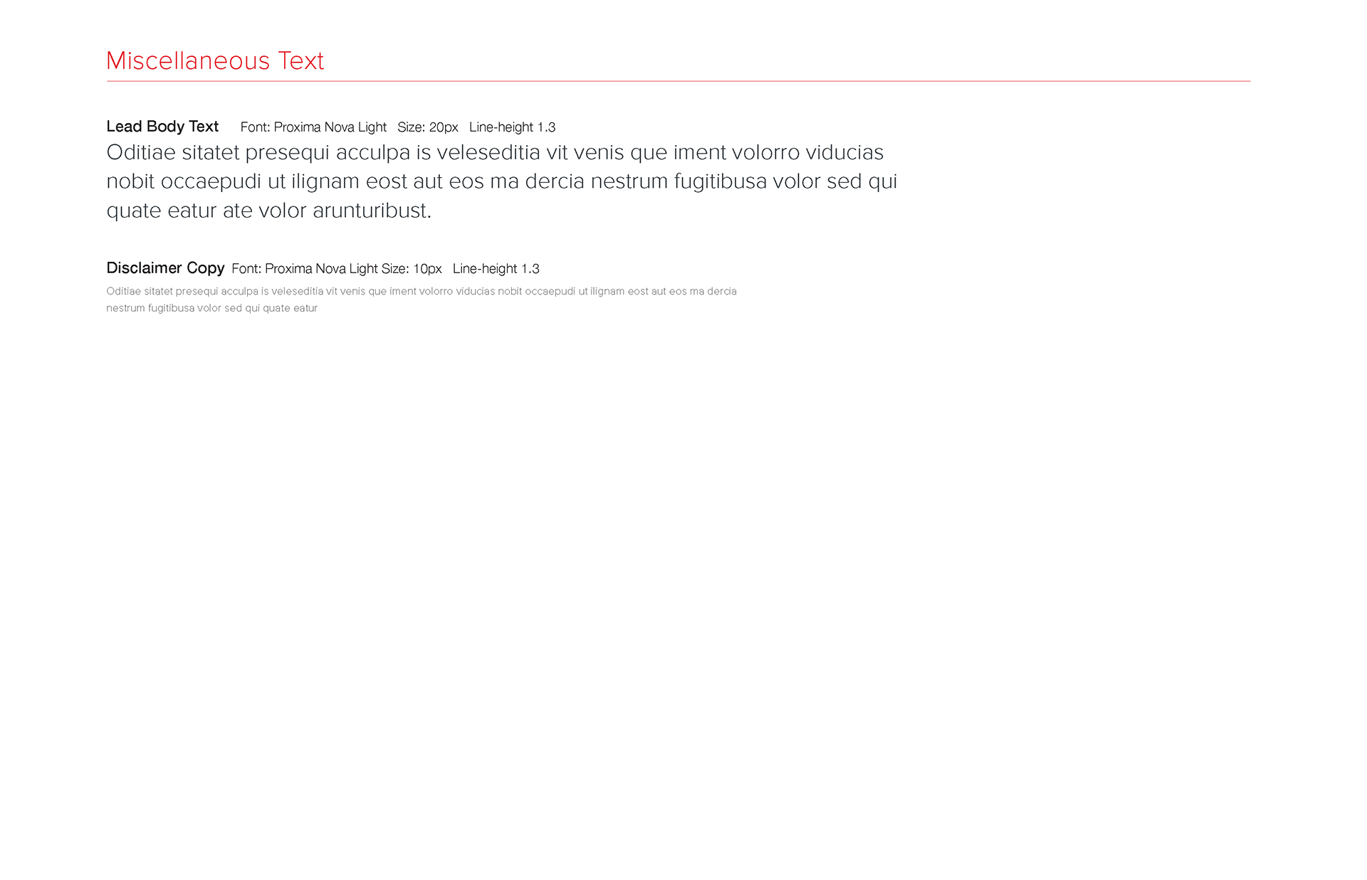
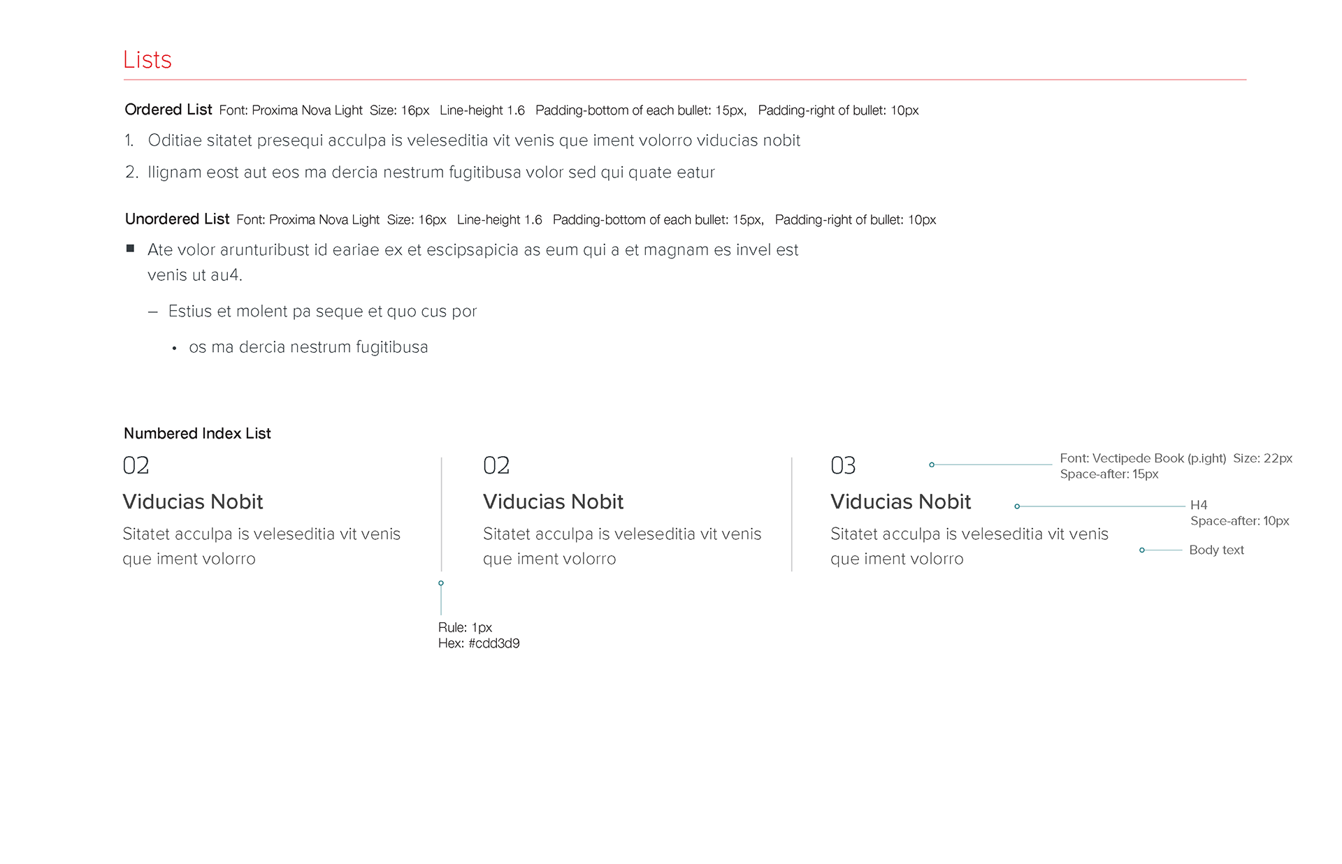
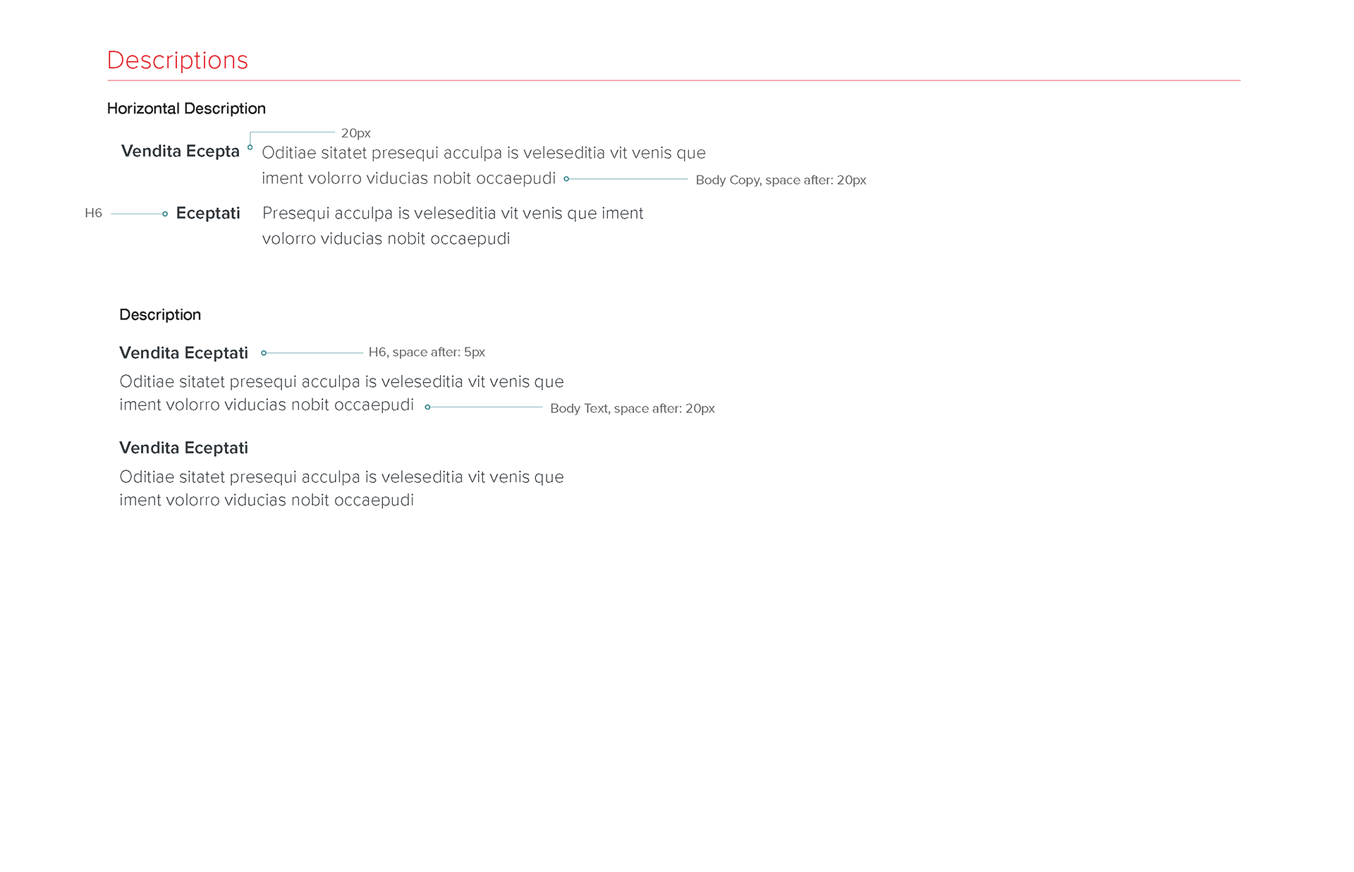
After our MHE's developers rewrote the code for the interim coded pages that MHE's vendor Sapient consulting quickly created in the first 90 days of the higher ed rollout so that there would be a centralized codebase for all our modules, we also moved toward a centralized CSS styleguide to govern our visual designs for more atomic design strategy. Here's an example of our new styleguide specs based on the third redesign of MHE's website.
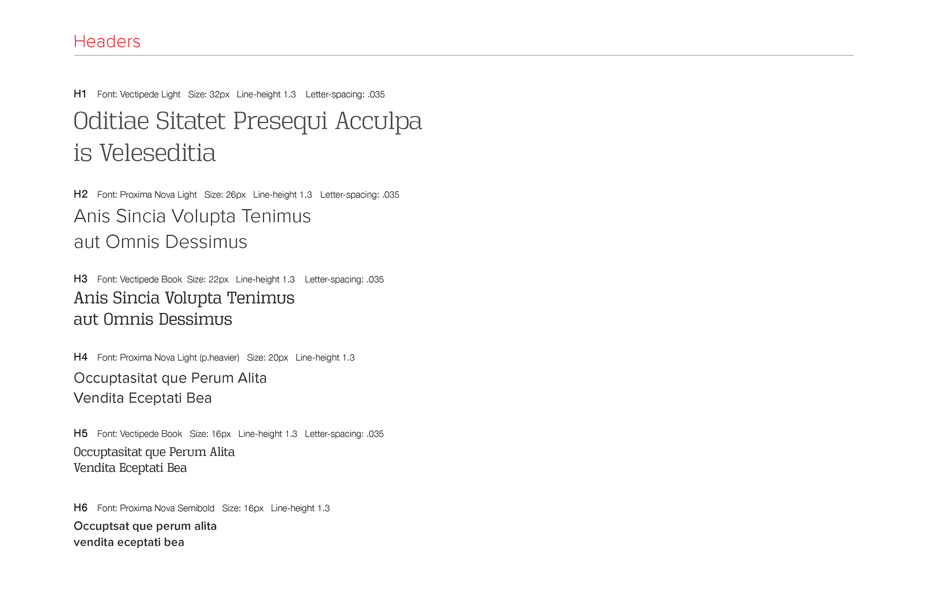
TEST PHASE
User-Experience Customer Interviews + Usability Testing
User-Experience Customer Interviews + Usability Testing
Whenever we wanted to test out how user-friendly and intuitively designed our latest eCommerce pages were, our eCommerce team partnered with the other stakeholder divisions — higher ed and PreK-12 — which had their own dedicated UX researcher or research team to prepare for the user-testing. I would prepare customer interview questions and test scripts for the online customer interview and usability tests that the UX researchers would use. I would prepare the designs for interactive prototypes for each step of the usability test. I often sit in on these interviews to ask the questions for insight into their thought processes about their site experience. Afterward, I would analyze the results with the UX researchers, product management and marketing team stakeholders to assess next steps in the design process.
Please find link to a usability testing (pdf) that I authored:

