PROJECT: Logo / Identity Design for XLNTÉ — an International Exports Consulting Agency
ROLE:
Principal Designer at siming cybercreative
KEY SKILLS / DELIVERABLES:
• Logo Illustration and Identity Design
• Business Card Design
• Tagline Writer
• Brand Positioning
• Chinese / Transcultural Design
DESIGN APPS USED:
• Adobe Illustrator
PROJECT OVERVIEW / CONTEXT:
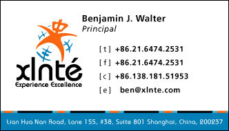
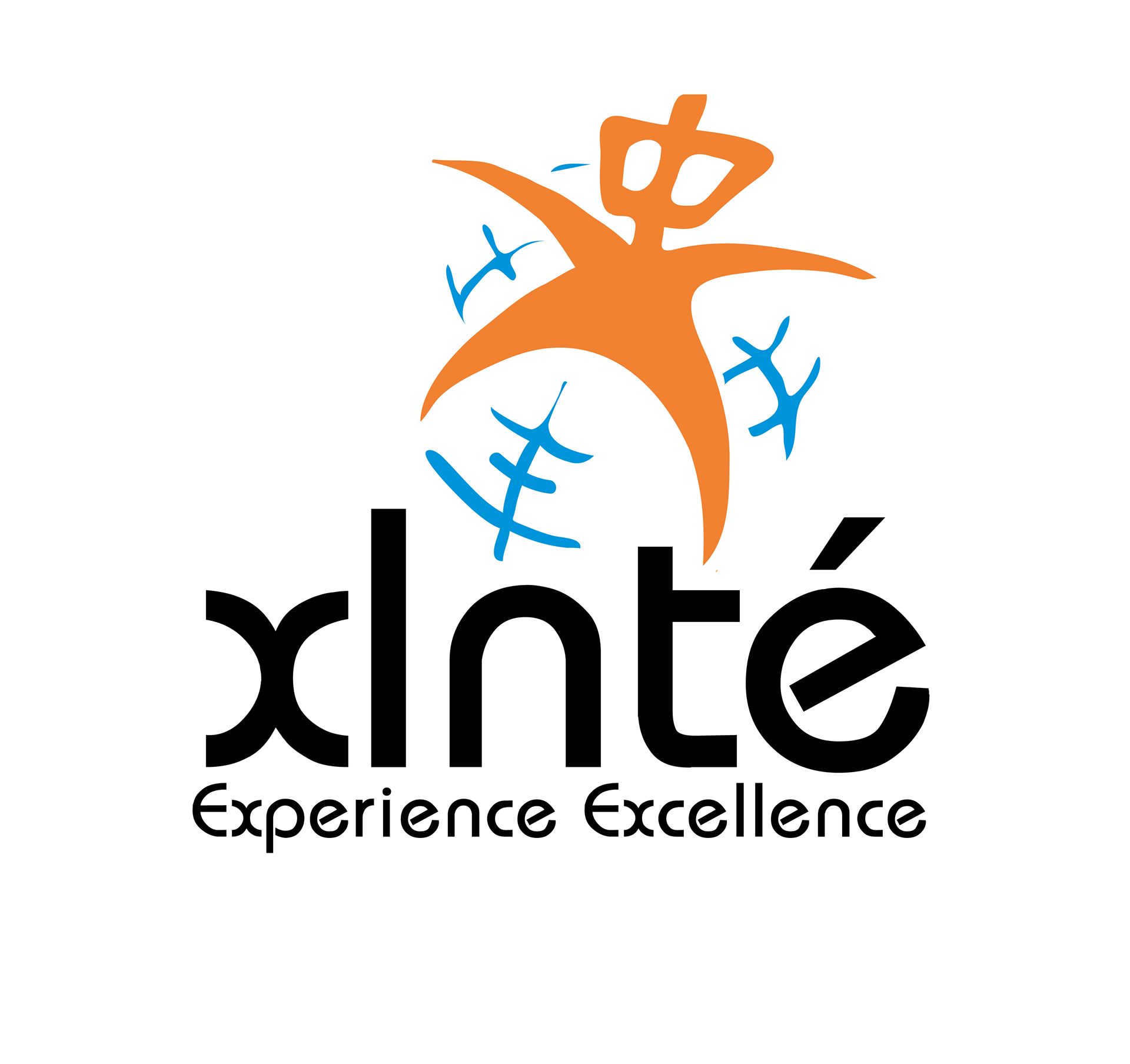
Represented above is my logo design for my client “XLNTÉ”, a new company based in Shanghai that helps international company source products in Asia for cost-effective, quality savings through strategic partnerships with vendors. I created this tagline “experience excellence” to emphasize their brand position as an experienced, excellent consulting resource and to invite their existing and potential clients to experience this excellence.
The logo mark forms the shape of an “x” and the body of a Chinese person with the Chinese character “zhong” for its head. Zhong means center or middle which is a reference to China as the “central country”. Chinese call China the “central country” (zhong guo) because they believe that they are the center of the world and that commerce begins in Asia. My logo alludes to the idea that China is once again at the center of the world commerce with XLNTé mapping China at the center of commerce today through their commerce consulting solutions. The “x” of this Chinese-looking mark also refers to the “x” mark on a map, the globe. The three blue lines in the globe form the character signifying prosperity.
Represented above is my logo design for my client “XLNTÉ”, a new company based in Shanghai that helps international company source products in Asia for cost-effective, quality savings through strategic partnerships with vendors. I created this tagline “experience excellence” to emphasize their brand position as an experienced, excellent consulting resource and to invite their existing and potential clients to experience this excellence. The logo mark forms the shape of an “x” and the body of a Chinese person with the Chinese character “zhong” for its head. Zhong means center or middle which is a reference to China as the “central country”. Chinese call China the “central country” (zhong guo) because they believe that they are the center of the world and that commerce begins in Asia. My logo alludes to the idea that China is once again at the center of the world commerce with XLNTé mapping China at the center of commerce today through their commerce consulting solutions. The “x” of this Chinese-looking mark also refers to the “x” mark on a map, the globe. The three blue lines in the globe form the character signifying prosperity.
Proposed business card design for my web development partner and architect Ben Walter who was also my classmate at our MIT undergraduate course on web communications. He was a co-founder a this consulting agency “XLNTÉ” based in Shanghai, China.
